|
|
Post by cowboyleland on Feb 8, 2013 8:24:47 GMT -9
If you are like me, you love the look of Mesper's figurs. But they are optimised for 30mm and if you shrink them the great detail starts to get lost. Here is the solution that works for me. 1. Import a page of the pdf into GIMP (make sure you are importing at 300dpi We want the figs to be easy to cut out when we scale down. 2. Bucket fill between the legs and other spaces that are going to be too fiddly to cut out. This may leave a few white pixels next to the outline, but this will get handled in the next step. The next steps are about emphasizing the details so they will not get lost when we scale the figures down. 3. Get the "Select by Colour" tool and click on black. 4. Go to "Edit" and click on "Stroke Selection," adjust the "line width" to 1 pixel and click "Stroke" Now we need to thicken the outline to make the figures easy to cut out. 5. Get the Fuzzy Select tool (magic wand) and select the background. 6. Go to Edit and click on "Stroke" again. This time adjust the line width to 10 pixels. (The original outline thickness on the pirates is about 12, but I wanted to play it safe.) Then click "Stroke." 7. Now you can reduce the image to 50% and still see most of the detail. Go to Color and adjust contrast and brightness to taste. I bumped both up by 50 on the GIMP scale. I have no luck with photography, but here is what I got 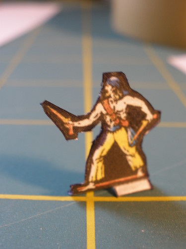 P2080016 P2080016 by cowboyleland, on Flickr I'm happy with him so I went and bought the bundle. |
|
|
|
Post by gilius on Feb 8, 2013 14:34:41 GMT -9
|
|
|
|
Post by cowboyleland on Feb 8, 2013 17:20:16 GMT -9
Oh, that is what "Curves" means. Thanks, Gilius, I'll give that a try.
|
|
Deleted
Deleted Member
Posts: 0
|
Post by Deleted on Feb 10, 2013 11:47:52 GMT -9
cowboyleland - firstly thanks for testing these figurines and providing the tutorial! Then I got some question and/or suggestion regarding following steps: 6. Go to Edit and click on "Stroke" again. This time adjust the line width to 10 pixels. (The original outline thickness on the pirates is about 12, but I wanted to play it safe.) Then click "Stroke." 7. Now you can reduce the image to 50% and still see most of the detail. Go to Color and adjust contrast and brightness to taste. I bumped both up by 50 on the GIMP scale. I'm not familiar with Gimp but in Photoshop usualy it's better to first reduce (or enlarge) size and only then add outlline - which should result in more regular and clean one (assuming that outline is made as bitmap not vectors). At least that's the way I'm doing outlines when rescalling figurines - so just my 2 coppers:)
|
|
|
|
Post by bravesirkevin on Feb 10, 2013 12:27:16 GMT -9
I'd also recommend using an Unsharp Mask in the last step, possibly instead of doing the Brightness and Contrast. This will keep your colour values perceptually identical to the original, but will make them pop! 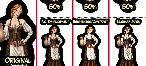 If you were using Photoshop I could tell you exactly what to plug in, but as I don't know GIMP, you may have to play around a little to get the right settings. It's worth it though, because once you get it right, it will give you a very clean and crisp result that preserves and enhances details. |
|
|
|
Post by oldschooldm on Feb 10, 2013 14:29:43 GMT -9
I'd also recommend using an Unsharp Mask in the last step, possibly instead of doing the Brightness and Contrast. This will keep your colour values perceptually identical to the original, but will make them pop! Awesome! |
|
|
|
Post by cowboyleland on Feb 10, 2013 17:29:01 GMT -9
Seconding Oldschools sentiments. thanks SirKev, I'll give that a try.
@ Mesper: I like to do the shrinking last so I can see what is going on, but I'll definitely try it the other way too.
I LOVE the way as soon as you tell people how you do things everyong jumps on and tells you how it REALLY should be done ;D
|
|
|
|
Post by kiladecus on Feb 25, 2013 5:35:44 GMT -9
Ok... Does anyone know where the "Unsharp Mask" is in Gimp? I have gotta try this.
My figures go through a lot of color changes when I "enhance" them... and it is not always good (Did you see Sekhmet's "Hello Kitty" cape? Not good).
Please let me know!
I LOVE how this forum is filled with people from all kinds of backgrounds, and pitch in to help people improve. I have learned SO much here in the last few months!
;D
|
|
|
|
Post by bravesirkevin on Feb 25, 2013 6:30:32 GMT -9
In GIMP it's under Filters>Enhance. In Photoshop it's under Filters>Sharpen
Just to add a more complete description, what it does is to increase the contrast of each pixel, by comparing it to the pixels that surround it according to certain parameters.
The 3 parameters are:
Amount: How much contrast to add. In Photoshop, this is measured as a percentage, from zero to 500%, in GIMP it's value from 0.00 to 5.00. I'm not sure if they correlate, so please experiment a little. In Photoshop 100% leaves it exactly the same, and a good value is usually somewhere between 150% and 200%
Radius: This is a count of how many surrounding pixels to compare against. A small value will compare each pixel against only the pixels that are very close to it, while a large radius will take a much bigger sample (And thus affect the colours even more dramatically).
Threshold: This parameter is there so that it ignores colours that are very similar. The main use for this is to prevent noise in a flat colour area from getting blown out of proportion while you're sharpening. A very low value will make your noise more noisy, and a value that's too high will cancel out the sharpen effect unless there's a lot of difference in the colours, so you'll need to play around to find the right balance. I usually don't touch this one unless I have noise in my image.
|
|
|
|
Post by gilius on Feb 25, 2013 7:01:54 GMT -9
By the way, I must thank bravesirkevin for the unsharp mask tip. A few days ago I played a little with it to print some Battle Studio! minis and it worked very well. I did not write down the parameter values but I got the feeling that they will depend on the contrast and colors so I do not know if I could have a "one size fits all" setup.
|
|
|
|
Post by kiladecus on Feb 26, 2013 15:58:20 GMT -9
WOW! Thanks for the tip, BSK! I am afraid to touch anything, so when you say to leave "Threshold" alone, I will not be touching it. A quick question... should I keep the "Radius" low? Is this another case of "Don't touch it, Dave?"  |
|
|
|
Post by bravesirkevin on Feb 26, 2013 16:19:02 GMT -9
By the way, I must thank bravesirkevin for the unsharp mask tip. A few days ago I played a little with it to print some Battle Studio! minis and it worked very well. I did not write down the parameter values but I got the feeling that they will depend on the contrast and colors so I do not know if I could have a "one size fits all" setup. You're most welcome! Your set-up will depend a lot on how the image starts out, so there is no "one size fits all" as you put it, but once you're more familiar with the way the tool behaves you'll come up with your own rules of thumb on how to get the best results. WOW! Thanks for the tip, BSK! I am afraid to touch anything, so when you say to leave "Threshold" alone, I will not be touching it. A quick question... should I keep the "Radius" low? Is this another case of "Don't touch it, Dave?" Low radius is generally better, but not too low. Around 2 pixels will work in most cases, but it does depend very heavily on the state of the image before you started. Long Answer: Generally, I'd set my amount at around 175 or so, and then tweak the radius until I found the kind of sharpness I wanted, and then reduce or increase the amount to fine tune the contrast so that things don't get blown out. In your case, I would use the threshold because your stuff is hand coloured so you've got paper grain and pen strokes which will both get very noisy if you don't use the threshold. Just leave it at zero until you're happy with the contrast and sharpness, and then right at the end of the process slide it up gradually to smooth off your flat colours properly. Don't be nervous! Just experiment and learn! Until you're more confident, it might be a good idea to keep a back up "raw" copy that you can compare the "corrected version against. Also, if you mess up the corrected version, you can always go and start over on a new copy of the raw version. Don't worry though, you will pick up the skills pretty quickly once you get going. |
|
|
|
Post by cowboyleland on Feb 26, 2013 18:45:15 GMT -9
Also, "undo" is a great friend to have.  |
|