|
|
Post by Sirrob01 on Oct 13, 2009 2:17:09 GMT -9
I'm working on some other standees but thought I'd do one for the Hoard. I'm still working on improving my drawing. He's based on a 1950's tacky horror movie monster  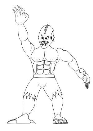 Stands about 50-55mm tall, still have some work to do on his hands and some other minor details to add. Feedback welcome |
|
|
|
Post by Floyd on Oct 13, 2009 4:47:06 GMT -9
Sort of a Creature from the Black Lagoon meets Wolfman?
I love the old Universal Monsters.
~F
|
|
|
|
Post by anitangel on Oct 13, 2009 15:02:34 GMT -9
He shouts for collarbones this way his muscle doesn't look stiff... That should make a difference.
Anita
|
|
|
|
Post by Sirrob01 on Oct 14, 2009 0:16:13 GMT -9
Thanks for the comments both put some lines in for collarbones. I went back and had another go at the head (might be a little to duckman now ) and added some other minor detailing. 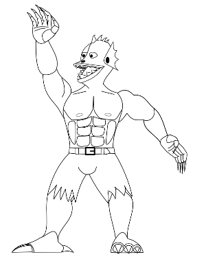 Comments and thoughts welcome again. |
|
|
|
Post by jabbro on Oct 14, 2009 4:02:15 GMT -9
Cool figure. The second head is nice, but he lost his "creature from the black lagoon" look. Maybe it is just me.  Nice touch adding the belt and buckle on the Hulk pants. He'll make a great addition to the HOARD. |
|
|
|
Post by Floyd on Oct 14, 2009 5:31:43 GMT -9
What's he doing? Hailing a cab to the movie set?  Now that you've developed the character you should redraw him onto one of OneMonks keyline sketch pages to get the size and proper proportions for scale and girth. ~F
|
|
|
|
Post by anitangel on Oct 14, 2009 7:59:57 GMT -9
The second head is a lot better. I think he still has the lagoon monster look. The collar bone gives some definition to the torso although collar bones tilt the other way start in the middle of the chest and tip upwards toward the shoulders Could be though that he has inherited some anatomy from fishes. Oh, and I've just noticed you could make us see his knee caps a bit. Not a must. The hand has lots of detail, very nice improvement! Anita |
|
|
|
Post by Sirrob01 on Oct 14, 2009 11:23:16 GMT -9
Jabbro - Yes that annoyed me to, but drawing exactly what I want seems a little beyond me at the moment, I mgight give a 3rd head a try later today. Floyd - Doh never looked at it like that , was meant to be a ready to strike down with his clawed hand but now all I see is cab hailing, maybe more bend at the elbow?. I've been practicing humans so I pulled this guy out of proportion deliberately, the arms should be a little to long the hands a little to big the head a bit to big and the legs slightly short and the trunk extra thick not sure it worked out the way I expected. Anitangel - Thanks for that I'll reverse the collarbones and add some knee caps in, I totally missed those, although I had a note on my original sketch not to forget them . Thanks for the comments all, much appreciated as it challanges me to improve what I'm drawing . Once I have the 10 hero sketches done I'll post those up for comment as well. |
|
|
|
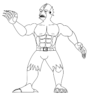
Post by Sirrob01 on Oct 14, 2009 23:50:56 GMT -9
 Attempt number 3 The feet are annoying me now but I might call this one done for now and size scale and colour him, or I'll never get him finished:) feedback as always is welcome |
|
|
|
Post by jabbro on Oct 15, 2009 3:53:42 GMT -9
Excellent. I think you have rounded him out nicely. He has a more sinister sneer, which I think removes the illusion of happy hand waving. The feet don't bother me at all. I think this is the one. ;D
|
|
|
|
Post by anitangel on Oct 15, 2009 8:09:24 GMT -9
Well done! I agree ready for coloring. The feet are just fine too.
Anita
|
|
|
|
Post by Sirrob01 on Oct 22, 2009 2:53:01 GMT -9
I got the monster finished up, fairly happy with how he turned out 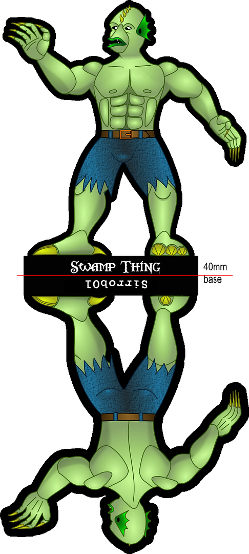 If anyone spots any major mistakes let me know if not I'll add him to the hoard thread tomorrow Comments on ways to improve in the future are more than welcome |
|
|
|
Post by jabbro on Oct 22, 2009 4:27:01 GMT -9
Looks good! You've definitely improved. I like the subtle coloring. Wasn't the swamp thing a plant monster?  No need to change it. I just thought it was a humorous coincidence. |
|
|
|
Post by anitangel on Oct 22, 2009 8:40:34 GMT -9
Gradients, shades, textures, colors! Well done!
Weird that Jabbro here likes subtle shading while pushes me to raise the contrast and darken the shades on my figures... The shades between the muscles on the chest are strong and give dimension. How about darkening the shades on the arm and the legs a bit? Or does he print out okay?
Your development in just designing these three swamp things is amazing. You evolve your drawing fast. Practicing pays off easy for you.
Anita
|
|
|
|
Post by Sirrob01 on Oct 22, 2009 12:25:48 GMT -9
Jabbro hmm I'm not sure maybe he was, I'll have to do some googling later on . Anita I think Jabbro was being nice and subtle rather than what we tend to do with our partners . He did print okay when I test printed him but I up'd the contrast a little more and it made him pop off the page on print although he looks a little washed out/bright now on my monitor. I wish the drawing was coming as easy as 1,2,3 but there was a fair number of failed heads before I got an okay looking number 3 I wont scan those in . Still when I compare my drawings to yours/Jabbros and the other artists here I'm no were near the quality thats being produced . I actually used Jabbro's Arabians as a study in cloth folds and your initial female pixie sheet as a guide on females although I couldn't replicate either, both were very helpful to look at along with Jim and Scruffs drawings/releases. Anyways the High Contrast Swamp Thing, I'm pretty sure I prefer the HC version below to the one above (at least when printed) 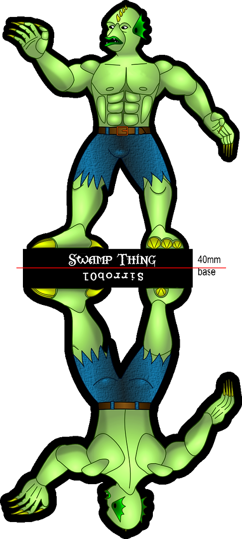 |
|
|
|
Post by anitangel on Oct 22, 2009 14:13:27 GMT -9
That did make him pop didn't it?! I think it is ready for the hoard Well, going through some account on deviantart is pretty discouraging for me, especially when 13 years olds whip out better drawing then I do. I don't know if you feel the same way, but don't let it discourage you. You are doing very well if you are observing and try to learn from others. And don't belittle yourself, you are better then some people and you will get even better. I couldn't have made a dune buggy, I could learn that from you, if I was interested in designing 3D. Anita |
|
|
|
Post by Sirrob01 on Oct 26, 2009 22:19:25 GMT -9
Anita thanks for the vote of confidence . There are better artists around (theres always someone better at something ) but unfortunately not to many of them are drawing very nice angel sets or Demons, Zombies and Arabians for use in TT wargames and RPG's, for myself I try to learn from what others have drawn to try and improve my own drawing and have fun while doing it (although I am with Jim I hate laying stuff out) The quality of the mini's yourself Jabbro, Jim and the other artists here put out is far above anything else available around the old www so keep on producing those mini's and having fun doing it. If it wasn't for you all I wouldn't have picked up a pencil to give it a try myself, although I must admit it's tough posting my work sometimes when I flick over what yourself and the others are putting out  . Working on two more for the hoard just hope I can get them finished by the end of the month...back to the paper and pencil edit - sorry for my slow reply been a very busy 4-5 days |
|
|
|
Post by jabbro on Oct 27, 2009 5:07:57 GMT -9
Sirrob, don't you worry about a thing. Especially about posting new work. I am constantly learning and picking up new techniques and ways to improve. If you want proof, go look at my horrible barbarian with sloppy thick lines and dots for eyes. The trick is not stopping. If you keep striving to improve, you'll succeed. Just like your drawing of the heads for the swamp thing. Each new one is an improvement on the old. The same will be said of every other thing you work on from here on out. |
|
|
|
Post by Floyd on Oct 27, 2009 8:04:37 GMT -9
I like it sir!
Look like an irradiated mutant lizard creature!
~F
|
|
|
|
Post by Sirrob01 on Oct 28, 2009 1:14:55 GMT -9
Mutant Lizard creature theres an idea Hopefully I'll get these finished before Saturday, Plan to do two, Always liked the creepy floaty guys from the Hush episode of buffy.  Gone back to the drawing board on the hands |
|
|
|
Post by anitangel on Oct 28, 2009 9:21:46 GMT -9
That face is very well done, he would be creepy just standing on the ground!
Anita
|
|
|
|
Post by jabbro on Oct 28, 2009 16:34:07 GMT -9
Looks good. I like the face, too. He'll make an excellent figure.
|
|


 Nice touch adding the belt and buckle on the Hulk pants. He'll make a great addition to the HOARD.

 .
.
