|
|
Post by ceredwyn on Nov 7, 2009 20:16:58 GMT -9
Hello! First time posting, and first time designing a paper miniature! I need to get good at it because its a large part of several projects that Kioma Winterwolf and I are working on. So, a bit of background... I'm more of a traditional artist, working in media such as greyleads, charcoals, watercolours, acrylics and oil pastels. I produce work in a plethora of styles, ranging from cartoons, expressionism, manga to photorealism, and have been producing portraits, concept art and illustrations for people around the world for the past 9 years or so. So, this is a method of creating images that is quite foreign to me, and its a relatively steep learning curve, I've found. Here's my first piece. A couple of points. Animals are not my forte. 99% of my work is about the human (or humanoid) body. I'm branching out, however, because my illustration work requires it, and I wish to expand my set of skills. Secondly, I'm not super great at the ol' photoshop, and that's another tool I'm learning to use. I have very limited experience with any other programs, and I'm a slow learner! So when I read stuff here on these forums about programs and techniques and things... I start thinking about cheese, and my brain goes somewhere else! Really frustrating. So, this is just a raw jpg. Just the line work. I dunno anything about vectoring or.. uhmm... other stuff... I've read that you dont HAVE to do it, and Kioma can prolly do it for me, but I'm keen to learn more and get some critiques about design, as well as get advice about turning this into a better miniature. I will be doing a couple of colourings for this one, and its going to be one of three or four 'demon dogs' for one of our projects. So I should.. like.. post the damn thing already... Here you go! Any advice or consructive criticism is greatly appreciated! 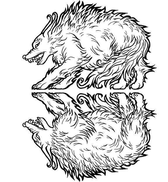 |
|
|
|
Post by jabbro on Nov 8, 2009 6:22:19 GMT -9
Looks good for a start. If you are going to try and color this digitally, but want to skip the vector tracing (it does not look like you really need it) you can just create this as a multiply layer in Photoshop. This will get rid of the white and leave you with a pure outline, like vector tracing would. After that you can color on the layers below that and you should be alright.
Nice starting figure.
|
|
|
|
Post by ceredwyn on Nov 8, 2009 6:34:14 GMT -9
Thanks!
I created the images as just black outlines and no white background, then stuck them together in a separate jgp to post here. So I still have the lines-only layers I can work with in order to start the colouring.
Speaking of colours, perhaps I'll start experimenting with a particularly fetching russet?
I'm probably doing this the silly, slow way; starting on paper, tracing, doing the back side, scanning, refining the lines manually in a separate layer. I guess its a carry-over from more 'traditional' art where you are essentially taking no short cuts. You have to draw all the lines yourself. No copy/pasting!
|
|
|
|
Post by old squirmydad on Nov 8, 2009 13:05:53 GMT -9
|
|
|
|
Post by ceredwyn on Nov 8, 2009 17:22:23 GMT -9
Yeah! Its very impressive. I think I do most of my image refining at the sketch stage, and dont do anywhere near the same amount of work at the light box. Its probably a habit from my illustration work. That and I am so used to scanning in a finished image and then working over it 'manually' in photoshop. Like... *makes some links* This guy became this guy! ( Warning, shirtless Blood Elf man! Yes, I'm a gamer girl... And a roleplayer...That's my lvl 80 Warlock  ) My scanner doesn't seem to satisfy me when it comes to scanning pencil images. So much detail is lost when the light reflects off the shiny shiny graphite  So I just... Do it again, enhance what's there, or make some new details. I anticipate a steep learning curve in terms of trying to make the miniatures too detailed and fancy! It helps, however, that some of the miniatures on my list (which is loooong) are surprisingly simple. Should I just do those ones first? Warm up, so to speak? |
|
|
|
Post by anitangel on Nov 8, 2009 17:32:24 GMT -9
Hi, Welcome to the forums! Yay, another female creator ;D I do the same way --I use the light box to get the silhouette of the front view to the back. I don't know any faster way to do it, other than what you already do, skip the vector program. Because you mentioned that you are new to photoshop and you make manga drawings I thought this simple tutorial might interest you: www.howtodrawmanga.com/howtodraw/jdillon/cgmain.htmlThere are other tutorials on the site about how to draw --but I am sure you won't need that. I think russet is a good color choice for a demonic dog, don't be afraid to throw in some orangeish-yellowish highlights to the fur to make it kindda flame looking, or darks to deepen the darkness coming from the demon dog. Whatever you decide on I've found that the guys start complaining about the darkness of the figure when it reaches 85% dark gray. So you might not want to use pure black anywhere for shadows. I hope I was help you out in some way. Anita |
|
|
|
Post by squirmydad on Nov 8, 2009 17:48:00 GMT -9
Welcome to the forums!
I like the style of your design, very wild and raw. I look forward to seeing your colors. I like the fact that you did a true rear view.
It is a struggle trying to keep from over detailing the figure designs. But hey! this is for fun, so go crazy!
JIM
|
|
|
|
Post by ceredwyn on Nov 12, 2009 19:48:20 GMT -9
Thanks for the tips guys! That's a very interesting looking website, anitangel! I've been drawing anime in traditional media for years, but haven't really made the full jump to purely digital images. There's a couple of pictures I've been experimenting with that are purely digital, but its slow going. Looks like that tutorial is going to be really useful for me, so thanks for linking it! Normally I just draw and paint with watercolours, like This! (Yet another character I roleplay, this time in a tabletop game >.> ) I'm not colouring the first dog just yet, I've decided. Got to do some more linework so that I just have... more stuff. More of a collection. Then I can colour it! I know I get very distracted with colouring, be it traditional or digital. So, look out for another demon dog or two, some zombies, ogres, that sorta stuff! Might be forced to make something for the November Hoard too! ;D |
|
|
|
Post by ceredwyn on Nov 22, 2009 22:46:18 GMT -9
Second demon dog, this one perhaps more versatile with a skinny frame and lumpen skin. This could be toadlike, leathery and warty, or slimy and repulsive. Could even go for a flayed or melted look! 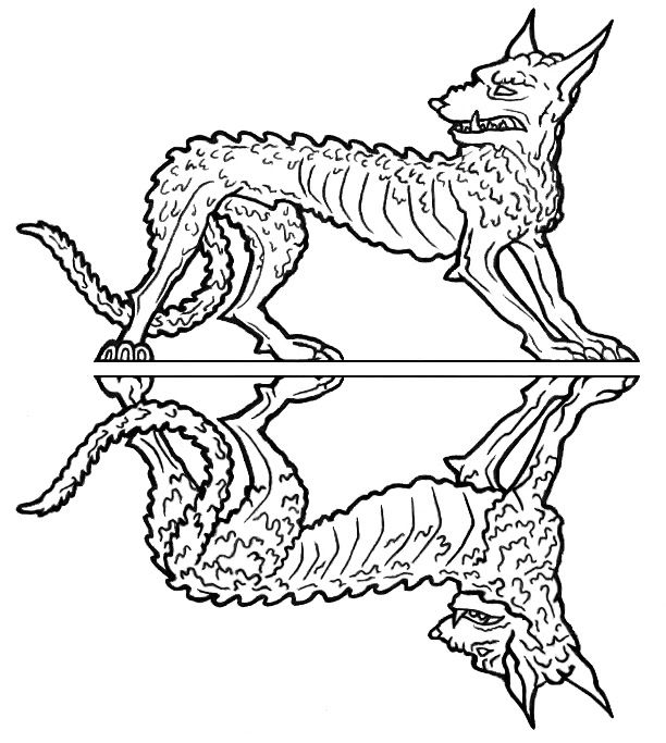 Will hopefully upload half a zombie later today! |
|
|
|
Post by ceredwyn on Nov 22, 2009 23:04:36 GMT -9
Buggrit, here's my initial sketcheroo for the haffa-zombeh! I've since made the hands smaller... 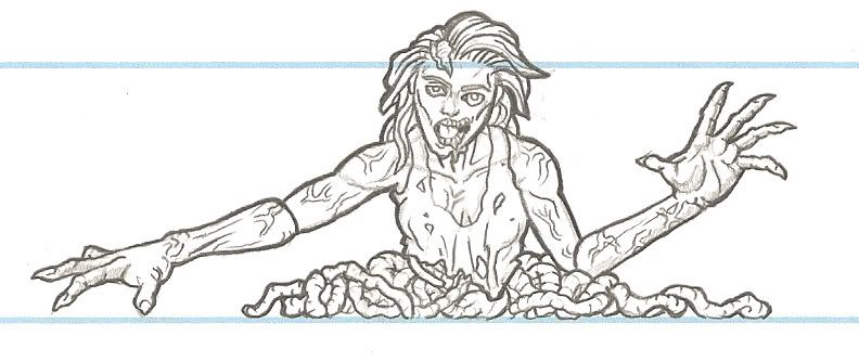 |
|
|
|
Post by darkmook on Nov 23, 2009 1:07:42 GMT -9
Reeeeeeeeeeeeeaallly nice!
|
|
|
|
Post by ceredwyn on Nov 23, 2009 2:00:53 GMT -9
Thanks! Gotta love looking at disemboweled things for intestine references  |
|
|
|
Post by Adam Souza on Nov 23, 2009 7:16:05 GMT -9
Really nice stuff.
|
|
|
|
Post by anitangel on Nov 23, 2009 11:10:07 GMT -9
I think you are doing well. And if Darkmook approves of your zombie I don't think you need to worry about how the reference worked out, because it is a sure sign you did very well! He is our zombie master  Anita |
|
|
|
Post by ceredwyn on Nov 23, 2009 14:50:31 GMT -9
Eee! Thank you!
|
|
|
|
Post by ceredwyn on Dec 3, 2009 22:50:20 GMT -9
So I've done a coloured version of the first demon dog, and I'm wondering if its too detailed, too orange, not enough contrast between highlights and lowlights, etc. Let me know what you think! 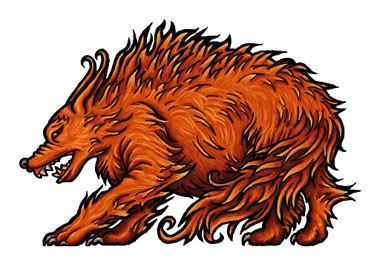 |
|
|
|
Post by darkmook on Dec 3, 2009 23:57:29 GMT -9
That looks really nice-love the colour work!
|
|
|
|
Post by squirmydad on Dec 4, 2009 3:44:17 GMT -9
The test is to shrink it down to actual size and print it out. Printing on paper has a way of flattening the highlights and shadows, this is why I always recommend boosting the contrast so you keep the details and the colors are brighter.
You could easily boost the brightness of the light fur, and it will look bery good at scale.
JIM
|
|
|
|
Post by anitangel on Dec 4, 2009 8:26:15 GMT -9
Without test printing I'd say to make the darks darker, so it keeps the detailed fur, which looks amazingly well done by the way. Keep up the good work!
Anita
|
|
|
|
Post by Dryw the Harper on Dec 4, 2009 8:52:15 GMT -9
I like it. I can see a pack of these terrorizing the countryside.
Dryw the Harper
|
|
|
|
Post by Floyd on Dec 4, 2009 12:34:28 GMT -9
Very nice. Very nice!
I like your stylized technique. And
coloring of the demon dog is good!
~F
|
|
|
|
Post by stevelortz on Dec 4, 2009 20:33:21 GMT -9
Your figures have a very heraldic look to them. I like it!
Have fun!
Steve
|
|
|
|
Post by brynbrenainn on Dec 4, 2009 22:02:18 GMT -9
What he said.
They look great.
|
|
|
|
Post by ceredwyn on Dec 4, 2009 22:02:20 GMT -9
Thank you guys! Having printed out a preview, I'm thinking that its dark enough, but the highlights need to be more prominent.
Will work on it over the next couple of days in between churning out other miniatures.
Watch this space!
|
|
|
|
Post by tugunmojo on Dec 5, 2009 15:49:31 GMT -9
You've put together some really nice stuff--will be checking back often!
;D
|
|
|
|
Post by ceredwyn on Dec 6, 2009 15:36:17 GMT -9
Thank you!
Will hopefully have some free releases by the end of the month, if all goes well!
|
|


 )
) So I just... Do it again, enhance what's there, or make some new details.


