|
|
Post by stevelortz on Feb 4, 2013 10:44:46 GMT -9
Clockwise from left in first circle: Peasant Woman, Peasant Man, Noble Woman, Noble Man, City Guard, Captain of the Guard, Collector, and Bandit. General NPC encounter type folk on this page, 27 minis in all. Second circle: Skeleton Warrior, Ogre Skeleton Warrior, Skeleton Warrior, Necromancer, Skeleton Warrior, Zombie. Yeah, the second page is all skeletons (15 human sized, 2 Ogre sized) and Zombies(5) with the Necromancer. 23 in all, plus seven piles of bones.  I've bought a few sets of Arion figures that I like. I didn't buy them for the tri-fold or tent versions. I like ALL of the figures you've done in this illo. It would be a lot of work in most of them, and next to impossible for some to do back artwork. I don't think the problems stem from orthographic project but rather from pronounced foreshortening, which some poses require. kiladecus faced some of the same problems when he worked on Dark Skull Studio's "New Gods of Mankind: Anointed" sampler, as discussed on the "Dark Skull Announces" thread. He solved the problem by mirroring the front art for the back, but printing the back in a grey scale, instead of color. That seems to suit my tastes quite well! I'm not usually a fan of computer generated artwork, but the work you've exhibited is the best I've seen. You've managed somehow to overcome some of the CGI tell-tales. Good work! And I'm looking forward to building some of your figures. Are there any Wolfen in the pipeline? Have fun! Steve |
|
|
|
Post by madmanmike on Feb 4, 2013 11:02:03 GMT -9
Okay, I didn't realize that I wasn't getting my point across.. All of my minis have backside artwork. I've rendered the front and the back of each figure (all 110+ so far) and will continue to do so. What I'm saying is it seems that many consumers want minis they can trim all the white off of in order to make the paper mini have that silhouette you find in a regular cast mini. But to do that, I have to use a flat render. The back-side of my minis is in 3D perspective, so it doesn't match the front side in a way that would allow for this trimming. I'm wont to believe that those guys who want to trim every mini are in the minority as it's A LOT of work to do so. So instead of selling 18 minis in a package with three variations of each, I'm going to put 40+ in every package (front and back) and worry about doing variety sets down the road. Here's what I mean, a free sample from the first package and it's lesser flattened (and thus mirrored) counterpart. Note that the lighting was not changed for any of these images, nor was the post work; the difference in color and light is entirely an artifact of the flat-rendering process.   |
|
|
|
Post by madmanmike on Feb 4, 2013 11:05:03 GMT -9
Oh, and as to Wolfen, yes, they will be included. Once the first two sets are ready to go, there is a freebie sample set that will go up first that has four gladiators, NPC stat cards, an arena map and simple combat rules to make it a mini game in and of itself. This is the scale image I did with the first draft Wolfen (not the final style for that set).  |
|
|
|
Post by madmanmike on Feb 4, 2013 11:08:32 GMT -9
Here's the final art on that freebie set; I did shorten the Dwarf's top-fold line to save space on the package after doing this screen shot. 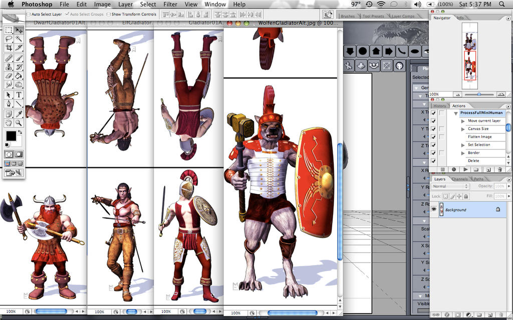 |
|
|
|
Post by madmanmike on Feb 4, 2013 11:58:53 GMT -9
One more thing I'd like to say..
From a 3D artists perspective, my type of art tends to be dismissed by traditional artists as lazy, because they think we're just pressing the "Make Art" button. That prejudice is dying down as more and more traditional artists start using tablets and programs like Photoshop, but it's still there..
When I look at other Poser based mini designs, so far I have difficulty not having that same prejudice.. Quite a bit of it is as close to pressing the "make art" button as it can be. I use DazStudio, but it uses Poser content and for all intents and purposes is essentially the same.
This feeling is largely based on the poses I see. Many of them are purchased poses or free downloaded poses that are just the click of a button to make the figure pose, and they're terrible. As it is, it seems to me that someone saw an opportunity to make their own minis with a program and a content library and did so, with no regard for the potential quality issues.. I have a program and a content library and it's just not enough. I take the time to pose every figure and try to make it a realistic pose. I stand up and use a prop and look in the mirror to see what's real, and occasionally I try to mimic the poses I see in other products and have to laugh at how unreal they are.
Likewise, the difference between a good render and a bad one is the same as the difference between a good photo and a bad one or a good film and a bad one... Lighting, lighting, lighting. I don't see any attempt to do good lighting in most of the 3D minis out there..
These are all artist quibbles which I understand are not going to be as big of an issue for the average consumer as they are for me, but I am who I am, and I want to see a better representation of the style out there for people to use and enjoy.
And all that said, I don't want to bad-mouth anyone who's making minis.. nor do I want to suggest that anyone who likes the minis I've seen that I don't like has no taste or is a fool. Being autistic, it took me quite a few years to realize that as a genius, I am not qualified to make the assessment "It doesn't take a genius to figure this out." I just want to explain where I'm coming from and what my motivations are.
|
|
|
|
Post by madmanmike on Feb 4, 2013 12:15:19 GMT -9
Digging around, here's another Wolfen Scale image with a horse instead of a human.. For those who aren't Palladium Gamers, in the Palladium Fantasy world the Great Northern Wilderness is home to the Wolfen Empire, where these ten foot tall wolf-men have built a Roman-esque empire, bringing civilization to their cousins the Coyles (slightly smaller and more wild Coyote-men) and the Kankoran (human sized Fox-men, also shown below), and all of the monster races (with varying degrees of success) in their domain. To their south is The Eastern Territory, a sort of medieval Old West where humans have colonized a large area and are preparing for war with the Woflen. This Wolfen is designed to represent the mercenaries who serve Baron Marquest in my redo of The Tombs of Gersidi, Palladium Fantasy's original published adventure from nearly 30 years ago.  A gloating Coyle (terrible quality image, some of my really early work) 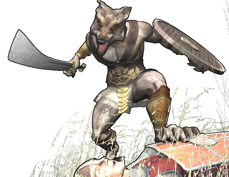 A Kankoran on the hunt 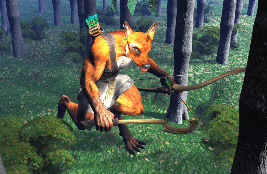 |
|
|
|
Post by bravesirkevin on Feb 4, 2013 13:37:31 GMT -9
From a 3D artists perspective, my type of art tends to be dismissed by traditional artists as lazy, because they think we're just pressing the "Make Art" button. That prejudice is dying down as more and more traditional artists start using tablets and programs like Photoshop, but it's still there.. In a lot of ways 3d CGI is much harder to do than the more traditional stuff, and most artists know it. The thing about 3d is that the flaws are so glaringly obvious, and there's no quick or easy way to avoid those extremely conspicuous imperfections. As you quite rightly pointed out, bad lighting and generic poses certainly don't help much at all! On the other hand, the imperfections in a cartoon or traditional drawing are called "the artist's style" and are said to "add character to the piece". It's a kind of uncanny valley thing I guess... If the art, whether CG or traditional, is so perfect that people can't tell it from a photograph, then they like it, and if it's very imperfect, but stylised, they'll like it too, but if it's straddling the middle, where it looks like the artist has tried to make it look realistic, but didn't quite pull it off, that's where the negative reactions come in. |
|
|
|
Post by oldschooldm on Feb 4, 2013 14:03:31 GMT -9
Hmm. I might try something with that free set (is it out yet?) - I wonder what happens if I edge it all in black and cut to the union of the two sides' outlines. That might be awesome, or it might suck.
I'll let you know... [I'm deep in something at the moment, but this thread has intrigued me...]
|
|
|
|
Post by madmanmike on Feb 4, 2013 14:22:03 GMT -9
From a 3D artists perspective, my type of art tends to be dismissed by traditional artists as lazy, because they think we're just pressing the "Make Art" button. That prejudice is dying down as more and more traditional artists start using tablets and programs like Photoshop, but it's still there.. In a lot of ways 3d CGI is much harder to do than the more traditional stuff, and most artists know it. The thing about 3d is that the flaws are so glaringly obvious, and there's no quick or easy way to avoid those extremely conspicuous imperfections. As you quite rightly pointed out, bad lighting and generic poses certainly don't help much at all! On the other hand, the imperfections in a cartoon or traditional drawing are called "the artist's style" and are said to "add character to the piece". It's a kind of uncanny valley thing I guess... If the art, whether CG or traditional, is so perfect that people can't tell it from a photograph, then they like it, and if it's very imperfect, but stylised, they'll like it too, but if it's straddling the middle, where it looks like the artist has tried to make it look realistic, but didn't quite pull it off, that's where the negative reactions come in. Yes, the Uncanny Valley. I post-work my images to make them look more cartoonish in order to move them away from that. Most Uncanny Valley reactions are to the hyper-realism in 3D that they know cannot be real, like monsters and sci-fi or fantasy stuff.. (that UV is also responsible for the fear of clowns and mannequins). I was completely unaware of The Uncanny Valley until one of my traditional artist friends pointed it out to me. Hmm. I might try something with that free set (is it out yet?) - I wonder what happens if I edge it all in black and cut to the union of the two sides' outlines. That might be awesome, or it might suck. I'll let you know... [I'm deep in something at the moment, but this thread has intrigued me...] No, it's not out yet; If we put it out before the regular sets are ready to release, it will lose some of it's impact in creating sales. The difficulty that you will have is the depth perception. If you look at the human gladiator above for example, his sword is closest to the camera in the front image, and furthest away in the back; in the back, you can only see the tip of it, whereas in the front it is large. That's what I'd lose if I went with the flat rendering, along with the quality of the lighting and reflections.. Still, if you do give it a go, I'd love to see how it comes out.. Whenever I get these finished of course.. I know that the majority of this boards patrons aren't interested in the NPC cards that are holding up the project, but they are what will sell the packages to Palladium's existing fan-base. Likewise, with the simple combat rules included in the freebie set, they will make all of the minis usable in their own game to start. I can't justify releasing the minis without them as in the end I believe their value will be discovered by the non Palladium fans who purchase them, and in the end that might make those people Palladium fans. This is the ultimate goal for me here, to improve Palladium's customer base. My own profit is a secondary concern to that. |
|
|
|
Post by stevelortz on Feb 4, 2013 16:25:08 GMT -9
Most of my sculpting career, I was doing pieces for one game system or another, and had to tailor what I did to the needs of the game publisher. I know what you mean about the stat cards. If there's going to be a simplified game where the cards can be used with the miniatures, I would consider that a bonus.
We had some similar "front/back" problems because the molds were two-piece, and we had to think of how the figures pose would be effected by the "plane of the mold", and how deep the piece could be based on the thickness of the vulcanized rubber.
I usually made my armatures from bits of metal or epoxy and brass wire. Some big companies who I won't name (but their initials were RAL PARTHA) cast up what they called "dollies", ready made armatures for the sculptors to work on. Their dollies had both feet planted flat on the ground, with the weight evenly distributed on both, facing straight out from the plane of the mold.
As you can imagine, this led to some very static poses, but some sculptors would try to compensate by making the figures do outlandish things with their arms, without remarkable success.
I too used to pose for myself in a mirror and work up a batch of sketches when I was trying to decide what I wanted to do with a figure.
More shortly...
|
|
|
|
Post by stevelortz on Feb 4, 2013 16:28:42 GMT -9
This feeling is largely based on the poses I see. Many of them are purchased poses or free downloaded poses that are just the click of a button to make the figure pose, and they're terrible. As it is, it seems to me that someone saw an opportunity to make their own minis with a program and a content library and did so, with no regard for the potential quality issues.. I have a program and a content library and it's just not enough. I take the time to pose every figure and try to make it a realistic pose. I stand up and use a prop and look in the mirror to see what's real, and occasionally I try to mimic the poses I see in other products and have to laugh at how unreal they are. ... These are all artist quibbles which I understand are not going to be as big of an issue for the average consumer as they are for me, but I am who I am, and I want to see a better representation of the style out there for people to use and enjoy. And all that said, I don't want to bad-mouth anyone who's making minis.. nor do I want to suggest that anyone who likes the minis I've seen that I don't like has no taste or is a fool. Being autistic, it took me quite a few years to realize that as a genius, I am not qualified to make the assessment "It doesn't take a genius to figure this out." I just want to explain where I'm coming from and what my motivations are. I very much like your work that I've seen. I find these "artists' quibbles" very enlightening. I know I can't do digital artwork and this discussion helps me understand why, and why some artists' work does NOT appeal to me. I went to see the version of Beowulf with Angelina Jolie playing Grendel's mom, and was VERY disappointed with the CGI (as well as the way they whacked the story up). I have a friend who is figuring out how to use Zbrush to do 3-D digital sculpting for 3-D printing. We have some good long discussions occassionally! I'm game for however you decide to do your figures! I trust you to do them, not just adequately, but well! Have fun! Steve P.S. - And my wife is on the autism spectrum, also, so I understand that too! |
|
|
|
Post by oldschooldm on Feb 4, 2013 16:29:56 GMT -9
I know that the majority of this boards patrons aren't interested in the NPC cards that are holding up the project, but they are what will sell the packages to Palladium's existing fan-base. Ooh. NPC cards? I own every set of Paizo Item and Face cards.... |
|
|
|
Post by madmanmike on Feb 4, 2013 17:02:17 GMT -9
I know that the majority of this boards patrons aren't interested in the NPC cards that are holding up the project, but they are what will sell the packages to Palladium's existing fan-base. Ooh. NPC cards? I own every set of Paizo Item and Face cards.... Yeah, there will be one for each mini; so a G.M. lets his players pick the mini they want, then the rest of them are there for N.P.C.s, complete with stat blocks. All attributes are considered average, so there's no special bonuses for them, but the basics of each represented O.C.C. (occupational character class) are provided at 3rd level, along with whatever weapon(s) and special abilities they are armed with.. There will be ten to a page, so they're narrow enough to fit in the pockets of a collectors card page (although taller, so you'll have to forgo the top row). Since the first package has 27 minis on the first page and 21 on the second, that means there will be two pages of minis and five pages of stat cards in the package (with a sixth page to be an optional backside, just lines for notes).. One more reason I don't intend to provide multiple formats of the minis. Since I already put the full Priest mini up, I'll go ahead and show his stat card too.. A movement translation chart for the Spd. attribute will be included in the set.  The downside to these cards and why the project is taking so long is simple; this is just the guts with no flavor.. In other words, the only part of making a character that is boring for me. Sure, it's a boon for GM's (nobody enjoys that part as far as I know), but even worse for me.. I'm making NPC's without the backstory (when I run a game I usually wing the stats and focus on that backstory), and I'm not even getting the chance to use them! So I'm doing the drudge work for GMing so the customer doesn't have to. |
|
|
|
Post by madmanmike on Feb 4, 2013 17:28:34 GMT -9
Another example of how the 3d renders don't lend themselves to the 'fitting' so you can trim around them.. Several of the characters have cloaks on like this one, and the depth of the figure really shows between the renders.. I did this one for one of the players in my group, a wizard working for the Timiro military.. Probably throw it into a Magic Users pack down the line..  |
|
|
|
Post by stevelortz on Feb 4, 2013 17:57:55 GMT -9
When I see stat blocks, my eyes tend to glaze over, so I appreciate the extra effort you are going to, adding value for your customers!
Have fun!
Steve
|
|
|
|
Post by madmanmike on Feb 5, 2013 11:09:45 GMT -9
Why I don't care for triagonal mini design.. For me if you're going to have a triangle, it should point in the direction your mini is facing. For that to be right, I end up without a straight on shot of the character:  This of course showcases the rear image, but... meh... Likewise the dimensions of this mini are greater than an A-Frame style, so you can't get as many to the page, i.e. as much bang for your buck. |
|
|
|
Post by gilius on Feb 5, 2013 12:29:38 GMT -9
I have to agree... never understood triagonal format. I can see the appeal of A-frames as they are probably the easiest format to build. You can churn out an army of A-frames in minutes with just scissors and a glue stick. Triagonal may be as easy, and gives a view of the mini from any side you look... but as you pointed out, it is never a really good view.
Besides, I am not familiar with wargames that use triangular bases -- and resolving contact for close combat may be awkward -- although I suppose it is not as much of an issue for most RPGs.
|
|
|
|
Post by oldschooldm on Feb 5, 2013 22:20:48 GMT -9
Another example of how the 3d renders don't lend themselves to the 'fitting' so you can trim around them.. Several of the characters have cloaks on like this one, and the depth of the figure really shows between the renders.. I beg to differ. :-) Here's some fuzzy photos of my experiment of creating an cut outline that is the logical union of the front and the back of your figure...  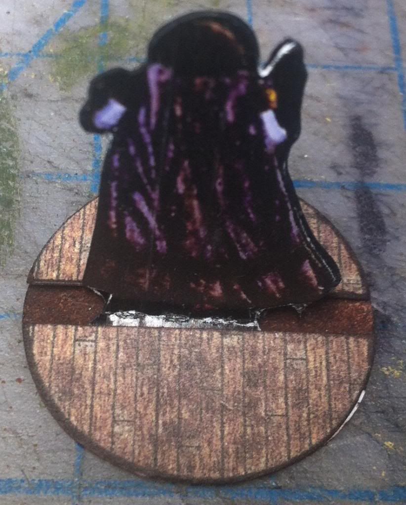 Other than the fact I need to lighten the colors when putting the whole thing I black, I think the experiment is a success! I'll post another one with brighter colors... |
|
|
|
Post by oldschooldm on Feb 5, 2013 22:40:14 GMT -9
Brighter and more contrasty and on cardstock... 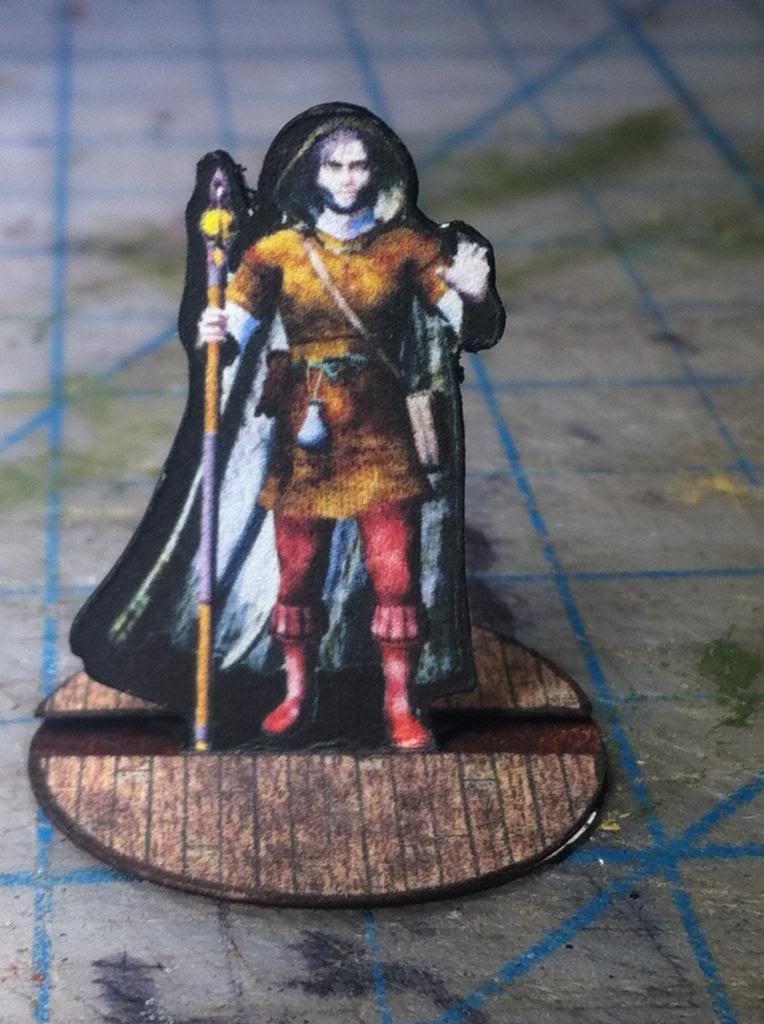 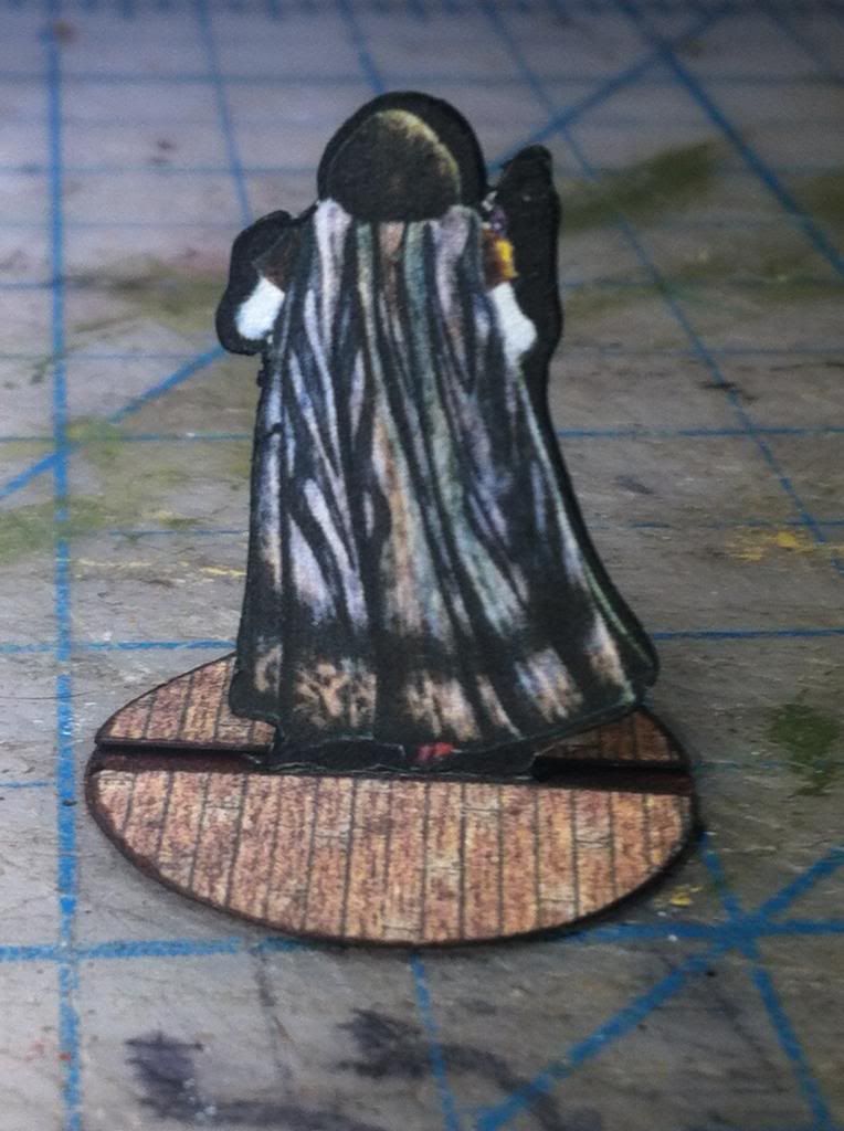 Well worth the tradeoff of the extra black on the back to me... |
|
|
|
Post by bravesirkevin on Feb 6, 2013 0:37:11 GMT -9
Well worth the tradeoff of the extra black on the back to me... This isn't too different from what I do with my miniatures. Mine are pretty close to being pixel perfect copies, front and back, but because of my process things can shift out a little, and because of the super-fine detail on some parts, there's a risk of things shifting out of line when the model's put together, so I put a little margin around it to make things easier for the end builder. Mini Tutorial: (feel free to ignore it, if anyone wants this detailed properly, let me know and I'll set it up in a new thread)With my technique, the front of the model and the back are each in their own PSD, in exactly the same position with a black background.  I use the pen tool to create a transparent shape layer around the front. This shape layer will eventually determine my outline on the final print, so I try to keep a consistent margin around the figure. I then duplicate that shape layer on to the back. Here I can see straight away if there's anything that's at risk of getting cut off, and adjust the back's shape layer accordingly before duplicating it and sending it back to the front. 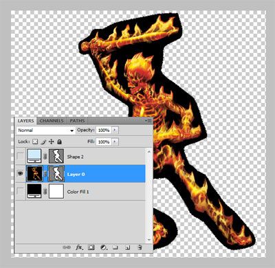 Once I'm happy with the path, I apply it to my original artwork as a vector mask. I'm wont to believe that those guys who want to trim every mini are in the minority as it's A LOT of work to do so. I'm not sure you're right about this one. I've seen a lot of folks with photos of trimmed paper minis around on the internet, but I seldom see photos of the tent-style tokens. Also, it's not really that much work to trim down a mini. 10 knife strokes at the most, on a mini with a good outline. Automated cutters make things even easier, and a lot of the paper-mini crowd have invested in those. From what I have seen, the tent-fold tokens tend to get viewed as the cheap, quick-fix alternative to miniatures, while the hand-cut paper-minis tend to be a hobby on their own. There are some people who will use both the cast minis and the paper ones, because the paper ones give them options that the metal and plastic ones don't. The implication here (and I may be wrong, so other guys out there feel free to correct me,) is that you may be able to profit more by catering to the paper-mini hobbyists than by going the tent-fold route. As OldSchoolDM's demonstrated, your minis actually look really good when done that way, so it might be worth considering. |
|
|
|
Post by madmanmike on Feb 6, 2013 4:08:32 GMT -9
Hmm.. sadly, as I have no printer and no access to a printshop, this is the first time I've seen my mini's in print..
I might be able to go ahead and extend that black outline to match the front and back pretty easily in my post-work processing...
|
|
|
|
Post by madmanmike on Feb 6, 2013 4:49:46 GMT -9
Hmm.. It's not a process I could automate in my post-work, so it would add some time to each one.. and I would have to rebuild the existing 220 files from scratch..
I have them saved in the 3d program, but the original renders were lost in the hard drive crash last summer.. So to do this I'd have to render them all over again (all I have are the finished .pdf pages..)..
Something to mull over...
|
|
|
|
Post by oldschooldm on Feb 6, 2013 7:51:49 GMT -9
... this is the first time I've seen my mini's in print.. Glad to oblige - though I'd get a printer if I were you. It would help you better gauge color and detail making your minis more attractive. I'm glad I discovered this technique, as I have several sets from various companies that I've passed over when printing minis for my game in favor of more "cartoony" figures that have fronts, backs, and can be trimmed. Now I'm happy to do this if the figure is right (front and back don't match....) |
|
|
|
Post by madmanmike on Feb 6, 2013 8:01:41 GMT -9
Glad to oblige - though I'd get a printer if I were you. It would help you better gauge color and detail making your minis more attractive. lol, I'm doing all this on a five year old computer with a program that is four versions too old because I haven't got the money to upgrade.. With three kids and being on work comp, getting a printer is out of the question.. I actually have one, but putting ink in it costs around $60 for refills.. Maybe when the tax return comes, although the kids would just start wasting the ink fast on nonsense... |
|
|
|
Post by madmanmike on Feb 6, 2013 8:04:17 GMT -9
My reason for not doing a thicker outline in the first place was to conserve ink.. These are meant to be for the budget conscious..
Still...
|
|
|
|
Post by bravesirkevin on Feb 6, 2013 8:50:13 GMT -9
My reason for not doing a thicker outline in the first place was to conserve ink.. These are meant to be for the budget conscious.. Still... The thick outline wouldn't make a noticeable difference in the ink consumption, to be honest. It's like the difference between printing a page of double spaced light text vs a page of single spaced bold text. You only start seeing a huge hit on ink when you've got huge areas of dark solid colours. People who buy paper minis online would want a good outline there because it makes it easier to cut, and the fact that they'll save ink because it's not there won't even enter their minds. I'd also avoid thinking about pitching sets at budget conscious people, with cheapness being your selling point. The thing about people who don't want to spend money, is that they don't want to spend money. The budget conscious people will pass over your product and just download free stuff instead. Rather focus on creating a really good, unique, high-quality product, so that the people who do have money will think it's worth spending their hard earned dollars on it. I should add that you're not going to make a lot of money off of these if you sell them too cheaply. People who are willing to buy this kind of thing will buy it at any fair price, and being a dollar or two cheaper is not going to change the mind of someone who's not willing to spend money. Those kinds of techniques do work when you're selling face-to-face, but on the internet, there's a completely different dynamic at work. |
|
|
|
Post by madmanmike on Feb 6, 2013 9:46:03 GMT -9
Yeah, pricing.. Having perused a large portion of the catalog of minis available from DrivethruRPG, I've come to think that $8 for 40 unique minis plus stat cards is probably a good value..
|
|
|
|
Post by Christopher Roe on Feb 6, 2013 10:22:45 GMT -9
I'd also avoid thinking about pitching sets at budget conscious people, with cheapness being your selling point. The thing about people who don't want to spend money, is that they don't want to spend money. The budget conscious people will pass over your product and just download free stuff instead. Rather focus on creating a really good, unique, high-quality product, so that the people who do have money will think it's worth spending their hard earned dollars on it. Just wanted to chime in and say that this is true and is very, very good advice. Publishers can't make really money selling to people who lack money or don't want to spend it (the old saying about squeezing blood from a turnip comes to mind), and if making some money off their content is not a core motivation for a publisher, then they might as well skip the sales part and go straight to dishing out the stuff for free. Also, price-oriented customers tend to be fickle--the publisher would be in trouble the second that somebody cheaper comes along, given equal skill levels, and that starts a pricing spiral to the bottom that nobody's going to survive without keeping a day job. Yup. This is also very true. Think about overhead, it's nice to have an useful amount left over after the marketplace and the taxman have taken their cut. Otherwise, why even sell? |
|
|
|
Post by madmanmike on Feb 7, 2013 8:52:48 GMT -9
Okay guys, you're being a great help to me. Somebody do me another favor and put this one together so I can have some feedback on it.. This is the Assassin mini from the first set, redone with a black outline that matches both sides. When I started the process of doing these I wasn't sure how I was going to post work it, so my automated process includes two layers that I decided not to use but never took out of the process.. One layer is a white aura and another is a black one; I've activated both and filled the black aura, then merged the aura from both the front and back images to make this compatible outline.. Some of the minis I've done will have to be tweaked to reduce the differences between them (maybe making the back renders flat for example) but I think this process is workable with minimal extra effort. Since I'm of the lazy type, I'll probably keep the original design in the package for the people who just want to cut and fold quickly to get some A-frame standees, but add in this version of each for the paper-mini crowd to get their fix.. Thoughts?  |
|
|
|
Post by oldschooldm on Feb 7, 2013 9:46:48 GMT -9
Here ya go: 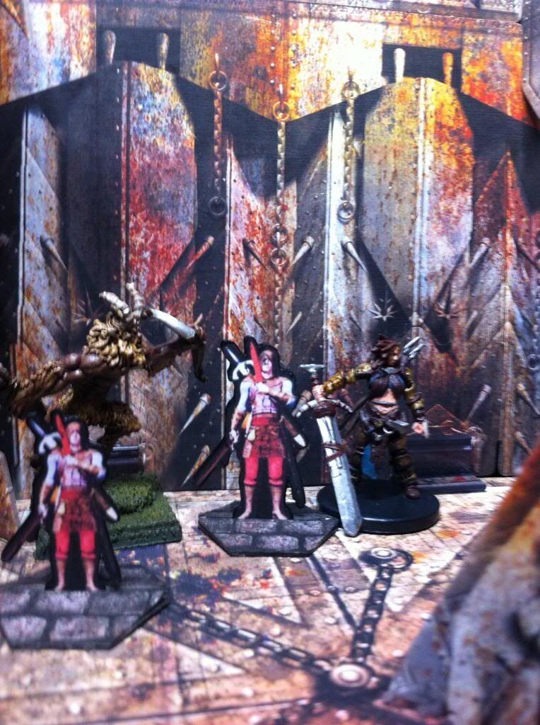 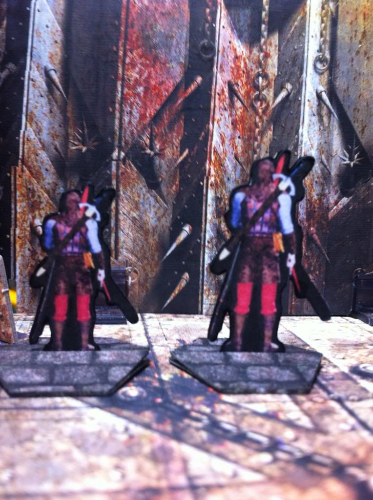 I wanted to show size/detail comparison to a mounted metal mini (the satyr) and a Paizo plastic prepainted mini. The larger one was printed at 125% size, a much better fit for mixing with other minis. I also upped the brightness and contrast as I did for the other figure. |
|