|
|
Post by Brave Adventures on Sept 9, 2013 16:49:30 GMT -9
I know there are several members here with Papercraft related blogs, and there are many Publishers with their own websites. What does everyone think about creating something like a webring between all of our Papercraft related websites? Alternatively, if you have your own blog or website and are interested in cross-linking with BraveAdventures.com, please let me know! Ryan |
|
|
|
Post by bravesirkevin on Sept 9, 2013 16:59:26 GMT -9
I'd definitely be interested. Been neglecting my blog for far too long though. Need to get that guy moving again.
|
|
|
|
Post by spaceranger42 on Sept 9, 2013 18:05:42 GMT -9
I would happily do this.
|
|
|
|
Post by squirmydad on Sept 9, 2013 18:26:26 GMT -9
I like It! I have no idea how to do it though.  |
|
|
|
Post by Brave Adventures on Sept 9, 2013 18:28:54 GMT -9
Awesome! I'll look at setting up a webring. Here is how I imagine it working: I could host the webring database on my server. Then people in the ring could copy-paste some JavaScript onto their site referencing the data to auto-generate a banner or widget with Previous, Next and Random buttons to access the different websites; and a list button that brings the person to a list of websites in the ring. If someone with a Papercraft related site wants to join, they could email me and I'd add them to the database. The data would be in one place so it'd be easy to add new sites etc.
We'd need a name for the webring and some kind of cool looking logo or graphic. Alternatively, we could have a few different banners to randomly feature different members in the ring.
This should be something I can set up, so I'd like to avoid 3rd party webring generators that add ugly advertisements and banners to our sites etc.
What are your guys' thoughts?
Ryan
|
|
|
|
Post by Brave Adventures on Sept 9, 2013 18:46:02 GMT -9
I did some quick reading and it is fairly straight forward to set this up with JavaScript. I would just create the js file on my server and anyone in the ring can just copy-paste like 3 lines of code to put the widget/banner wherever they want. Then I just need to add their URL to the js file. I'll try setting up a demo/test later this week.
Ryan
|
|
|
|
Post by mesper on Sept 9, 2013 19:25:28 GMT -9
I did some quick reading and it is fairly straight forward to set this up with JavaScript. I would just create the js file on my server and anyone in the ring can just copy-paste like 3 lines of code to put the widget/banner wherever they want. Then I just need to add their URL to the js file. I'll try setting up a demo/test later this week. Ryan Sounds interesting! I like the idea and would like to join (assuming that I'll somehow manage to launch my English language page...). |
|
|
|
Post by pavaro on Sept 9, 2013 21:23:35 GMT -9
I also would be interested.
|
|
|
|
Post by Brave Adventures on Sept 10, 2013 5:41:47 GMT -9
Okay, the JavaScript is tested and ready to go!
Here is what we need to do now:
1) Put the sites of everyone who wants to join into the database. If you want to join, please post your URL and Website Title as you would like it to appear in the Widget/Banner. You can post it here or message me.
2) Think of a cool name for the webring. My Suggestion: "Cardboard Warriors Papercraft Webring". The webring widget/banner could feature a link to the forum. I like this name because Cardboard Warriors sounds cool and the forum is what brings us together. This name would need Squirmydad's approval though. Other suggestions are also welcome!
3) Design a cool looking Widget/Banner for the initial webring. We can change it later or randomize it later to feature random member's sites/blogs. But we should make some kind of appealing graphic for the initial setup. Thoughts? Suggestions?
4) Post the reference code on everyone's sites. It is very short and basically just imports info from the JavaScript database on my server. So changes like new members, graphics etc. only need to be made once.
5) Profit?
Ryan
|
|
|
|
Post by squirmydad on Sept 10, 2013 6:25:43 GMT -9
I approve of this message. |
|
|
|
Post by pavaro on Oct 23, 2013 12:09:33 GMT -9
What's next for this idea?
|
|
|
|
Post by aaron on Oct 23, 2013 13:34:26 GMT -9
I'm down for banner designing and what not just shoot me the dimensions and what you want in the banner. I'm ok with HTML sort of ok with css but Java is a little out of my league and PHP is way out of my skill set
|
|
|
|
Post by Brave Adventures on Oct 24, 2013 15:56:59 GMT -9
The code is all ready. We just need a logo. I was imagining a big, scary looking marauder-warrior like the guy below, holding a hobby knife and a card-paper building, but I haven't had time to create the image.  What do you guys think? |
|
|
|
Post by WackyAnne on Oct 24, 2013 17:14:13 GMT -9
Huh, I thought I commented on this long ago. Must have been another case of hitting "Reply" rather than "Post Quick Reply", then tabbing away thinking the job was done. I think I'm over that glitch now  My thoughts on the Cardboard Warriors logo involved crossed swords morphing into scissors or something... maybe a fantasy hero and a space marine dueling it out with hobby knife and gluestick would work too. It would have to be an idea that came across clearly even at small size/low resolution; maybe if you had a quick sketch I could better picture your idea. Were you imagining a similar pose? With giant X-acto blade for sword? |
|
|
|
Post by pavaro on Oct 24, 2013 21:29:05 GMT -9
On my page is similar logo (top right). Marauder most alright. Not only should be swords logo. Maybe a hybrid rifle with a sword? From the abstract. |
|
|
|
Post by Brave Adventures on Oct 25, 2013 14:18:27 GMT -9
maybe if you had a quick sketch I could better picture your idea. Were you imagining a similar pose? With giant X-acto blade for sword? I was imagining a completely different pose but a similar helmet. Basically, I was imagining a character like that trying to put together a card paper building. It's kind of what I imagine when I hear "cardboard warrior". |
|
|
|
Post by madarchitect on Oct 25, 2013 23:47:54 GMT -9
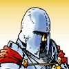
I think the pose above could work quite well. With xacto spear in hand, stepping on a printer, and scattered cardboard sheets at his feet. The tricky thing is not to overcomplicate it. It should be readable in small size. I'm afraid that cardboard building would be too small a detail comparing to the warrior, to be evident.
|
|
|
|
Post by cowboyleland on Oct 26, 2013 5:17:05 GMT -9
Good ideas and good points all. I am not (at this time) a publisher or a blogger, but I think you are all getting stuck at the theory level. I think people need to submit some sketches, collect some feedback, modify their sketches based on feedback and re-submit their sketches for a poll. My talents don't lie in the 2d direction so I will leave it to you real artists. Edit: (One hour later) On the other hand, someone did make me a Grand Modder. I grabbed the base image when Jim made them free. As you can see there are problems with lines in the PDF that have been discussed elsewhere on this forum, but you get the idea, and I did suggest rough sketches. 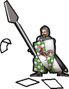 |
|
|
|
Post by aaron on Nov 2, 2013 5:46:50 GMT -9
I don't have time to do an animated banner but I can make a static one. I just need the dimensions ... if were still doing this that is?
|
|
|
|
Post by squirmydad on Nov 3, 2013 8:24:39 GMT -9
I have two blogs that I sort of maintain; the One Monk Miniatures Blog at blogspot which I've mainly been using for announcements and one at Wordpress which I use to talk about painting minis and eating pie. A format such as TGN uses looks like it would fit the bill for a project like this and with more exposure might encourage designers to post more on their thoughts, processes, and coming soons. Loking forward to this getting off the ground. |
|
|
|
Post by aaron on Nov 3, 2013 14:23:54 GMT -9
I like pie. Pie is good LOL. especially after a big dinner .... mmmmm pie. so Mr squirmy are you in need of any banner art LOL
|
|
|
|
Post by WackyAnne on Nov 3, 2013 18:49:22 GMT -9
<- goes off to read about Mayhem in Pie..... mmmmm....pie!
|
|
|
|
Post by squirmydad on Nov 5, 2013 14:34:22 GMT -9
I like pie. Pie is good LOL. especially after a big dinner .... mmmmm pie. so Mr squirmy are you in need of any banner art LOL Actually I just posted my favorite pie and cookie recipes.  Banner art...yes, yes I do actually. See the forum header at the top of the page with the kobolds? I'd like to have some more like that for the forum and don't you have a game on the way? Perhaps a characterful photo of your game in progress, with credits, and the forum title and descriptor like it is above. Hows that sound? I'd love to have a pile of those from different producers to advertise their works and then just have that banner rotate through them randomly. That'd be cooool. |
|
|
|
Post by cowboyleland on Nov 5, 2013 14:43:02 GMT -9
That would be cool, but you are THE COOLEST! (I mean I like your idea, this isn't a bromance kinda come-on or anything.  ) Not that there would be anything wrong with that  |
|
|
|
Post by aaron on Nov 6, 2013 7:18:26 GMT -9
Yes , yes I do have a game on the way but I have been cooling off talking about it because I have a tendency to get obnoxious when I geek out about it LOL I'm sure you haven't noticed or anything I don't have a good camera to take pics of my built stuff yet but I am working on getting one... though admittedly it's low on the priority list at the moment. sooo how about I give you a banner of all the races in my game !! although I am quite fond of the Kobold encounter banner and world works makes some pretty spectacular stuff. ok so without any more rambeling what do you think? 
|
|
|
|
Post by squirmydad on Nov 6, 2013 9:53:49 GMT -9
You have a game on the way? I hadn't noticed... First impression - I like it! Questions and/or criticisms - The wood texture background makes me think this is for a fantasy game, is that accurate? You need a "coming in 2014" notice under the name of the game. You need to move a camera up in your priority list for promoting the game. Consider it a business expense for marketing as pictures of reaal minis and models will always sell a product better than a cool logo. I'm going to check and see if I can put a gif animation for the header pic of this forum and if that works then I can just build a file that rolls through the different producers who hang out here. |
|
|
|
Post by madarchitect on Nov 6, 2013 13:05:31 GMT -9
ok so without any more rambeling what do you think? Really like the logos. The banner itself requires some improvement IMHO, especially in terms of composition/layout. There is a lot of info on the banner (5 logos, 4 text nodes) but positioning of these elements looks a little random or careless, unless this is intended, (or you know all that and this is just a draft) here are my thoughts/ sugestions: 1. Keep equal margins to the text: Left margin from "Cardboard warriors" to the edge, should imho match the right margin from "The paper miniatures forum" (Tpmf for short) and your TM info to the right edge. The right margin ot these lines is diffrent btw. Upper margin from both upper lines of text should match, it seems now like you have positioned the text so that upper line of the lower case letters in "Cardbord Warriors" is the same as baseline for "Tpmf". It does not work well imho. Keeping the upper margin for both lines equal would be better. Or you can try adjusting the font size to get both. 2. All logos differ in size and distance. Keep the circles the same size and the same distance between circle centers. I know some logos (like the red one and the green one) have some wider background elements (which I like very much) but they are not strong enough to count them as composition elements. 3. Temporum oblitus logo should have equal clear space on the left and right. I would suggest keeping the same distance (name it -a-) between: Left banner egde -a- 1st to 5th logo -a- Temporum oblitus -a- Right banner edge. 4. Relation of size. The strongest elements are "Cardboard Warriors" and the logos. This makes an impression that the logos are related more to Cardboard Warriors element than Temporum oblitus, which is not your intention I guess. I would suggest reducing the size of logos, while enlarging (a bit) Temporum oblitus. Also using colour for temporum oblitus logo could help in making these two elements related. Temporum oblitus info - colour, other info - white. The message would be more clear I think. 5. Fonts. The font used for TM info and "Tpmf" has too small intercharacter space. Especially "i" overlaps with other letters making it hard to look at. 6. Background texture is of too low resolution. It looks like blurred pixelation. like if it was upscaled from a smaller image to fit the banner. I agree with squirmydad that the wood texture implies fantasy setting, if it is not inteded I think a slight desaturaton could help reduce this effect, while maintainig the overall good look. I agree also that a cool photo sell stuff better (If someone already wants to buy something), but a cool logo is sometimes more intriguing. Just my 6 eurocents. Hope it helps. |
|
|
|
Post by aaron on Nov 7, 2013 4:36:38 GMT -9
ok good feedback I see all your points but I think part of the problem is I'm confused .... again LOL
am I making a banner for the main cardboard warrior forums or just for a Temporum Oblitus section of the forum?
I was trying to keep the theme of the Kobold encounter banner but use my stuff instead for use on the main forum but if it's going to be a banner for it's own section then I would do it totally differently.
I totally agree about the camera but I just dumped a lot of money into a new printer and computer software to make the game I have to wait for a couple of paychecks before I can get the camera I want. ... also I don't have a whole lot of stuff yet, I am defiantly behind the 8 ball making this game. I wanted it out by now but I'm afraid I'm only about half way. it's the troops that are taking A LOOONG time to do!
the wood grain is actually rusted metal and though looks like rusted metal on 8.5 x 11 300 dpi .... on the banner ... not so much. so I will be re-doing that today.
Photoshop isn't really good with margins so your right I should have payed closer attention to that but I did want kind of a scrap together feel for it, setting the residence for the landscape of the game but I agree the lines could be a bit cleaner.
the logos were intentionally randomized to give it a sense of chaos without being a complete mess but if that's to distracting then I should clean that up a bit also.
"3. Temporum oblitus logo should have equal clear space on the left and right. I would suggest keeping the same distance (name it -a-) between:
Left banner edge -a- 1st to 5th logo -a- Temporum oblitus -a- Right banner edge." .... ok wait I think I get it .... no, no not really LOL
ya the fonts look awesome on the 8.5 x11 ...again on the banner not so much .... not sure how to bridge that gap without changing the font spacing ( which I hate doing because it always screws up Photoshop and then I have to reset all the defaults thus loosing all my brush-tools and layer presets of which there are many)
OK AWESOME feedback ! I'll see what I can do with my cell phone about getting some pics ( maybe I can increase the resolution in Photoshop or shometing untill I can get a good camera... alright off to work on it !
|
|
|
|
Post by aaron on Nov 7, 2013 4:52:10 GMT -9
better?  |
|
|
|
Post by mproteau (Paper Realms) on Nov 7, 2013 5:56:08 GMT -9
It says "Temporum Oblitust (TM)" in the bottom right...
|
|


 )
)


