|
|
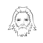
Post by lightning on Sept 24, 2015 1:22:57 GMT -9
I had my first go at character design. Still needs much improving but I thought I share it and see what you guys think. Viking guard concept |
|
|
|
Post by cowboyleland on Sept 24, 2015 3:20:55 GMT -9
This is a great start. Before you put too much more work into details, print it out at scale and hold it out at arms length. You might decide you have enough (or more than enough) already.
|
|
|
|
Post by lightning on Sept 24, 2015 5:48:44 GMT -9
... and put my glasses on :-)
True, for making this an actual tabletop figure I will definitely have to reduce more. That's the goal :-)
But: the chest is too long, the legs too short and other stuff too. So much room for practice still!
|
|
|
|
Post by pavaro on Sept 24, 2015 7:38:01 GMT -9
Fine concept. I think that his left hand is too small (keep spears) and unnatural.
|
|
|
|
Post by lightning on Sept 28, 2015 10:48:46 GMT -9
 for those who saw my vent in the shout box: this is what i have been working on. the problem i have is with the smoothness and thickness of the lines. i see these tutorials of people drawing in one swift and smooth stroke and the thickness goes nicely from thin to thick to thin as wanted. i also see other guys who stroke by stroke add up what they want in the end but if i do that it just looks like a mess. so if any of you have tips and want to share secrets of the trade please let me know :-) but if this is not the right place forgive my rant. i will continue to practice and i will get better. i will have victoryyyyy :-) |
|
|
|
Post by paperpusher on Sept 28, 2015 11:36:35 GMT -9
If I may...you thread is titled "first try" my best is to give yourself some time and practice nobody starts out perfect at anything. You need time to figure out what works for you to get the results you want. The only way to determine that is through practice. Keep drawing eventually you will find a method for achieving the effects you want. Sounds vague I know. You say specifically you are having trouble with line smoothness. What are you drawing with ? Have you thought about how you are holding your pen/pencil? The direction you are making your stroke? For example I know my lines flow better and are much smoother if i pull my lines away from my body...I'm left handed so I try to pull lines either left, up, or in a counter clockwise motion.
|
|
|
|
Post by mproteau (Paper Realms) on Sept 28, 2015 11:39:05 GMT -9
I've got a cheap wacom tablet and have not been able to get the hang of it at all. I don't know if it's just a lousy tablet, poor support in GIMP for the tablet, lousy handling of the tablet by the user, or a combination of all three. Still, lightning, what you've got there looks super. I think I just need a ton of practice. I'm so much more proficient with the mouse! |
|