|
|
Post by josedominguez on Mar 8, 2009 7:09:42 GMT -9
Here we go again  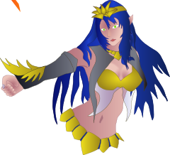 If I start at the beginning of the month, I might have something finished in time for the hoard! Every time I start something I decide to do it a different way.... this is drawn straight into inkscape, no paper involved. Seems great until you get to back views. |
|
|
|
Post by Aestelon on Mar 8, 2009 15:16:34 GMT -9
On the other hand, you'll still be able to flip the whole image over and use it as a guideling for drawing the back.
Looks good so far. I take it she'll have heavier outlines later?
|
|
|
|
Post by josedominguez on Mar 10, 2009 7:30:26 GMT -9
Yup, I haven't worked out the complimentary shading thing yet.... it was a lot easier on the bug as he's all shades of grey, so a nice charcoal outline worked. Harder with flesh though. I'm still very new to this, haven't quite found a style yet. Still copying everyone else really. 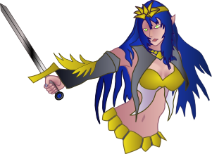 with extra outline and sword (not sure on that, think it needs to be a polearm of some sort) |
|
|
|
Post by Floyd on Mar 10, 2009 9:33:59 GMT -9
She is "shaping" up to be quite the Elf...  You are doing a really nice job on this design. And remember... imitation is the greatest form of flattery. Working in someone else's style sometimes helps you to work through problems, or come up with new ideas. Just keep drawing...the style will develop. A note, for making this a paper figure in the standard 28mm-30mm heroic scale. Subtle gradations, shading and highlights are not going to translate well. So you may want, from time to time, reduce and print out a test copy. Things to think about might be exaggeration of color and shadow. Simple is usually better. And high saturation and well delineated segments for major body areas. Great work, she is lovely. ~F
|
|
|
|
Post by josedominguez on Mar 10, 2009 9:36:01 GMT -9
Number 3 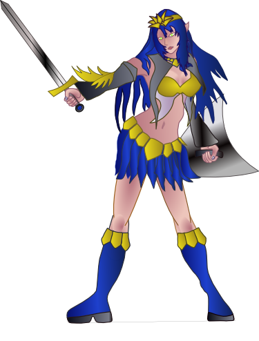 |
|
|
|
Post by Aestelon on Mar 11, 2009 9:50:22 GMT -9
Everything Floyd said; she's a beautiful piece of work. Have you tried doing a true-sized printout yet to see how she looks at that scale? Then it's just the back to go!  |
|
|
|
Post by josedominguez on Mar 11, 2009 10:26:35 GMT -9
I'm still having issues at the point where a drawing becomes a figure. Not too bad though, and I've kept it to a simple pallette so I can make the gradients a bit more obvious at smaller size. I'm still learning but I'll get there. The advice on thicker outlines has definately worked out. Looking a lot less 'washed out' now. Need to photoshop the outline a bit too. 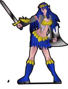 |
|
|
|
Post by onemonkeybeau on Mar 11, 2009 11:28:38 GMT -9
Love the thicker outlines!
Looks much more 'figure-like'!
onemonkeybeau
|
|
|
|
Post by josedominguez on Mar 11, 2009 12:03:09 GMT -9
spent ages trying to match Jim's 4mm outline using pixels, then I noticed a command on inkscape that let you measure outlines in mm.
Doh!
|
|
|
|
Post by Aestelon on Mar 15, 2009 20:07:23 GMT -9
Of course, you don't have to measure the outline exactly, as long as it's thick enough. The main point of it is to give the modeller some leeway when cutting it out. And of course, when you've got thin areas of model (like the blade of a sword), that extra millimetre or two will help make it a little sturdier. But you can easily make the lines thicker than you need them, and let the modeller use their own judgement when the knife's out.
The new outline really does make a big difference, though! ;D
|
|