


Post by Vermin King on Jan 31, 2019 3:57:40 GMT -9
Yes, I stand by my statement of hitting it with a sledgehammer for a week, but I thought I would go through my sledgehammer process
First, you have to find a font that is close to what you want.
I used this one
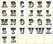
I liked this one, and it was in 50+ pages on the net, so I figured my monkeying with it wouldn't be an issue.
None of them are very clear.
I created a new page in Gimp and selected 'All' and set 'Color to Alpha' to give me a blank pallet.
I also opened the font file and set Color to Alpha around the letters I needed
I then copied over the letters to spell 'CWF CIRCUS'
I selected the text and enlarged so that the text is about 3/4 of the width of the page.
This is very fuzzy and lumpy.
There is also a lot of detail that you can only see with a good imagination.
Setting the pencil to 3 pixels, I then outlined each letter, and the details I wanted to retain on each letter
I then use Color Select for the black outline and Cut it out.
Delete everything else and Paste the outline back in.
Using Paint Fill, I then filled the black areas, which shows invisible artifacts that need to be smoothed out. I use the Free Select tool to lop off the knobby bits.
Then I use the Paint Fill to put the white into the letters. More knobby bits show up.
At this point I go back to the pencil, and smooth out with black and white until it looks good.
I have tried using Enhance, Curves, etc. to get a good start on this and it seems to create more invisible artifacts that show up when you use Paint Fill. Probably user error.
I don't know how helpful this is, but that's how I did it
EDIT--
Helpful Hint: There are three C's, so just fix one and replace the other two with the fixed one
First, you have to find a font that is close to what you want.
I used this one
I liked this one, and it was in 50+ pages on the net, so I figured my monkeying with it wouldn't be an issue.
None of them are very clear.
I created a new page in Gimp and selected 'All' and set 'Color to Alpha' to give me a blank pallet.
I also opened the font file and set Color to Alpha around the letters I needed
I then copied over the letters to spell 'CWF CIRCUS'
I selected the text and enlarged so that the text is about 3/4 of the width of the page.
This is very fuzzy and lumpy.
There is also a lot of detail that you can only see with a good imagination.
Setting the pencil to 3 pixels, I then outlined each letter, and the details I wanted to retain on each letter
I then use Color Select for the black outline and Cut it out.
Delete everything else and Paste the outline back in.
Using Paint Fill, I then filled the black areas, which shows invisible artifacts that need to be smoothed out. I use the Free Select tool to lop off the knobby bits.
Then I use the Paint Fill to put the white into the letters. More knobby bits show up.
At this point I go back to the pencil, and smooth out with black and white until it looks good.
I have tried using Enhance, Curves, etc. to get a good start on this and it seems to create more invisible artifacts that show up when you use Paint Fill. Probably user error.
I don't know how helpful this is, but that's how I did it
EDIT--
Helpful Hint: There are three C's, so just fix one and replace the other two with the fixed one


