|
|
Post by BilliamBabble Inked Adventures on Sept 19, 2010 9:28:13 GMT -9
Okay. I'm appeasing myself because I haven't finished my current "Tombs/Catacombs" mini-map project yet, so I'm going to post random bits of graphics here, in order to convince myself of actual progress. One of the reasons is that I'm expanding a traditional dungeon map - mausoleum/crypt with some spooky skull filled corridors and rooms. The skull walls are lots of fun to draw, but the finished piece is now a long way off. 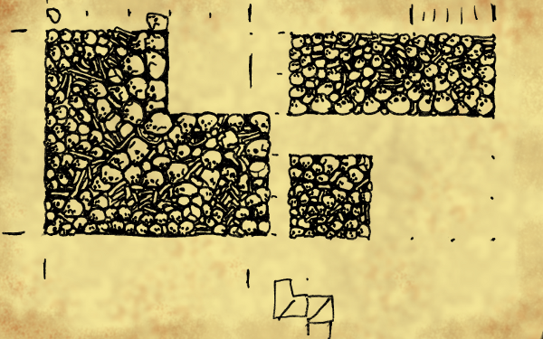 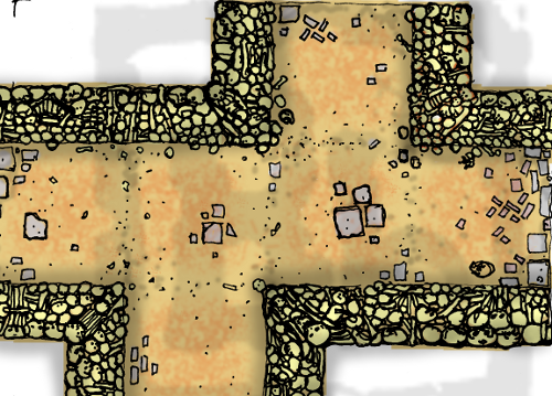 Main crypt area - experimenting with layout:  Working title "Inked Adventures: Bones, Tombs and Catacombs"(?) With the subheading " - a crypt for all occasions" Okay, perhaps I won't give up my day job just yet. ;D I wanted to use names like "Undercrypt!" or "Undertomb" but they seem to be taken. *rolley eye smiley* Under-questy-halls-of-the-dead-Revenge-of-the-lich-king-tombs-of-darkness-III-return-of-the-zombie-dragon-ghoul-lords... etc. If you're really nice to me, I might post some heavily watermarked scenery details.  |
|
|
|
Post by kane on Sept 19, 2010 10:12:21 GMT -9
I love your style. Really. Its just FULL of character! Looking forward to this.
|
|
|
|
Post by squirmydad on Sept 19, 2010 11:22:35 GMT -9
Very cool ,I like the style as well.
JIM
|
|
|
|
Post by Floyd on Sept 19, 2010 15:45:23 GMT -9
Looking good!
|
|
|
|
Post by stevelortz on Sept 20, 2010 18:26:26 GMT -9
"Bones, Tombs & Catacombs" works pretty well if you pronounce it "Bones, Tombs & Catacooms"!
Love your work!
Have fun!
Steve
|
|
|
|
Post by mruseless on Sept 20, 2010 18:26:39 GMT -9
Ooooo, I like that!!
|
|
|
|
Post by stevelortz on Sept 20, 2010 18:27:31 GMT -9
In fact, I love it so much, I BUY your stuff!
Have fun!
Steve
|
|
|
|
Post by kane on Sept 20, 2010 20:52:32 GMT -9
Yes, please, give us more ways to give you money!
|
|
|
|
Post by BilliamBabble Inked Adventures on Sept 25, 2010 17:18:20 GMT -9
Thanks for the praise.  I'm trying my best to make products to take all your money, I just can't produce stuff fast enough! ;D Mwhahaha ... capitalism! Love it. I haven't made much progress with this piece so far I will throw you some more scraps: Tombs, coffins - pre-shadow, to be added into rooms: 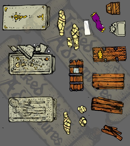 Another little gem: A sort of oval chamber - which reminds me of a barrow I drew some years back ( fav.me/dupx1o - deviant art link ) pre-colour, pre-shadow, pre-everything ... 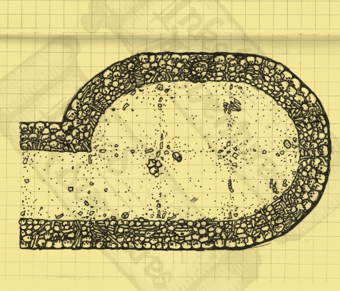 I'm still convinced that drawing too many skulls can turn you into a Goth ... Or perhaps become an architect for Pol-Pot? Sorry, too far, I know. It's a sickness, no really ... |
|
|
|
Post by BilliamBabble Inked Adventures on Sept 25, 2010 17:22:19 GMT -9
"Bones, Tombs & Catacombs" works pretty well if you pronounce it "Bones, Tombs & Cata cooms"! Isn't that how you say it? Half rhymes, assonances and an over dramatic booming of the voice at the end is the trick to cheesy marketing, I reckon. Bones, Tomes and Cata-combs ... ? ;D |
|
|
|
Post by kane on Sept 25, 2010 20:58:07 GMT -9
Looking good! Keep on working on it. Can't wait to see what the finished product looks like.
|
|
|
|
Post by Dagger on Sept 25, 2010 21:45:58 GMT -9
I really like the oval chamber. The skeletal walls are perfectly suited for the catacombs level of a dungeon... and I especially like how the debris on the floor hints to where the grid is as opposed to having an explicit grid mucking up the visual. This way you can use the grid if you need to or ignore it if you don't... either way the grid is not taking anything away from the looks of the game.
|
|
|
|
Post by afet on Sept 26, 2010 13:43:40 GMT -9
This set is looking fabulous so far. I can't wait to see it done.
|
|
|
|
Post by stevelortz on Sept 26, 2010 14:41:40 GMT -9
"Bones, Tombs & Catacombs" works pretty well if you pronounce it "Bones, Tombs & Cata cooms"! Isn't that how you say it? Half rhymes, assonances and an over dramatic booming of the voice at the end is the trick to cheesy marketing, I reckon. Bones, Tomes and Cata-combs ... ? ;D Here in the heart of Hoosierland, capital of high culture, we usually say "Tomb" as "Toom", but "Catacomb" as "Cata-coh-mb". There's more than corn in Indiana! Have fun! Steve |
|
|
|
Post by BilliamBabble Inked Adventures on Sept 27, 2010 13:55:41 GMT -9
I especially like how the debris on the floor hints to where the grid is as opposed to having an explicit grid mucking up the visual. This way you can use the grid if you need to or ignore it if you don't....  I'm very fond of "contrived but natural" grids, flagstones make the job easy but dirt floors are very different. I don't really like thin grid overlays on hand illustrated plans. In the Vexing Sands pack ( inkedadventures.com/main/?p=95 ) I tried to "imply" a grid on the desert floor piece, but we ended up including the option to print with a grid overlay, because is would be too subtle for some folk. I'm looking forward to tackling some cavern sections and getting back to work on some forest pieces, which also use a contrived-debris style. Of course it's then even harder to adapt to hex grids ... but that's a whole different kettle of fish. |
|
|
|
Post by BilliamBabble Inked Adventures on Sept 27, 2010 13:58:00 GMT -9
Here in the heart of Hoosierland, capital of high culture, we usually say "Tomb" as "Toom", but "Catacomb" as "Cata-coh-mb". There's more than corn in Indiana! ;D |
|
|
|
Post by BilliamBabble Inked Adventures on Nov 22, 2010 9:29:14 GMT -9
|
|
|
|
Post by BilliamBabble Inked Adventures on Dec 3, 2010 15:08:42 GMT -9
I keep inventing more things to slow down the release of this pack. Test pieces - need colours adding and tabs cleaning up. Reversible 3D tomb with dais/base: 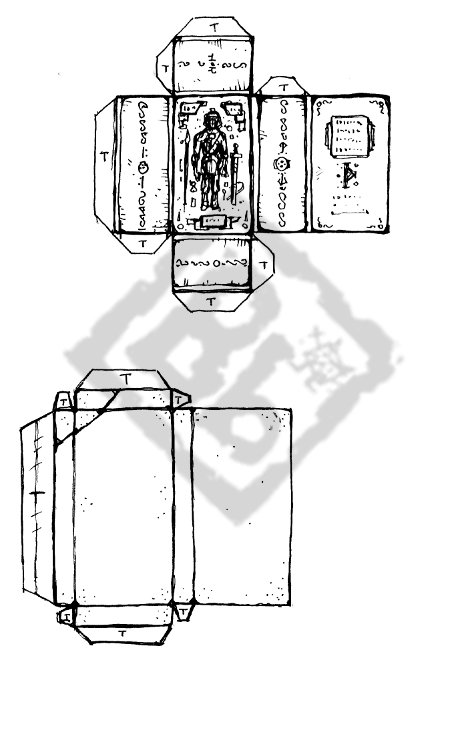 (The base in 2 5ft "squares" long) Reversible ancient coffin: 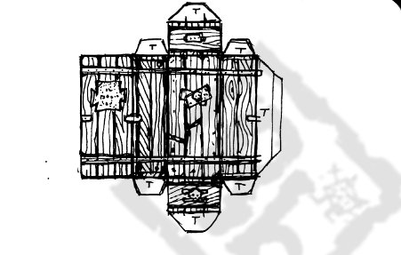 Paper assemblage test (very rough, unweighted, forgive the magic tape!) - photo via phone - 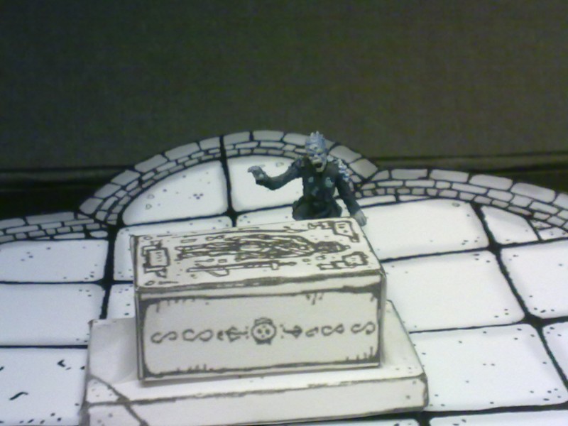 |
|
|
|
Post by revgunn on Dec 3, 2010 15:37:57 GMT -9
Dude.... will you hurry up with this so we can buy it???  |
|
|
|
Post by sammo on Dec 3, 2010 19:52:03 GMT -9
Dude.... will you hurry up with this so we can buy it???  I second that! |
|
|
|
Post by Dryw the Harper on Dec 3, 2010 20:39:43 GMT -9
I'm loving this stuff. I like the hand drawn style. I like the direction you are heading with the 2.5D props. Cool.
;D
Dryw the Harper
P.S. Many Imperfect People are looking forward to exploring these corridors, catacombs, tombs, and vaults.
|
|
|
|
Post by BilliamBabble Inked Adventures on Dec 5, 2010 7:07:11 GMT -9
Yup. I totally agree, publication for this pack is long overdue - I keep getting distracted by other projects and seem to lose whole weekends by fiddling with settings on web pages... Man, the weekends seem so short! I'm having a big dilemma. I've been saying that this pack will be a "fixed" mini-map (i.e. the props and details are included in the rooms like with Evil Summonings, as opposed to a modular kit with loose scenery counters - as with the Basic Pack). As the set develops it will be better sold as the latter I believe. Or maybe a detailed mini-map with "blank" sections". One solution might be layers. The open source software I'm using has a very simple way of exporting to PDF and I don't think there's any options to use layers, and I rather like the fact that the PDFs can be looked at on older viewers. ... Hmm ... *ponders* Having just typed this I'm remembering that the OneBookShelf websites allow for free downloads of updated publications. So maybe if I just get this pack out there and if the feedback is negative, at least people who've bought it will have the option to download an amended edition for free. It'll probably be about $3 ($3.50 maybe) - but review copies are free to friendly bloggers.  (send me an email or PM) Maybe it's going to be just too perfect to share.  All mine ... only for me, No share, No not for others ... Only for me ... MINE ...
Zee art vill not be compromized! ;D |
|
|
|
Post by deathdragon on Dec 5, 2010 14:40:19 GMT -9
Why not pack both a layered version & a non layered with counters,that way all bases are covered  (pun partially intended) wouldn't take much to convert the extra layers into pages of counters. If you need help with the layered pdf its not a problem really doesn't take too long to do |
|
|
|
Post by onemonkeybeau on Dec 5, 2010 20:02:23 GMT -9
I am a loose counter type of guy myself... but wither way, You've got my sale!
onemonkeybeau
|
|
|
|
Post by sammo on Dec 5, 2010 23:07:29 GMT -9
I'm in the blank floor plans with loose counters camp myself. It makes the set more versatile IMO.
I'll happily cough up a few buck to support your work, just let us know when its ready!
|
|
|
|
Post by afet on Dec 8, 2010 13:59:10 GMT -9
These are looking amazing.
|
|
|
|
Post by kiladecus on Dec 9, 2010 14:00:36 GMT -9
Another good sub-heading... "A TOMB with a view..." Ok, that was even bad for ME!  Looking VERY nice! I have Claudio's Space Base sets for my future maps, and I can use these for my "Fantasy" version. Like it!  |
|
|
|
Post by BilliamBabble Inked Adventures on Jun 10, 2011 4:03:55 GMT -9
Okay, really bad jokes aside... Another peak at some more sections for Part 1 of the Crypts/Tombs pack: 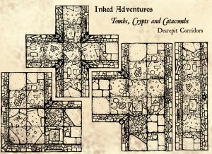 (Pre-colour work) |
|
|
|
Post by josedominguez on Jan 13, 2012 10:14:04 GMT -9
Any progress on this? I love your stuff and I've got a table load of the dungeon set plus all of the extras and encounter sets I'm basing our next campaign around it  |
|
|
|
Post by kiladecus on Jan 13, 2012 15:10:24 GMT -9
Yes, I agree! I am letting my EL4 credits build up so I can buy this when it is released! (Wow, that is kinds Win-Win for you, huh!)  |
|