|
|
Post by Tommygun on Dec 12, 2010 0:24:20 GMT -9
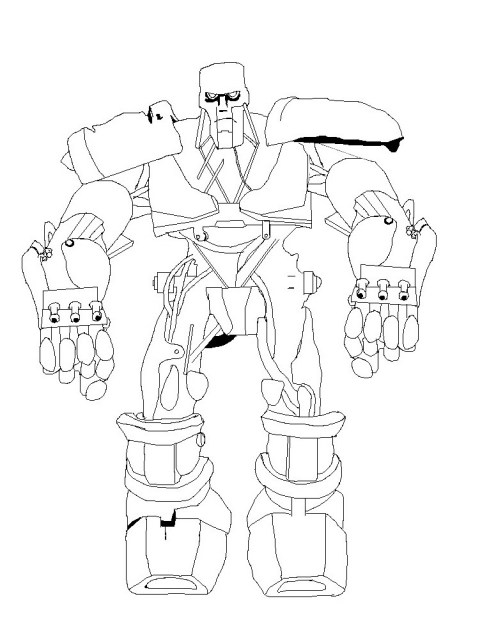
Sense I don't think I can get a full sheet of these guys done for the December horde, I'll post the bulk of them here. Here is a basic pose I traced out. Ounce done, I can cut it up into separate parts and repose them. Edit they are done now.Here is the link to the pdf File:tommygun.sector-17.com/tommygun/main.php?g2_itemId=821&g2_page=3 |
|
|
|
Post by kiladecus on Dec 12, 2010 13:01:08 GMT -9
Oh, you GOTTA! I loved that guy in Judge Dredd! I NEED ONE (thinking dirty, rusty yellow!)! Holding my breath!!!  |
|
|
|
Post by onemonkeybeau on Dec 12, 2010 14:42:51 GMT -9
No joke!
This guy is SWEET!
onemonkeybeau
|
|
|
|
Post by Tommygun on Dec 12, 2010 21:35:20 GMT -9
I think I have enough done to start coloring. I'm going to try and do this with 3 transparent alpha layers. One layer will be the black line drawing. Second layer will be the colors and a third will have detail textures. I'll try and keep the colors down to 3 rusts shades, gray and black with just a little yellow at the eyes. At some point I will add more hydraulic lines and rams.  |
|
|
|
Post by Dominic on Dec 12, 2010 22:20:22 GMT -9
It looks like it's standing on thread-roller skates for some reason, they do not feel like part of the complete mini somehow. Other than that, it looks good.
|
|
|
|
Post by Tommygun on Dec 12, 2010 22:36:00 GMT -9
But he is standing on treaded roller skates.   |
|
|
|
Post by Dominic on Dec 12, 2010 23:38:53 GMT -9
Oh... then my case shall be rested.  |
|
|
|
Post by Parduz on Dec 12, 2010 23:54:33 GMT -9
But he is standing on treaded roller skates.  I see, but it seems on both the tips of the skates. One of the feet should be "rolling" in front view. |
|
|
|
Post by kiladecus on Dec 13, 2010 5:01:34 GMT -9
As ANYONE can see by the "original" drawing, this is a spot-on drawing, and Tommy should be commended on his fine artwork.
Period!
|
|
|
|
Post by old squirmydad on Dec 13, 2010 7:51:38 GMT -9
Best moment of the film was the ABC ambush. I saw him in the advert for the film and got really excited. Then I saw the film...once...long time ago. Yeah, it should have been a movie about ABC warriors.
;D
|
|
|
|
Post by cowboyleland on Dec 13, 2010 18:27:35 GMT -9
I think Parduz is right. We should see a little more tread and the top of the boot should be forshortened a tad.
Correction: what I (and I think Parduz) read as the top of the boot is actually the bottom of the shin. I 'm not sure why it read that way. I wonder if colouring will fix it. Otherwise he ROCKS!
|
|
|
|
Post by Tommygun on Dec 13, 2010 19:39:28 GMT -9
Here is a quick base coloring. Shadows, high lights and details will be added later. The roller skate analogy shouldn't be taken too literally. When the treads are used, both feet are flat on the ground. They don't sway back and forth the way you would while skating. Here is a side shot of the feet. The way these warriors were drawn varies some by the artist over the years, but this is basically similar to mine. I'm imaging the treads forming a triangle pattern if seen from the side. That is they slope up then down, as seen on this hummer.    |
|
|
|
Post by kiladecus on Dec 14, 2010 2:54:49 GMT -9
I need a Hummer like that to get out of my DRIVEWAY!! One bad thing about living in the country in the middle of OHIO! Blah!  |
|
|
|
Post by Parduz on Dec 14, 2010 3:43:30 GMT -9
Correction: what I (and I think Parduz) read as the top of the boot is actually the bottom of the shin. I 'm not sure why it read that way. Well, i think i see why, now that i see the side of the original thing: 1) The feet/leg shape is uncommon and allows "distorted perspective" when see from the front 2) Out paper minis already have distorted if none perspective, to allow them to have flat feet. The down curve of the knees and shin "suggest" that the legs are bent and the shape of the boot add the illusion of it being on the tips, just like skaters when they stands on the rubber brake. So, while the frontal projection is accurate, it gives to the eye false information 'cause the lack of the side view. The solution is to break the illusion by changing the pose of one leg (like the pose of the model) or by rotating the feet a bit to give us some view of the internal sides. |
|
|
|
Post by Tommygun on Dec 14, 2010 4:10:40 GMT -9
I eventually plain on having different poses, so I will try and get a more rotated view of the legs.
Something along the lines of how the Tarra Force figures where done.
I'll try to get this basic figure done first for the horde, then I can cut him up and put different arms and legs on him.
He has energy weapons built into his hands, but I want some of the figures to carry bid heavy weapons too.
|
|
|
|
Post by kiladecus on Dec 14, 2010 5:06:21 GMT -9
Well, TG, YOURS may have energy weapons in the hands, but mine are going to have SMG's! Three per hand!  In my game, this guy will be blasting up to 12 shots a round! Being a large figure, he will have VERY HEAVY armor (like a GW Terminator), and multiple wounds! Best part, I will be runing them in squads of THREE!! (That's right, doing the math: up to 36 shots per round per squad)! WHOO-HOO!!! I can't wait for these!! Makes my Psi-Borg look lame in comparison with a Heavy Flamer and the Jaws-of- Life... er Death!  Bring it on, Tommygun! I want these guys!  |
|
|
|
Post by Tommygun on Dec 14, 2010 21:50:20 GMT -9
I decided on his size today. I based it on the movie version, which looked about a third taller than a human. He is pretty big at about 8 foot 8 inches (2.64m) tall. I think the comics varied a great deal in how tall they were. I'll be adding more hydraulics now and rust. Then I can start shading and high lighting next, fallowed by details like scratches etc...   |
|
|
|
Post by Dagger on Dec 15, 2010 0:19:23 GMT -9
It's looking great... Standing next to the trooper though it looks like his head might be too small.
|
|
|
|
Post by Tommygun on Dec 15, 2010 1:12:54 GMT -9
I made the head 10% larger and I lengthened the jaw more on top of that. Although the fact that it wasn't outlined like the Terra Force one, I think was making it seem small. There is a bug in Inkscape with the outlining? When you transfer it back to Gimp, the outline becomes offset and is thicker on one side.  |
|
|
|
Post by Tommygun on Dec 16, 2010 16:55:31 GMT -9
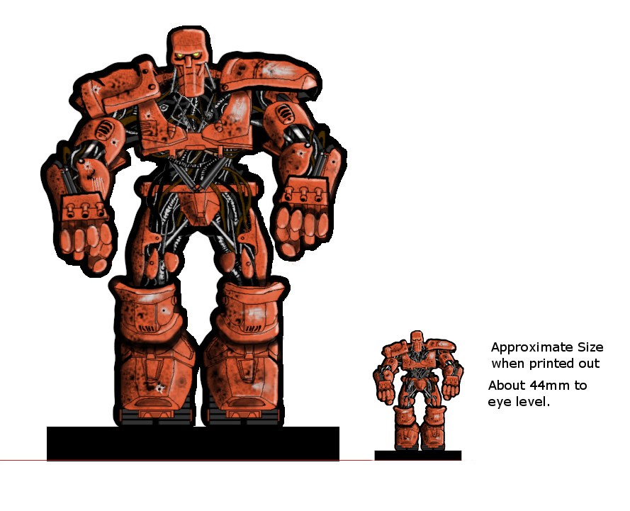
The front is done. The second image shows about how it will look printed. I probably added too much detail, as you can see a lot is lost when you see the printed size of it.  |
|
|
|
Post by kiladecus on Dec 16, 2010 18:32:27 GMT -9
Too much detail? That is like saying you have TOO MUCH MONEY!
That looks FREAKIN' AWSOME!
I can't wait to print that out!
|
|
|
|
Post by Parduz on Dec 17, 2010 0:25:44 GMT -9
Tommygun, i have to say that at print size it is great.
I'd like more "separation" beween body parts, so between the feet and the leg and between the hands and the arms (using thicker black lines, or shadows like the one you used in the last picture).
Other than this, it is great.
|
|
|
|
Post by Tommygun on Dec 17, 2010 2:25:37 GMT -9
Tommygun, i have to say that at print size it is great. I'd like more "separation" beween body parts, so between the feet and the leg and between the hands and the arms (using thicker black lines, or shadows like the one you used in the last picture). Other than this, it is great. Do you want a black line that goes across the wrist and knee area? |
|
|
|
Post by Parduz on Dec 17, 2010 3:35:08 GMT -9
Here's a rough, fast, unaccurate sample of what i meant, made by a 50% transparent black brush:  I think that the "shadows" add depth to the minis... Do you want a black line that goes across the wrist and knee area? No, i don't want, i'm just suggesting what i see as an improvement, but it is always my humble opinion: the artists are you guys, i'm just a wannabe  |
|
|
|
Post by kiladecus on Dec 17, 2010 4:37:15 GMT -9
Once again, I thought it looked fantastic, but Parduz's suggestion does work. You do a great job, and that simple "tweak" makes it really stand out! The ONLY thing I could suggest is this, the gun barrels are kinda lost in the whole scheme of things. Maybe a little hightlighting or something to make them stand out and "pop" a little without distracting from the rest of the model. Being a wargamer for over 20 years, I like to take one glance at a figure and sum up what weaponry he has. But, hey, that is just what I am suggesting... Offering suggestions to you is like going up to Ray Walton and offering him marketing advice!  Great job, in case I haven't stressed that enough! BTW, I don't know what you do for a "living," but I think you should consider a career change! You are the "best" artist I have seen in this capacity, and with the people on this forum, that is a HUGE compliment... (not that I am tearing anyone esle down, and I DO have my "favorites" here, but let's face it... Tommy's got "mad skillz, yo!"). |
|
|
|
Post by deathdragon on Dec 20, 2010 20:53:39 GMT -9
I love it now i just need a Stallone as Dredd mini
|
|
|
|
Post by Tommygun on Dec 20, 2010 21:28:18 GMT -9
Thanks guys. Well the first basic ABC is done and I'm almost done with the December Horde. Just need to outline two of them.  |
|
|
|
Post by deathdragon on Dec 20, 2010 21:50:00 GMT -9
hey a target drone,shooting practice with marvin ;D
|
|
|
|
Post by revgunn on Dec 20, 2010 21:54:20 GMT -9
THESE ARE FREAKIN AWESOME!!!
The details... nice. Your shading is really good too.
I've been following along, just hadn't had a chance to post.
|
|
|
|
Post by Tommygun on Dec 21, 2010 4:45:33 GMT -9
After I posted these guys, I took another look at the group shot and this idea popped into my head.
The ABC guy looks unhappy because the Burkabot keeps complaining that Marvin needs new shoes and the Mobil Swords won't stop digging holes in the back yard.
And Marvin is depressed because they are fighting....
....is it just me?
|
|