|
|
Post by kiladecus on Oct 20, 2013 9:01:09 GMT -9
Here is a prototype of my new cards for an upcoming game (No, it isn't a new-fangled traffic light). This is a WIP, a bit of a sketch, so the final results may look nothing like this. Any thoughts (considering you have no idea how it works). 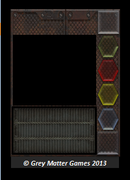 No, this has nothing to do with DEADLY MISSIONS, but that doesn't mean I am not going to continue with that. I just have a few things I have been putting off. |
|
|
|
Post by okumarts on Oct 20, 2013 9:25:39 GMT -9
My only concern would be ink eating, but then again I'm kind of cheap that way.
|
|
|
|
Post by cowboyleland on Oct 20, 2013 10:19:16 GMT -9
A lighter back ground might also make it easier to read, unless you are planning white text?
|
|
|
|
Post by kiladecus on Oct 20, 2013 11:46:51 GMT -9
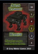 Here is a mock-up of a card so you get an idea of how it will look. I could always switch to a white border on the card, I guess. My other option would be calling the game, "INK DRINKER!" EDIT: Unlike some of my other games, this will be a traditional size (poker-size) card. There will be 9 per page, and the backs are going to be light grey. Yes, you will use a little ink, but not as much as you may think. The images will be the heart of the card, and they will be pretty light. (At least that is my goal). |
|
|
|
Post by kiladecus on Oct 20, 2013 12:45:07 GMT -9
Ok, with the feedback here, and on Facebook, I did this... 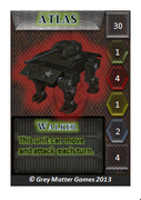 Any other thoughts? EDIT: I also decreased the black line on the text box to make it not so prominent. (Not pictured) |
|
|
|
Post by wyvern on Oct 21, 2013 2:04:34 GMT -9
Experience with printing various papercraft items this past year suggests the overall colour scheme is far too dull and muddy to guarantee readability from inkjet printers especially. Even with pro-printed cards for other games, my preference is for darker text on a lighter background, as I've never found white text on dark works at all well.
|
|


