|
|
Post by kiladecus on May 10, 2014 5:29:09 GMT -9
We have received a LOT of great feedback from you, so far. Here is where we are this morning: 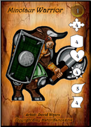 I lined the icons up on the right side of the card (so it "feels" more like the cards we are used to). I replaced the "Lightning Bolt" icon with a new "Fireball" icon. This was one of the better decisions, because no matter what I did, the ranged attack icon never seemed to be what I had hoped for. It was hard to read, and this is MUCH better. I also took the "Glow" away from the Level Marker (the yellow bead with the "1" on it). I kept it as a glass counter so it doesn't blend with the rest of the icons. This *may* serve another purpose in the future. I will discuss that down the road. The icons are white in this drafft because they are "blank" at the moment. They will be colored in to represent the various abilities. Let me know what you think, and keep the feedback coming!  |
|
|
|
Post by Parduz on May 11, 2014 13:43:48 GMT -9
I like the neat and clean look of the card, now. You could add some "flame shape" to the fireball to make it not seems a drop, but perhaps once colored this suggestion will make no sense.
Many compliments
|
|
|
|
Post by dungeonmistress on May 11, 2014 20:03:33 GMT -9
This looks good so far. Parduz, I like the flame idea, I think that could work. |
|
|
|
Post by kiladecus on May 12, 2014 6:30:33 GMT -9
Thanks for the feedback.
I think I will add shadows to the icons so they stand out a little bit, and add some depth to them. They look a little too static at the moment.
But first I need to rest... I have only had a few hours sleep in the last couple of days.
Keep the input coming.
|
|
|
|
Post by kiladecus on May 15, 2014 2:44:52 GMT -9
Contrary to rumors, I am not dead... just dead tired.
Trying to balance work, family and GMG. I am hoping things slow down a bit so I can get some of these projects wrapped up.
There are a lot of projects on the burners, just trying to find time for everything.
(Sigh)
|
|
|
|
Post by enpeze on May 15, 2014 7:22:34 GMT -9
I would avoid to put the numbers in front of the mini so that it is covered. The minotaur is beautiful drawn and it would be sad not to see him fully.
|
|
|
|
Post by kiladecus on May 15, 2014 16:37:17 GMT -9
He is wider than most figures, so that shouldn't be an issue. On other wide figures, I will reduce them so this won't happen.
Thanks for the kind words, by the way.
|
|
|
|
Post by kiladecus on May 17, 2014 4:27:27 GMT -9
I am not sure if anyone remembers PYR-8-X ("Pirate X"), but he was one of the heroes featured in the Steam Pirates set. I am playing around with the idea of including him in the new set. 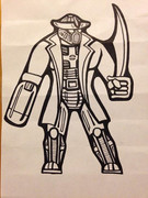 Any thoughts or feedback? |
|
|
|
Post by cowboyleland on May 17, 2014 16:14:08 GMT -9
Thoughts: He looks short in the legs. Hands hanging at the side reach to mid thigh, so your thighs are a little short. Then shins should be about as long as the thigh. I'm treating the right appendage as a normal arm. Whatever is going on there looks like it is proportioned like a humanoid arm.
|
|
|
|
Post by kiladecus on May 18, 2014 7:20:26 GMT -9
Well, I received a lot of positive/constructive feedback (and since PYR-8-X IS a construct, that is a good thing).  I lengthened the legs, and thinned the body out, overall. 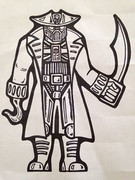 Any more feedback? |
|
|
|
Post by Parduz on May 18, 2014 13:57:18 GMT -9
I still think his "boots" (lower legs) are a bit too short... you could add another "line" like the three already there  Other than this, it's a great figure |
|
|
|
Post by kiladecus on May 18, 2014 15:56:22 GMT -9
Grrr... How did I miss that, Parduz? You are amazing at this... that is why you have a verb named after you. ;D I may just raise the knees a bit. I think that may work, too. |
|
|
|
Post by Parduz on May 18, 2014 22:27:43 GMT -9
Grrr... How did I miss that, Parduz? You are amazing at this... that is why you have a verb named after you. ;D I may just raise the knees a bit. I think that may work, too. IMHO, not so well, but i'd have to see how it comes out |
|
|
|
Post by kiladecus on May 24, 2014 8:33:58 GMT -9
I feel a little like I am juggling chainsaws at the moment, but I am still trying to "perfect" the cards to be what I think will look professional, and still fit within the parameters of what I use and convert quick;y and easily. I tried adding shadows to the icons, and it really wasn't noticeable. It was only when I added the shadow to the INSIDE of the icons, they really popped. I adjusted a lot of little things (tweakings and such). I have worked with a lot of people in the past, and they can tell you I am not as much as a perfectionist as I need to be on some of these releases. I will work on this, and try to force myself to not say, "Yeah, it's ok." Here is a page of LADY HOPEs, without the stat icons colored in. 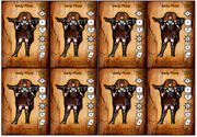 Any thoughts or concerns? |
|
|
|
Post by kiladecus on May 24, 2014 10:35:24 GMT -9
Well, I am still hammering out the colors to match the stats, but these are getting very close. Of course, the stats are NOT accurate). I have to determine how having various skills/abilities will affect the number of stats a card can have. You can't have one figure with one ability "cost" the same as a figure with six abilities. I am still working on the numbers on this, too. What abilities need to be figured into a character's cost, and which don't. Six "lame" or lower-level abilities may be equivalent to two standard abilities, or one really good one. Here is a WIP of the cards for the three sisters... 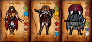 |
|
|
|
Post by dungeonmistress on May 24, 2014 10:59:32 GMT -9
The three sisters are looking really good. About the only thing I would suggest is to make the color of Lady Charity's gloves match her upper bodice - which has the appearance of black velvet. That would make the whole outfit look more 'together' and it would keep her arms from 'getting lost' in the background of the fabric of her cape. Other than that, they look great.
As far as stats go...I have no idea, especially considering that I am unfamiliar with your games mechanics.
|
|
|
|
Post by migibb on May 24, 2014 13:09:29 GMT -9
Looks good David - the shading on the inside of the coloured symbols does help them to pop. Can you do the nunbers themselves in Bold? Just to make them even clearer at a casual glance?
|
|
|
|
Post by kiladecus on May 24, 2014 14:14:43 GMT -9
migibb - I'll take a look at that. I was trying to think of a way to make the numbers stand out a bit. WackyAnne - Don't worry about it... I am still trying to figure them out, myself. The first Icon is going to be a "set" icon. It will have the image of the set, so that way people (read as: "me") can keep track of which figures are from each set. The villains will have a number 1-3, or "L" (for "Legendary Characters"). The compass is "Movement." The Shield is "Defense." The Heart is "Health." The Sun is "Close Combat Damage." The Fireball is "Ranged Combat Attack." The Scroll is "Magical Attack." The colors will be defined later. Each color represents a different aspect. White is Necromancy (Undead). So, a white Heart is an Undead figure. Charity's Scroll marks her as a Necromancer. Hope has a Blue (Mechanical) Scroll: Technomancy (I just made up that word). A Blue Heart is a Construct. And that is how it goes....
|
|
|
|
Post by dungeonmistress on May 24, 2014 14:20:40 GMT -9
Technomancy is a legitimate word (I think). It is what the TechnoMages of Babylon 5 practiced. I have all 5 seasons and most of the movies.  |
|
|
|
Post by cowboyleland on May 24, 2014 14:49:00 GMT -9
Some would say (and I would agree) that any term consciously created by a native speaker is a legitimate word, especially if you are compounding pre-existing fragments like "techno" etc. And yes, I've read technomancy in fiction before, despite the fact that the spell check on this board wants to draw squiggly lines under it.
|
|
|
|
Post by kiladecus on May 24, 2014 17:03:16 GMT -9
I am mixing some concepts from old RPG characters and other concepts. This is an undead assassin I am playing with. Any thoughts? Parduzing? 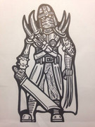 |
|
|
|
Post by dungeonmistress on May 24, 2014 19:33:54 GMT -9
Is he a distant relative of Wolverine's? I think if you adjust the proportion of the legs to the body just a bit (ex:make the legs - from the knee down- just a bit longer), and may it's an optical illusion or maybe it's the blade he's holding, but the right arm looks a little longer than the left.  |
|
|
|
Post by kiladecus on May 25, 2014 15:44:30 GMT -9
Yes, the legs are short. It was a concept sketch. I will clean it up after I refine it a bit.
|
|
|
|
Post by enpeze on May 25, 2014 22:08:58 GMT -9
how about bigger number font? At first glance the font seems rather small compared to the icon boxes. For example how you could do it look at the font size in descent 2 in comparision to the icons. These are large and easy to see.
|
|
|
|
Post by migibb on May 25, 2014 23:09:44 GMT -9
I can see what dungeonmistress means about the right arm on the latest figure - because you are showing the bone, the elbow must be much lower down than the left arm. Because we can't see it..... |
|
|
|
Post by kiladecus on May 26, 2014 5:33:51 GMT -9
That was just a concept sketch. Here is the "actual" figure.  |
|
|
|
Post by dungeonmistress on May 26, 2014 6:33:19 GMT -9
Yeah, that's it! The proportions look good. What if you had him holding his knife up a bit, pointing toward hiss left shoulder? He would seem more...ready, I think.
Can't wait to see his color scheme.
|
|
|
|
Post by kiladecus on May 26, 2014 10:22:59 GMT -9
Once in a while, I draw a figure that I think is striking... I really like the way the skull turned out on this one.
I am happy with the way this turned out.
I haven't had a chance to consider colors yet. I am thinking (as with my other Undead characters) rusty metal, but I am also thinking that since this is a heroic character, maybe giving him some "shiny" equipment.
SKAAR turned out to be a welcomed addition to the game, and he seems to be a fan favorite. This time, the Undead hero will be a little more assassin-like, and be more of a lurker, and less of a berserker.
I like the asymetry of the fiigure. The three spikes on one shoulder, and one on the other; the single side horn... but what I like the MOST about it (aside from the skull) is the belts.
Any other thoughts?
|
|
|
|
Post by kiladecus on May 26, 2014 10:28:18 GMT -9
BTW, I have NO idea of what "mulemulein" means, nor where it came from. I just happened to see this in the post AFTER I posted it. I could have edited it out, but it is SO freaky that the term just showed up there. I laughed when I saw it and said, "What is THAT an where did it come from?" |
|
|
|
Post by migibb on May 26, 2014 11:51:57 GMT -9
The proportions on the finalised one are much better David - I like. Not sure whether I prefer him with or without the scarf round his lower face, though. He does look striking indeed in your cleaned up version - but possibly a bit too "Skeletor"  If he is going to be a bit more "mulemulein" ( have no idea what that is supposed to mean either, but I like it!! lol!!) and "lurky", perhaps having a rag covering his skeletal visage might be more appropriate.....? Like I say, I am undecided. I like both. |
|


 If he is going to be a bit more "mulemulein" ( have no idea what that is supposed to mean either, but I like it!! lol!!) and "lurky", perhaps having a rag covering his skeletal visage might be more appropriate.....?
