|
|
Post by squirmydad on Mar 31, 2014 12:17:50 GMT -9
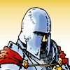
Hey Cardboard Warriors! A paper model publisher would like to help promote the forum by adding a pdf flyer to the cd's they sell. I'm working on the rough now but I'd love some input and assistance on this. What I'm trying to convey in the flyer is free stuff, open discussions, news, and variety. Here's the rough so far, if you have a better idea do please upload it. Thanks all!   |
|
|
|
Post by squirmydad on Mar 31, 2014 19:35:54 GMT -9
Version 2;  |
|
|
|
Post by mesper on Mar 31, 2014 20:23:17 GMT -9
Nice idea! So I'd like to contribute (but how? should I provide some content / figs / back-drops etc.?) And, ehm... "me like" the FIRST version more - kinda beta-version design BUT I can see some more publisher's banners there (including PERMES - just to be honest:)  |
|
|
|
Post by migibb on Apr 1, 2014 3:56:16 GMT -9
I prefer the second one, but would seem fairer to try and get as many of the publisher banners in if you can. The first one looks a bit spartan - too much white. Also - you said there would be punch and pie....?  |
|
|
|
Post by cowboyleland on Apr 1, 2014 4:08:37 GMT -9
After looking at the second, the first seems too white. But the second is too busy. Oh, Goldilocks, where art thou?
How about get rid of the faded banners background and the big two sworded guy to be replaced by two little publisher banners in the top corners (where you can see the faded Okum banner now) and maybe put a publisher banner under each sample figure (looking like basing tabs). Then the text would be easier to read on a white background.
Don't get me wrong; I'm flattered you would feature my mod so prominently, I just don't think this is the best layout possible.
NB: I have opinions, but no expertise!
Cheers!
|
|
|
|
Post by squirmydad on Apr 1, 2014 11:07:18 GMT -9
All these opinions help. Just trying to find the balance that best conveys the information of what this place is. Thanks, I'll keep plugging on it. |
|
|
|
Post by glennwilliams on Apr 1, 2014 13:40:36 GMT -9
I find the text gets lost--maybe a plain single color banner behind it?
|
|
|
|
Post by squirmydad on Apr 1, 2014 15:06:15 GMT -9
Version 2.1;  Version 3;  |
|
|
|
Post by squirmydad on Apr 1, 2014 16:12:27 GMT -9
Version 4;  |
|
|
|
Post by hackbarth on Apr 1, 2014 16:33:59 GMT -9
AAAARGH! >_<
Too polluted! Too much things happening at once! too much noise!
Pick one typeface for the text, simple, black, on white, no border. What is the typeface of the text "The paper miniatures wargaming forum"? It'll do.
Use whitespace to give emphasis to important elements, the first version had that going. The last one has it too.
|
|
|
|
Post by dungeonmistress on Apr 1, 2014 16:40:24 GMT -9
OK. So I did a quick peek "first impression" look at all of these and v1 is too sparse, has an empty feeling to it. V2, is dominated by the big guy, pretty much all you see. V2.1, really busy, almost too much to take in at once, my eye gets 'lost'. V3 better, but still too busy. V4, is more balanced and shows off the designers banners, while at the same time getting the 'free mini's' message across. This one, imho, is the best so far. Almost there. Try putting a pale grey background behind the mini's on each side and around the bottom. Pale grey tends to make things pop.
And what's this about punch & pie and where do I get mine?
|
|
|
|
Post by Vermin King on Apr 1, 2014 18:03:47 GMT -9
I feel sorry for you on this one Squirmydad. It sounds like a project where nothing you do will be 'right'. I wish you all the best with this. I am afraid that someone is going to end up with feelings being hurt. My banner is covered up. Why is my banner at the bottom? I like the direction this is headed, and I hope that level heads prevail. On the other hand, this is a great group, so I believe it will work out.
|
|
|
|
Post by squirmydad on Apr 1, 2014 21:30:54 GMT -9
AAAARGH! >_< Too polluted! Too much things happening at once! too much noise! Pick one typeface for the text, simple, black, on white, no border. What is the typeface of the text "The paper miniatures wargaming forum"? It'll do. Use whitespace to give emphasis to important elements, the first version had that going. The last one has it too. I've collapsed Hackbarth's brain, success! Just playing with elements to see how much I can cram on the page, too much apparently. This one is much simpler. Version 5;  |
|
|
|
Post by squirmydad on Apr 1, 2014 21:38:41 GMT -9
And even simpler version 6;  |
|
|
|
Post by mahotsukai on Apr 2, 2014 2:05:51 GMT -9
The thing with the publisher's banners is that we all know them because we are on this forum, but will the target audience. So would just a list of the publishers that use cardboard warriors be better?
|
|
|
|
Post by cowboyleland on Apr 2, 2014 3:19:22 GMT -9
I like the white back ground over the black and grey one.
|
|
|
|
Post by Vermin King on Apr 2, 2014 3:55:35 GMT -9
I actually like the gray over the white. The thing with the publisher's banners is that we all know them because we are on this forum, but will the target audience. So would just a list of the publishers that use cardboard warriors be better? I think that an alphabetical list would be good. Maybe compact the lower part a bit and slide it to the left and have a column of publishers down the right. |
|
|
|
Post by mesper on Apr 2, 2014 4:13:35 GMT -9
1. No matter what would be BELOW, I'd stay with original CW banner at the top of the flyer - its a good idea - as it shows/reminds what it is all about and what can be seen when opening forums in browser. (if with "Free paper & model showcase" text then perhaps try to lower it somewhat so border/halo effect wouldn't cover too much of a banner?) 2. Agree with hackbarth that layout needs some "air" and fonts clean-up, but then v 5. and 6. looks IMHO just too simple and plain 3. The thing with the publisher's banners is that we all know them because we are on this forum, but will the target audience. So would just a list of the publishers that use cardboard warriors be better? Publisher's logos or banners would be appreciated... mostly by publishers of course:) But then logos and/or banners works for both sides IMHO. And while agree that logos are recognizable mostly, if not only, by already active CW or OBS users, then some banners gives quite good impression what can be found on forums (as more informative/illustrative) so might attract potential users to visit the CW! BTW: trick/solution with whatered banners/logos in the background (like used in v2. / 2.1) might work, but then all foreground elements should be very distinctive (with sound contrast and borders or narrow and darker shadows) Still the question is (as usual:) how to find some golden mean |
|
|
|
Post by dungeonmistress on Apr 2, 2014 6:58:54 GMT -9
I like v5 better than v6.
For those who have been involved in this hobby for a long time, just the name of an artist is enough. But, I remember when, not so long ago, I didn't know who was who, it was the art work that drew me in.
For that reason, I'd say sure, throw in the artists names, they all deserve the recognition. For the newbie, though, show 'em the fabulous art! They will quickly realize that those great Imperfect People come from Dryw the Harper and the beautiful neoclassical look comes from Permes (to use two as an example), and well you get the idea.
The artists banners are attractive each in their own light, but crowded together on one poster, it gets to be too busy. Maybe use instead, one or two examples of an artist's work and that artist's name? Do this in little groupings perhaps surrounding one picture from the Hoard in the middle? Don't over populate it. Sometimes less is more. And if you keep a subtle color in the background it will keep the poster from looking empty and at the same time make what is there POP!
|
|
|
|
Post by glennwilliams on Apr 2, 2014 7:46:40 GMT -9
I like V5. I liked having the big guy in the center, and I really liked the Cardboard Warriors banner across the top, but five is a pretty good effort. This kind of thing drives me nuts when I'm doing the "box art" posters, which is why I just standardized the darned things and stopped thinking about it. So, I'd pick what you like and go with it. You can always tinker with it later.
|
|
|
|
Post by Dagger on Apr 2, 2014 14:55:28 GMT -9
I'm feelin' the love for Armor Grid... Thanks |
|
|
|
Post by Rhannon on Apr 2, 2014 16:26:51 GMT -9
Ok I'm confused, quite incomprehensible ( I am a little, a little is rough my English ) and decidedly unpleasant ( especially going forward ...), but it is.  Erik, I agree with King. Whatever be the choice no one will complain ( because here all the users/producers are kind and sensible and have a lot more passion than economic calculations ) but ... But a very large number of users/producers ( thank goodness! ) and not enough space for all the personal banners, imho. So ... A - Sell spaces, take the money, run away. ( At the end is another personal exploration ) B - Someone makes a banner with a figure for each producer ( a bit like the banners wuth many figures, like that of Permes, but with one for each ). Not forgetting anyone, possibly. With some nice houses in the background by other manufacturers. And on the ground a few tiles by others... One banner. C - No banners. All space for the forum and Onemonk/Squirmidad site and only if necessary a list of present producers. Obviously this is just my personal opinion. I like all these your banners. |
|
|
|
Post by dungeonmistress on Apr 2, 2014 16:54:18 GMT -9
Option B might work - maybe?
|
|
|
|
Post by glennwilliams on Apr 2, 2014 17:07:28 GMT -9
Whatever you choose is fine.
|
|
|
|
Post by mahotsukai on Apr 2, 2014 23:38:32 GMT -9
Let's not forget what we are promoting here.
The purpose of the flyer is to attract people to Cardboard Warriors. So we only need the names of the publishers for those who know the paper scene, and lots of non specific eye candy for those who don't.
|
|
|
|
Post by hackbarth on Apr 3, 2014 4:14:13 GMT -9
5 and 6 are much better!
Drop the papercut awards graphic. It's a nice inside joke for us that are in the hobby, but a bleeding finger will make people uneasy, even subconsciously.
Drop the red oblong surrounding the URL. You can give more emphasis to the URL without limiting it in a box putting it in a line with background contrasting/inverted than with title.
How do I illustrate this?:
Title in white letters over black background
Subtitle in white letters over black background
URL in black letters over white background (entire row)
Rest of the banner going from black to light gray degrade towards bottom
And the same for version 6, with URL in white over black background.
|
|
|
|
Post by hackbarth on Apr 3, 2014 4:31:05 GMT -9
This way:  |
|
|
|
Post by cowboyleland on Apr 3, 2014 4:36:38 GMT -9
If you drop the papercuts graphic, as Hackbarth suggests you might have a bit more space. If you want include some reference to publishers, maybe the last line could read:
"Come out and join the fun with more than twenty commercial publishers and hundreds of players from around the world"
|
|
|
|
Post by madarchitect on Apr 3, 2014 6:07:18 GMT -9
Option 5 is IMO the best. I would slightly darken the gradient on the bottom of the page however (darker background will make the miniatures stand out more. Also I would suggest dropping the white shadow for the advertising text (the border is enough and the shadow does not add to its readability) and contracted it a bit to the centre of the flayer. As it is now the text is much too close to the miniatures on the margins, also the top line about monthly hoard should go one or two lines lower. As for the publishers logos/ listing, I'd suggest a simple list at the bottom of the page "Supported by: One Monk, Permes, Okum Arts... etc". Just Plain text not to cram the flyer with unnecessary graphics. Those who know the brands, would get the info who is here, those who don't would get the info "there is a lot of us" (or "our name is Legion for we are many..."  ) |
|
|
|
Post by Vermin King on Apr 3, 2014 13:05:04 GMT -9
"our name is Legion for we are many..."  |
|


 )
)

