|
|
Post by pavaro on Feb 21, 2015 13:20:06 GMT -9
I know that this thread was cited by me several times but you must help me. What do you think about my another figurines - PAVARO Studio figurines? Are they acceptable? Or maybe are too "dwarf/midget"? Maybe I should go in a human direction? Human proportions etc. |
|
|
|
Post by Brave Adventures on Feb 21, 2015 13:40:19 GMT -9
Very cool Pavaro. I really like your skeletons. They are very expressive.
Ryan
|
|
|
|
Post by pavaro on Feb 22, 2015 0:44:46 GMT -9
Very cool Pavaro. I really like your skeletons. They are very expressive. Ryan Thanks but are not they too dwarf? What do you think about these 3 vampires? |
|
|
|
Post by wyvern on Feb 22, 2015 2:02:11 GMT -9
There's nothing inherently "wrong" with dwarf skeletons - or indeed any other kind, halfling, elf, orc, human, animal, monster, etc. - but it depends whether it's really your chosen drawing style you're meaning here, or how you've designed these specific minis. If meant as dwarfs, the skeletons (especially the one above the J-key) work better that way for me than the vampires. The vampires too could be non-humans just as much as humans, but if they're meant as humans, the hands seem really over-sized. I'm not sure the pose for the female vampire works too well at present either; a taller, more human-proportioned, redrawing might work better, perhaps (doesn't really look haughty enough just now). Interesting basing technique too, though I suspect it may be a little restrictive for most gamers  |
|
|
|
Post by pavaro on Feb 22, 2015 3:02:17 GMT -9
I wanted obtain effect "warhammer battle figurines". They have in itself something unusual. These figures have excessively big hands. Therefore my female vampire has also greater hands etc. I want do figurines with character but I want not do figuirnes for the youngest children only...
|
|
|
|
Post by cowboyleland on Feb 22, 2015 5:14:20 GMT -9
I don't play "warhammer" but the large hands themselves don't bother me. I especially like the guy in the red armour and all the skeletons look good. The male vampire seems a little short, since he is standing straight and the skeletons have bent knees or spines. I am not sure how he is holding his sword. In most poses like this the hands would be on top of the pommel. In this case his right wrist seems to pass through the grip.
In general your style is starting to remind me of Patrick Crusiau, and there is nothing wrong with that!
|
|
|
|
Post by pavaro on Feb 22, 2015 6:37:59 GMT -9
The problem is that I am looking for my style still. These figures are sample project. Made on fast.
|
|
|
|
Post by pavaro on Sept 5, 2015 10:31:31 GMT -9
Hi again. Which variant figures is better? I mean proportions. I note that I want create characters not necessarily about ideal proportions. They must be sweet but and mature. I hope I explained it well.  |
|
|
|
Post by Vermin King on Sept 5, 2015 11:59:27 GMT -9
The first one is much better for 'sweet and mature'. The second seems more like someone who is looking for an excuse to cut your head off
|
|
|
|
Post by pavaro on Sept 5, 2015 22:20:42 GMT -9
After many rehearsals, I came to the conclusion that I have the best draw on a reduced scale. Hence two examples, 4,5 and 4 head height. It is small difference but for me very important.
|
|
|
|
Post by pavaro on Mar 3, 2016 7:35:53 GMT -9
|
|
|
|
Post by mproteau (Paper Realms) on Mar 3, 2016 7:44:59 GMT -9
I think either works fine. Once printed, some folks print quality will mean there is NO difference. Once printed, some folks eyesight will mean there is NO difference. So, if working in black lines means you don't have to think about colors while laying down lines, I vote black. |
|
|
|
Post by migibb on Mar 3, 2016 7:51:17 GMT -9
As mproteau (Paper Realms) says, the print quality and small size of the peces will probably mean there is little difference. I prefer the lower ones (with the black lines) just to make them "pop" a bit more...... |
|
|
|
Post by pavaro on Mar 3, 2016 8:16:03 GMT -9
Ok, but I often draw few details on small surface. This causes that a figurines are unclear/blurred. If I use black lines.
|
|
|
|
Post by mproteau (Paper Realms) on Mar 3, 2016 8:24:20 GMT -9
Ok, but I often draw few details on small surface. This causes that a figurines are unclear/blurred. If I use black lines. First, you don't have to be all-or-nothing. You can use colored lines sometimes, all times, never. Whatever works best. But, you may find that those little details when shrunk down and printed are either *too* detailed to really make a difference. Or, maybe not - in which case you get to use your judgement. My point is, take heart in knowing that even if you pick the wrong answer, it's not wrong, and your figures will be fine. I think in general, the black lines add nice contrast. You run the risk of being too subtle with colored lines, but still in some circumstances it might work out better. |
|
|
|
Post by migibb on Mar 3, 2016 10:09:41 GMT -9
Just experiment with it - and use the black lines for the main details perhaps? The ones you want to really "pop"....
|
|
|
|
Post by pavaro on Mar 3, 2016 10:36:36 GMT -9
Ok. I will try to do some models and try out different variants.
|
|
|
|
Post by pavaro on Apr 18, 2016 7:57:06 GMT -9
Today I would like to ask you for help. Here are my sketches of figurines. www.pavarostudio.pl/koncepcja-wygladu/Tell me, which variants are better? Please select one number from each image. E.g A1 and B1... |
|
|
|
Post by migibb on Apr 18, 2016 10:16:39 GMT -9
I would say A2 and B2 myself. A1 is a bit too short - the head is too large and out of proportion for my taste. As far as the shading goes I would probably have preferred something in the middle. There is just a bit too much dark in the first one - although it may look much better if it were, for example, varying shades of blue.....
|
|
|
|
Post by cowboyleland on Apr 18, 2016 17:24:00 GMT -9
I agree completely with migibb. |
|
|
|
Post by Vermin King on Apr 18, 2016 18:36:23 GMT -9
I prefer B2 to B1, but the A figures are more difficult. A1 seems short and A2 seems too tall or thin
|
|
|
|
Post by pavaro on Apr 18, 2016 20:04:57 GMT -9
|
|
|
|
Post by migibb on Apr 18, 2016 23:07:35 GMT -9
I like the Darkest Dungeon characters, but I think the heavy shading on them works due to the overall darkness of the scenes in which they appear (poorly lit etc.) And again, I think having the colouring rather than just the shadows makes a big impact on how you see them..... I would say that the DD ones (and mainly due to the amount of black on them) remind me of Aston Sperry's style on the earlier Pathfinder Paper Minis. I would suggest checking his DA page for more inspiration: whodrewthis.deviantart.com/gallery/ |
|
|
|
Post by pavaro on Apr 19, 2016 6:56:09 GMT -9
The shading is in the testing phase. We'll see what will be. Regarding too small figures. Here is drawing which I found in net. I would like to model themselves on him. What do you thing about this drawing? 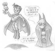 |
|
|
|
Post by cowboyleland on Apr 19, 2016 8:59:09 GMT -9
I cant get back to your drawings to check, but I would say that the rather extreme facial expression and expressive posses of the french cartoon help to make the unrealistic body proportions OK. Charming, even. If the faces on your soldiers were equally expressive I think you could get away with it. Many people seem to like light hearted minis.
|
|
|
|
Post by pavaro on Dec 1, 2016 9:14:30 GMT -9
Which proportions for minis are better? Or which sketches are more suitable on minis?  |
|
|
|
Post by Vermin King on Dec 1, 2016 9:20:13 GMT -9
I prefer the first two, but I've been doing a number of chibi figures lately, so my opinion may be skewed
|
|
|
|
Post by cowboyleland on Dec 1, 2016 10:01:47 GMT -9
I prefer the one on the right. Irritating, isn't it?
|
|
|
|
Post by pavaro on Dec 1, 2016 10:06:47 GMT -9
Yes is it. I'm waiting on more opinions. I am very curious what others think. Can you explain why?
|
|
|
|
Post by cowboycentaur on Dec 1, 2016 10:34:46 GMT -9
I prefer the ones on the right. Larger heads look more cartoony which is not what I want in a miniature.
Stylized is okay, but without proper body proportions they don't fit well with my other minis.
|
|


