|
|
Post by wyvern on Dec 1, 2016 10:35:02 GMT -9
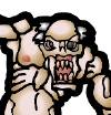
The right hand pair for me as well.
Why is easy - because they're closer to scaled human proportions, so are slightly less caricatured than the other pair, and I prefer minis nearer to normal human proportions.
|
|
|
|
Post by pavaro on Dec 1, 2016 20:49:39 GMT -9
Thanks for previous answers. I know that this topic is boring but please about more opinions. I would like to design another figures but I have to set the style.
|
|
|
|
Post by pavaro on Apr 6, 2017 7:04:29 GMT -9
Which is better?  |
|
|
|
Post by chiefasaur on Apr 6, 2017 8:17:48 GMT -9
They are BARELY different enough to tell apart from a full view. I doubt such subtle changes will be even visible on the physical models.
|
|
|
|
Post by Vermin King on Apr 6, 2017 8:22:37 GMT -9
Very subtle, but I like the middle one best. I'd know more if they were in color, but I understand not wanting to color the ones that might be discarded
|
|
|
|
Post by migibb on Apr 6, 2017 8:25:13 GMT -9
I'd go for the middle one too.... The one on the left has too much of a big head... Not too much difference between the other two, but I think the middle one is slightly more "balanced".
|
|
|
|
Post by pavaro on Apr 6, 2017 9:58:36 GMT -9
Thank you for your help. Maybe it sounds stupid but this model is important to me. It is a model for other my figures / figures (I mean proportions). This is a curse for me because I still see my mistakes in drawing. And does the big head do not give a "nice effect"? I do not want to do exactly human proportions. Light deformation is supposed to give the effect of sweetness and maturity. Many artists in this forum are not doing exactly human characters. I do not know how to put it exactly... I do not know where to look for sources how to achieve this goal.  |
|
|
|
Post by Vermin King on Apr 6, 2017 12:39:04 GMT -9
Do you read any online web-comics? I read Girl Genius fairly regularly. I downloaded some of the characters that were close to a figure view (feet fairly flat at the same elevation) and reduced them to the size of miniatures and printed them off. I liked the look (they would fit in with Dave Okum's figures). Since that exercise, I look at similar proportions as being good for the table.
|
|
|
|
Post by migibb on Apr 6, 2017 15:09:23 GMT -9
Thank you for your help. Maybe it sounds stupid but this model is important to me. It is a model for other my figures / figures (I mean proportions). This is a curse for me because I still see my mistakes in drawing. And does the big head do not give a "nice effect"? I do not want to do exactly human proportions. Light deformation is supposed to give the effect of sweetness and maturity. Many artists in this forum are not doing exactly human characters. I do not know how to put it exactly... I do not know where to look for sources how to achieve this goal. Oh i expect some deformation of proportion, all 3 of them have "unrealistically" big heads. It;s just the one on the left is a little *too* big IMHO. But it is personal taste!  |
|
|
|
Post by jeffgeorge on Apr 6, 2017 17:27:41 GMT -9
Do you read any online web-comics? I read Girl Genius fairly regularly. I downloaded some of the characters that were close to a figure view (feet fairly flat at the same elevation) and reduced them to the size of miniatures and printed them off. I liked the look (they would fit in with Dave Okum's figures). Since that exercise, I look at similar proportions as being good for the table. I'd love to see Foglio do some minis... |
|
|
|
Post by whisper31 on Apr 6, 2017 18:11:21 GMT -9
Do you read any online web-comics? I read Girl Genius fairly regularly. I downloaded some of the characters that were close to a figure view (feet fairly flat at the same elevation) and reduced them to the size of miniatures and printed them off. I liked the look (they would fit in with Dave Okum's figures). Since that exercise, I look at similar proportions as being good for the table. I'd love to see Foglio do some minis... Now that I can agree with. He did some great stuff back in the Dragon mag days and his other stuff is great as well. Wendy and Richard Pini did some beautiful work with ElfQuest, and Steve Gallacci did great work with Albedo Anthropomorhics. I'd love to see these folks come back (if they are still around). |
|
|
|
Post by pavaro on Apr 6, 2017 20:09:10 GMT -9
Do you read any online web-comics? I read Girl Genius fairly regularly. I downloaded some of the characters that were close to a figure view (feet fairly flat at the same elevation) and reduced them to the size of miniatures and printed them off. I liked the look (they would fit in with Dave Okum's figures). Since that exercise, I look at similar proportions as being good for the table. I'm pretty green in comic titles. I watch a lot of graphics on the web. That's not it though. Thanks for the source. It seems to me that these are human proportions. Maybe I'm wrong? Oh i expect some deformation of proportion, all 3 of them have "unrealistically" big heads. It;s just the one on the left is a little *too* big IMHO. But it is personal taste! You're right. This model (from left) is "sweet" but other characters no longer look like this. Hence my question. I'll ask for more criticism. I model in part on such authors: 8rad pasiphilo (Normal proportions rather) Sanity Studio Or maybe you know books, links, forums, other sources, how to create people in other proportions? |
|
|
|
Post by 8rad on Apr 7, 2017 10:03:16 GMT -9
I like the middle one, but really you need to look at them on a table. The main point of enlarging hands feet and head, like with plastic/metal minis is they are to give expression and character from the perspective of the player looking down on them on the table. Another wee tip is learn to like your mistakes. One of the appeals to me anyways like all hand drawn art over cgi/photo realistic is the mistakes. These really add the human/boardgamey touch.
Keep practising but try not compare your style to others too much. Emulate what you find appealing in others pieces but mix it up your way to make something that is truly your style. =)
8rad
|
|
|
|
Post by pavaro on Apr 7, 2017 21:59:46 GMT -9
Thank you all for the advices. I will try to take them into consideration and soon share something.
|
|
|
|
Post by pavaro on May 8, 2017 6:53:26 GMT -9
I have a problem with my banner. I wonder how to draw the fill of this banner to be natural. Normal lines are a bit artificial. Do you know any tricks how to make "embroidered" banner in photoshop? For help thank you in advance.  I decided to draw models according to my natural style.  |
|
|
|
Post by pavaro on May 8, 2017 10:52:28 GMT -9
Does anyone have any idea?
|
|
|
|
Post by Vermin King on May 8, 2017 12:54:49 GMT -9
I don't really think it needs the cloth pattern
|
|
|
|
Post by pavaro on May 8, 2017 19:54:04 GMT -9
Maybe I wrote wrong. I want to make a symbol on the banner. How to make it real? I do not mean fabric texture.
|
|
|
|
Post by pavaro on May 10, 2017 6:13:23 GMT -9
Do I understand that no one will help?
|
|
|
|
Post by Vermin King on May 10, 2017 7:23:04 GMT -9
It would probably help if we knew what you wanted to put on there
|
|
|
|
Post by kgstanley81 on May 10, 2017 7:36:19 GMT -9
If it's near the top of the banner, it looks like the center would be a little bit bigger than the edges ( smaller, BIGGER, smaller)
Don't know if this helps
|
|
|
|
Post by cowboyleland on May 10, 2017 9:31:53 GMT -9
The folds are (of course) going to hide or distort little bits of the emblem. At this scale I wouldn't worry about showing stitching or anything like that unless it is very crude.
|
|
|
|
Post by pavaro on May 10, 2017 20:01:18 GMT -9
Can you send some sketches of emblems for undead?
|
|
|
|
Post by factoria tabletop on Jan 7, 2018 4:59:35 GMT -9
Which is better? i think i am arrive late to the party but i will give you my opinion. for me the best is the third one ( the one in the right ), the head is not so much big like the first one and the line on the legs are thicker than the others... I like so much the style! My best regards! |
|
|
|
Post by pavaro on Jan 7, 2018 9:06:29 GMT -9
Which is better? i think i am arrive late to the party but i will give you my opinion. for me the best is the third one ( the one in the right ), the head is not so much big like the first one and the line on the legs are thicker than the others... I like so much the style! My best regards! Thanks for opinion. Unfortunately or well I changed my style and this project is not actual already. Maybe in the future I show new sketches. |
|
|
|
Post by pavaro on Jan 9, 2018 7:35:00 GMT -9
Which chain mail is better?  ![]() |
|
|
|
Post by Papercraft Warrior on Jan 9, 2018 7:54:09 GMT -9
To my eyes, the second one
|
|
|
|
Post by pavaro on Jan 9, 2018 7:55:43 GMT -9
To my eyes, the second one On the left or on the right? |
|
|
|
Post by Papercraft Warrior on Jan 9, 2018 8:07:01 GMT -9
To my eyes, the second one On the left or on the right? Going from the left side, to the right side, and indexing the leftmost element with an index of "1", the chainmail No. "2" is the best looking to my eyes. I should add that from a greater distance, the No. "1" better reads as being chainmail, the No. "2" blends in with the overcoat. Take note -> all of this is from looking at my computer screen, I do not own a printer. |
|
|
|
Post by factoria tabletop on Jan 9, 2018 8:23:56 GMT -9
In my opinion from left side 1 and 2, they have more visual power because the head is in black line...
anyway, they are so cool...maybe i need to start to copy justtttt a little your pictures, just for learn!
see ya!
|
|