|
|
Post by pavaro on Jan 9, 2018 11:33:16 GMT -9
On the left or on the right? Going from the left side, to the right side, and indexing the leftmost element with an index of "1", the chainmail No. "2" is the best looking to my eyes. I should add that from a greater distance, the No. "1" better reads as being chainmail, the No. "2" blends in with the overcoat. Take note -> all of this is from looking at my computer screen, I do not own a printer. My first idea was third from the left but it looks like aaa hair of Ludwik XIV... So my next combinations have given these variations. Thanks for opinion. Of course, it looks like a chain mail though? In my opinion from left side 1 and 2, they have more visual power because the head is in black line... anyway, they are so cool...maybe i need to start to copy justtttt a little your pictures, just for learn! see ya! Nice to hear but my workshop is still at the stage of further development. There are many artists in this forum that you can learn from.  |
|
|
|
Post by cowboyleland on Jan 9, 2018 13:36:18 GMT -9
I think I like the one on the far right the best.
|
|
|
|
Post by pavaro on Jan 9, 2018 21:02:40 GMT -9
Thanks. It's getting more and more interesting. But it will be a problem to choose....  |
|
|
|
Post by cowboyleland on Jan 10, 2018 6:07:37 GMT -9
I think you need to trust yourself. I don't think if you had shared just one of these anyone would have complained about the chainmail.
|
|
|
|
Post by Papercraft Warrior on Jan 10, 2018 7:20:22 GMT -9
I think you need to trust yourself. I don't think if you had shared just one of these anyone would have complained about the chainmail. I support this message. |
|
|
|
Post by mproteau (Paper Realms) on Jan 10, 2018 7:54:29 GMT -9
I think you need to trust yourself. I don't think if you had shared just one of these anyone would have complained about the chainmail. +1 this. Or, put another way, I prefer any of them over none of them. Life is too short to sweat the small stuff. You do good work! |
|
|
|
Post by okumarts on Jan 10, 2018 8:09:42 GMT -9
Words to live by:
|
|
|
|
Post by pavaro on Jan 10, 2018 12:18:57 GMT -9
Unfortunately something tell me to be perfectionist. I hope that more people will talk about my chainmail. All reviews are welcome. |
|
|
|
Post by oldschooldm on Jan 10, 2018 13:13:46 GMT -9
As my CEO's have been fond of saying (and I learned to say as a software CEO): "Ship it!"
|
|
|
|
Post by pavaro on Feb 14, 2018 10:34:16 GMT -9
Which lineart (line thickness) is better? 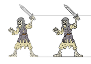 |
|
|
|
Post by Papercraft Warrior on Feb 14, 2018 10:37:06 GMT -9
Which lineart (line thickness) is better? Left one looks nice close-up, but the right one is easier to read when looked at from a fair distance. |
|
|
|
Post by pavaro on Feb 14, 2018 10:38:48 GMT -9
Which lineart (line thickness) is better? Left one looks nice close-up, but the right one is easier to read when looked at from a fair distance. Thanks for the observations. Which would you choose? |
|
|
|
Post by Papercraft Warrior on Feb 14, 2018 10:41:39 GMT -9
Left one looks nice close-up, but the right one is easier to read when looked at from a fair distance. Thanks for the observations. Which would you choose? Right one for the print pages. Left one for the big size previews on webshop pages. |
|
|
|
Post by pavaro on Feb 14, 2018 10:44:25 GMT -9
My first assumption is the one on the right but I'm afraid it's too dark and childish...
|
|
|
|
Post by mproteau (Paper Realms) on Feb 14, 2018 11:12:42 GMT -9
The right one, definitely. When printed, the heavier lines will be really useful for picking up the details.
Excellent mini.
|
|
|
|
Post by pavaro on Feb 14, 2018 11:19:28 GMT -9
I love this forum. You are very helpful! |
|
|
|
Post by pavaro on Feb 14, 2018 11:24:32 GMT -9
I know that the problem can will be in drawing style but I don't know if heavier lines are useful everywhere. Example: 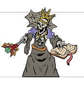 |
|
|
|
Post by mproteau (Paper Realms) on Feb 14, 2018 11:28:49 GMT -9
First off, that mini looks awesome! Some lines may be darker than they need to be in that figure, but that doesn't mean they're too dark. There are some areas where it's black rather than shading, but that's just a style thing. I think this guy looks fantastic.
|
|
|
|
Post by pavaro on Feb 14, 2018 11:51:26 GMT -9
I have such thoughts, because I see a lot of graphics eg on deviantart and there are no such characters. |
|
|
|
Post by mproteau (Paper Realms) on Feb 14, 2018 12:57:15 GMT -9
pavaro! If you are questioning your designs simply because you haven't seen the same style elsewhere... NO! Do I need to list the wonderful and prolific designers here who have styles completely their own?!? A wise forum member once said in this thread: "I prefer any of them over none of them. Life is too short to sweat the small stuff. You do good work!" If I were you, I'd find that person and let him or her know "You're right, and because of your encouraging words, I'm going to finish up a set of my really awesome skeletal minis, and people will like them because they are good." Oh, and if you want to make sure that set of minis has cutfiles, make sure they fit within the safe cutting area defined in the cutting guides I've attached to a bunch of threads... 
|
|
|
|
Post by pavaro on Feb 14, 2018 23:16:56 GMT -9
I know that we are re-working this topic once again. I still have the impression that I do not have the effect that I would like minis to have. I am thinking of simplified characters with realism. I do not know if it is achievable. Because of the fact that I have been working on my workshop for so long, we have what we have now. So such figures.
|
|
|
|
Post by cowboyleland on Feb 15, 2018 8:19:25 GMT -9
I thought I posted here yesterday but it looks like it got lost. I like these figures. The thicker lines on the right sword wielder brings out the detail at distance. I like the Lich just the way he is, too. The magically floating spellbook is a cool touch.
|
|
|
|
Post by pavaro on Mar 7, 2019 10:43:12 GMT -9
How do you think which version will be better adopted? I mean the proportions. 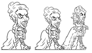 Do the characters above should have four fingers? Example  And what do you think about such figures?  |
|
|
|
Post by cowboyleland on Mar 8, 2019 7:00:32 GMT -9
In your first picture: I prefer the figure on the far right. But that is beause it is closest to natural proportions and I am boring.
I don't think the number of fingers is ever going to make-or-brake a 30mm figure. Most people probably won't notice a difference.
I think the final picture you posted has too light line weight to read at 30mm scale on the gaming table.
YMMV
|
|
|
|
Post by pavaro on Mar 9, 2019 11:18:23 GMT -9
I have a question for everyone. Do you know any websites, guides, authors who draw in such styles? Example 1Example 2 |
|
|
|
Post by cowboyleland on Mar 9, 2019 14:55:52 GMT -9
Example 1 looks a bit like Trashmobs, but not really.
Example 2 leads to a non-specific page.
|
|
|
|
Post by pavaro on Apr 29, 2019 23:48:35 GMT -9
As usual, I give it back to your evaluation. Which sketch is better. I'm sorry I do not publish any figurines. They are not good enough to qualify for this. 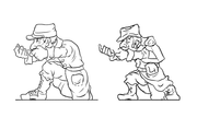 |
|
|
|
Post by Vermin King on Apr 30, 2019 3:26:28 GMT -9
I like them both. The left figure seems slightly thick and the line art should be bolder. The one on the right seems a tad thin figure-wise, but I like the bold line art
|
|
|
|
Post by pavaro on Apr 30, 2019 5:42:30 GMT -9
I like them both. The left figure seems slightly thick and the line art should be bolder. The one on the right seems a tad thin figure-wise, but I like the bold line art How would you have to choose which one? |
|
|
|
Post by Punkrabbitt on Apr 30, 2019 21:11:04 GMT -9
I like the one on the right.
|
|


