|
|
Post by squirmydad on Sept 1, 2014 9:54:28 GMT -9
The theme for this months HOARD is  Halloween Frights! Halloween Frights! This can be any sort of miniature on the above theme or feel free to submit miniatures off theme. If you submit a figure, they must include both front and rear art, have a proper trimming outline, and include instructions for multi-part models. Recolors and figure mods are encouraged, and even uncolored designs are welcome. No nudity or sexuality, but bloody gory and horrifying is encouraged. If you have questions about how to design your figures, like formats, resolution, and stuff like that, see the HOARD GUIDELINES in this forum category. Entries for the Hoard will be accepted until the last day of September, 2014. Halloween? But it's September?!?! It's also a tradition so folks will have toys to use in their Halloween themed adventures come October.  So what scares you? What represents lurking menace that stop your heart if it showed up on your doorstep? And don't forget to vote in the Papercuts 2014 showcase. Papercuts 2014 |
|
|
|
Post by gilius on Sept 8, 2014 16:19:54 GMT -9
Here is my contribution to this horde: The Monster. It stands around 36mm at eye level. 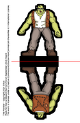 Funny thing is, the use of essentially the same color palette as Shrek was not a conscious decision. |
|
|
|
Post by wildagreenbough on Sept 8, 2014 22:14:39 GMT -9
Nice one to kick off this month's hoard |
|
|
|
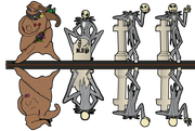
Post by 8rad on Sept 11, 2014 8:23:52 GMT -9
|
|
|
|
Post by squirmydad on Sept 11, 2014 18:07:52 GMT -9
Oh, that's fun!  Not frightening, but quite delightful. |
|
|
|
Post by aaron on Sept 18, 2014 14:30:40 GMT -9
ok it's time for another anual Pumpkin mancer!! lets see if I have improved over last year! W.I.P. ! 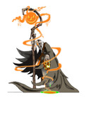 |
|
|
|
Post by pavaro on Sept 18, 2014 22:43:03 GMT -9
WOW!!!!! This image is great. Tell me, do your figurines printed have the same vivid colors on paper (or close)? |
|
|
|
Post by aaron on Sept 19, 2014 4:38:57 GMT -9
as far as I can tell they do? I haven't printed this bad boy yet, he's not quite done yet and of coarse he's going to be surrounded by his pumpkin men assassins ! soooo I think they will though it depends on the printer. I have a new printer with some pretty cool stuff so it will probable look ok, but honestly on most printers the dark grey will come out as black and lot of the more subtle detail will be washed and blended together, as far as the orange and green though it should POP and his skin tone should do well. here he is (again work in progress) but now you can see him at 28mm with the front having a black boarder, the back is still being worked on OBVIOUSLY, if you want to have a go printing it up and seeing what it looks like have at it! 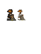 |
|
|
|
Post by mproteau (Paper Realms) on Sept 19, 2014 7:09:01 GMT -9
He's a really cool mini - if I didn't like him, I wouldn't bother with offering constructive criticism...  I'm not sure I like the dripping stuff... The skull he's holding is inside the folds of his cape, but the drip/puddle appears outside. It looks like you've got some perspective thing going on like he's holding it way out from his body, but my brain is having a hard time reconciling the depth of each element. Maybe consider pulling the skull out from under the sleeve? |
|
|
|
Post by pavaro on Sept 19, 2014 7:14:58 GMT -9
I ask because my projects are always bland. I know that it depends on many factors.
|
|
|
|
Post by zygrott24 on Sept 19, 2014 18:32:24 GMT -9
My Jack Skellington WIP:  Those skinny limbs are hard to deal with. I will try to get Oogie done too if I can finish up Jack. |
|
|
|
Post by aaron on Sept 20, 2014 8:13:09 GMT -9
mproteau (Paper Realms) first thanks for the constructive criticism! over on Deviant art I can't get anyone to tell me anything except the boot lickers who tell you how awesome your stuff is when they themselves have no idea about art Of coarse I typically smile and thank them for their praise even though half (or more ) are probably bots. LOL so thanks for the incite. ok second the perspective issues are an ... well, Issue and here's why, his sleeves actually aren't sleeves it's he has on something like a poncho. so If I broke down the layers of his outfit (now I feel like one of those announcers at a fashion show) here we have the pumpkinmancer in a 5 piece ansambel that looks fabulous and says I'm here to turn pumpkins into horrible knife wielding assassins. he has on almost invisible pants (because their covered up by everything else)then he has on a shirt, then a cloak and finally a poncho ish thing. since he never bothers to separate the colors from the whites when he does laundry eventually all his cloths fade to that same color grey. he's also wearing really nice converse the high tops of coarse, their the perfect foot ware for Pumpkinmancing. so this is why the perspective gets confusing.... and to top it all off the skull is actually a rotting pumpkin .... there is no human body parts being held .... this is why I try to avoid foreshortening in all my models it just doesn't work very well in the 2d. hummm maybe I will do the pumpkin floating next to him ..... ok pavaro this is the stuff I pay attention to It might help it might not, in any image the picture should tell a story. if you look at a photographer they are always on the look out for the one shot that will have the most impact. the biggest bang for the buck as they say here in the U.S. (and probably other places) the factors for telling a story with a single image in art is, proportions, line, light or lighting and color. technically color is lite but for the purposes of impact you have to separate them. Proportions are really the hart and sole of any model. understanding how something is supposed to look and how it moves are essential to any and every artist period. It's the first class you take in basic art, and it's reinforced throughout your art carer. I have several anatomy books that I reference on a regular basis, I could probably be a doctor with as much as I have studied the human body and all it's parts and pieces ... ok not really, don't ever take medical advice from me, and never EVER let me operator on you LOL that being said motion is the one thing I see a lot of people messing up on (including me) it's easy to do but knowing what something looks like and knowing how it moves are two very different things. taking a basic animation class or studying animation will help your images IMMENSELY! I give that advice to everyone and anyone. knowing how the bones move and twist, knowing how the muscles flex and relax and knowing that the upper body is capable of way more motion than people think. like your collar bones are meant to let your shoulders come together slightly so when some one is shrugging their shoulders like I don't know... they are actually bringing their shoulders slightly up but more moving them forward this will fundamentally change the shape of the upper body and it will mean that 99% of all shoulder pads are drawn wrong because they have to be able to compensate for that forward motion. when a warrior is swinging a sword that forward shoulder motion comes into play in a big way and for a few seconds contorts the shape of the upper body. so paying attention to motion and proportion is essential to a good model. Line is all about the position movement of a person place or thing, it's where you get into the law of 2/3rds and horizontal and diagonal line. (horizontal/ vertical lines represent stationary or standing still ) diagonal lines represents movement, using zygrott24 Jack Skellington as an example the head stones are stationary and in a horizontal position and Jack who is in obvious motion is diagonal to the horizontal stone. (well done btw!) lighting is SUPER important and changes the mood of anything it's going to effect how you see the line of an image and what not, a beach during a sunrise is half lit but the rays of light are more direct and everything takes on a sort of pinkish hue, the same beach at mid day will not even look like the same place all the colors and places will pop and all the shadows will to their will be very little gradients to anything and the world will be in sharp focus. and then again at sunset when the world turns blue and the shadows seem to creep out from where they were hiding and dance and mix with everything around them and the sky lights up in oranges and lavender ... but the soft defused lighting creates an almost eary/romantic mood. Then finally color. your eyes will skip anything grey. you just don't look at it as much. the first color your eyes will go to is red. the next is yellow that's why warning signs are always red an yellow. wo when ever you use red and or yellow that's the first thing people will see. on the color wheel (if you don't have one you should download one from the web somewhere) there are two types of color defined by heat. Hot colors and cold colors. so if red is the hottest color and blue is the coldest color then make those north and south then cut the color wheel in half. everything north of orange is hot and everything south of green is cold. in My design classes in college they taught us to use Hot colors to make something pop and cold colors to highlight what's popping. also colors are important because they have a psychology behind them (which I am not getting into here) each color has a meaning associated with it like black is death but if you mix it with silver or gold then it's elegant. it's something worth looking up if you haven't done so already. now when you are dealing with a 28mm model all that stuff I just said is HYPER important. colors don't work they way you think they are going to and you almost have to Ignore lighting and make everything SUPER gaudy. like if your elf has a green shirt you would want it to be a woodland green but when you print it out at 28mm its a dark forest green almost black... so to make it look right you have to make his shirt a bright florescent green almost yellow so when you print it the shirt looks green. The reason for this is the difference between destructive coloring and constructive coloring. when you color things on a computer you are using constructive coloring (playing with light) when you print the image off on your printer you are using destructive coloring (taking a white piece of paper and destroying it's perfect albedo to make different colors.) If you don't know what Albedo is or If you are unsure about the difference between constructive and destructive coloring then I defiantly suggest looking it up because it plays a HUGE part in why models don't print they way they look on screen. ok hope that helps at all and I didn't just tell you a bunch of stuff you already knew LOL cheers!
|
|
|
|
Post by pavaro on Sept 20, 2014 10:55:23 GMT -9
aaron Thank you very much for your time and useful learning. Your tips will be helpful. I know that will be stupid question but what you use to shading and brightening (what technique do you use?) ?
|
|
|
|
Post by aaron on Sept 20, 2014 15:11:54 GMT -9
as they say the only stupid question is the one never asked. Remeber I am new to mini paper models so my skills are still improving but I have that toutorial that I created and I still basically use that same formula. here it is cardboard-warriors.proboards.com/thread/5702/temporum-toutorial you may recall? I should probably do another one showing how I make it 28mm after the whole thing is done. but I have changed the color types that I use due to the way it looks when it's printed now I go for really bright colors to start and then I add shadow lines and a few highlights but mostly the colors I Use to start are near florescent. If something isn't clear or you have any questions I am always here! |
|
|
|
Post by cowboyleland on Sept 20, 2014 17:09:54 GMT -9
Hey aaron, the one thing that looks out of place to me in your figures are the "airbrushed" shadows. Have you ever tried hard edged shadows, like in the Batman animated series for example? I think they would mesh better with your bold style. Just a thought. @ Zygrott24: don't forget that the thick black outlines we all love will have the effect of thickening the limbs, so you might be able to get away with limbs nearly as thin as the original has. |
|
|
|
Post by pavaro on Sept 21, 2014 0:21:53 GMT -9
aaron : Well yes...There is a thread. Sorry for my mistake and thanks for your answer.
|
|
|
|
Post by aaron on Sept 21, 2014 5:06:44 GMT -9
cowboyleland It was squirmydad who said it best, when he described the amount of effort for the amount of payoff as a diminishing return. using solid shadowing would defiantly look better however it would require more time to map out the light source, create and keep a color chart and each shadow and highlight would become it's own work of mini art and heaven help me I would never use another cape or anything like it. using the technique I do now may not look as good as solid shadows but it's quick and dirty for it's return. I don't have to map it and I don't have to think much on the light source just a simple thing take less than 5 minutes to shade a whole model which is good when your trying to make a unit of 20.
|
|
|
|
Post by cowboyleland on Sept 21, 2014 11:43:19 GMT -9
Hi aaron, I totally understand cost-benefit based decisions. Shading is the thing I am the WORST at. I just assume it is easier for others by several orders of magnitude. Knowing that doing it super well is a challenge even for someone as talented as you actually makes me feel a bit better about myself. Thanks for taking the time to answer. |
|
|
|
Post by squirmydad on Sept 21, 2014 12:59:40 GMT -9
|
|
|
|
Post by cowboyleland on Sept 21, 2014 16:31:06 GMT -9
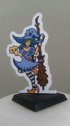
Here is my contribution, sort of at wyvern's request and with thanks to jackmatt once again. Jackmatt is my go-to guy when I need a suit.  Image Update: I realise I had forgotten to change the length of the jacket on the back.  It is fixed now. |
|
|
|
Post by aaron on Sept 21, 2014 17:18:23 GMT -9
Hi aaron, I totally understand cost-benefit based decisions. Shading is the thing I am the WORST at. I just assume it is easier for others by several orders of magnitude. Knowing that doing it super well is a challenge even for someone as talented as you actually makes me feel a bit better about myself. Thanks for taking the time to answer. One of the coolest things about this forum are people like you cowboyleland. Since I have been coming here and first trying to make paper models of any kind you have always been there to push me to do better. with words like that's pretty cool but why not ... *add eye opening statement here* People like you and Keven, the God of all things Photoshop, Squirmy dad and his Brother Malcolm ,Mesper the Ann's as well as many others have been there to push me to do better and be more than I thought I could be. I'm about to launch Temporum Oblitus, I would love to say that it was all my genius that created all the parts and pieces but I can't. It was really a collection of you guys giving me ideas and pushing me to try new things and be better. When the ULTRA fame comes in from all the hard work, or even if it's just some kid in Sheboygan who got board and thought it was cool, I just want you guys to know that I appreciate all the ideas, suggestions and critiques that you have given over the time that I have been here. I always want to be able to pay that forward because we have a great community here, I would love for it to stay that way. so feel free to continue tell me how much I suck and that you have seen me do better , stop playing the lazy game and get back to it! LOL squirmydad I LOVE the pumpkin Knaves they will go quite nicely with the pumpkin assassins!! like say ello to ma little friends! |
|
|
|
Post by zygrott24 on Sept 21, 2014 18:45:25 GMT -9
Some minor progress on my Skellingtons: 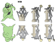 Since this thread has diverged a little into comments on how helpful (while simultaneously challenging in a constructive way) folks on this forum are, let me say thanks to everyone here as well. This Horde marks the 1 year anniversary of my first entry, my rats (aka being brave enough to go ahead and just do it!). It was the constructive criticism offered here on other beginner's models that made me stop finding reasons not to submit my work and start asking for help fixing it. I am not great yet, but I am definitely improving. I am also glad that people as fast and prolific as aaron are still improving when they are already so advanced (cue aaron to complain about being slow despite the fact that he's one of the fastest I have ever seen on the forums ). This is a great community, so much free content from both amateurs and professionals, help from the same great artists on poses, coloring, scaling, and more, plus great War/roleplaying gaming ideas, stories, experiences and galleries. Thanks everyone, and long live the HORDES! On that note what do people think of the coloring on Oogie? Should I go with the Burlap (normal lighting), or the greenish blacklight look from his song sequence (in the WIP)? Just a few more pinstripes and bugs to go... |
|
|
|
Post by cowboyleland on Sept 22, 2014 3:54:43 GMT -9
I would like to see a burlap version. (FWIIW)
|
|
|
|
Post by Vermin King on Sept 22, 2014 4:34:13 GMT -9
I personally like him the way he is ... unless you want to do both versions ... hint, hint
|
|
|
|
Post by jackmatt on Sept 22, 2014 7:22:29 GMT -9
Here is my contribution, sort of at wyvern's request and with thanks to jackmatt once again. Jackmatt is my go-to guy when I need a suit. Image Update: I realise I had forgotten to change the length of the jacket on the back. It is fixed now. Thankyou for the compliment. |
|
|
|
Post by wyvern on Sept 22, 2014 8:33:29 GMT -9
Here is my contribution, sort of at wyvern's request and with thanks to jackmatt once again. Jackmatt is my go-to guy when I need a suit. Maybe try a white border round the mini? I can see this being tricky to hand-cut otherwise, as I'm losing definition of where the figure's "edge" is in places on-screen, and inkjet printouts are usually worse. Typical problem with black-clothed minis, of course... Another Gentleman carrying the little black doctor's bag would be good too |
|
|
|
Post by zygrott24 on Sept 28, 2014 18:33:45 GMT -9
|
|
|
|
Post by squirmydad on Oct 1, 2014 11:51:38 GMT -9
Any more Frights still hiding out there? Flush 'em out and get 'em in! I'll be assembling the Hoard layout this week and will hopefully be posting it on Monday next week. Had a scary idea and didn't get to realize it? Don't despair, just add it to the next Hoard. Thanks all! |
|
|
|
Post by aaron on Oct 1, 2014 13:56:35 GMT -9
ACK!!! i'm still behind!! I've been building my kickstarter!! Man they are a lot of work!! OK I'm pausing everything to finish the Pumpkinmancer!! hold the bus!! i'm coming!! ok here's the finished Pumkinmancer but I don't have the pumpkin assassins done yet !  here's the fist of two pumpkin Assassins wip 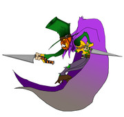 I should have them both done by tomarrow evening sorry about the wait I totally lost track of time!! |
|
|
|
Post by squirmydad on Oct 2, 2014 21:09:28 GMT -9
Aaron, don't sweat it. The pumpkinmancer looks great, I'm sure the assassins will be along some other day. |
|


 Halloween Frights!


 I'm not sure I like the dripping stuff... The skull he's holding is inside the folds of his cape, but the drip/puddle appears outside. It looks like you've got some perspective thing going on like he's holding it way out from his body, but my brain is having a hard time reconciling the depth of each element. Maybe consider pulling the skull out from under the sleeve?


 It is fixed now.