|
|
Post by distrigillator on Mar 24, 2015 4:22:00 GMT -9
I love the 'heavy metal' font on the bases. Looks like it's straight off a 1980s metal compilation! The font is "Metal Lord" and it's really brutal.  PS: Don't forget voting, it's really important. |
|
|
|
Post by distrigillator on Mar 25, 2015 17:56:11 GMT -9
|
|
|
|
Post by pavaro on Mar 26, 2015 7:19:58 GMT -9
I begin to read.  |
|
|
|
Post by distrigillator on Mar 28, 2015 4:52:15 GMT -9
|
|
|
|
Post by distrigillator on Mar 29, 2015 2:36:00 GMT -9
MOAR teasers for God of teasers!  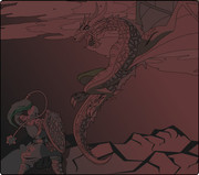 PS: To be more serious, this miniset is almost ready, and will be available to 31st of March.  |
|
|
|
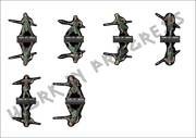
Post by distrigillator on Mar 29, 2015 6:04:10 GMT -9
Finally, I've finished the warrior... I've done it much earlier I expected. So, I'm glad to show you some progress of RoA artwork! 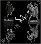 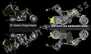 |
|
|
|
Post by cowboyleland on Mar 30, 2015 2:47:24 GMT -9
Wow! So much more dynamic and full of great detail. Wonderful minis!
|
|
|
|
Post by distrigillator on Mar 30, 2015 14:40:31 GMT -9
|
|
|
|
Post by distrigillator on Apr 3, 2015 3:23:18 GMT -9
|
|
|
|
Post by Rhannon on Apr 3, 2015 3:37:53 GMT -9
Great figures, Alex. As always. But I think that, for commercial sets, figures with white border would be an added value. Even brightness variations.  PS: I hope you read your own personal board in this forum.  |
|
|
|
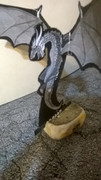
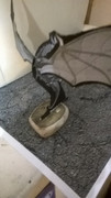
Post by distrigillator on Apr 4, 2015 3:19:34 GMT -9
Great figures, Alex. As always. But I think that, for commercial sets, figures with white border would be an added value. Even brightness variations. PS: I hope you read your own personal board in this forum. Of course, I read the board. Black border is more preferable for me because of much more convenience in the working process. But I'll think about that, may be I'll add light gray border.  One more thing: I've made all staff to that man-at-arm. So, new mini is coming soon.    PS: About brightness - new sets are MUCH brighter then the old ones, the example is above (old and new "Dragon slayers"). If it isn't persuasively, I'll do some photos soon. PPS: Thank you for your criticism, it's very important. |
|
|
|
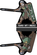
Post by distrigillator on Apr 7, 2015 19:37:09 GMT -9
New warrior is coming.  |
|
|
|
Post by Rhannon on Apr 7, 2015 21:26:46 GMT -9
... Black border is more preferable for me because of much more convenience in the working process. But I'll think about that, may be I'll add light gray border. ... Why not white?  |
|
|
|
Post by distrigillator on Apr 8, 2015 0:25:54 GMT -9
Why not white? That's because of some specificity of the process of making constructor kits and of the programm "Inkscape". If I make white cloud, I should make a border, right?  The cloud in constructor modification isn't a single object, and that's how it looks with borders in "constructor" variant. 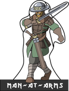 Sorry, but it'll be very inconvenient and complex to change the technology. Moreover, I did too many tools already to change something. May be I'll make some sets without tools variety, but with white cloud. I'll try to solve that problem in next set, but I don't promise anything yet.  |
|
|
|
Post by cowboyleland on Apr 8, 2015 5:24:51 GMT -9
How light could the grey get and still eliminate the lines?
|
|
|
|
Post by distrigillator on Apr 8, 2015 21:05:39 GMT -9
How light could the grey get and still eliminate the lines? This is a vector graphic software magic. It's very simple and convenient (For "Inkscape" exactly). There are two colors for each figure - fill and stroke color. 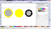 So, if you needn't outlines, just don't paint stroke (but I can't do that if the figure is white on white field - you won't see it. )  If you need something especial, you can do different shings - change style of stroke, use gradients etc.  But there is a problem in "Inkscape" (Also I'm not quite sure if there isn't the same in the other programmes), you can't paint ONLY A PART of stroke. Yeah, there are different ways to solve the problem, you just need to RTM and some imagination.  Is it clear, I wonder? |
|
|
|
Post by distrigillator on Apr 9, 2015 5:15:42 GMT -9
|
|
|
|
Post by distrigillator on Apr 20, 2015 3:59:47 GMT -9
|
|
|
|
Post by Rhannon on Apr 20, 2015 11:07:41 GMT -9
|
|
|
|
Post by distrigillator on Apr 20, 2015 20:57:40 GMT -9
Sorry, but I don't see anything. |
|
|
|
Post by Rhannon on Apr 20, 2015 22:40:20 GMT -9
Sorry, but I don't see anything. I do not know why. There had to be an image ( an animated gif ). A round of applause. Referred to your drawings. Do you write it: Congratulations! |
|
|
|
Post by distrigillator on Apr 20, 2015 22:51:19 GMT -9
Oh, I see, thank you very much! |
|
|
|
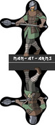
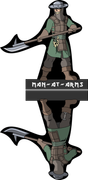
Post by distrigillator on Apr 22, 2015 18:10:16 GMT -9
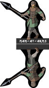
And here is a new man-at-arm!  |
|
|
|
Post by distrigillator on Apr 23, 2015 19:47:45 GMT -9
|
|
|
|
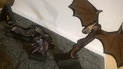
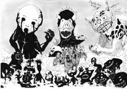
Post by squirmydad on Apr 24, 2015 9:04:09 GMT -9
Great creepiness. How can mortal men survive in the face of such demonic hate? |
|
|
|
Post by distrigillator on Apr 24, 2015 16:12:57 GMT -9
Great creepiness. How can mortal men survive in the face of such demonic hate? To be in short - these creatures aren't demons, they are usual spirits of village (like brownies, urchins etc). Yes, they are little scary and folly, but there is no evil in them. But the big ones... there is no salvation from them. These three are someching like pagan gods or forebodings. |
|
|
|
Post by distrigillator on Apr 26, 2015 22:01:46 GMT -9
|
|
|
|
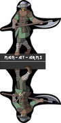
Post by distrigillator on Apr 30, 2015 17:05:48 GMT -9
New man-at-arm is coming.  |
|
|
|
Post by distrigillator on May 1, 2015 23:28:28 GMT -9
|
|
|
|
Post by distrigillator on May 4, 2015 4:46:27 GMT -9
|
|