|
|
Post by DZgameshop on Sept 23, 2014 14:45:44 GMT -9
This is my first post to this great site. I wanted to take the opportunity to share some figures. The art includes all the classic rpg heroes; fighter, cleric, wizard, rogue. If you would like to share some feedback I would be more than happy to hear it. I'm trying to see if the designs would work well for 30mm scale and if the semi-realistic tone is appealing. I'll be looking to give a fully formatted set away for free in the future. Thanks! Attachments:
|
|
|
|
Post by oldschooldm on Sept 23, 2014 16:36:15 GMT -9
Welcome! I'd build these models in a heartbeat (I'll leave the creators feedback to the other creators here - I'm just a builder.)
I'll ask the obligatory question, though: Will these have backs? I hope so!
|
|
|
|
Post by mproteau (Paper Realms) on Sept 23, 2014 17:35:17 GMT -9
They do look wonderful! I'd caution having too much dark shadow on the figures - they tend to print darker than they appear on the screen.
|
|
|
|
Post by cowboyleland on Sept 23, 2014 18:17:34 GMT -9
I like the "semi-realistic tone." They look like they should read well at 30mm. Make sure you test-print for colour.
|
|
|
|
Post by Vermin King on Sept 23, 2014 18:22:16 GMT -9
I keep bouncing between the small pic and the big one. Other than the rogue, I think the contrast works fine with the shadows. The rogue is going to lose detail, but as a rogue, is that a bad thing? I love the artwork. The feet are going to make things a bit sticky for basing.
|
|
|
|
Post by pavaro on Sept 24, 2014 0:19:29 GMT -9
DZgameshop Nice work! I must to ask this question.  How do you do these figures? Maybe some tutorial? 
|
|
|
|
Post by distrigillator on Sept 24, 2014 1:15:55 GMT -9
They are perfect!  I fell in love with your Rogue. |
|
|
|
Post by hackbarth on Sept 24, 2014 4:50:12 GMT -9
They need to have true backs!
Other than that, I see that their feet are on different levels. That is an common mistake for the first time we design paper minis. We must unlearn much of we learned on drawing. When you draw a character, you draw at a perspective, and feet on different levels is a part of it, it gives a dynamic stance and illusion of tridimensionality to the figure. But on paper minis for practical reasons (the figures are going to be fixed to a slot in the base or similar arrangement) the feet have to be at the same level.
Ack! I write too much for such a small issue.
The figures are all amazing.
|
|
|
|
Post by DZgameshop on Sept 25, 2014 8:09:16 GMT -9
Thanks for all the feedback thus far! I'm hoping to hear more.
Are backs preferred by most people? I've used paper minis for a long time, but only in games where facing didn't matter. I don't have backs yet for these figures, but if that is what the market demands (not sure if there was ever a poll on this) then I may need to add backs.
The issue with the feet is interesting. I'm trying to have the poses be as dynamic as possible, and having some flexibility with angles helps with that. It really helps weapons and other details to stand outside the figure's frame, while still maintaining an engaging stance. I'll take this point into consideration on some of my next designs, but i'm not sure if they ever will be exactly equal. Should I change my mind on this and have equal footing be a mandatory (number one) design goal?
Thanks again everyone! This is a great learning lesson.
|
|
|
|
Post by oldschooldm on Sept 25, 2014 8:12:21 GMT -9
For me (as a builder): If there are no backs, I won't buy/build them. To me these are proxies for 3D minis of people, not game tokens.
But, that's just me! I say they're yours and make them however makes you happy!
:-)
|
|
|
|
Post by labrat on Sept 25, 2014 9:43:06 GMT -9
Hey, nice work! I really like the artwork on these.
I second the advice of the others here. Backs are a must for most serious paper modelers. Flat feet, also for modeling purposes. And try to keep them bright. Dark shadow is great to increase the contrast, but too much will darken the whole figure at 30mm scale. Other than that I think your proportions work fine at 30mm. The painting looks great. As you stated, it is good to not have arms and weapons intersecting the body of the figure, since they tend to blend in at this scale and get lost.
You will have to experiment with the thickness of your black outline. It looks fine, but some prefer a thicker line for easier cutting. Those who like it thinner can always just cut closer to the figure. A thicker line never hurts.
I can't think of anything else right now. I'm sure Parduz will have plenty to say though.
Nice set. I hope I win the free stuff. ;D
|
|
|
|
Post by hackbarth on Sept 25, 2014 10:34:49 GMT -9
The issue with the feet is interesting. I'm trying to have the poses be as dynamic as possible, and having some flexibility with angles helps with that. It really helps weapons and other details to stand outside the figure's frame, while still maintaining an engaging stance. I'll take this point into consideration on some of my next designs, but i'm not sure if they ever will be exactly equal. Should I change my mind on this and have equal footing be a mandatory (number one) design goal? I wouldn't say mandatory, you can disguise uneven feet a little with some "ground" texture, but it helps a lot. Backs are mandatory (IMHO). They are what sorts out Paper Miniatures from character illustrations. |
|
|
|
Post by Parduz on Sept 26, 2014 0:53:49 GMT -9
+1 for Backs, for the same reasons.
+ also for Flat feet. To me, uneven / perspective feet look bad when slotted on a base. The base force your eyes to reckon that there's 2 perspectives on the same subject (the real one and the drawn one) clashing. Flat feet instead are a "guide"... a smooth joint between the two perspectives.
|
|
|
|
Post by Cardstock Dane on Sept 26, 2014 6:38:22 GMT -9
you can disguise uneven feet a little with some "ground" texture, but it helps a lot. Have to agree with you there. I have gotten some good results disguising with scenic bases myself, some of them even look better than flat fleeted minis would, if I may say so myself. |
|
|
|
Post by DZgameshop on Sept 26, 2014 10:22:22 GMT -9
you can disguise uneven feet a little with some "ground" texture, but it helps a lot. Have to agree with you there. I have gotten some good results disguising with scenic bases myself, some of them even look better than flat fleeted minis would, if I may say so myself. I would love to see an example of the scenic basing. Thanks Meanwhile, I was sizing the figures 30mm from head to toe, however I found a sizing guide on this site and I think I will use it instead (toes to nose it seems). If anyone has any thoughts please share.  |
|
|
|
Post by Cardstock Dane on Sept 26, 2014 10:34:15 GMT -9
Not the best photos, but it should give you some idea: 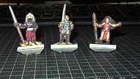 A few other examples (especially the monk at the right):  I personally think it looks good - I have based these on photos of 'lead' minis and for my own purposes, so I can't share them - but personally, I like the way they look. I have a couple of batches I haven't gotten around to cut yet, that looks even better - more about those in my design thread when they're ready. |
|
|
|
Post by Cardstock Dane on Sept 26, 2014 15:44:50 GMT -9
Oh, and I just realized that I forgot to say the most important thing: I LOVE your style! If you have backs for those, too, they'll be among my favourite minis. |
|
|
|
Post by hackbarth on Sept 28, 2014 17:10:04 GMT -9
|
|


 How do you do these figures? Maybe some tutorial?


