|
|
Post by Sirrob01 on Nov 19, 2014 23:20:52 GMT -9
I've been getting a little bit of stuff printed down at my local print shop, turns out about 100x better but costs are higher. For some stuff I'm happy to wear the extra cost, however I noticed when i did a test print on my printer and compared to what they printed there was a vast difference mine were a pile brighter. I thought it might have been a CMYK issue, but turns out there's an artificial color boost on my printer settings which if I turn it off I get an almost exact identical color replication as the print shop (well much much closer). So does anyone elses printer have the same settings (attached pic) or something similar and the option to turn it off? or am I just slow to the party  I have noticed the profiles seem to push the printouts closer to what I see on screen, which is not particularly great when your sharing files.....everyone's monitors being different and all. So any other brands have this strange feature (mines an epson)? 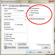 |
|
|
|
Post by Vermin King on Nov 20, 2014 4:51:58 GMT -9
I've got something similar on my Brother printer under Advanced Settings, but since I had no clue what they were, I buried my head in the sand, I mean ignored them
|
|
|
|
Post by Sirrob01 on Nov 20, 2014 10:06:54 GMT -9
I think the thing I've found most interesting is that the printer settings there seem to override any pdf settings in regards to color profiles etc. In the past I've had it configured to use either the standard epson profile or sRGB. I've always found it frustrating that when I use a different printer the color shift could be quiet significant between makes/models/brands and although this didn't produce a perfect match it's closer than anything I've tested before and I think the difference is 10k+ commercial printer vs $200 home inkjet, but I need to run some more tests across as many printers as I can find Question now is should I color match my printouts for anything I make with the option off or with a known color profile ie sRGB. I guess these are all the problems commercial printer have when files are dumped on them. I know theres others around with way more experience with printing so hopefully one oft hem might chime in ( aaron and @christopherroe) Oddly I printed some wwg-hinterlands (always struggled to get light enough prints) with everything off and ended up with an almost black square so I'm not sure how the color profiles on those are being managed... also stumbled on this: files.support.epson.com/pdf/r2880_/r2880_mc.pdfI'd be interested to know how your prints change if you print with the setting off Vermin KingAlthough it'll be image to print to photograph, I'll try and post up some examples later once I get the current project wrapped up |
|
|
|
Post by aaron on Nov 20, 2014 10:42:51 GMT -9
well I'm not super teck savvy and I just got a new Cannon printer. It's ok with the prints but ink is cheap and refillable so that's my primary focus. I have found that it prints about two shades darker than what I color on the screen so when you see my designs they have a tendency to be bright and vibrant. I try to stay away from grays and blacks unless I want my models to be all black. the printer may have a setting that compensates for the conversion from constructive coloring to destructive coloring. this is the part where I talk about the difference between constructive coloring and destructive coloring so if you already know about it then just skip on to the next post Your computer creates light and uses increasing light wave frequencies to make color. to change the colors you add more waves or a higher frequency of waves and conversely you can take some waves away or decrease the frequency of light waves to change colors and make things brighter or darker, like a volume dial on your car radio. only instead of sound your turning up color ... which are actually very similar but that's another discussion for another day. This is called constructive coloring because your computer is producing light and changing it's values. Destructive coloring is all about the reflective property of something or Albedo. Albedo refers to the reflective properties of a thing. Destructive coloring happens when something is not producing light it's reflecting it. So if you have something that's green it's actually not green it's every color but green ... it rejects green, or reflects it. so a white light will hit something that will absorb all the frequencies of that light except green. so when your printing from a computer image you are going from something that creates light to something that is white (reflecting all light perfectly ) then you smear ink on it that changes or destroys it's perfect reflective properties. changing it's albedo so it will reflect the colors you want. when converting from Constructive to destructive their is always Vibrance lost. so I make my images SUPER bright so that loss in color or vibrace wont be to bad no matter what printer I'm using..... there's my two cents ... |
|