|
|
Post by Aestelon on Feb 18, 2009 20:22:26 GMT -9
I've started to sketch out a couple of designs for my Elven Nobles for my own fantasy world. My first ones here are basic foot troopers; a swordsman and and spearman. They were first sketched out in blue in GIMP. Swordsman: 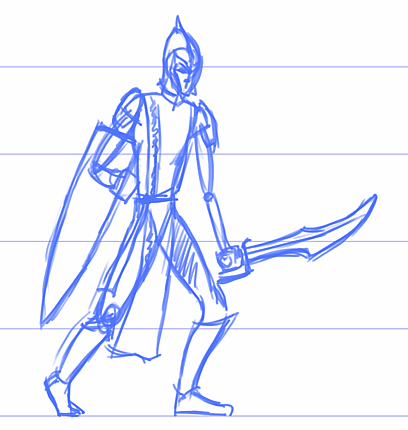 The spearman I've inked properly (again in GIMP, retracing in black on a new layer), and then imported it to Inkscape, where I used the Trace Bitmap function to get nice vector art out of the linework. Then I re-imported the new, neater lines back into GIMP for colouring. It's not finished yet, but I think it gives an idea where I'm going. I'd love any input you might have. 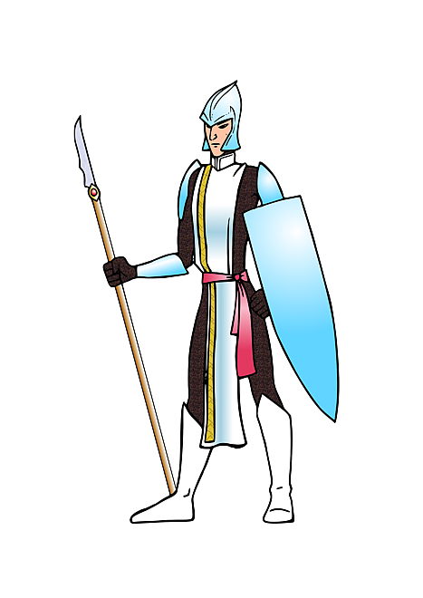 |
|
|
|
Post by kane on Feb 18, 2009 20:52:20 GMT -9
Very nice. Reminds me of something you might see in a fantasy comic book in the 70s.
|
|
|
|
Post by Slick on Feb 18, 2009 21:52:01 GMT -9
I agree 100%. It has a very cool old skool feel to it. Kinda like lord of the rings meets the fonz  . Nate |
|
|
|
Post by WaffleM on Feb 19, 2009 5:01:24 GMT -9
He looks Great!!! I really like the black/silver coloring, but it may make it difficult to outline. What plans do you have for the shield?
|
|
|
|
Post by Floyd on Feb 19, 2009 5:28:07 GMT -9
Hey very nice indeed.
I like your economy of line. A little in the right place, says a lot.
~Floyd
|
|
|
|
Post by Aestelon on Feb 19, 2009 5:49:42 GMT -9
Thanks, all. These foot troopers are pretty spartan in terms of decor (dark mail, white tabard and a few choice bits of plate armour), but I intend to make them more elaborately equipped as they go up the ranks. He looks Great!!! I really like the black/silver coloring, but it may make it difficult to outline. What plans do you have for the shield? I agree with the dark areas, and I'm thinking of adding a highlight layer to brighten the dark mail up a bit. That there is a straight texture fill from GIMP (the Java texture), and I wasn't planning on leaving it like that. The shield, I thought might be nice with some sort of identifying symbol on it. Possibly some of the letters from the DarkArts BB or Wizardspeak fonts at Blambot. I might even leave the shield blank, but add a couple of symbols by the side that can be stuck on if you want. |
|
|
|
Post by josedominguez on Feb 19, 2009 6:14:39 GMT -9
If Marvel had produced Warhammer Fantasy Battle, that's how all elves would look now  |
|
|
|
Post by onemonkeybeau on Feb 19, 2009 8:07:17 GMT -9
Yeah, I really like it too!
The first thing I thought of was the old laserdisc game Dragon's Lair... man I loved that game!
Excellent stuff as always... I'm a big fan!
onemonkeybeau
|
|
|
|
Post by Floyd on Feb 19, 2009 9:05:08 GMT -9
Yeah, I really like it too! The first thing I thought of was the old laserdisc game Dragon's Lair... man I loved that game! Excellent stuff as always... I'm a big fan! onemonkeybeau Yes, very Disney-eque Don Bluth style. Great example OMB! ~F |
|
|
|
Post by Aestelon on Feb 19, 2009 12:17:34 GMT -9
Heh. I never even thought of that, Beau, but I kinda see where you're coming from! ;D
|
|
|
|
Post by squirmydad on Feb 20, 2009 14:11:06 GMT -9
These would look great as a unit. I like the conservative poses. Wild dynamic poses do not look right for regimented troops.
JIM
|
|


 .
.