|
|
Post by aleks on Aug 29, 2016 21:49:31 GMT -9
|
|
|
|
Post by cowboyleland on Aug 30, 2016 4:33:24 GMT -9
Hey aleks, Don't be so hard on yourself, those are cool looking textures. A quick and easy way to add shadow and highlight is the airbrush tool or a very fuzzy paint brush. |
|
|
|
Post by printableheroes on Aug 30, 2016 9:44:05 GMT -9
Nice! Love the fists - whenever I do beefy hands I always struggle with getting the thumbs/fingers to look right, but yours look great!
If you do ever get around to shading it I think it'd really make the form pop!
|
|
|
|
Post by chiefasaur on Aug 30, 2016 12:51:11 GMT -9
Very nice. Pretty slick for a first finished model. Now I want to see an army of space dwarves!
|
|
|
|
Post by aleks on Aug 30, 2016 22:45:41 GMT -9
|
|
|
|
Post by cowboyleland on Aug 31, 2016 6:15:07 GMT -9
I checked out your PDF. I think the shading might be too subtle to see when it is printed out. YMMV. One of the hardest things to get used to is how things change between the screen and the printer. You can add highlights with just a little squirt of white from the airbrush. I used to feel guilty because it was so easy but aaron does it so . . . Have fun! |
|
|
|
Post by chiefasaur on Aug 31, 2016 7:56:41 GMT -9
Since this model is all rounded metal, you can use rounded shadows to really pull out the volume of the character. Also, don'd be afraid to exaggerate the rim-light. I find it really makes printed models pop against their boarders. Shading metal is all about dark next to light. I dropped some quick and dirty shadows on your dude for an example, check it out. 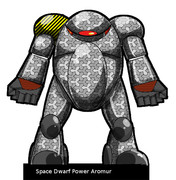 |
|
|
|
Post by aaron on Aug 31, 2016 8:05:46 GMT -9
I like what you did here and I think you have some really good potential to be fantastic at this! I hope I can encourage you to keep going, and let me say your much better than I was when I first started! you're model is very solid in it's design but it does need some tweaks like Cowboy said my shading technique is fast and dirty and looks marginally ok. Though to be honest I don't think the shading is the issue here though. I think it's the texture pattern and the anatomy of the model. (not to be overly critical )but It looks like an egg, with a glowing eye, in pajamas, with arms and legs and has no way to turn its torso. So I did a quick Hotrod to illustrate what i'm talking about. 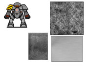 I included the textures I used, and I changed the shape and position of the shoulder pads bringing the arms down a bit so they weren't sticking out of the side of it's head. also I changed them from being round. Dwarves are typically really boxy and tend to favor sharp hard angels so I cut the waste line and added a pivot line, Of course I couldn't help adding some dwarfy runes and glyph to the belly plate but all in all this hot rod took me about 20 minutes less the time it took to choose the texture I wanted. again I hope this helps and encourages you to keep going I know when I first started I got tons of help and tips from people who are the ones I consider the masters of this craft so keep going to don't give up!! |
|
|
|
Post by Vermin King on Aug 31, 2016 8:25:14 GMT -9
Aleks, I hope you don't feel like folks are tearing your model down. You have inspired others to help you with your art. The first submission that I had that generated this much conversation, really left me feeling like I'd failed. One of the artists (who I will not name) that reworked my little model, sent me a PM, saying pretty much what I am saying now. Any time you can generate this much interest is a success. Yes, learn from it, and try out some of the ideas, but this is a very nice first mini. I hope you will be proud that so many people are wanting to help you with your art so that you can produce more mini's in the future.
|
|
|
|
Post by okumarts on Aug 31, 2016 8:29:16 GMT -9
What Vermin King said (double plus good!) I'm excited to see what is next and how this all develops. Talk about getting a group of people fired up...
|
|
|
|
Post by aleks on Sept 20, 2016 3:21:15 GMT -9
Hi everybody. Real life took me away from here for a while. I was really glad to have feedbacks and advices from you all. I don't know where I'll go from here, but I'm sure I'll have nice travel buddies. I checked out your PDF. I think the shading might be too subtle to see when it is printed out. YMMV. One of the hardest things to get used to is how things change between the screen and the printer. Thank you for giving it a try. whenever I do beefy hands I always struggle with getting the thumbs/fingers to look right, but yours look great! It's only a matter of luck ;-) Shading metal is all about dark next to light. Your shading really popped out the armour, although it turned out a little too shiny as I intended, but nice advice. I need to master the layers in Gimp to gain more control on what I do. I think it's the texture pattern and the anatomy of the model. (not to be overly critical )but It looks like an egg, with a glowing eye, in pajamas, with arms and legs and has no way to turn its torso. Definitely it's look like an egg!!! I tell you a secret... I'll want to make a cool model, but I was very late to join Papercut, so I sketched some quick and dirty attenmp in gimp and choose the better one, In about an hour of work. Any time you can generate this much interest is a success. Totally agree! I'm excited to see what is next and how this all develops I hope it will develop in something good... Thank you all. |
|
|
|
Post by Punkrabbitt on Sept 22, 2016 7:47:34 GMT -9
aleks, I thought your original basic desofn was great. I like that it looks like an egg. The texturing seemed a little off. aaron's "hotrod" mod should be a really good jumping off point for further work on this concept. I would like to see a half dozen variations on this guy, personally.
|
|


