|
|
Post by tonsha on May 9, 2009 12:04:34 GMT -9
New Project. I've been reading thru the SAM rulebook for a few month's now, and I've been really impressed with the Cymric Welsh and Romano-British setting. (I even pulled out my copy of the Mabinogion and had a read). I've put together some figures, based on my own basic figure templates, and thought I'd share them with everyone here. The plan is to put together two complementary forces: Romano-British and Saxons. These will be army figure sets, and (I hope) my first foray into selling figures. So here we go... 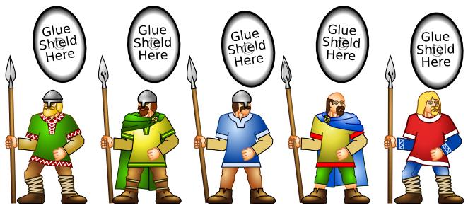 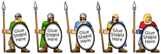 The figures are designed with blank shields. The idea is that it will be possible to add a variety of shield designs which will allow you to deploy a variety of units in the field. Or, alternatively, field a more rag-tag warband. Whatever takes your fancy. Here are the shield designs: 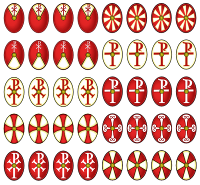 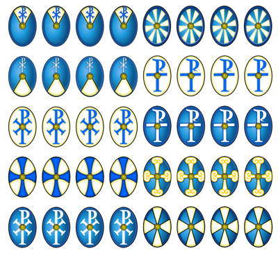 For my first set of figures, I intend to publish these spearmen, a set of heavy shieldmen, and some archers. This will go some way to providing figures for the R-B army list in SAM. Feedback greatly appreciated.  DaveA |
|
|
|
Post by magpiestear on May 9, 2009 13:17:16 GMT -9
Looking good Dave!! The one in red definitely looks Saxon.
You are doing rear views as well aren't you?
Love the separate shield idea, not only will it add variety but also the sllightest impression of depth with the extra thickness of card.
As well as the helmets and bare heads what about some with the 'pillbox' style hat for romano-brits. Take a look at Gripping beasts dark ages range for inspiration (the best 28mm dark age figs around for my money).
Saxons might also have a seax suspended from a baldric as a second weapon, the brits the odd sword or dagger, or even possibly an axe (single bladed).
These would be a definite sale for me!! I might even have to part company with my metal dark age stuff.
I have a slight concern over the vivid colours though, works OK for fantasy but not so much for more historical figures, the lower class troops would be in dull browns, creams, whites etc. Perhaps if you just grunged them up a little?
Oh and there's something about the spear arm on the two with bent knees that doesn't seem quite right. I think it's the fact that it appears to stick out at an odd angle when the rest of the figure gives the impression of movement, it might be the vertical spear as well that tricks the eye.
Anyway great stuff as I said Dave, mark me down for a set!!
|
|
|
|
Post by jabbro on May 10, 2009 8:17:40 GMT -9
Nice, I would vote on the row with the shields unattached. Personally I would like to vary the way they are glued on the figures a bit more. I hope both the figures and the shields will have backs. These will be a sharp garrison when all is said and done.  |
|
|
|
Post by Aestelon on May 10, 2009 9:12:07 GMT -9
I agree with the others; I think the separate shields are a good idea, for the reasons both of them suggested (extra dimensionality and ability to vary the positioning). Plus it allows owners to field them without shields at all if they so choose, or add new shields of their own designs (and possibly different shapes). Excellent stuff so far, although I must admit the guy on the far right makes me think he should be in a prog rock band...  |
|
|
|
Post by tonsha on May 11, 2009 22:22:27 GMT -9
Thanks for all the replies - this is just the kind of feedback I need. @magpiestar: Yes these will all have 'backs'. It really is the only way. I'll check out the Gripping Beast figures for the helmets you describe. The only research I've done so far is to download as many painted figures from the net that I could find. So any other tips would be gratefully received. I'm interested to know why the guy in red is more 'Saxon'. Is it just the fair hair? I know about the saex - I was going to add those when I did the saxon figures. Thanks for the advice on the colours. Would this apply to both armies (R-B AND Saxons?). I wonder why that is? Celts were pretty colourful, and they were pre-roman. And Romans were pretty colourful themselves so I would have thought there would be more colour...? Well, the painted figures I downloaded certainly follow your guidelines more than the ones I've done, so I'll defer to that. ;D I agree with your concerns over the guys with the bent leg. I'll try and sort it out. The figure templates I used for these were based on Jim's orcs, so that's why the look so 'chunky' as well. jabbro: Great idea for the shields! I thought giving people minor variations on shield placement would make for a better variety of figures when placed together in a unit, but I was always worried that people would get frustrated if the black outline looked uneven. Your suggestion is a much better idea. Thanks. @aestolon: I've reproduced the shield designs in red, blue and green, and made oval and round versions. If I include them in each figure set - or make them downloadable from somewhere - there should be plenty of options for everybody! Now what I really need is some suggestions for Saxon shield designs... I was going to do very basic 2 colour round shields halved/quartered. Would that do for you guys? DaveA |
|
|
|
Post by squirmydad on May 12, 2009 6:10:30 GMT -9
I'll see what I can do about getting my normal guy templates up again. I think it would help even if only I have sketches to go by.
JIM
|
|
|
|
Post by magpiestear on May 12, 2009 13:03:33 GMT -9
Just a quick response (whilst trying to do my 3 2000 word assignments) If you want some ideas for shield designs, both saxon and romano brit then take a look at the 'little big man studios' sets that Gripping beast sell www.grippingbeast.com/shop.php?CatID=140I'm sure there are enough on here to get your creative juices flowing. There is some debate at the moment as whether the early saxons used large shields (usable in shield wall formations) or small bucklers. Doing the shields as separate additions like Aestalon and Jabbro suggest would allow gamers to choose easily themselves, or even to have two different forces or to swap them about by using blu tak etc. Oh and I kinda assumed that you would be doing backs With regard to colours it all stems from cost!! The dyes for the wool were relatively expensive, especially those such as purple and red and so would normally only be worn by the nobility (hence the colour purple being used by the Roman ruling classes). So deeper colours for nobles and their cronies and simpler colours for the riff raff. Patterns were not uncommon though, stripes, a simple plaid or check etc (not modern tartan though, 5th or 6th century Tartein was a much simpler pattern of vertical and horizontal stripes).The clothes were also probably quite grubby, especially on campaign (no persil see!!) I think the vibrancy of your colour palette doesn't help here, like I said OK for fantasy but doesn't look quite right for historicals. As to the red guy looking more saxon, can't put my finger on it, probably the fair hair and beard, but also the criss cross straps on his legs, he just instinctively feels more saxon somehow. Romano Brits also possibly cut their hair short in the 'roman' style, since they still considered themselves to be romans (at least until the early 500's). I'll dig out my copies of 'glutter of ravens' and 'armies and enemies of rome and the dark ages' and see what dan Mersey and Phil Barker have to say on the subject. I'll also re-read 'Age of Arthur' WAB army lists as well for some more pointers and add them here as and when I get chance. Ok so this was longer than I anticipated, but then it is 11 pm and I really ought to be going to bed soon! |
|
|
|
Post by onemonkeybeau on May 12, 2009 13:25:31 GMT -9
Hey Dave,
After taking a look again at your figs, I think the arms are too long.
It you drew a line of where the arms would hang they would be be able to grab their knee caps!
I think this is what was throwing me off a bit. Something didn't look quite right.
onemonkeybeau
|
|
|
|
Post by Aestelon on May 12, 2009 17:05:55 GMT -9
I never even noticed that, but you're right. I think the forearms are okay, but it looks like the elbows would fall a little below the waist, if we could see it.
|
|
|
|
Post by squirmydad on May 12, 2009 18:38:37 GMT -9
I think like Dave mentioned before, he used my orc poses for the anatomy reference, and thus they are designed to look like that. I think once he gets some good anatomy reference for the scale and proportion of the miniatures, he'll be able to make really nice figures.
Remember, once you figure out how to design humans, you can design 99% of everything else. Especially if your ding historical, then all you really need are men and horses.
JIM
|
|
|
|
Post by tonsha on May 12, 2009 22:03:46 GMT -9
Hey Dave, After taking a look again at your figs, I think the arms are too long. It you drew a line of where the arms would hang they would be be able to grab their knee caps! I think this is what was throwing me off a bit. Something didn't look quite right. onemonkeybeau Yeah - I knew they were a bit off, but I hoped no-one would notice. ;D ;D ;D Still - I may not need to start from scratch. I'll see if I can tweak them a bit. Shouldn't be too hard. I've not had chance to do the changes suggested so far (we've had a death at church, so I'm involved in getting things ready for the funeral), but I should have something up for the weekend. DaveA |
|
|
|
Post by squirmydad on May 13, 2009 0:23:02 GMT -9
|
|
|
|
Post by Aestelon on May 13, 2009 2:39:59 GMT -9
Thanks for that, Jim. They'll serve well as posing inspiration even for those of us not designing in vector.
|
|
|
|
Post by tonsha on May 25, 2009 21:39:03 GMT -9
Crikey! It's been nearly two weeks since the last post here! Sorry about everyone. Last week was a real toil what with the funeral and everything, and then (to top it all!) I ended up with a back injury. The weekend has been agony!  Thanks for all of the feedback everyone. And thanks, Jim, for the figure poses! I'll get back to working on this project this week. I'll try and make some serious progress before the weekend. DaveA |
|
|
|
Post by godofrandomness on May 26, 2009 14:52:13 GMT -9
back injuries suck! I had one a couple weeks ago myself. There was a big convention promoting safety at the navy base I work at, and my store had me build a couple displays show what kind of safety products we carry, and as I was wheeling the last one inside, I backed up to go around an open door.... and walked backwards off of the receiving dock onto concrete back first 5 feet below.  Nothing broke, thank god, but the trony irony is a real killer.... Hope everything is ok with you! |
|
|
|
Post by tonsha on May 27, 2009 21:57:21 GMT -9
OUCH!  I can totally sympathize GoR! (Mine wasn't anything nearly as bad...) Hope we're BOTH better soon. DaveA |
|
|
|
Post by godofrandomness on May 28, 2009 1:21:14 GMT -9
Yeah mine is mostly ok now. As long as I don't over do it on lifting ad stuff, then my back will whine and complain the next morning. Also, my tailbone likes to ache a little now whenever I am moving to sit down or get up.
|
|
|
|
Post by stevelortz on May 28, 2009 3:28:56 GMT -9
Also, my tailbone likes to ache a little now whenever I am moving to sit down or get up. Sounds like you may have a problem with your sciatic nerve if there was no injury to your tailbone itself. My daughter broke her tailbone while delivering our granddaughter, and my sister-in-law broke hers when she fell down roller-skating. Not fun. I hope you have a speedy and very thorough recovery! Have fun! Steve |
|
|
|
Post by tonsha on Oct 5, 2009 8:52:30 GMT -9
Right - I've finally got around to using Jim's male anatomy parts to do some more work. I've also been looking at the Gripping Beast gallery 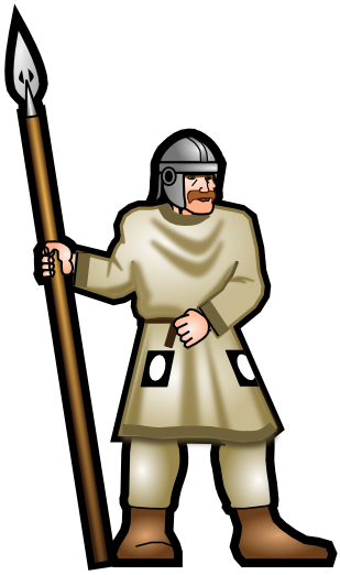 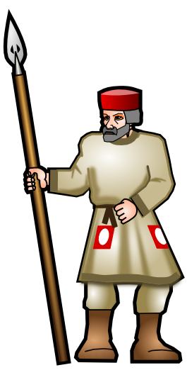 Even got a 'pillbox' style helmet! I want to get your ideas on the colours, garb and general feel of the figures. Please bear in mind that the poses I've selected are very 'rank-n-file' poses, suitable for putting loads of them together in unit. (I may get more dynamic when I do the character figures). You will be able to select a shield design from one of the ones provided and glue it to the figure. Feedback welcome! ;D DaveA |
|
|
|
Post by magpiestear on Oct 5, 2009 13:08:00 GMT -9
Welcome back Tonsha. I really like the Pedyt you've designed! Uniform and clothing is open to conjecture but many people also give them shoulder patches along with the hip patches you've drawn on them. I've been trying to find suitable piccies on the net. Keep up the good work though, they would be awesome to use with Song of Arthur and Merlin as well as warhammer historicals age of arthur. Now to remind Moloch about those Roman roads he said he'd consider designing for me once upon a time!!! |
|
|
|
Post by tonsha on Oct 5, 2009 20:19:31 GMT -9
Welcome back Tonsha. I really like the Pedyt you've designed! Uniform and clothing is open to conjecture but many people also give them shoulder patches along with the hip patches you've drawn on them. I've been trying to find suitable piccies on the net. Keep up the good work though, they would be awesome to use with Song of Arthur and Merlin as well as warhammer historicals age of arthur. Now to remind Moloch about those Roman roads he said he'd consider designing for me once upon a time!!! Thanks for the feedback! Get me some pics of the shoulder patches and I'll make sure I accomodate you. What were they for anyway? Same colours for same units? I'm afraid historical accuracy is not my forte. You're right - SAM & WAB are my targets for these figures. Hence the rather pedestrian poses - good for WAB units! (btw I'm not a WAB player - I'm a SAM player) Maybe I'll try and get some feedback from Daniel Mersey on the SBH forum (The writer of SAM) and see what he thinks as well... Keep the feedback coming! DaveA |
|
|
|
Post by magpiestear on Oct 6, 2009 0:56:13 GMT -9
Feedback from Daniel would be good, he has some illustrations in the back of his 'Glutter of Ravens' rules. The shoulder patches are usuallly done in the same colour and most people seem to paint the whole unit the same. The rationale seems to stem from late roman legionary and auxilia uniform evidence. I'd lend you some of my reference books but Salford is just a tad too far away! I'll keep looking and let you know of any decent links. Mags |
|
|
|
Post by tonsha on Oct 7, 2009 11:56:30 GMT -9
Quick Update: Fronts with minor head, spear and colour variations. 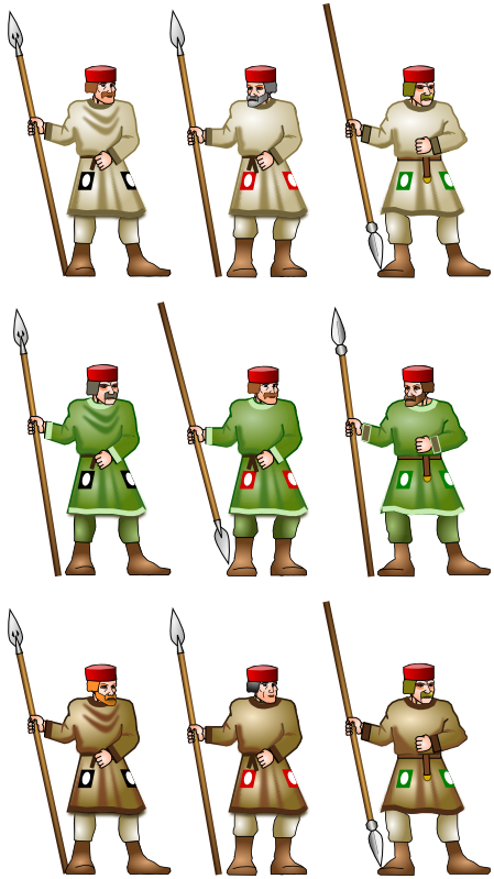 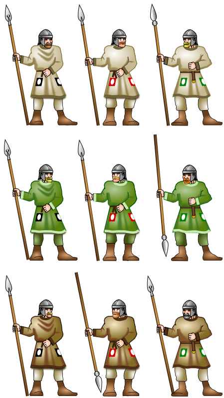 Considering there will be 30 shield variants as well. I think this will be enough. Agreed? I could always do a set of bareheads as well... Should I stick with one colour for the hip patches? I think the black/white combination works well with the cream and brown uniforms, while the red/white patches work well on the green uniform. As for shoulder patches, would they be positioned on the upper arm (rather like sergeant chevrons), or on the top of the shoulder (like a shoulder pad)? I intend to repeat these figures with swords as well. Probably provide round shields for the swordsmen. At some point I'll be doing archers from scratch. I'll get going on the backs now. DaveA |
|
|
|
Post by magpiestear on Oct 7, 2009 14:15:32 GMT -9
|
|
|
|
Post by anitangel on Oct 7, 2009 14:33:57 GMT -9
I have a little suggestion. On the first page the spears facing down could be tilted a big away from those toes just like you have done on the second page with he brown/red patch, and green/green patch guy.
Lots of options here, sorry but historical accuracy is not my thing. So I cannot help you out there.
I definitely see improvements on the bases.
Anita
|
|
|
|
Post by tonsha on Oct 7, 2009 21:36:57 GMT -9
@magpiestar Aha! Thanks for the links. I'll have a go later and post the results. @anitaangel Yes - good idea. The reason I went for the 'close in' look with the spears was to avoid it being separate from the body when cut out. Once you add the black border it merges with the figure and the whole thing becomes stronger. Jim also noticed a problem with his Sebek figure (in the reptilian set) where the spear appears to be 'floating' above the ground when placed in one of the standard OneMonk bases. However, this would be a visual advantage if the spear was the other way up, because we want to feel as though they are going to throw or thrust with it, rather than have it sitting on the ground. So you're right - I'll move them away from the body. Thanks for the feedback guys! One thing I am worried about is how the muted colours will look when printed. The differences are so subtle that the final print may just look like a solid colour. So I need to try some print tests. DaveA
|
|
|
|
Post by tonsha on Oct 8, 2009 12:45:38 GMT -9
Magpiestar - I've created two variants with 'shoulder pads' and no headgear. I'd like your opinions please. 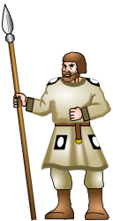 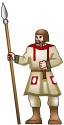 How does the hair look? This is the hairstyle I intend to use for all of the bareheads, and it pretty much matches the Gripping Beast style. What about the shoulder patches. I've completely made up the black/white ones. The red 'yoke' style is based on sample RB minis from various manufacturers. Which style would you prefer? Finally - is the 'cream' colour acceptable? I've seen some painted minis looking white. Would you prefer a white uniform? DaveA
|
|
|
|
Post by magpiestear on Oct 8, 2009 13:40:38 GMT -9
For me the cream is most acceptable. Most clothing for the masses would be made from undyed sheeps wool, or maybe some cheap colours (definitely not purple too expensive, hence for the nobility) and they definitely didn't have Daz, ariel or persil for washing it with either! LOL! ;D Bright white's are usually a figure painters attempt to make the troops stand out on the tabletop.
The bareheads look fine.
I actually like both shoulder patch designs, although the 'yoke' style is the most common one depicted on gaming figures. Probably as it's based on late roman designs. My foundry miniatures llate romans even have the design cut into the model! whereas the GB ones rely on the painters own skills to add them.
I really like these Tonsha, excellent work, well done!
|
|
|
|
Post by anitangel on Oct 9, 2009 6:44:14 GMT -9
The yoke style is visually more appealing, though I don't know much about historical custumes  Anita |
|
|
|
Post by old squirmydad on Oct 9, 2009 11:14:32 GMT -9
The yoke style is visually more appealing, though I don't know much about historical custumes Anita What she said. Are you going to be dropping in a fabric texture and using the colors as an overlay? If not, then I think the contrasts of the browns and creams will stand out well enough. If you do drop in a fabric texture then that may mute it and require some saturation/contrast adjustments. The variety of heads is a good feature, keep going! |
|


 Nothing broke, thank god, but the


