|
|
Post by Dave on May 21, 2009 21:08:10 GMT -9
Big huge thanks to Jim and the rest of the gang here. Making minis is really fun. These are inspired by the G.I. Joe action figure Beach Head who was one of my favorites. None of these guys has a balaklava though. Might need to remedy that.  15 figures in this set, four color themes and blanks. Here are the freebies: 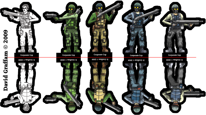 And the full-res link (for 30mm): www.davesgames.net/papercraft/pdf/corp-cops-sample-01.pdfI'm feeling out my preferences for line widths and scale exaggeration. These sets took a lot more work than necessary, but I learned a lot of ways to save time for my next set. I'm taking the modular approach, which is probably obvious. This first set has just one torso and maybe three different setups for legs, and quite a few arm/weapon combos. Right now I'm looking at them and thinking they should have knives, shields, pistols in shoulder rigs and all kinds of other accessories I haven't had the time or inspiration to draw yet. Eventually I'll have a really nice library of toys to stick on these guys, and about that time I'll be sick of modern and near-future stuff and I'll want to make fantasy figs, you'll see! The next set consists of 16 soldiers of fortune. The line drawings for those doods are complete. I just need to color them up. I'll post some freebies of those when they're done, too. Eventually I'll starting letting you know where you can find more of them, and help me pay my bills and whatnot while you load up your game table with desperadoes. I can dream, anyway... Enjoy! And comments! Suggestions? Too dark? Too busy? Love/hate/indifferent? While I'm at it, here's a space trucker figure that got me started on these more militant dudes: 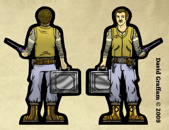 And a sneak peek of the soldiers of fortune: 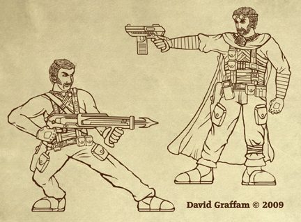 |
|
|
|
Post by onemonkeybeau on May 21, 2009 21:29:57 GMT -9
Hey Dave!
These look pretty cool.
One thing I'd like to see is a thinner outline on the front image.
And it looks to me like the feet may be a tad too small.
onemonkeybeau
|
|
|
|
Post by Dave on May 21, 2009 21:47:21 GMT -9
I'll do thinner front borders on the next set, but can you tell me why that's the norm? For this set, it's probably best to leave a fairly thick border, since the fronts and backs might not match up exactly, especially with the helmets. In fact this next set might have a couple of those, too, but they're already drawn so I'll just have to settle for something less than perfect. But still good, I hope! Some day I'll have a nice collection of boots and shoes. Right now I've just got a couple of pairs, and I'm not thrilled with them. I'll keep working on those! |
|
|
|
Post by onemonkeybeau on May 21, 2009 22:02:54 GMT -9
Hey Dave!
The reason for the thinner border on the front is exactly what you mentioned... to cover misalignment. The idea is to have a thicker border to cut into on the back just in case the two sides don't match.
Don't worry about the boots... on second look they're just fine.
PS: I really like the look of your soldiers of fortune! Wow! That guy with the cape is SWEET!
onemonkeybeau
|
|
|
|
Post by stevelortz on May 22, 2009 0:04:28 GMT -9
I second onemonkeybeau's comments.
I used to wear a balaklava from time to time in the winter, and my brother would always say, "Pardon me, but you have a Greek pastry on you head!" (meaning "baklava")
I really like your space trucker and the soldier of fortune sketches. Your style is different from Jim's, but the two styles are compatable and complementary.
Good work! I'm looking forward to see more. Do a few more space truckers and we might get Mel Ebbles to do a space truck-stop diner. That would be a hoot.
Have fun!
Steve
|
|
|
|
Post by stevelortz on May 22, 2009 0:14:37 GMT -9
I just went and visited your website. Very cool stuff! We need YOU to do a space truck-stop diner!?!
Have fun!
Steve
|
|
|
|
Post by abaddonwormwood on May 22, 2009 0:21:23 GMT -9
Dave very nice to see you surface again. Very neat work there sir!
Lord Abaddon of Wormwood
|
|
|
|
Post by squirmydad on May 22, 2009 3:37:15 GMT -9
Very cool! You have been busy. It's cool that your practicing to release commercial stuff. I do recommend doing some free sets as you practice your style.
As for the figures, the coloring looks great. The poses look decent and varied. It's cool your going modular, it really makes it easy to make variants in the future.
I can tell your going for more realistic proportions, but I would totally recommend try to mimic heroic styled figures, they just look better on the table. Of coarse I'm biased, because that's my style...
The outline on the front of the figure should be thinner. You want to encourage the cutter to cut as close to the figure as possible. This will ensure you get a good profile shape, and not look like a figure floating in a black blob.
Watch your tab alignment, the green cop, the tab is aligned to the center of the figure, but should be centered to the center of the feet.
Overall though, they look fantastic, and I can't wait to see your stuff in the store. You know you welcome to include any of my textured bases and instructions in your sets if you wish. If you have specific base texture styles you would like to see done, just send them my way and I'll see about adding them to the base page.
JIM
|
|
|
|
Post by jabbro on May 22, 2009 5:16:35 GMT -9
Very nice. I like the Sci-Fi influence on the trucker. The soldiers of fortune look like a nice enough blend of gear. I am sure that the color will help separate the bandages from the harnesses. The rest look good, though I can't help but think about Bruce Campbell when I look at the face on the Corporate Cop.  |
|
|
|
Post by kane on May 22, 2009 6:19:33 GMT -9
Overall, good, but the forarms seem a bit spindly. A bit more bulk overall may help.
|
|
|
|
Post by Dave on May 22, 2009 9:21:41 GMT -9
Great suggestions, gang! And Jim, thanks so much for letting me borrow your formatting and bases. You've set the bar very high! A space truck stop diner would be a great location and the characters would be super fun. I'll have to think about that. In the back of my mind I've got a space-trucker Space Hulk style minis game brewing, but we'll see what happens. As for your suggestions: you're all dead right. I should release some free sets to build up some rep. The feet should be centered on the tabs. The figs should be bulkier (and I think my newer stuff is getting there). Getting the borders right is going to take a bit of thought, since I need to be able to automate that part of the process. I'll be playing with Photoshop Actions until get that right. As for bases, I kinda thought I would plug One Monk on my PDFs so that folks who stumble on my stuff first will head over here and see all the other goodies. I do have loads of surface textures I might use, so I'll think a bit on how I want to go with those. Thanks again! I return now to Photoshop to implement changes and make new stuff. |
|