Post by Floyd on May 30, 2009 8:36:05 GMT -9
Bare with me this is my first tutorial. 
These are a set of basics ideas and tools for giving the impression of volume and detail to an otherwise flat shape.
This example is using One Monk's TerraForce Soldier figure. They were re-colored by Mel Ebbles and released as a tie in to his GunCrawl miniatures skirmish game, the recolored set for GunCrawl can be found here at RPgNow.
The idea here was to give the fatigues the impression of folds and shape. As well as adding a level of depth to the weapon and make it stand out and away from the figure (as if being held in front of him).
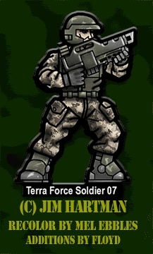
The work was done in Photoshop on 5 layers.
1. Background - containing the source image
2. Shadow Layer - containing all the extra dark, shadowy details.
I blocked in the major areas to be shadowed using the brush tool Note how I made the light source to the upper right of the figure. So the majority of the visible shadows would be on the left bottom.
Then Gaussian Blurred(3.8pix) the layer.
I then added extra shadowing detailing with the Brush tool set on Multiply and pressure at 40%. Note the finger details and extra stuff like under the belt and cuffs of the fatigues and the face where it is recessed into the helmet.
The layer was then set to Multiply and I dropped the opacity to 74%.
3. Highlight Layer - contains the lightest areas of the fatigues, where the main light may be hitting the fatigues and other areas almost directly.
I blocked in the major highlights with a white color.(I went with a neutral look but feel free to mix it up a bit here. Try a soft yellow or even orange for a different look. Change the layer style from Overlay to soft light, or pin light. Experiment!).
The Highlight blocks were then Gaussian Blurred as above But the layer was set to Overlay & the opacity set to 68.
The idea here is to give the impression of detail your eye will fill in the rest for you. I know this sounds a bit abstract, but less is more. Looks at some of the amazing tricks impressionists pulled of with light in their paintings.
• Notice how the highlight interacts with the shadow giving the folds a rounded, organic look, volume and shape.
4. Detail & Scuffs - Extra bits of detail to add visual interest.
I added some chipped paint and some random highlights (to taste) on the helmet, shoulder pads(of some of the soldiers), backs, boots, etc. It was done much like the highlights above. But little to no blur. And the opacity was only dropped to around 70%.
Go crazy here if you like. Adding battle damage and wear to the outfit and equipment. Muddy boots, etc.
4. Gun Layer - Where the hard edges are define giving the material a subtle but different look and feel. I made the beveling effect(using Layer Styles) and a very shallow but sharp edge. And added a drop shadow & a grey-green gradient overlay.
That's it.
The entire process is a pretty simple approach that everyone should be able to accomplish in some form. And with a little practice and experimentation will be adding a suitable amount depth and detail to all their paper miniatures.
Don't get bogged down in the details... too much and you risk loosing the effect when the figure is on the table and all your precious work is lost at a distance or buried in the microscopic detail. Try the layered approach. Start by adding the most obvious places shadows would be. Then work up slowly from there...little by little. And in time you'll intuit the right amount of detail and shadow vs. visual interest.
Imply and suggest ... that is really the key. You'd be amazed at how much your eyes actually fill in for you.
Hope this helps anyone interested in paper figure modeling.
I am always glad to hear comments, suggestions, and most importantly examples of applied practice.
~F

These are a set of basics ideas and tools for giving the impression of volume and detail to an otherwise flat shape.
This example is using One Monk's TerraForce Soldier figure. They were re-colored by Mel Ebbles and released as a tie in to his GunCrawl miniatures skirmish game, the recolored set for GunCrawl can be found here at RPgNow.
The idea here was to give the fatigues the impression of folds and shape. As well as adding a level of depth to the weapon and make it stand out and away from the figure (as if being held in front of him).
The work was done in Photoshop on 5 layers.
1. Background - containing the source image
2. Shadow Layer - containing all the extra dark, shadowy details.
I blocked in the major areas to be shadowed using the brush tool Note how I made the light source to the upper right of the figure. So the majority of the visible shadows would be on the left bottom.
Then Gaussian Blurred(3.8pix) the layer.
I then added extra shadowing detailing with the Brush tool set on Multiply and pressure at 40%. Note the finger details and extra stuff like under the belt and cuffs of the fatigues and the face where it is recessed into the helmet.
The layer was then set to Multiply and I dropped the opacity to 74%.
3. Highlight Layer - contains the lightest areas of the fatigues, where the main light may be hitting the fatigues and other areas almost directly.
I blocked in the major highlights with a white color.(I went with a neutral look but feel free to mix it up a bit here. Try a soft yellow or even orange for a different look. Change the layer style from Overlay to soft light, or pin light. Experiment!).
The Highlight blocks were then Gaussian Blurred as above But the layer was set to Overlay & the opacity set to 68.
The idea here is to give the impression of detail your eye will fill in the rest for you. I know this sounds a bit abstract, but less is more. Looks at some of the amazing tricks impressionists pulled of with light in their paintings.
• Notice how the highlight interacts with the shadow giving the folds a rounded, organic look, volume and shape.
4. Detail & Scuffs - Extra bits of detail to add visual interest.
I added some chipped paint and some random highlights (to taste) on the helmet, shoulder pads(of some of the soldiers), backs, boots, etc. It was done much like the highlights above. But little to no blur. And the opacity was only dropped to around 70%.
Go crazy here if you like. Adding battle damage and wear to the outfit and equipment. Muddy boots, etc.
4. Gun Layer - Where the hard edges are define giving the material a subtle but different look and feel. I made the beveling effect(using Layer Styles) and a very shallow but sharp edge. And added a drop shadow & a grey-green gradient overlay.
That's it.
The entire process is a pretty simple approach that everyone should be able to accomplish in some form. And with a little practice and experimentation will be adding a suitable amount depth and detail to all their paper miniatures.
Don't get bogged down in the details... too much and you risk loosing the effect when the figure is on the table and all your precious work is lost at a distance or buried in the microscopic detail. Try the layered approach. Start by adding the most obvious places shadows would be. Then work up slowly from there...little by little. And in time you'll intuit the right amount of detail and shadow vs. visual interest.
Imply and suggest ... that is really the key. You'd be amazed at how much your eyes actually fill in for you.
Hope this helps anyone interested in paper figure modeling.
I am always glad to hear comments, suggestions, and most importantly examples of applied practice.
~F