|
|
Post by Slick on Jun 10, 2009 18:52:43 GMT -9
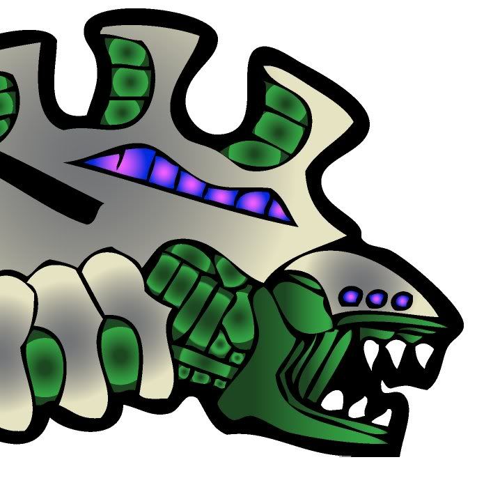
Well I was going through my files and playing around with the cool shading and highlighting tutorial that Floyd put up in the photoshop section. I have been applying this technique to various models of Jim's and mine. All the models I have used this on have already had some highlights in the form of gradient fills. Then I had an Idea. Lets take a standard bucket fill and use this technique and see where it leads. Below is the before and after shots of a TOA figure. Before 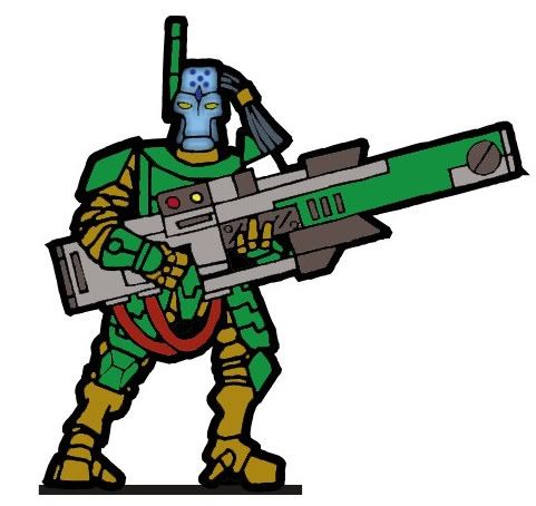 (the head was textured on the base layer with a standard box blur after filling and freckles were added after. Hence why it is textured on the before picture) All parts were filled with a standard solid color at 65% tolerance to get ride of most of the white and gray outlines. Then the shadow, highlight and bevel layers were made following the tutorial and here is what I came out with. After 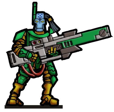 I know the lighting is off but it's not too bad looking I think. Its a lot faster to do this then work out gradient fills for each section and then make them all look good. Nate |
|
|
|
Post by onemonkeybeau on Jun 10, 2009 19:57:49 GMT -9
Hey!
Nice work Nate!
The guy looks excellent!
onemonkeybeau
|
|
|
|
Post by Dagger on Jun 11, 2009 5:40:59 GMT -9
Yeah... that's some significant improvement between them. I just love the beveling on the weapon. I wonder what some beveling would look like on his armor plates...
|
|
|
|
Post by Slick on Jun 11, 2009 18:51:44 GMT -9
I don't know, thats a great idea to try out the bevel on the weapon ill give it a shot later tomorrow! Nate EDIT Well latter tomorrow came about 30 min after I posted the above statement and here is a pic. 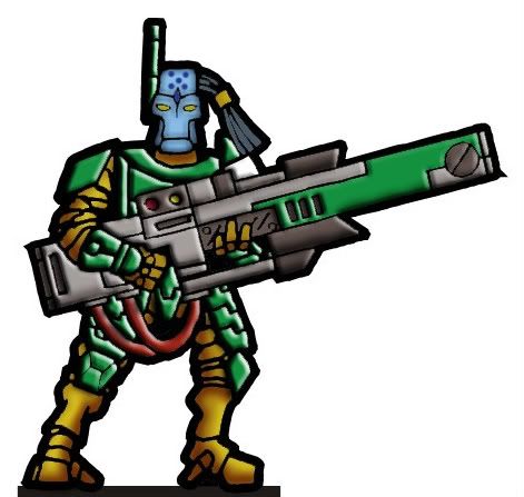 I like it but we will have to see how well it prints. I think that the details are too fine to look that good on paper but Ill give it a try later. There is no shading done to the beveled armor parts I let photoshop do that. I might be able to tone it down some after some messing with the bevel settings. Nate |
|
|
|
Post by Dagger on Jun 11, 2009 20:00:12 GMT -9
I like it... it's especially dramatic when you look at it next to the original figure...
|
|
|
|
Post by Dave on Jun 12, 2009 15:41:10 GMT -9
I like it!
There's a white patch just above his left shoulder. Should that be colored?
I wonder if some shading beneath the rifle would give it more weight? It seems to be a little flat. I'd be tempted to use a blue-to-green gradient layer on the armor to tie the color scheme together, and maybe apply an outer glow to make those red and yellow buttons/displays on the rifle look like they're luminous.
|
|
|
|
Post by Slick on Jun 12, 2009 17:08:09 GMT -9
There's a white patch just above his left shoulder. Should that be colored? I wonder if some shading beneath the rifle would give it more weight? It seems to be a little flat. I'd be tempted to use a blue-to-green gradient layer on the armor to tie the color scheme together, and maybe apply an outer glow to make those red and yellow buttons/displays on the rifle look like they're luminous. The white patch above the shoulder is left white as that part of the pad and the symbol is in white. I also tried applying a gradient shade over the armor as well but it messed up with the beveling. (alas this is most likely just my inexperience causing the problem) Great idea about the luminous buttons ill have to see what I can do. I also added a drop shadow under the weapon but removed it due to the figure becoming too dark. Ill post where I'm at with the figure latter tonight. Nate !EDIT! Here is the final figure. I'm done adding details too it. I added a shadow under the weapon and made the 2 displays on the gun have a bit of a glow to them. I need to stop here because I want to be able to replicate this on the other figures and I'm already at 10 layers. 1) base color image 2)green armor bevel (fronts) 3)green armor bevel (backs) 4)white armor bevel (front) 5)white armor bevel (backs) 6)light gray/red weapon bevel 7)dark gray weapon bevel 8)Highlights 9)shader 10) detail parts (glowie bits and what not) Here is the pic. 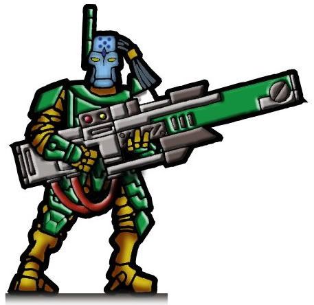 The figure came a long way from the basic solid fills that I started with and it was not too much work to get it looking like this. The figures printed well but I might increase the brightness by about 5-10% on my next batch. Nate |
|
|
|
Post by Dagger on Jun 13, 2009 6:04:36 GMT -9
The shadow below the weapon was a nice touch... but you're right about going too far with the detail, if it's not noticeable at gaming distance it's really a waste of time and will slow down your production process...
|
|
|
|
Post by Slick on Jun 13, 2009 13:15:04 GMT -9
Well here one is all built up and edged. The base is just my test base I need to find a good set of bases for them. I might also try out the flat basing style on these guys but I like round bases. I don't know I'll have to see. 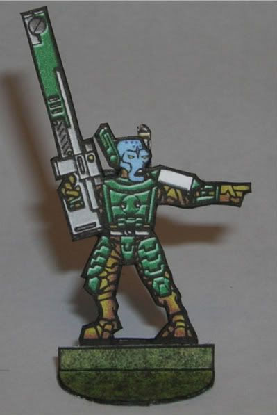 This has been a great learning experience now on the the other figures in the set. Nate |
|
|
|
Post by Dagger on Jun 13, 2009 17:42:02 GMT -9
That's pretty nice... the beveling really makes the armor pop...
|
|
|
|
Post by kane on Jun 15, 2009 7:07:42 GMT -9
That turned out very well! The face could use a bit more shade and highlight, but the armour and weapon look great.
|
|
|
|
Post by agelessone on Jun 15, 2009 7:48:05 GMT -9
Yes, that looks really nice...the armor segments look like they are separate part rather than part of the shirt.
very cool
|
|