|
|
Post by sammo on Sept 9, 2010 7:05:57 GMT -9
Here is the last mini for this faction, a set of archers, limited pose and color variation but there are 5 in the PDF. Now I'm going to finish all the builds... 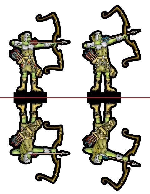 and the PDF broken |
|
|
|
Post by mruseless on Sept 9, 2010 10:28:38 GMT -9
Nice!
|
|
|
|
Post by Floyd on Sept 9, 2010 12:09:48 GMT -9
Looking very nice. I like your figure and I like the earthy colors. The
bow is also very cool.
For miniatures on the table you "may" want to test out putting a larger separation in the major body parts & major details.
One minor picking of nits... the foreshortened foot looks a little... maybe.. to small? or it could be that it is not quite sitting on the flat plane line drawn from the bottom of the other foot.
Cheers mate & keep up the good work!
~Floyd
|
|
|
|
Post by Sirrob01 on Sept 9, 2010 14:26:22 GMT -9
Looking very nice, should make for a nice warband  |
|
|
|
Post by sammo on Sept 9, 2010 14:31:33 GMT -9
Yeah, I think the foot is a little to small and the look is amplified by the fact that it doesn't sit right on the line. It's not so noticeable when it is built though.
I told myself I was going to just keep plugging through all of the minis I wanted to do for 2 factions and not backtrack, so when i learn a new lesson/technique on mini #10 I wouldn't have 9 minis to redo to make them look as good.
I'll post some pics of all the minis in the next day or so when I have them all built, it should make for a impressive little force.
What do you suggest to separate the mini parts more? Stronger outline or more contrasting colors? These first minis i have been struggling with the colors, trying to get enough contrast but keeping the earthy tones (since they are all woodland folk).
|
|
|
|
Post by noncharon on Sept 9, 2010 16:06:47 GMT -9
I'm just a lurker here that snatches stuff for my D&D game, but I really enjoy your stuff. Keep it up. |
|
|
|
Post by Sirrob01 on Sept 9, 2010 17:28:47 GMT -9
I struggle with contrast on print out as well and it's very tough when you spend time colouring and then on printout the colours are flat and you have to go back and recolour (I was very disappointed in my chimera on printout). I played around with the above (hopefully thats okay)to give you a bit of an example: 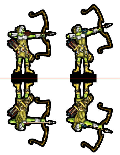 In gimp Basically Duplicated and turned layer to burn made new layer from visible set burn layer to hidden set new layer to overlay at 45% done. I find burn does less washing out than just upping the contrast/brightness on the image (dodge is the other good one). I still like your original edit: I'm happy to send you the xcf/psd file if you want to view it as layers? |
|
|
|
Post by squirmydad on Sept 9, 2010 17:49:14 GMT -9
They look great, nice coloring.
|
|
|
|
Post by Reivaj on Sept 9, 2010 18:56:41 GMT -9
Great work sammo!!, i´m working in some archers too, but this are Satyrs, I´m just starting. You made a very good work! Congratulations  |
|
|
|
Post by sammo on Sept 9, 2010 22:17:50 GMT -9
@ Sirrob01:
I'd really appreciate a .xcf copy. It's really cool how subtle the difference is but how much crisper it looks. I'd like to check out the layers so I can repeat it.
Thanks for the comments everyone!
|
|
|
|
Post by Sirrob01 on Sept 10, 2010 4:08:53 GMT -9
|
|
|
|
Post by sammo on Sept 10, 2010 14:20:33 GMT -9
Thanks for the file. It is pretty easy to see how it works with the example. Also I can add a new technique to my toolbox for future minis. |
|