|
|
Post by revgunn on Sept 18, 2011 19:15:27 GMT -9
  Hey y'all. I've been lurking around for a few weeks, just watching things. Mostly, I'm trying to learn to be a better artist. You folks are awesome. All these threads of great new work everyone is doing. I bought the Whiplash Trigger set Dave Okum made, and I love them. Except for the guns, they're perfect. I've learned a LOT from OkumArts stuff lately. Made me want to start drawing again. That and I started a new RPG with a really great group. They know nothing of paper miniatures. I've been working on a few new ones, with some new style to them. What do y'all think? I'm wondering if I should flatten out the feet on the bottom figure. I know the back on that one is giving me fits.... it just keeps looking wrong, especially that left arm. I'm having real issues staying focused. Having some trouble "seeing" the character. Major frustration. I just bought myself a Wacom Bamboo, so I hope that will help me get in the groove again. It actually works in GIMP. I'm wondering about going commercial. Wild huh? Any thoughts? |
|
|
|
Post by cowboyleland on Sept 18, 2011 19:27:59 GMT -9
Just my two cents: I think the bottom guys back should be pretty much covering the left arm, much as his other arm is, but maybe we should see a hint of his right fingers coming around between his arm and his back.
|
|
|
|
Post by revgunn on Sept 18, 2011 19:33:00 GMT -9
Ok. Thanks. You're the back guy, so, yeah. I can't "see" it on my own.. I'll try again tomorrow with your suggestion. I'm having mind block here tonight.
|
|
|
|
Post by gilius on Sept 18, 2011 19:33:51 GMT -9
Great figures. I'm amazed at how people can add lots of nice details to their drawings. Mine always lean towards basic outlines. I have some plans for working on that.
|
|
|
|
Post by revgunn on Sept 18, 2011 19:36:05 GMT -9
Yeah... well Gilius, detail might be my downfall. I think I tend to add too much. I just can't seem to stop myself.
|
|
|
|
Post by josedominguez on Sept 19, 2011 9:46:49 GMT -9
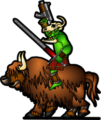
I love the bottom guy...... Panic at the Disco meets Clockwork Orange via A Fistful of Dollars.  |
|
|
|
Post by revgunn on Sept 19, 2011 21:15:42 GMT -9
Wow, I'm flattered. You can see the character. He's a polite psychopath.
|
|
|
|
Post by Vermin King on Sept 20, 2011 7:35:24 GMT -9
Only those feet are going to give you fits unless you make them flat. The perspective view give the downward facing foot on front view, but on the back they would be pointed up, which won't match front to back.
flat feet would solve the problem. And cowboy is right about that arm.
These guys are really loaded with character. I was thinking steampunk clockwork orange on the last guy, too.
|
|
|
|
Post by revgunn on Sept 28, 2011 21:14:28 GMT -9
I'm really working on coming up with my style. The stuff I've done so far is not what I want them to look like. After working on new techniques, I've arrived at this....  All I'm really interested in is Western stuff. I've been researching a lot, looking at actual historical dress, as much as possible. I'm not sure why its so important to me, but it is. I'm having a LOT of trouble staying focused. I really want to create the coolest figures I am capable of... I just don't have the time. All this real life stuff keeps getting in the way. I've been sick, plus trying to be a husband and father, working, and doing all those responsible things. I'm gonna push myself though. I WANT to deliver something really awesome. I'm gonna be just lurking and working for a while, til I get something DONE. Opinions and criticism are welcome.... I'm still trying to work out how I want to draw these, a trade off of detail and visibility on the table. I'll welcome all the help I can get. |
|
|
|
Post by Vermin King on Sept 29, 2011 8:54:14 GMT -9
I think he looks really good as is. flat feet help a lot ... LOL
|
|
|
|
Post by cowboyleland on Sept 29, 2011 9:46:45 GMT -9
Looks great so far. Right now I like the pants/shirt look better than the gradients in the belt and hat, but I don't know what it will look like shrunk and printed. I'm afraid some of the subtle stuff I like is going to get lost.
|
|
|
|
Post by revgunn on Sept 29, 2011 13:33:58 GMT -9
Thanks. Yes, the feet really help. I dunno what I was thinking before.
Well Cowboy, in the ones I've printed in the past, most of the detail can still be seen, provided I get the colors light enough. A few were just too dark. If you picked em up and looked at them, you could pick it out, but at any distance it was just dark mush.
It's all gradient shaded. I just worked on the shadows and highlights by hand on the shirt and pants. Hadn't gotten to the pistol belt yet.
One thing bugging me is on the britches. Where the highlights are, its like they pop out or something. 3d ish looking. It did that when I jpeg'ed it. As an XCF it didn't look like that. Strange. In any case, I've gotta smooth everything out. Thanks for the feedback y'all.
|
|
|
|
Post by mruseless on Sept 30, 2011 10:40:20 GMT -9
I dig these!
|
|
|
|
Post by kiladecus on Oct 1, 2011 13:18:34 GMT -9
I think it looks great, Rev. No complaints nor critisms from me.
|
|
|
|
Post by Vermin King on Oct 4, 2011 11:54:46 GMT -9
I've been crawling old 'Found It on the Internet' threads lately and saw this www.nemsi-books.com/PubCompany/?page_id=1047 . The main point of interest is that on the flat figures, they are drawn with a perspective of looking down at the feet. They handled the back view by blocking with a rock, etc. Kinda applies to the foot problem. |
|