|
|
Post by Adam Souza on Oct 28, 2011 7:57:24 GMT -9
|
|
|
|
Post by Vermin King on Oct 28, 2011 9:07:57 GMT -9
Excellent idea.
|
|
|
|
Post by nikloveland on Oct 28, 2011 14:26:06 GMT -9
I second that motion. Too bad I can't actually help  |
|
|
|
Post by kiladecus on Oct 29, 2011 12:29:10 GMT -9
It was Tommygun making fun of me, and my lack of skills and abilities... I get that a lot.
Clever idea nonetheless.
I need to break out my Crayola markers...
|
|
|
|
Post by pblade on Oct 29, 2011 20:48:57 GMT -9
I need to break out my Crayola markers... I'd recommend talking with Dryw then, since if my memory serves that's how he does his Imperfect People. ;Df - Pb |
|
|
|
Post by josedominguez on Oct 30, 2011 8:49:44 GMT -9
|
|
|
|
Post by Adam Souza on Oct 30, 2011 10:31:59 GMT -9
Sweet !! Thanks Jose !!
|
|
|
|
Post by cowboyleland on Oct 30, 2011 16:23:39 GMT -9
That is exactly what I was picturing, but I didn't know how to pull it off. Well done!
|
|
|
|
Post by dragnoz on Nov 3, 2011 0:58:04 GMT -9
|
|
|
|
Post by kiladecus on Nov 3, 2011 3:44:49 GMT -9
Looks good. But then again, it IS Adam's work. There are MANY talented artists here. I love this site!  |
|
|
|
Post by Adam Souza on Nov 3, 2011 7:25:44 GMT -9
Wow , that's great Dragnoz. I dig the shadow and highlights and the whole watercolor vibe. Looks good. But then again, it IS Adam's work. There are MANY talented artists here. I love this site! Thanks, I really appreciate the vote of confidence. After getting used to Jim Hartman's, Adam Steel's, and now Dave Okum's stuff I feel like I draw stick figures with crayons. |
|
|
|
Post by kiladecus on Nov 3, 2011 10:47:55 GMT -9
You and I seem to be cut from the same cloth! From what I can tell, you and I don't seem to see our work for what it is. We compare ourselves to others like Tommygun, Dave Okum, Adam Steele, Labrat... I could go on and on... Maybe instead of comparing your work to Adam Steele's, you need to compare your work to Adam Souza's! Don't get me wrong, I am not saying that your stuff and your talent isn't as good as his. I am NOT saying that at all. As a matter of fact, I like some of your stuff MUCH better than some of his stuff. I was thinking of this the other day. Imagine if EVERYONE's stuff looked the same. Sure, it would be awesome to have all figures blend together with the same style... but then again diversity is cool in it's own right. Imagine the Mona Lisa done in the style of Andy Warhol... (how's THAT for an example!!) I like some stuff that looks very realistic, but I also like big honking robots... and super heroes. If we were limited to just one kind of figure, one style, look at what we'd be missing. As far as using crayons, I have been working for MONTHS to complete my undead set of figures that I am releasing with Inked Adventures. I have tried SEVERAL computer programs only to have EACH one have it's share of problems. Billiam Babble suggested that I do what I knew... So I broke out the magic markers. In short, the set is being reviewed and prepared for release. See, if you try to be someone else, or do things like someone else, you stop being yourself. Your artwork suffers. As a result, the forum and all the people here suffer, because they lose out on your work. We don't need more "wanabe clones." We need more Adam Souza's, and dare I say, more David Wears here doing what they can and enjoying it. Sure you are no David Okum, and I for one am GLAD! Afterall, he is a brilliant designer, but I never downloaded any M.A.D.'s that he designed!  (I am sure that I will need to read this a few times myself when I feel put down by my work. ) So, there you have it... Putting away my pom-poms, and climbing down off my soapbox. for what it's worth... |
|
|
|
Post by imnntt on Nov 3, 2011 19:37:12 GMT -9
|
|
|
|
Post by Adam Souza on Nov 3, 2011 20:56:41 GMT -9
Thank you for the positive reinforcement Kiladecus ;D
I know what you mean, there is soo much great work done here, and a big part of it's strength is diversity.
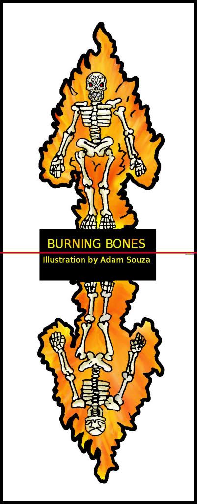
Imnntt, I love the coloring your did.
The bones really pop, and the colored tribal is something I hadn't even considered. The orange border was a great choice, as it compliments the flames well. The shading and glare on the back of the head were nice touches as well. Thank you for contributing your talent.
|
|
|
|
Post by Adam Souza on Nov 4, 2011 23:39:59 GMT -9
Added  One of the mutated plants is 90% done, just have to adjust it's alignment so the front and back match up better. |
|
|
|
Post by kiladecus on Nov 5, 2011 11:08:16 GMT -9
It's about time you add that one! Will try to tackle a couple of these next week. |
|
|
|
Post by Adam Souza on Nov 14, 2011 7:31:48 GMT -9
Added a Mutant Plant to the mix  |
|
|
|
Post by paladin on Nov 21, 2011 16:53:37 GMT -9
I will give this Plant some color. Will take a while though.
|
|
|
|
Post by Adam Souza on Nov 21, 2011 19:38:22 GMT -9
Thanks Paladin, any assistance would be appreciated.
You've done a wonderful job with the zombies and Cyclops Robot in the past, I'm sure it will look great.
|
|
|
|
Post by paladin on Nov 22, 2011 14:00:45 GMT -9
;D Thanks for trusting me! I will try my best - promised!
|
|
|
|
Post by kiladecus on Nov 22, 2011 14:08:04 GMT -9
I emailed you my BOBA FETT submission. I hope you got it. If you don't want to post it, I understand. |
|