|
|
Post by Cardstock Dane on Aug 26, 2015 22:56:47 GMT -9
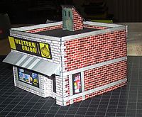
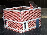
Here's my first entry in this years competition (a couple more to followin other categories). It is also the first kitbash I did a couple of years back, and it's a kitbash of a building from my first card model purchase - the Deli from Microtactix' 'Twilight Street'. The theme I chose was a bit of fun - I also bait scammers and the 'Western Onion' is a little pun we do on the scammers preferred money transfer service.  Front:  Back:  And compared to the original model:  So that was my first attempt at a kitbash. I was satisfied when I was done, and I still think it came out well, although the pen slipped when I was doing the edging.  Anyway, It's not a big kitbash of an entire medieval village or anything, but I still hope you like it.  Textures used are grom cgtexturex.com and 419eater.com. |
|
|
|
Post by Vermin King on Aug 27, 2015 4:04:31 GMT -9
Is my computer acting up? I don't see photos...
|
|
|
|
Post by Cardstock Dane on Aug 27, 2015 5:03:40 GMT -9
I see them...
|
|
|
|
Post by oldschooldm on Aug 27, 2015 6:48:54 GMT -9
So that was my first attempt at a kitbash. I was satisfied when I was done, and I still think it came out well, although the pen slipped when I was doing the edging.  Anyway, It's not a big kitbash of an entire medieval village or anything, but I still hope you like it.  Thanks for the submission - it's awesome how many styles of modifications we see. Some focus on geometry, texture, conversions, etc. This is a big-tent category and you are more that welcome! As to "slipping pen" while edging - 1) It happens to all of us (often), 2) Never admit it and your players will never see it, and 3) That is why you don't see photos of the "fourth side" of many models. :-) |
|
|
|
Post by Vermin King on Aug 27, 2015 7:08:57 GMT -9
I see them now! Very nicely done.
|
|
|
|
Post by bluecloud2k2 on Sept 17, 2015 19:15:33 GMT -9
Pity you can't make that available for download... cuz it's awesome and I'm always looking for freebies for my city board.
Though I'd love to snag that sign!
|
|
|
|
Post by Cardstock Dane on Sept 18, 2015 12:10:25 GMT -9
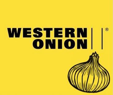
Thanks.  The sign is no biggie, really - a Photoshop amalgamation between an ordinary Western Union logo, and this:  |
|