|
|
Post by onemonkeybeau on Nov 2, 2010 10:10:01 GMT -9
THAT is AWESOME!
Thanks for the link... I missed it too!
onemonkeybeau
|
|
|
|
Post by onemonkeybeau on Oct 28, 2010 5:24:36 GMT -9
Nice job, Rob! The paper looks much better. I wonder though, will the paper be a selectable layer? I'm just thinking that if I need 4 straight sections of road, having a paper in the same position 4 times would look rather odd. Just trying to think ahead  onemonkeybeau |
|
|
|
Post by onemonkeybeau on Oct 28, 2010 5:19:31 GMT -9
Said it before and I'll say it again:
Love, love, LOVE your style, dude!
onemonkeybeau
|
|
|
|
Post by onemonkeybeau on Oct 28, 2010 5:18:13 GMT -9
Yup, same image on both front and back.
onemonkeybeau
|
|
|
|
Post by onemonkeybeau on Oct 28, 2010 5:16:49 GMT -9
NICE!
Thanks Dave!
onemonkeybeau
|
|
|
|
Post by onemonkeybeau on Oct 27, 2010 6:55:15 GMT -9
So I've been thinking about how the actual logistical gameplay use of these would play out...
I love the idea of these but am a little skeptical of how the real-world gameplay aspect will pan out...
So, as I was looking at my figures I noticed something in common with every single one of them... their bases have a lot of unused real estate on them...
Why not mount these AWESOME status markers onto straight pins and stick them directly into the base?
-OR-
Mount just the status marker orbs (sans the pole) onto plastic paperclips and 'clip' them onto the figs as needed?
onemonkeybeau
|
|
|
|
Post by onemonkeybeau on Oct 26, 2010 6:06:53 GMT -9
My only criticism is that the paper in the upper left corner looks to me like it's hovering above the ground.
onemonkeybeau
|
|
|
|
Post by onemonkeybeau on Oct 26, 2010 5:56:50 GMT -9
Dude! These are great! My only suggestion would be to have someone (sirrob ) make a .GSD for these. And maybe bolster up the area where the pole and grass meet... might prove to be a bit flimsy... maybe you could add some taller grass, or a rock to make the weakened area not so close to the bottom? At any rate... AWESOME job and I'll be using these bad boys for sure! Excellent idea, my friend! And much needed! onemonkeybeau |
|
|
|
Post by onemonkeybeau on Oct 25, 2010 5:51:37 GMT -9
Yeah, I like it too! My only suggestion (more of a how-would this-look thought) would be to move your aim stats so that the bullseye was in the center of the two stats like the revision before. I think this might make the card feel more balanced as all the other icons are lined up vertically as well. EDIT: oh, and the new METTLE icon looks good onemonkeybeau |
|
|
|
Post by onemonkeybeau on Oct 25, 2010 5:45:57 GMT -9
I think that's smart... get the rules/playtest finalized and then work on the aesthetic appeal.
I'm with you either way!
(but I still think grungy would cool ;D !)
onemonkeybeau
|
|
|
|
Post by onemonkeybeau on Oct 24, 2010 5:28:33 GMT -9
I agree the tiles look great (as usual ) But I'd like to see the cards more grungy... even tattered a bit. Right now they look too pristine. onemonkybeau |
|
|
|
Post by onemonkeybeau on Oct 21, 2010 19:57:03 GMT -9
Any chance one of the first ones could be the newly released Zombies?
Thanks!
onemonkeybeau
|
|
|
|
Post by onemonkeybeau on Oct 20, 2010 12:31:07 GMT -9
Nothing says Christmas like zombies!  onemonkeybeau |
|
|
|
Post by onemonkeybeau on Oct 20, 2010 10:13:58 GMT -9
I think, my friend, that that is it! I really like the icon only card! You've packed a LOT of info on it without being overwhelming! Congratulations! Now, all we need to do is grunge-ify it up a bit and I think we're good to go! I really think a few plays with the rules in hand where all references to the stats include the icon, people will catch on quickly... The icon card makes it look so much cleaner... but that's just me At any rate, excellent job! EDIT: I just noticed that the tattered edges on the front side don't match up with the edges on the back... they probably should be mirrored for aesthetic appeal onemonkeybeau |
|
|
|
Post by onemonkeybeau on Oct 19, 2010 16:55:27 GMT -9
Yeah... me too.
;D
onemonkeybeau
|
|
|
|
Post by onemonkeybeau on Oct 19, 2010 16:48:42 GMT -9
YES! We're getting really close! I really like the changes you've made. I am thinking Parduz is correct with the text vs. icon thing... might want to play around with that for a while... kind of like the Warlord CCG does. Once people know the icons and what they stand for there won't be any need for explanation...  Obviously you have a bit more stats, but you have gotten the general gist of what I was going for! Excellent edit! onemonkeybeau |
|
|
|
Post by onemonkeybeau on Oct 19, 2010 7:42:38 GMT -9
Thanks Rob!
onemonkeybeau
|
|
|
|
Post by onemonkeybeau on Oct 19, 2010 7:27:07 GMT -9
Hey Sam! I just showed the new card to my wife and her first impressions was, "it's busy" I thought about that for a while and I tend to agree. I then went off on a search through Googleland to see what others have done. My criteria was a card with lots of info on it Here's what I found:  I really like how this card looks. It says a lot without seeming cluttered. I think one of my hangups with your card is that the font is too big. I've noticed on all other cards, the font is rather small, and a lot of the info that's used over and over is represented with pictures... like this one 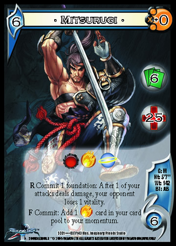 or this one... Too, what's keeping us from turning the card sideways, like this one?  Hope these help the creative process... I really like where you're going with this! onemonkeybeau |
|
|
|
Post by onemonkeybeau on Oct 18, 2010 14:31:30 GMT -9
Hey Rob! Just robo'd out Adventurers 2 and it seems the perforation line was made into a cut line, so that the fig comes out in two pieces Also, on the Wood Elves the aiming archer's arm/bow space is not getting cut out. Thanks again for these! I'll check the others soon. onemonkeybeau |
|
|
|
Post by onemonkeybeau on Oct 18, 2010 8:16:15 GMT -9
No joke revgunn!
These look excellent!
Looking forward to a full posse!
onemonkeybeau
|
|
|
|
Post by onemonkeybeau on Oct 17, 2010 16:53:40 GMT -9
Parduz, I think your observations are very needed. You have a very keen eye and I'm sure your skills are appreciated by all involved. Keep them coming onemonkeybeau |
|
|
|
Post by onemonkeybeau on Oct 17, 2010 16:47:04 GMT -9
LOL!
Thanks Rob! I'm sure my daughter (and magpiestear's) will be in 7th heaven... as soon as I get some new cartridges...
Thanks again!
onemonkeybeau
|
|
|
|
Post by onemonkeybeau on Oct 17, 2010 6:09:50 GMT -9
You sir(rob), are a prince among men! Thank you for converting these bad boys! onemonkeybeau |
|
|
|
Post by onemonkeybeau on Oct 14, 2010 17:45:25 GMT -9
Hey Sam! Card looks good. I'd like to see a more 'lived in' look to the card rather than a sterile gradient fill though... but that's just me Just a few things I found for you to change before the final draft The words on the back of the card on the PDF tend to blend in with the figure... the card in the preview in the post above is much more legible. Might have to do with the background color too. Misspellings on the bask are: recieve = receive (pesky "i" before "e" except after "c" rule...) elit = elite know = known I'm really excited to see where this leads! I'm still perusing the rules but Parduz has asked all my questions already Great job Parduz! If I have any more, I'll shoot them to you here. Beau |
|
|
|
Post by onemonkeybeau on Oct 12, 2010 6:24:16 GMT -9
I tend to system hop One shots are the way we go for sure... I find that getting together a group regularly is really tough (family, work, real life...) So when we play it's usually small one shots or maybe a few linked adventures. onemonkeybeau |
|
|
|
Post by onemonkeybeau on Oct 12, 2010 6:20:31 GMT -9
Me too, you can never have too many monsters!
onemonkeybeau
|
|
|
|
Post by onemonkeybeau on Oct 11, 2010 17:06:32 GMT -9
I'd be happy to read them over for you, look for typos and inconsistencies (something I'm pretty good at spotting ) onemonkeybeau |
|
|
|
Post by onemonkeybeau on Sept 30, 2010 10:20:58 GMT -9
Heh heh, I'm the same when it comes to RPG's... Savage Worlds is a generic set of RPG rules that, as their tag line says, is Fast, Fun, and Furious. I think the best thing you could do would be to download the free Test Drive set of rules. This will give you a good look at what the system can do. It's basically an RPG that was designed to be used with miniatures (which is what I like). Test Drive 6Then, you can download the skirmish set of rules (the full ruleset is free!) called Showdown... this is an excellent Fast, Fun, and Furious miniatures skirmish ruleset that has recently been updated and made a lot more streamlined and balanced. Showdown Skirmish RulesAlso go HERE for more free goodness! Hope that helps you onemonkeybeau |
|
|
|
Post by onemonkeybeau on Sept 30, 2010 8:05:28 GMT -9
Yeah, Savage Worlds is an awesome system... check out their skirmish ruleset too!
onemonkeybeau
|
|
|
|
Post by onemonkeybeau on Sept 30, 2010 6:18:26 GMT -9
Mine's pretty self explanatory ;D I'm Jim's testing monkey... and my real name is Beau... onemonkeybeau PS: I'm also known as momaw27 on the internet which is the name of the Hammerhead alien in the Cantina scene in Star Wars. And 27 is to help me remember my wedding anniversary date... so my wife doesn't kill me.  |
|


