|
|
Post by Vermin King on Sept 20, 2020 8:15:43 GMT -9
I want to thank Zephalo for finding this piece at the Victoria & Albert Museum With a bit of googling I found a larger (complete) version of the image: 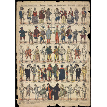 Greetings, Zephalo Credits -- Object: Print Place of origin: Rome (city) (made) Date: 19th century (made) Artist/Maker: Turati, V. (chromolithographers) Grixoni, E (drawn) Excelsior (publisher) Materials and Techniques: chromolithograph Credit Line: Harry R. Beard Collection, given by Isobel Beard Museum number: S.896-2009 These types of figures were used in Paper Theatres, so the feet would have a bit of a base that is glued to something to set on the stage or they would be glued onto sticks so that the kids could move them around. So the feet are in perspective. Point down when looking at the front view. Up for the back. I think I am going to keep the feet, but adjust the base into more of a 'hump' than a strip. I've got all the background cleaned up and before I started working on them, I had done an unsharp mask. I also fixed some of the damaged areas. I am not going to do all the figures, but the ones I do will be approximately 30mm. I don't change my grids around much. I leave them at 75 pixels/ 1/4 inch. 30mm usually works out to being one inch on the neck somewhere. I will adjust color on individual figures rather than try to do a color adjustment for the whole page 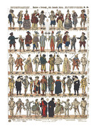 |
|
|
|
Post by Vermin King on Sept 20, 2020 11:46:23 GMT -9
Well one thing I have learned is that even the better copies of the figures have damage that needs fixed. I started on the fellow in the middle on the bottom row and realized I had a whole lot of work to do on it to get it usable. All the folds and shadows disappear in a sea of blackness. The file was a jpg, so there was also a lot of jpg-related blockiness. So I picked a lighter figure and it also has quite a bit of work to make it look good. This is going to have to be a long-term project
|
|
|
|
Post by Vermin King on Sept 20, 2020 16:48:46 GMT -9
Might actually be easier to redraw them...  |
|
|
|
Post by cowboyleland on Sept 21, 2020 14:47:13 GMT -9
If you want a name to put on that guy's base, he is Pantalone. I don't know who she is.
|
|
|
|
Post by Vermin King on Sept 21, 2020 15:40:11 GMT -9
I was thinking of going through some vintage cards of Carnivale personalities to get the names, but thanks
|
|
|
|
Post by cowboyleland on Sept 21, 2020 16:35:04 GMT -9
No problem. That theatre degree of mine should be good for something.  |
|
|
|
Post by squirmydad on Sept 21, 2020 18:51:40 GMT -9
I've sent the image to my Theatre hivemind for assistance.  |
|
|
|
Post by Zephalo on Sept 22, 2020 3:34:45 GMT -9
Just to keep you busy... A couple of months ago I made extended search for (more or less) historical paper soldiers. I found a lot of what I call "standees" (minis with only front and no/black/mirrored back), but also a lot of "real" miniatures (front and back). (You can find a lot of interesting facts about paper soldiers on this Spanish page: www.estamperiapopular.com/The most interesting for me was this page there about double sided paper soldiers: www.estamperiapopular.com/?page_id=665 ) The French company Pellerin made a lot of paper models in their different L’Imagerie d’Epinal series, the interesting term here is "personnages à aspect complet" as these are double sided paper minis. I found three more pages of "carnevale" figures published by Pellerin at the Dutch Gerheugen digital collection:   The first two are a bit like caricatures, but the last one fits quite well to the Italien one:  The JPGs you can download there are quite low quality, but you can use the page intern zoom and make screenshots like this:  Greetings, Zephalo |
|
|
|
Post by Vermin King on Sept 22, 2020 4:31:56 GMT -9
Outstanding! Thanks
|
|
|
|
Post by Vermin King on Sept 22, 2020 12:58:02 GMT -9
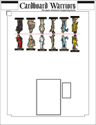
I find it interesting that different sites give different names to images obviously taken from this sheet (at the top of the thread). Most agree, but many do not agree. I mentioned cards that had figures and names. Some of those were evidently from the same company that did this sheet. I think I will take their designated names when there is a difference. I also think that the images are more distinct on the cards, so I may play with cleaning up those images and swapping out with the ones from the big sheet EDIT -- nice page, www.atelierdesarts.com/maschere/maschere-1.html |
|
|
|
Post by squirmydad on Sept 22, 2020 13:33:56 GMT -9
 From a Theatre friend; 1 Capitano (may be a specific Capitano) 3,13,25 are all Inamorati 3 is Columbina specifically 7 Is a zannin but I'm not sure which 14 Brighella 17 Balanzone/Dottore 19 Arlechinno 21 Beelzebub 22 Pulcinella 24 Pedrolino 26 Pantlone |
|
|
|
Post by Vermin King on Sept 22, 2020 17:34:32 GMT -9
Judging by the Maurice Sand images that these were taken from, I think I can make a case for several. Although I am not sure if he was suffering brain fuzz on a couple, because they look nothing like the standard versions 3 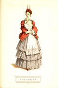 6  7  8 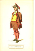 11 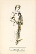 12 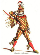 15 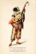 16 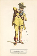 17 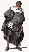 19 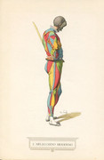 20 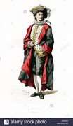 23 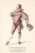 24 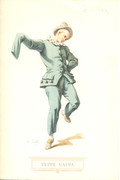 25 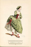 26 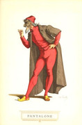 And now for the wacky one 14  You can barely read Pulcinella under it, but the color is wrong and the hat is wrong. hmmm. And what's with the mustache? |
|
|
|
Post by cowboyleland on Sept 22, 2020 17:34:47 GMT -9
I feel like 5, 10, 12, 16 and 23 could all be Capitanos. I bet at least some of them are.
|
|
|
|
Post by cowboyleland on Sept 22, 2020 17:36:30 GMT -9
Remember there is creative liscence between companies and regional variations.
|
|
|
|
Post by Vermin King on Sept 22, 2020 17:37:00 GMT -9
And you would be correct, sir
If you click on the pictures, when PostImage opens, the number and name will be in the title at the top of the page
EDIT --
went back and added numbers before the images. should be easier to navigate now
|
|
|
|
Post by squirmydad on Sept 22, 2020 20:30:33 GMT -9
|
|
|
|
Post by Vermin King on Sept 23, 2020 5:23:41 GMT -9
I hadn't been to that page before, but I did go to others. Many of the mask shops would actually use a Maurice Sand image from his books and list a character as something different than what was written at the bottom of the page, so I stopped trying to go that route. I found going to Drama sites gave better results. After Teatro San Samuele burned in 1747, and was rebuilt in 1748, it showed Commedia dell' Arte presentations, since the owner had two other theaters he wished to promote more. Sort of the Dollar Movie House of its day. This was the theater where Casanova's parents worked before heading to England. Casanova was a violinist there for a while before the fire, and managed it for a time after the fire. It was torn down in the 1890s to make way for an elementary school.   Thanks EDIT -- Over lunch, I swapped out Pantalone's mask and nose, and was working on Corallina. To satisfy my curiosity, I cropped and resized the Maurice Sand image, sitting next to my work box. I am assuming that copyright law wasn't so strict back then  |
|
|
|
Post by Vermin King on Sept 24, 2020 10:43:26 GMT -9
I am going to go with Pulcinella being #22, since that fits the Italian description best EDIT -- Another Maurice Sand image will fix this one up to look nice (at least for the front). Corallina certainly looks better than from the original sheet, as does Pantalone 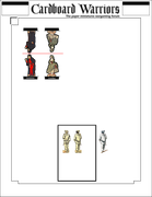 |
|
|
|
Post by Vermin King on Sept 24, 2020 16:40:32 GMT -9
I wish Arlecchino wasn't a side/back of head view in the original image. Not sure how to do the mask. 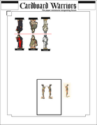 I wonder if # 18 is Stenterello. Maybe Narcisino. |
|
|
|
Post by Vermin King on Sept 25, 2020 6:51:47 GMT -9
|
|
|
|
Post by mesper on Sept 25, 2020 13:06:08 GMT -9
So much material, so little time OMG... how I know and understand such a situation and feelings... |
|
|
|
Post by Vermin King on Mar 2, 2021 19:52:51 GMT -9
I really need to come back to this. Tonight, I printed my first page of Plunder 003 - Venice from Okumarts, and when I started working on color combinations of the bonus page, I really wanted to give a couple of the characters bauta masks, so I checked my Pietro Longhi file and stumbled upon this long-forgotten project. Not that long ago, but too long.
Maybe I can knock out a figure a week, or at least set that as a goal.
|
|
|
|
Post by Vermin King on Mar 3, 2021 10:21:51 GMT -9
Peppe Nappa is next 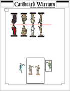 I think the blue is the more appropriate color, but the green looks more like the theater figure |
|
|
|
Post by cowboyleland on Mar 3, 2021 11:23:52 GMT -9
Nice work! Especially Puncilla's hat and you were very clever with Pantalone's left hand.
|
|
|
|
Post by Vermin King on Mar 3, 2021 12:21:24 GMT -9
In working on some of the vintage buildings and things, and trying to make photograph images into something that will print well and look right, I learned a few tricks that will actually make this project move more swiftly. Between calls and webinars (okay, during one of the webinars), I made some decent progress on Peppe Nappa. If I do the front in blue, I will have to do the back in blue also, which might take a bit of time. 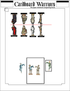 |
|
|
|
Post by Vermin King on Mar 4, 2021 6:10:48 GMT -9
These things are a labor of love, really, but I like to think it is also improving skills. Finished the front of Peppe Nappa. I probably have two hours in this already and still need to do the back. But I think he looks pretty good so far. If you are bored, just overlay the finished figure over the Maurice Sand figure to the left. Different pose, yet it still looks like a Sand illustration. Oops. PostImage is having an issue. When I click on the PostImage button, it tries to take me to the non-existent postimage.org . Hmmm EDIT -- And PostImage button is still messed up. I decided to do very quick and dirty on the backs from now on. The backs will be from the sheet with only slight modification EDIT #2 -- PostImage is back! 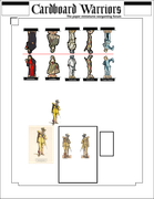 #16 Capitan Spezzaferro will be next. Anyone have one of these in particular they would like to see? |
|
|
|
Post by Vermin King on Mar 6, 2021 6:26:38 GMT -9
 As Capitan Spezzaferro required more manipulation, and I needed to do more verifications, I came to realize how poorly the back would align with the front on the Epinal figures I am basing this on. On the other figures, I did the border for the front,fuzzy selected the border, flipped it,and placed it on the back and adjusted the back to fit. Not a big change on most, but I think this one was crammed in on the edge, which messed things up, but there were also issues on the height of some of the elements. Once I finish the borders, this one should align better than the others. Not that alignment is bad on the others, but the borders should make the misalignments negligible |
|
|
|
Post by cowboyleland on Mar 6, 2021 9:50:16 GMT -9
Hey Vermin King, why did you switch to the fold line over the figures instead of the good ol' along the bottom of the base? |
|
|
|
Post by Vermin King on Mar 6, 2021 11:01:17 GMT -9
Since I started flat-basing. Back in the Oriental Hoard when I reworked some of the tatebanko figures, I started doing that. @bravesirkeviin prefers side folds, but I don't have good luck with that compared to top fold. And for folks that like the tabs glued together, I don't think side-fold works as well.
Top-folds line up the figures easier. Just make sure the tabs line up. I add the grey line in there to give a little leeway on getting glue on the tabs when I flat-base.
I just think it is the best way to accommodate the OneMonk-style basers and the flat basers.
|
|
|
|
Post by cowboyleland on Mar 7, 2021 7:59:07 GMT -9
I never thought about the tabs giving better points of reference when folding. Makes sense.
|
|