|
|
Post by Sirrob01 on Oct 26, 2010 2:20:58 GMT -9
I know there's about 4-5 sets of road tiles already out there, commercially and otherwise but I've always wanted to try some terrain  . I'm trying to get a sort of Victorian/Steampunk era look to the tile rather than a full fantasy look, not sure I'm there, I may have gone to modern with a few elements and to fantasy with some others: 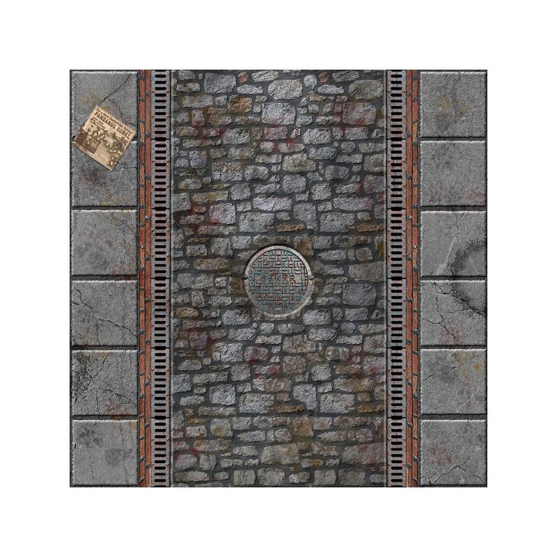 Looking for thoughts and idea's on the above as I could find very little inspirational pictures or images of Victorian era roads (or steampunky ones). thanks for any input  edit don't wry turtles are laid out gsd's to go |
|
|
|
Post by Parduz on Oct 26, 2010 2:55:21 GMT -9
Well, i like it a lot. I'm not very fond in victorian era (i dunno really what the look should be), and i know nothing about steampunk (it did'nt really catch me), but i have, around me, a lot of old, medieval / '800 paved roads: what they have in common is that the stones that are made of are mostly rounded and smooth. The reason is that it is easier to take rocks from rivers than to break mountains (and river rocks are rounded) and that carriages wheels tend to smooth them again... you may have cracks, but not so much "rough" rocks. Even with squared pavements they becomes smooth: 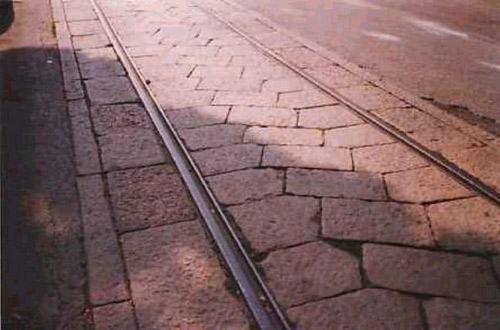 A different thing are these:    which we call "Sanpietrini" (from "San Pietro"). They are very common here, but still they become rounded (a curse for any honest biker).  Hope this help... |
|
|
|
Post by Dominic on Oct 26, 2010 3:57:30 GMT -9
Is the sidewalk supposed to be elevated, or on roughly the same level as the street? Right now it looks like there's sidewalk, then a row of bricks, then the grates, pretty much level. Am I right to assume that the bricks are meant to be rather vertical, or am I misreading the pic? If I'mnot, you should make them smaller on the x-axis.
|
|
|
|
Post by Parduz on Oct 26, 2010 4:09:19 GMT -9
 I did'nt noticed the perspective of the red bricks... which may means that they need some tweaking...
|
|
|
|
Post by Dominic on Oct 26, 2010 5:06:49 GMT -9
It just occured to me that they'll look off when you put two pieces together, the way they are drawn now, with vanishing lines and all.
|
|
|
|
Post by onemonkeybeau on Oct 26, 2010 6:06:53 GMT -9
My only criticism is that the paper in the upper left corner looks to me like it's hovering above the ground.
onemonkeybeau
|
|
|
|
Post by Dominic on Oct 26, 2010 10:22:01 GMT -9
My only criticism is that the paper in the upper left corner looks to me like it's hovering above the ground. Agreed. Laying on the street, it probably soaked some moisture and should have some kind of shadow around it, I don't know whether that makes sense. |
|
|
|
Post by Sirrob01 on Oct 26, 2010 11:22:25 GMT -9
Thanks all I really do appreciate the comments  I'll put together a new version this afternoon, I'll see if I can get the side of the curb bricks to look more vertical, I'll remove the perspective although that may make them look flatter, but some shadowing along the bottom edge of them might help. I have a small nobbly tile texture I'll see how it looks on the sidewalks, I did try 1-2 tiles of those before but it started to make everything look a bit busy. I'll see if I can sink the paper onto the sidewalk, it does look a bit floaty  . Does the overall look of the tile give that Victorian era feel? or at least not look out of place if used for a build of that era? Thanks again  |
|
|
|
Post by Tommygun on Oct 26, 2010 16:33:02 GMT -9
I really like the look.
It has a feeling that I think will work in both fantasy and SciFi.
|
|
|
|
Post by Floyd on Oct 26, 2010 18:25:32 GMT -9
Nice texture work Sir Rob! The metal grating on the edges of the stone road is pretty cool. I like the use of reds from the brick and the use of the sever access hatch. It definitely feels like Victorian/steampunk. Maybe you could add some more ornate bits here and there... maybe some patterns in the stone work occasional or something. (maybe some 2.5d flat street lamps?) The perspective is probably not such a good idea because even with shadows added it will add too much height separation from the sidewalk to the road... it would feel like a few feet drop. Unless that is your intention. Also there is the matching up the tiles perspective wise it will look odd. What I'd like to see (for variety) : Some uneven stone work, where the road isn't perfectly smooth or flat. Maybe some puddles with riles meandering off to the drainage at the sides. I'd up the contrast and make it a bit more gritty, but then again that may not be what you were going after. Again real nice work! I hope you put a set out. (if this one is any inclination of the quality then it will be fantastic). ~Floyd I couldn't resist playing with your street, here is an example of some of the ideas mentioned above. Eliminating the brick work, making some of the road stones appear uneven, added some puddles and shadows where the sidewalk meets the drainage grates. 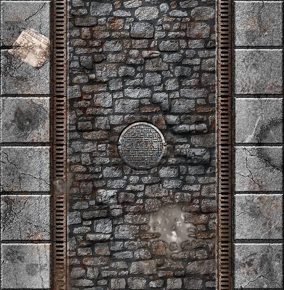
|
|
|
|
Post by Sirrob01 on Oct 26, 2010 22:00:56 GMT -9
Hey nice work floyd, you'll have to give me some tips on water it's one thing I tend to have serious problems with. Considering what you've done to my basic tile I think we should put you on the hook for a tile set  I like the smaller step drop consider that idea stolen  I might do grittyness somewhere between what you've got above and what I've done. 2.5d lamppost are a definite  Tommygun thanks for the feedback much appreciated that at least I'm on the right path. I better get busy  |
|
|
|
Post by enpeze on Oct 27, 2010 3:36:44 GMT -9
cool man. I think this is the right street for my next TL5 combat in Savage Traveller. many thanks.
|
|
|
|
Post by old squirmydad on Oct 27, 2010 9:50:23 GMT -9
Sherlock Holmes & the Case of the Clockwork Strangler...Nice roads.  Do you have any ideas for buildings or canals? |
|
|
|
Post by magpiestear on Oct 27, 2010 12:35:47 GMT -9
These are looking good Rob, and those manholes look like they might have mutant turtles living under them.........  |
|
|
|
Post by Reivaj on Oct 27, 2010 15:52:54 GMT -9
Excelent work Sir rob like always.  I like a lot the textures.Did you make it? or you take it from a site?  |
|
|
|
Post by Sirrob01 on Oct 27, 2010 22:26:45 GMT -9
Mostly I spent 4 days running around with my camera gathering textures but some come from image after. ie I couldn't find a sheet a copper to photographer anywhere  ... it is cheating using photo's but I don't have the knowledge/skill to build them up from scratch  I've done a fair chunk of post processing to give them a more coherent and game tile look  . I'm pretty sure most of the commercial terrain guys go from nothing and build up purely digital texture, rather than take an actual picture and process it to the look they want. Taking from Floyd's tile above: 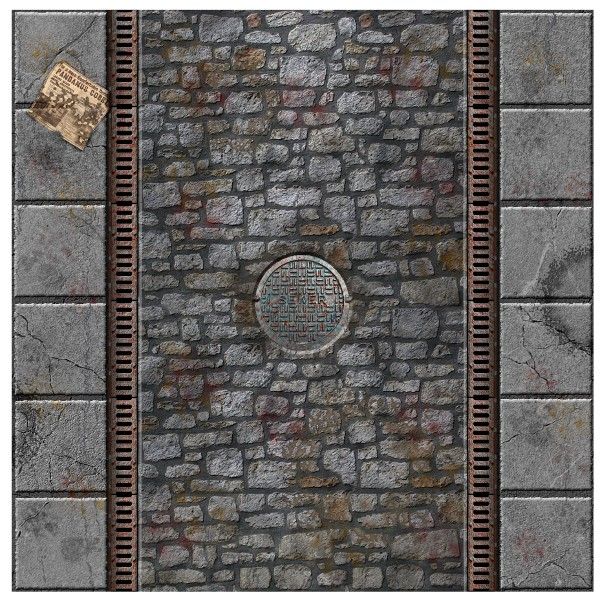 I'll dirty them up a little more once I've got the tiles I need done (possibly do a clean and grunger version), Water is causing me problems at the moment my last 2 attempts looked like melted chocolate  I was looking over some photo's/paintings of Victorian street scene's and some cities had very wide roads, so I've settled on the below as tile shapes: Lane Straight (above) Lane T Lane Corner Lane X Lane Deadend Double wide road straight Double wide road lane intersection Double wide road end in lane intersection Double wide Roundabout Maybe - Double wide corner. I'm also going to do 2 Houses a smaller town house and a larger stand alone house and some lamp posts  . I'm hoping then with What Dave/FDG/WWG have released A Victorian setting should be pretty easy to assemble. I might have bitten off more than I can chew with the above so I'll see how I go and possibly push bits out in smaller groups  |
|
|
|
Post by onemonkeybeau on Oct 28, 2010 5:24:36 GMT -9
Nice job, Rob! The paper looks much better. I wonder though, will the paper be a selectable layer? I'm just thinking that if I need 4 straight sections of road, having a paper in the same position 4 times would look rather odd. Just trying to think ahead  onemonkeybeau |
|
|
|
Post by Sirrob01 on Oct 28, 2010 11:09:18 GMT -9
Yep going to hit my mate up to run them through indesign for me again once i'm done. So the sewer cover and paper will be on/off able. If I add some other garbage/greeble bits I'll make them on/off to  Turtles are laid out and printed, Saturday I'll cut and photograph them (tomorrow for me  ). I've Finished Straight and L on the above hopefully get X done tonight  . |
|
|
|
Post by emergencyoverride on Oct 28, 2010 11:46:44 GMT -9
Looking good man. It is hard to find Victorian anything in paper. I have to use near Victorian or just plain not Victorian terrain for my rippers game and that really bites. I have been working on my gimp-fu recently and am just about ready to take a stab at a few buildings. Keep it up bro, this looks really promising. ;D
|
|
|
|
Post by Sirrob01 on Nov 6, 2010 14:49:43 GMT -9
Anyone know how Floyd's done those puddles  I'm up to about my 10th different attempt to replicate them and still no good...hopefully Floyd will pop back through and fill me in... |
|
|
|
Post by Floyd on Nov 6, 2010 17:09:53 GMT -9
Sir Rob sorry I didn't see this sooner. It's a rough puddle shaped selection, with some bricks peeking through to show a bit of unevenness. The color was pulled from the general brick tone then desaturated to an ashy mud color...but do it to your taste. An inner bevel with light source at or near the top. So the top shadows and the bottom acts like a catch light at the lip of the puddle. An outer glow was used, set to black and multiplied. Then the opacity turned down so that the edge was not harsh and sort of meshed in with the surrounding brick in an unobtrusive way. For the interior puddle reflections I used a rough stone texture and *bump mapped it into the reflection using only a light source for highlights, no shadows. That way only some of the random edges show through as light post? moon? reflections. You could do a render-clouds (photoshop)or use a texture brush for some dark patches to subtly blend into the puddle to give the illusion of depth. All of the above is what I did to make that puddle. It seems like a lot when I explain it but it's a rather simple procedure. Just getting the illusion of depth is 90% of the trick. If I can help you at all let me know. ~Floyd * Try this top page animation for some visual inspiration. Also near the bottom is a visual explanation of the bump mapping technique if you weren't sure what I meant. This was done in Photoshop using the Layer palette Bevel/Texture combination. This is also how I did the texture on the Stalker recolors for GunCrawl. |
|
|
|
Post by Sirrob01 on Nov 6, 2010 20:37:08 GMT -9
Thanks heaps Floyd, I should be able to follow that and replicate some muddy puddles. I've been playing around with the sewer cover and drain grates a little, trying to ornate them up a bit. I'm not 100% happy with the look yet but they are getting their: brass plain 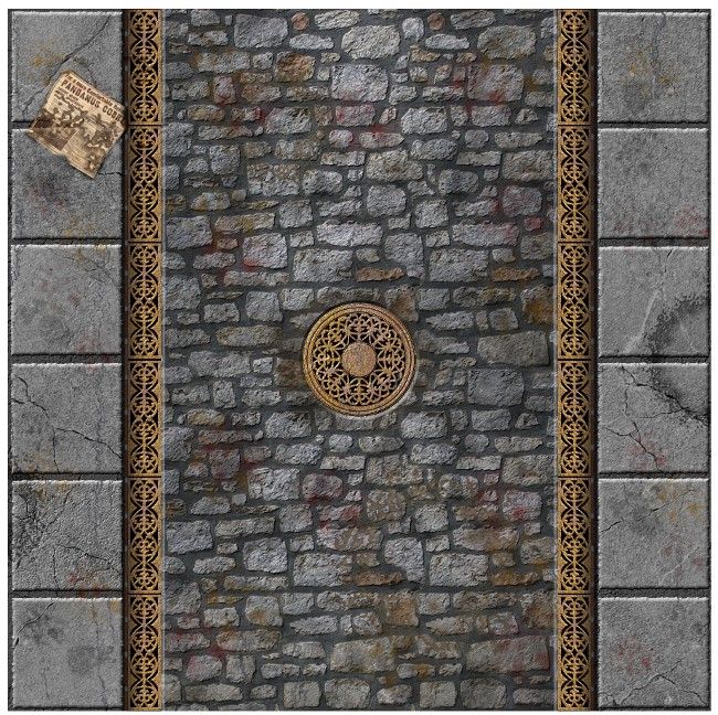 brass with dark and light patches 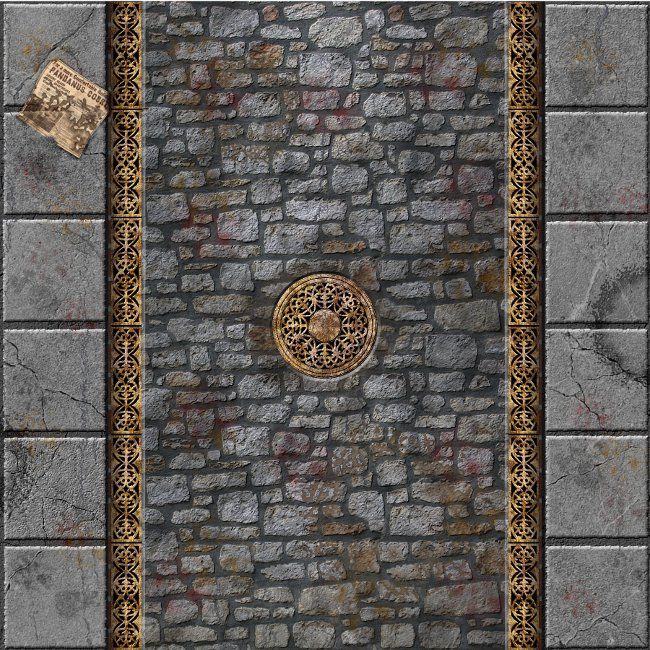 thoughts welcome. |
|
|
|
Post by Dominic on Nov 6, 2010 23:06:10 GMT -9
The first one looks better to me, even though in itself the more weathered brass looks good. I just don't see it weathering like this when it's completely exposed to the weather, i.e. should weather more uniformely.
|
|
|
|
Post by Sirrob01 on Nov 7, 2010 0:30:41 GMT -9
thanks Satrek, I'll try adding some weathering/wear that looks like water marks rather than random blobs  |
|
|
|
Post by labrat on Nov 7, 2010 1:26:21 GMT -9
Hey nice progression here. I actually like the look of the second one a little better, but I think Satrek is right that the first one is probably a more realistic weathering. So I guess it just comes down to if you want it to pop a bit more or look more realistic and dull as streets usually are. But adding in a puddle here or there, could add some extra variety as well, like what floyd did in his workup of it. Keep up the good work.  |
|
|
|
Post by algoesnext on Nov 7, 2010 10:45:40 GMT -9
I think they look great, but if you left it out unattended in theUK, the metal thieves would get it before you could turn on the street lights!
|
|
|
|
Post by Tommygun on Nov 7, 2010 20:25:34 GMT -9
It is showing a lot of improvement.
Now that you have rework a big portion of it, the stonework in the road seems a little flat compare to all the other things going on.
Very nice work though.
|
|