|
|
Post by tugunmojo on Nov 9, 2010 15:36:58 GMT -9
Those are nice!!!
|
|
|
|
Post by enpeze on Nov 13, 2010 16:30:55 GMT -9
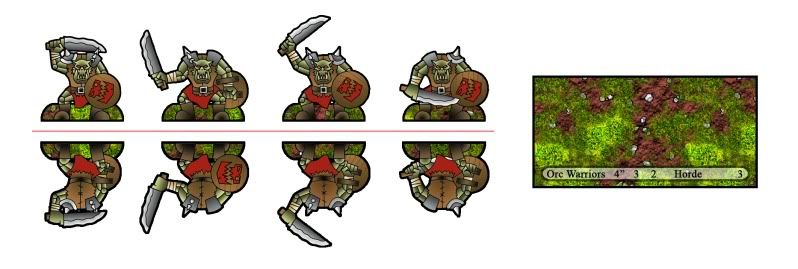
the bases you added do have some numbers printed on (I guess these are movement and combat values) Do you have a specific game system in mind for your boyz?Do you have already an idea which 15mm armies you want to release? What is the format of the bases? Thanks alot for info. i hope your project comes along very well. It looks extremely interesting.
|
|
|
|
Post by ken on Nov 14, 2010 10:55:35 GMT -9
The stats on the bases are from the Orc army in Mighty Armies. I had originally intended to use these for Mighty Armies, but think they would work really well for Song of Armies and Hordes when its released. I'm also working on my own system, but that maybe quite some time coming.
I have plans to finish the core armies for Orcs, Dwarves, Elves, Undead, Barbarians, and Demons. After that I'm not to sure, I had thought about Dark Elves, Ratmen, Empire, and Beastmen.
The bases are 2" x 1". The stats are Move, Fight, Support, Abilities, and Army Point Cost.
I should have an update posted tonight or early tomorrow.
|
|
|
|
Post by ken on Nov 14, 2010 22:54:17 GMT -9
Here are the next additions to the Horde.  I'm hoping to have these guys test build this week, when I do I'll get some group photos up. As always comments and critiques are always welcome.  |
|
|
|
Post by labrat on Nov 15, 2010 0:52:20 GMT -9
Drool. Those look really good! It makes me want to play the game to try it out.
|
|
|
|
Post by Parduz on Nov 15, 2010 1:30:24 GMT -9
Whoah!!! I'd like more contrast between the shields and the leather vest... my myopia tends to blend them all in a unique brown splat  Anyway, i'm drooling waiting for the tabbed ones.... |
|
|
|
Post by ken on Nov 15, 2010 10:57:40 GMT -9
I was kinda worried about the coloring on the shields and vests blending to much. I might play around with making a metal border around the outside of the shields to give them some separation. If that doesn't work I think I might make the shields all metal.
|
|
|
|
Post by enpeze on Nov 15, 2010 14:13:05 GMT -9
I think the contrast is not that wrong. All in all the orcs should be dirty and muddy. Maybe you add different shirt and boot colors to make them more individual.
What I would remove is the green (grass?) near the boots of the orcs. I guess it makes the general impression of the orcs a little bit too "round" for my taste - especially if they are just 15mm and viewed from a distance of 100cm+. (adding pelt, spikes and sharper edges would make them more barbaric)
|
|
|
|
Post by ken on Nov 15, 2010 22:51:10 GMT -9
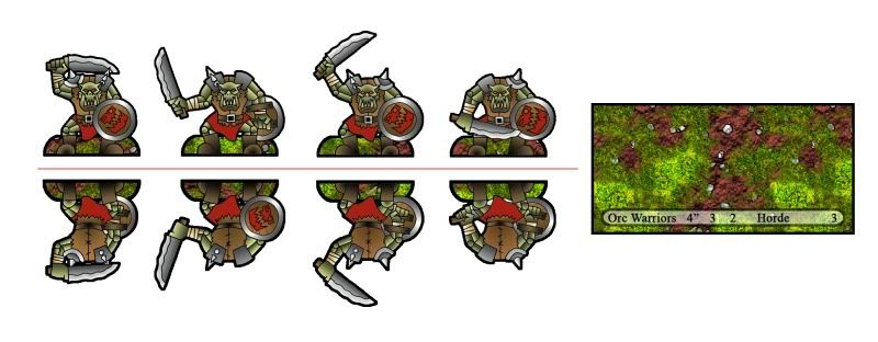
Here's a version of the warriors with a bit more seperation between the browns. What do you think?  |
|
|
|
Post by Parduz on Nov 16, 2010 1:24:30 GMT -9
It's better. But If you rotate the "metal fill" to have the highlight on the torso, it may be perfect  |
|
|
|
Post by mruseless on Nov 16, 2010 11:16:15 GMT -9
30mm please!
These guys are awesome!
|
|
|
|
Post by Dryw the Harper on Nov 16, 2010 18:27:30 GMT -9
I agree! They are awesome and need to be done in 30mm.  Dryw the Harper |
|
|
|
Post by WaffleM on Nov 18, 2010 4:27:51 GMT -9
Cool orcs! I really like the rough edged swords. They're like deadly bread slicers!
|
|
|
|
Post by roguetrader on Nov 20, 2010 14:32:49 GMT -9
Beautiful minis... I prefer 15 or 10 mm in metal ones, but 28-30 mm in paper.
|
|
|
|
Post by tugunmojo on Nov 20, 2010 19:37:41 GMT -9
These are awesome whatever size you do, tho I must admit that you've inspired me to get back into 15mm once I get moved into our new home.
|
|
|
|
Post by Dagger on Nov 21, 2010 10:27:10 GMT -9
Ditto... they look great... wonderful idea. Love your line art style.
The level of detail you have there is actually quite sufficient for 30mm scale... you could have gotten away with less detail at 15mm. At 15mm if you have too much detail everything tends to blend together at arms length (aka Gaming Distance).
Are you planning to do another race?
|
|
|
|
Post by ken on Nov 23, 2010 13:28:57 GMT -9
Thanks guys, I've been really excited about the way these are turning out.
I should have some pictures of the archers to post in a day or two. After that I'm working on the goblins, and the Shaman.
I am planning on a few different races after the orcs are done, I think the next might be dwarves. I also have ideas for "elite" units for the orcs, as well as warmachines.
I'm also working on a rule set to go with all of this, kinda following in WaffleM and Daggers footsteps.
|
|
|
|
Post by roguetrader on Nov 23, 2010 14:05:26 GMT -9
Elite orks units that I'd create:
- boar riders
- ultraheavy armored infantry
- scouts (specialized little goblins, perhaps)
- Big Guys (a unit of ogres, or trolls, etc..)
|
|
|
|
Post by ken on Nov 23, 2010 15:05:51 GMT -9
I've got concept sketches of Troll Rock Throwers and I'm working on some sketches of a Hydra as well.
|
|
|
|
Post by roguetrader on Nov 23, 2010 23:28:46 GMT -9
Fantastic... They'll be good support for the rest of the army.
|
|
|
|
Post by ken on Nov 24, 2010 1:41:44 GMT -9
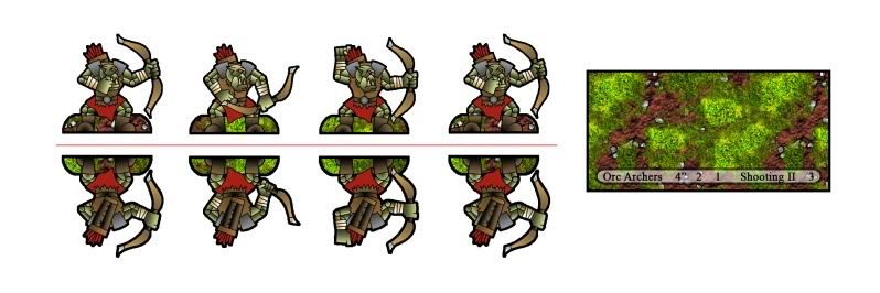
Here we go, Orc Archers. ;D  Just have 3 more units to do and the core Orc army will be ready to conquer all in its path.  |
|
|
|
Post by Parduz on Nov 24, 2010 4:09:01 GMT -9
I like your style so much. That archers just lack a better separation between the various "parts".
|
|
|
|
Post by Dagger on Nov 24, 2010 8:51:45 GMT -9
I really like your drawing style... I'm very anxious to see what your dwarves are going to look like. Actually these orcs look a little like orc/dwarf half-breeds  I'm with you on the flat basing, stick with your current approach... it's unique and very functional. However, if I were doing it I would try to use rocks and/or clumps of grass to fill in the tab area (as opposed to vertical open ground). 30mm - I think your current models have more than enough detail to look great at 30mm... especially at gaming distance. I'd say use less detail for 15mm so the lines don't blur into each other at gaming distance. Someone suggested printing a test sheet, putting it on the wall, and standing back a bit... that's an excellent idea. At gaming distance, most of your detail definition is going to come from contrasting colors. Borders - Yep, I think the thicker the better.... that way you can cut them to your liking... if you want thinner borders just cut closer. |
|
|
|
Post by ken on Nov 24, 2010 10:34:59 GMT -9
Thanks for all the comments. I really appreciate all of them.
Parduz - That seems to be my big problem. I agree with you, I'm just a bit stuck on how to separate them without making them too "cartoony". When printed, they do separate a tiny bit more than on the screen.
Dagger - I think I may do a test build or two with just a grass texture instead of the battlefield texture. I think that it will add some contrast. I am planning on adding a few more pixels to both front and back borders for the final release. Like you said, if you want them thinner, cut closer. After the set is done I'm gonna work on the 30mm versions, a warband set.
Stay tuned, goblins are coming!
|
|
|
|
Post by Parduz on Nov 24, 2010 13:27:06 GMT -9
I'm just a bit stuck on how to separate them without making them too "cartoony". I'd do this way (remember: i'm the one that does not draw anything!  ) 1- highlight a lot the pectoral part, the red skirt and the metal parts. A Lot 2- Drop-shadow on that parts from the head/chin/arms. A very black shadow with a fast transparency curve from none to all. (hope you get me) 3- Make the black contour of everything in front (head, arm) more thicker. This all is just happened in my imagination.... i dunno if the results will be what i have in mind. While writing, i'm thinking about saturation.... your colors all have (to my eyes) all the same level of brightness and saturation.... maybe puttin well saturated colors on the front (the green skin could be more "brillant") and dull colors on the background parts could help.... dunno. |
|
|
|
Post by ken on Nov 29, 2010 0:55:34 GMT -9
I'm just a bit stuck on how to separate them without making them too "cartoony". I'd do this way (remember: i'm the one that does not draw anything!  ) 1- highlight a lot the pectoral part, the red skirt and the metal parts. A Lot 2- Drop-shadow on that parts from the head/chin/arms. A very black shadow with a fast transparency curve from none to all. (hope you get me) 3- Make the black contour of everything in front (head, arm) more thicker. This all is just happened in my imagination.... i dunno if the results will be what i have in mind. While writing, i'm thinking about saturation.... your colors all have (to my eyes) all the same level of brightness and saturation.... maybe puttin well saturated colors on the front (the green skin could be more "brillant") and dull colors on the background parts could help.... dunno. Thank you for your suggestions, I really do appreciate them. I'm gonna play around with the saturation once I have them all done. I'm also planning on trying drop shadows in a few key parts. For now though, I got goblins!  As always any comment or critique is welcome.  |
|
|
|
Post by onemonkeybeau on Nov 29, 2010 7:41:18 GMT -9
Thought I'd throw in my appreciation for your work!
I am anxiously awaiting the 30mm release of these AWESOME figs!
onemonkeybeau
|
|
|
|
Post by Two foot Tom on Nov 29, 2010 7:45:38 GMT -9
These figs are exellent but please forgive my stupidity but how do they actually fix onto the bases? You may have already explained this and if you have; i apologise.
|
|
|
|
Post by kiladecus on Nov 29, 2010 8:17:25 GMT -9
Three things, please:
1) 25 - 30mm
2) Black Tabs
3) Download link
... eventually, I would like to see some futuristic ones with Bolters.. I mean, sub-machine guns and that kinda stuff!
PLEEEEEASE?!
|
|
|
|
Post by ken on Nov 29, 2010 11:02:42 GMT -9
Two foot Tom -
I use a bead of superglue and glue the figures flat to the base.
30mm versions with black tabs are coming, I promise.
As much as I would like to, I don't think futuristic orcs will be on my list any time soon.
|
|