|
|
Post by kiladecus on Dec 9, 2010 9:11:38 GMT -9
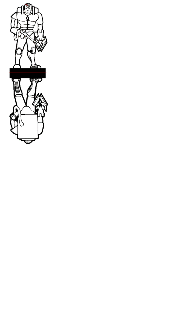
Ok, this month's forum Hoard is "Robots and Cyborgs." This is my first submission to do for One Monk, and this is where it stands so far... Please feel free to offer suggestions and feed-back! www.facebook.com/photo.php?pid=207338&l=fdaf8c2f57&id=100001331075572I will be adding detail and color as I can. Just wanted to get the outline done first. Thank you for your attention. |
|
|
|
Post by afet on Dec 9, 2010 10:00:29 GMT -9
This looks good. He looks a bit top heavy, though. Maybe you could beef up his legs and ankles a bit.
|
|
|
|
Post by kiladecus on Dec 9, 2010 10:40:45 GMT -9
I see what you mean, but I think it is because that "NASA" back-pack is so large.  I may have to play with it during clean-up. Thanks for the input. |
|
|
|
Post by cobra on Dec 9, 2010 11:10:46 GMT -9
A good start
But his left leg looks a bit twisted - almost like it was broken.
/Cobra
|
|
|
|
Post by revgunn on Dec 9, 2010 16:27:41 GMT -9
Hands are a bit small, as are the feet. Maybe add a lil to the calves/ankles. That will cure some of the top heavy-ness I think. Its real GW looking, and I like that. This is good. I'm impressed.
|
|
|
|
Post by kiladecus on Dec 9, 2010 17:00:11 GMT -9
WOW!! Rev, you just paid me the HIGHEST compliment ANYONE could.. By comparing something I did to a GW figure has just made my my MONTH! Thank you!  |
|
|
|
Post by revgunn on Dec 9, 2010 19:54:30 GMT -9
I calls em like I see's em. You're welcome. Keep up the good work dude.
|
|
|
|
Post by kane on Dec 9, 2010 19:59:08 GMT -9
Good overall design. Careful on the left knee, though. It looks to be slightly hyper-extended.
|
|
|
|
Post by kiladecus on Dec 10, 2010 3:11:37 GMT -9
Thanks for the feedback, fellas!  |
|
|
|
Post by kiladecus on Dec 14, 2010 5:32:11 GMT -9
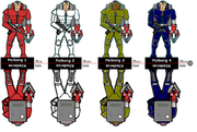
I think I have the left knee resolved (still working on it)...  ANY feedback as far as color goes? I know I do NOT want to try a camo scheme, but any thoughts? RED? BLUE? WHITE? ANY suggestions? I am going to color this in the next couple days, and was curious what people use the most and try to make it fit within that scheme. Let me know! |
|
|
|
Post by kiladecus on Dec 14, 2010 7:51:39 GMT -9
Here is the electronic version of it. I scanned the drawing into the computer, then had to retrace the lines (now looking grey) in PAINT. Taking your advice, I enlarged the feet and hand, and more importantly, fixed the broken leg!  I now just have to color it. [a href="  "]  [/a] |
|
|
|
Post by kiladecus on Dec 14, 2010 9:12:02 GMT -9
Actually I am considering submitting this as a B&W fig so people can do their own shading and color schemes... Or do you think more people would like it to be one set color? What do you think? Anyone... Anyone... Buehler... Buehler...  |
|
|
|
Post by Tommygun on Dec 14, 2010 13:46:29 GMT -9
I think for the horde it should be colored.
Ether gray metal or green camo or one of each.
|
|
|
|
Post by kiladecus on Dec 14, 2010 14:26:09 GMT -9
Multiples? We can do that?  Solves that question then, doesn't it? Thanks, Tommy! |
|
|
|
Post by Dryw the Harper on Dec 14, 2010 16:30:08 GMT -9
Include a blank one for the people who like to do recolors. I wish I had saved more of the black and white art for the Imperfect People, there have been some really well done recolors on the one set of black and white I managed to post.
Dryw the Harper
|
|
|
|
Post by kane on Dec 15, 2010 7:47:01 GMT -9
Definitely do a gray or toned version. Once gradiants are on there, recolors are SUPER easy! ;D
|
|
|
|
Post by kiladecus on Dec 15, 2010 8:31:00 GMT -9
Thanks, Kane! I was experimenting with my SKELETRONS last night, and after I did the red one, I did the other three in literally under a half an hour (MAYBE less)!  The trick was getting the first one done. It was an experiment, so as I do more, I am sure it will start to go quicker. Also, once I get a few in my files, it will just be a matter of modifying the ones I have done, and improving on them as I go. |
|
|
|
Post by kiladecus on Dec 16, 2010 11:14:29 GMT -9
|
|
|
|
Post by BilliamBabble Inked Adventures on Dec 19, 2010 8:16:52 GMT -9
I'm really loving this. Again, the oversized pack and the gripper really add to the "hard-tech" look. The colouring is nice and bold.  |
|
|
|
Post by kiladecus on Apr 28, 2011 2:07:34 GMT -9
Ok... this is my FOURTH attempt at posting this figure... having MAJOR difficulties on this end.
I found a little time last night to work with my original Psi-Borg. I am pretty limited since I am using PAINT (and can't get GIMP to work on my PC). However, I was able to switch out his flame-thrower for a sub-machine gun. I changed his stance slightly. I plan on doing one more pose with this, since they run in squads of three.
Once I finish the third pose, I will recolor them in the four color schemes I have. I can always add more colors if I felt the interest were there.
|
|
|
|
Post by kiladecus on Apr 28, 2011 2:21:02 GMT -9
It took quite a few tries, but I FINALLY got it posted on here. Let me know what you think. Also, the final version I will be doing will be two of the Jaws of Death. (Strictly a close combat specialist). Now, before anyone pints out that the blades on the JoD are both in front of AND behind his leg, I did this on purpose. Think of the weapon as a letter "Y" when you see it with three blades. I hope that will clarify any confusion before it can happen. Thanks again for taking the time to look at my work...  |
|
|
|
Post by Vermin King on Apr 28, 2011 7:37:54 GMT -9
very nice. thanks for the heads-up. have you thought about maybe repositioning the JoD to avoid explanations?
Looking forward to the set
|
|
|
|
Post by kiladecus on May 1, 2011 19:15:57 GMT -9
Here is Set II of the Psi-Borgs.  I have been playing around with one with two JoD (Jasw of Death), but haven't been happy with the results. I MAY do a set of three in each of the color schemes< and if anyone wanted (or cared), I could always do further colors in the future. Let me know what you think. Thank you for your attention.  |
|
|
|
Post by paladin on May 2, 2011 3:25:50 GMT -9
Clear design, kiladecus. The posing is very calm, but why not. They are in a mission meeting, listening carefully. Maybe you could put some more flat highlights on the armor parts, but I don't know, how shiny the armor shell be. It could add some depth.
|
|
|
|
Post by kiladecus on May 2, 2011 12:32:56 GMT -9
Thanks, Paladin. I actually have four shades for each of the colors... a medium, a light highlight, white highlight, and a darker shading. the problem is, I draw everything at 5" (like 12.48cm), and when these got converted down, the detail got lost, unfortunately.
So, it makes it very difficult to convert the colors like I was hoping, and even more difficult to convert the drawing.
My plan is to revamp my style a little, and start drawing figures at 1" (25mm) instead of trying to draw them and then shrink them down. With my limited resources (including limited talent) I can only expect so much.
So, that is kind of why they look so two-dimensional. if anyone would like to play with these and try to do some other color variants, or shading, send me a PM and let me know what you have planned. REVGUNN has done some work with these (you can see on his thread), so feel free to let me know what you think.
|
|
|
|
Post by paladin on May 2, 2011 13:18:21 GMT -9
 No, no, you can clearly see your subtle shading, kiladecus. You applied it very diligently. I meant: a bit more form with larger areas of highlights, e.g. on the breastplate or leg armor centers to indicate bending and curving - like you did with the excellent weapon shading. Look how your weapon pops out. It's the same thing.
|
|
|
|
Post by kiladecus on Mar 25, 2012 14:24:46 GMT -9
I was wondering if someone could help me out, please?  I did the two sets of these guys (the ones with flame-throwers and the ones with the sub-machine guns). When I originally submitted them to the Hoard (December 2010), I told Sir Rob 01 to scale them at 25mm. Well, since the industry standard is 28mm I was wondering if someone would be kind enough to take these two sets, and re-scale them at 30mm (because of the heavy armor) and put BOTH sets on one PDF, please. I am sure it wouldn't be that big of a deal to do, but I just don't have the skills to do this myself...  If anyone would be interested in doing this, you will have my undying gratititude! Thanks in advance you for attention, and help with this small task. No need to reply. If you are interested, simply go ahead and post the figures here on this thread. Thanks, again! ;D |
|
|
|
Post by cowboyleland on Mar 25, 2012 15:04:10 GMT -9
Hi Kil, I didn't see set one anywhere so I did set two. If you can give me directions to set one I'll add them. Also I really don't know what I'm doing with DPI etc so it opened really small in GIMP and then I enlarged it like 260%. Don't know if that is the best way to do it. Anyway, I hope it helps. Attachments:
|
|
|
|
Post by kiladecus on Mar 25, 2012 17:01:43 GMT -9
THANK YOU, CBL!! ;D I thought they original set was on here, but as I looked over this thread, I see I was wrong... (What are the odds I was wrong about something)...  Ok, it is on Hoard 89 (I believe). It was the December Hoard from 2010. It featured my Skeletrons, and REAL art from REAL artists... Tommyguns ABC Warrior, BurkaBot, Marvin and DeathDragon's Roomba Robots, and Reivaj's AT-286 robots. Thanks again for taking the time to do this! Had I known at the time, I would have just had Sir Rob do these at this size to begin with. Oh well, at least I will have the two sets in one PDF that people can grab (if they want to). If you have space and wanted to throw the Skeletrons on there, too, feel free. If not, then don't worry about it. They are good at the size they are. Thete were meant to be 2.5D figures... but NOTHING like the ones that you do! |
|
|
|
Post by kiladecus on Mar 25, 2012 17:04:09 GMT -9
Here is a picture of my Skeletron in it's 2.5D pose...  |
|