|
|
Post by Dave on May 25, 2011 18:00:24 GMT -9
Without a printer, I can't wage war, so I'm doing whatever I can to shiny up the place. I've made some changes to my main advert graphic style. A little more professional-looking, I think.
EDIT: See below for latest version.
|
|
|
|
Post by Dave on May 26, 2011 6:30:56 GMT -9
Updated again. I think this is about a 200% improvement over the advert graphics I've been using up until now.
Some day I'll have to go back through my entire catalog and update the graphics. I'm not looking forward to that.
|
|
|
|
Post by josedominguez on May 26, 2011 6:34:47 GMT -9
I like it  |
|
|
|
Post by old squirmydad on May 26, 2011 9:12:59 GMT -9
I like it, but (always one in there somewhere  )my first impression on seeing the metallic border at the top was 'Age of Steam' or 'Steampunk-esque'. Perhaps some wooden timber frame instead for the Medieval Fantasy line of buildings? |
|
|
|
Post by Parduz on May 26, 2011 10:16:12 GMT -9
Now that squirmydad said it, i noticed it and i agree. Other than wood plate (wich MAY become a bit too western, i dunno) i may see there one of that medieval cloth banners with squared dents...(sorry, i can't describe it better than that...  ). Maybe you can use that "bar" to visually differentiate your sets by "genre". |
|
|
|
Post by Dave on May 26, 2011 14:28:46 GMT -9
Maybe you can use that "bar" to visually differentiate your sets by "genre". Yeah, I like that idea. I'll save the metal bar for some other genre. Trying out a Tudor-style look now. |
|
|
|
Post by Dave on May 26, 2011 15:15:47 GMT -9
Here's how they're looking now. 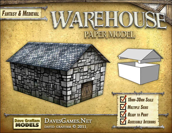 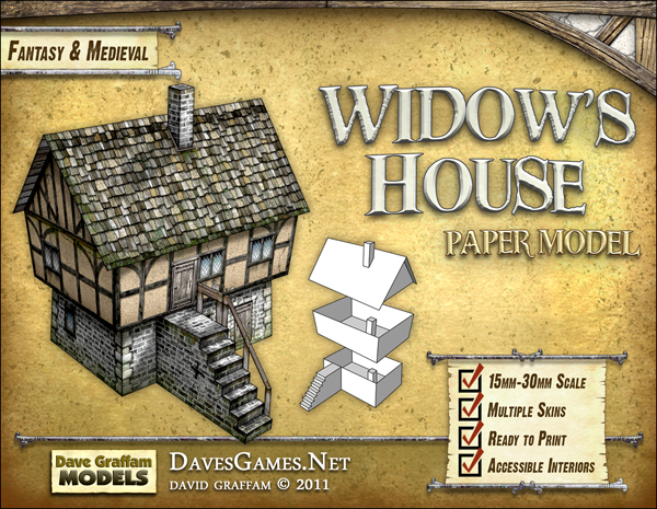 |
|
|
|
Post by Parduz on May 26, 2011 16:12:17 GMT -9
...i'm going to be annoying... The metal bar was "clearly" a "frame" in the picture. This wooden thing is much less visible. And you're loosing some space 'cause that ...... thing in the corner. Maybe a stone bar is better? Nitpicking a lot, anyway |
|
|
|
Post by Dominic on May 30, 2011 23:59:19 GMT -9
What I find odd is that the bars don't match the scrolls between, I mean it looke like the piece with the checkboxes is unrolled from the bars, so I'd expect it to be wrapped arround it more... Right now I cannot tell whether that made sense.
Apart form that I like the new design, although like Parduz said you're losing space. I wonder whether it'd work better if you actually enlarged the corner piece and used it as background, i.e. putting part of the model in front of it.
|
|


 )my first impression on seeing the metallic border at the top was 'Age of Steam' or 'Steampunk-esque'. Perhaps some wooden timber frame instead for the Medieval Fantasy line of buildings?

 ).
).