|
|
Post by Dave on Aug 6, 2011 9:58:05 GMT -9
[During development, this model was called the Observation Tower V3. Its final name will be the Watch Station.] Here's my paper test. Everything fits together as I hoped, so I can get started on the textures. 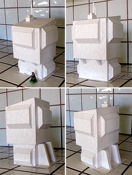 |
|
|
|
Post by josedominguez on Aug 6, 2011 11:09:23 GMT -9
Even in plain paper it looks impregnable. It's got real weight to it.
|
|
|
|
Post by noremorse on Aug 6, 2011 11:53:49 GMT -9
I am loving this Dave. Can I make a small suggestion? Well I will anyway  The roof looks a little plain, can you add a shallow dormer/observation point to give it more dimension? Of course, other people may not agree with me lol |
|
|
|
Post by Vermin King on Aug 6, 2011 12:56:53 GMT -9
Just wait for the textures. It'll all be good.
|
|
|
|
Post by Dave on Aug 6, 2011 14:04:14 GMT -9
If you wanted, you could add a second transceiver to the roof. There will be a couple of different mounting positions for that. But I think Vermin King is onto me -- the textures will keep it from seeming so plain.  |
|
|
|
Post by noremorse on Aug 6, 2011 14:14:26 GMT -9
I trust your judgement  |
|
|
|
Post by Dave on Aug 6, 2011 16:21:03 GMT -9
Better to put your trust in my laziness.  |
|
|
|
Post by Tommygun on Aug 6, 2011 16:53:41 GMT -9
Even in plain paper it looks impregnable. Give me 10 good men and some climbing hooks and I'll impregnate her. ....OK too much TV. I like it. It could be a police sub station in a really bad neighborhood. One idea. a small satellite dish on top. You could make one from a simple shallow cone. Also what do you think of a set of laser walls done the way you did the wooden fences? You could make them printable on white paper or transparencies. Although you may need to make columns too. Maybe a simple triangle column? |
|
|
|
Post by Dave on Aug 7, 2011 5:22:56 GMT -9
I'll probably do some sort of SF walls eventually. I'm not too big on the idea of requiring transparencies or other non-cardstock materials in my models, mostly because I think it would cut down on the potential audience for them. I can't afford to do that yet.
Satellite dish is a good idea, but I'm out of room for new components unless I start a new sheet, and this is already a pretty time-consuming build. I have to draw a line somewhere, and normally I would have quit a little sooner than I did on this one. I'll save that idea for something else.
|
|
|
|
Post by noremorse on Aug 7, 2011 16:30:10 GMT -9
You could so a building as a big Satellite dish, like a HPG (Hyperpulse Generator) from battletech or the SETI transceiver
|
|
|
|
Post by Dave on Aug 7, 2011 17:03:14 GMT -9
Just what I was thinking.  I have some good references for large radio telescopes, too. |
|
|
|
Post by Dave on Aug 21, 2011 2:22:48 GMT -9
Nearly done with the textures. I should be able to send the final PDFs to Jerry tomorrow, and he'll work up the assembly instructions while I'm messing around with more graphics stuff.
|
|
|
|
Post by Dave on Aug 22, 2011 1:51:53 GMT -9
Textures are done! Jerry has the final PDFs to work with now (at least, he will when he wakes up and checks email).
Now I'm working on the Beasts of War exclusive version of this model. Choices, choices.
|
|
|
|
Post by Vermin King on Aug 22, 2011 6:04:04 GMT -9
I'm not familiar with Beasts of War
|
|
|
|
Post by Dave on Aug 22, 2011 19:22:46 GMT -9
I'm not familiar with Beasts of War So Google it! Beasts of War is a website with tons of content about tons of tabletop games. They have a subscription-only Backstage Pass section that offers lots of cool stuff. About once a month, that subscription will get you a version of one of my models that features skins you won't get anywhere else. Warren (the main face of Beasts of War) mentioned that he'd like to offer my Observation Tower V2 for this month's Backstage Passers. I figured I could do better, so I started working on Observation Tower V3. And that's sort of how I ended up here. |
|
|
|
Post by Dave on Aug 25, 2011 0:51:39 GMT -9
Time for the color prototype. Assembly and photos by Jerry Jensen. I'll be making some texture changes, so the final look will be a bit different than what you see here. 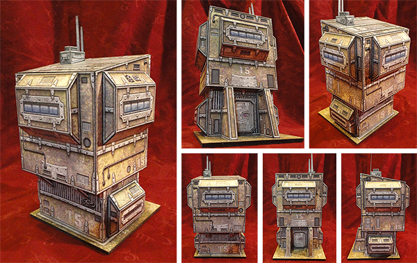 |
|
|
|
Post by Floyd on Aug 25, 2011 5:58:32 GMT -9
Yes, yes YES! You're really getting that chunky gritty Scifi look now!
All those little greebles got it screaming with detail in that texture work.
All complemented by the right amount of Euclidean Geometry! This piece
has that monolithic feel of Quake2-3 structures and the apocalyptic griminess
of WH40k.
Well done sir, Well done!
~Floyd
|
|
|
|
Post by golem101 on Aug 25, 2011 6:36:54 GMT -9
Very nice. I like the rusted/pitted/battered metal textures.
|
|
|
|
Post by emergencyoverride on Aug 25, 2011 6:41:58 GMT -9
That really rocks! I especially like the design of the entryway. ;D In the Grim darkness of the far future, there is only PAPER TERRAIN!!! Great Job.
|
|
|
|
Post by Dave on Aug 25, 2011 11:08:27 GMT -9
I have to give Jerry a lot of credit for shooting the photos against the red background. It really helps the model stand out.
There's still have a lot of work ahead. I'm going to redesign the trim a little bit, and probably add some more layer options. I have room for additional 3D objects, like some equipment jutting out from the walls. Maybe, as Jason suggested, a lookout window/skylight kinda thing on the roof.
|
|
|
|
Post by Tommygun on Aug 25, 2011 12:08:36 GMT -9
I want one.
I want ten!
I need ten!
|
|
|
|
Post by Vermin King on Aug 25, 2011 14:00:54 GMT -9
Beautiful in a grungy sort of way ... you know what I mean
I knew the textures would pop on this
|
|
|
|
Post by Tommygun on Aug 25, 2011 14:56:09 GMT -9
I want to mod this into a whole shopping district.
I can see a noodle shop on the bottom and an apartment on top.
All kinds of little businesses.
Corner grocery shop, liquor store, pachinko parlor etc.
Maybe even double wide versions.
|
|
|
|
Post by Floyd on Aug 26, 2011 5:33:32 GMT -9
I want to mod this into a whole shopping district. I can see a noodle shop on the bottom and an apartment on top. All kinds of little businesses. Corner grocery shop, liquor store, pachinko parlor etc. Maybe even double wide versions. I immediately thought of a congested, jumbled little settlement full of this sort of stuff too. Nice! I bet the new futuristic vehicle releases by EbblesLabs/WWG would look nice amongst this. Sort of a Bladerunner esque Chinatown meets FifthElement. ~F |
|
|
|
Post by Tommygun on Aug 26, 2011 12:42:03 GMT -9
We need to get Dave to do a hover version of one of his boats now for the flying Chinese lunch wagon.
|
|
|
|
Post by Vermin King on Aug 29, 2011 8:35:16 GMT -9
I can so see a giant electronic video billboard on this ...
|
|
|
|
Post by Dave on Aug 30, 2011 8:55:27 GMT -9
I've sent off to Jerry what I hope are the final PDFs to do his magic (final assembly, photos and instructions), and Jason has the final line-work files so he can finalize the GSD cutter files.
Now I'll work on some sci-fi promo graphics for it. I liked Jerry's red drapery background so much that I'm going to try something like that for my general displays. When I get those graphics sorted out, I'll apply them to my older sci-fi models. That'll clear a bottleneck in my website and graphics revamp projects.
|
|
|
|
Post by Dave on Sept 3, 2011 12:27:11 GMT -9
|
|
|
|
Post by Tommygun on Jan 15, 2012 17:49:00 GMT -9
Done Too!Thought I would drop a line and show you how I have been using your stuff. I printed out your template and used the measurements to make seven out of plastic. These are being used as apartments for a Blade Runner board. Plasticard: The other white paper.  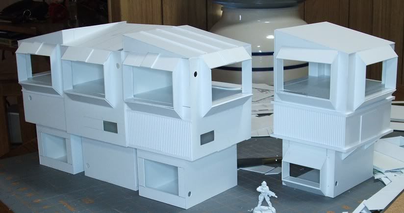 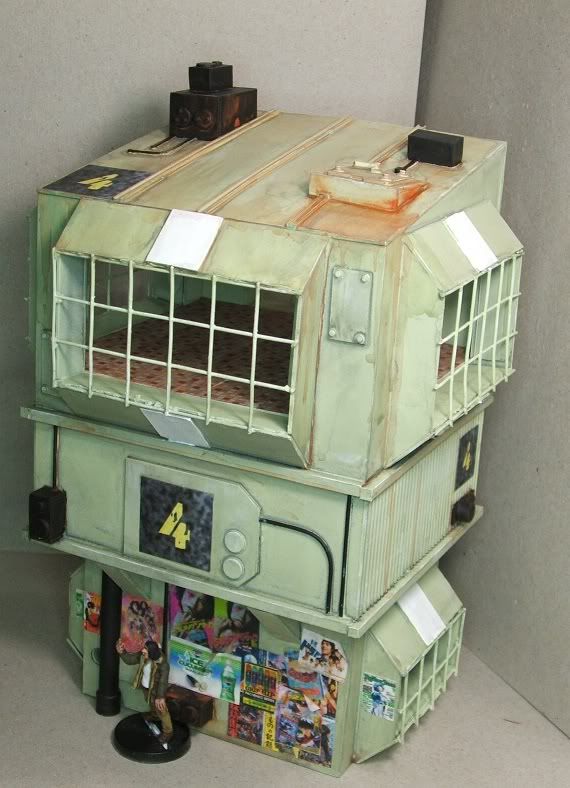 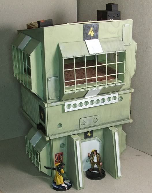 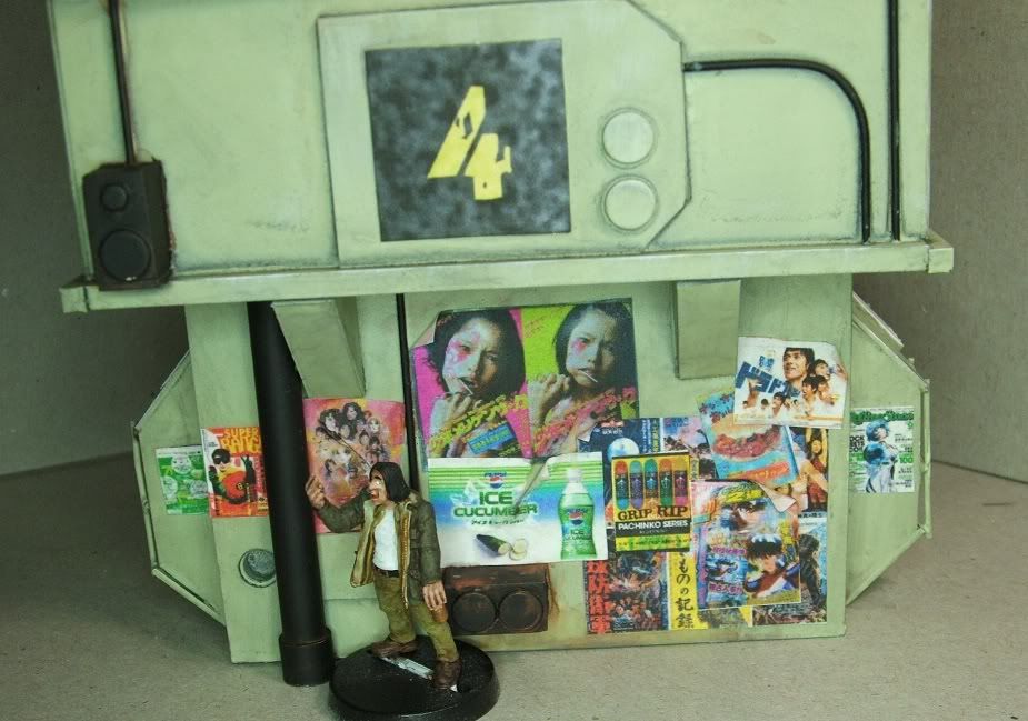 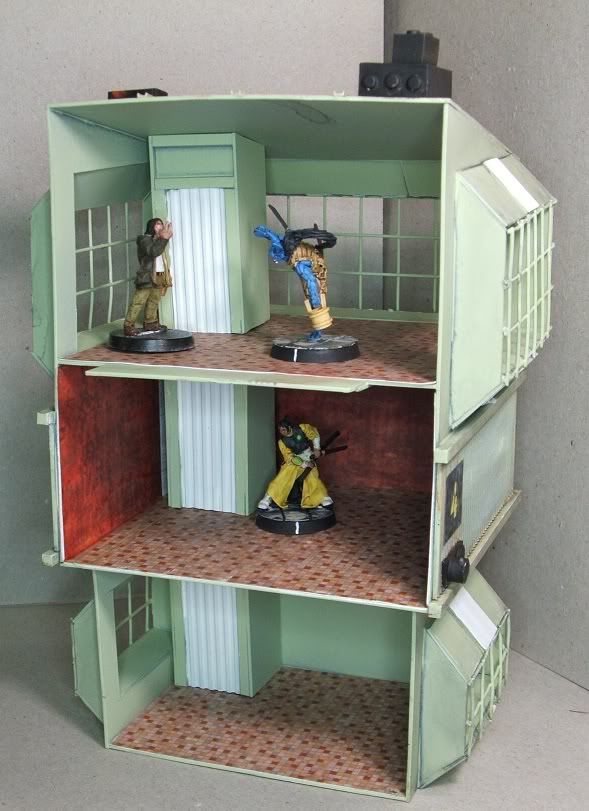
|
|
|
|
Post by Dave on Jan 15, 2012 18:03:40 GMT -9
Nice! I was checking out your Warseer threads the other day and love what you're doing with the plasticard. All that's missing from these Blade Runner setups are some lights!  |
|