|
|
Post by Brave Adventures on Dec 20, 2012 7:40:56 GMT -9
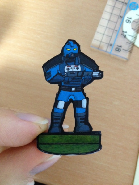
For those who don't know me, I'm the webmaster for Brave Adventures. I don't normally do the art for our projects but I am trying to improve my drawing skills. I guess I'll post pics and downloads of the stuff I'm working on here. Here's a futuristic soldier I put together tonight, it's loosely based on Xcom. Let me know what you think. Is it something you could use? Attachments:
|
|
|
|
Post by Parduz on Dec 20, 2012 8:20:52 GMT -9
Everything is usable, one day or another  About the figure, i'd say that there's not enough "contrast".... i mean that i doubt i can see what weapon they have from half-table distance. The details goes lost. I'd try to augment the color differences between one part and another.... or perhaps working hard on highlights and shadows. Last, it could be the photo perspective but... aren't the legs a bit short? Nice figures, anyway. |
|
|
|
Post by Brave Adventures on Dec 20, 2012 14:45:11 GMT -9
Thanks for the feedback. Yeah I noticed that when I print them out they look much darker than they do on the computer. I think the legs mostly look short because of the perspective though. I'll try to improve the contrast and then upload another photo.
|
|
|
|
Post by Brave Adventures on Dec 20, 2012 16:16:14 GMT -9
 I adjusted the colors a bit to bring out the details a little better. If anyone is interested I'll post the PDF for free. 1 sheet of paper fits 18 minis. |
|
|
|
Post by cowboyleland on Dec 20, 2012 16:56:25 GMT -9
Nice! You may want to try making his gun more of a different colour to his uniform. Since you say you are trying to improv your drawing: it looks like his hands are a little small. My high school teacher used to pound it into us: "Your open hand covers your whole face!" On the other hand,(see what I did there?  your hands on the Santa from the Nov. Hoard are the same so maybe that is your style. |
|
|
|
Post by Vermin King on Dec 20, 2012 18:10:42 GMT -9
He looks good enough to use the way he is, but the points mentioned are to help you with your art. Yes, the open hand is the size of one's face. Your elbows reach to your waist. Ground to knee is same distance as knee to hip.
Since the one hand is under the barrel and the other is holding the grip, that is fairly easily overlooked. I do think the figure would look better with the belt raised a little and the weapon in a more contrasting color.
But he would be useful, just the way he is. Certainly better than anything I've done recently
|
|
|
|
Post by Brave Adventures on Dec 23, 2012 21:33:41 GMT -9
Hey guys, thanks for the help. I was just winging it proportion-wise before. I'll keep your tips in mind though for the next mini I draw. I'll post a PDF of these guys later. I need to go prepare Christmas eve dinner for my girlfriend now. Merry Christmas!
|
|
|
|
Post by Brave Adventures on Jan 5, 2013 7:14:43 GMT -9
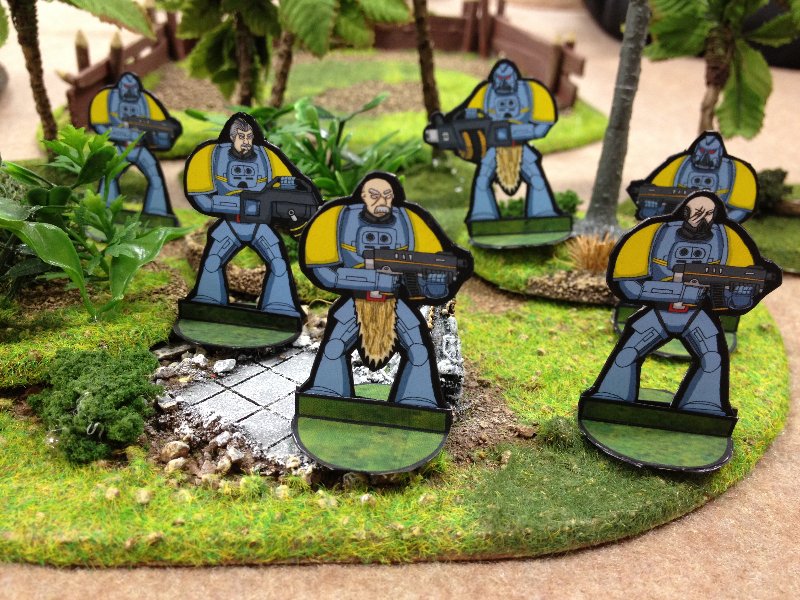
 This is my latest project. I expanded on what I learned from making my previous models and developed a "sprue" technique that I'm rather happy with. Basically, I drew a whole bunch of pieces separately and assembled them in different ways in Photoshop. Here is a preview of some of the miniatures. They are loosely modelled after Space Wolves, but the armour and weapons are intentionally different from GW space marines. I made them as a substitute for standard models so I could play space combat games like 40k with a local gaming group. In the photo, the legs look a little short compared to the bodies but I think that is mostly the perspective. The finished set will include heavy bolters, flame throwers. missile launchers, chainsaw swords and different poses not shown in this photo. |
|
|
|
Post by Vermin King on Jan 5, 2013 15:50:13 GMT -9
Looking good. These will probably see a lot of use.
|
|
|
|
Post by Sirrob01 on Jan 5, 2013 16:20:54 GMT -9
Look a bit like space marines crossed with original Battlestar cylons. Look really nice.
|
|
|
|
Post by Brave Adventures on Jan 11, 2013 16:26:31 GMT -9
Thanks Sirrob!
Currently I am working on the missile launcher for this set. I drew most of the pieces by hand but I have a wacom tablet and I need practice so I am trying to finish the remaining parts of the set using the tablet. It is a little more difficult than drawing by hand though.
I also have some differently angled arms including one holding a gun at 3/4 angle. But I increased the size of the gun for the standard pose so I need to fix the arms. It's a bit of a pain, because foreshortening can be tricky.
I also accidentally saved over one of my files, so the layered file with the flamethrower, heavy gun and heads is gone. It's not as bad as it sounds, but still annoying. That's why I took a break on them to make the Punk.
Anyway, these guys should be finished by next week sometime.
|
|
|
|
Post by Brave Adventures on Jan 11, 2013 16:29:05 GMT -9
Guess what I'm working on now. I've learned a few things recently that should make assembly and colouring of these guys much easier and cleaner than previously. Should be ready in 1-2 weeks. Any weapon or detail requests? Attachments:
|
|
|
|
Post by Parduz on Jan 11, 2013 16:47:59 GMT -9
Uh, i missed this thread and replyed in the "Punk" one about these guys.... sorry.  About weapons, take a look at the Space Crusade figures and the Dreadnaught expansions. There's 5-6 big heavy (exaggerated) different weapons that could come handy in building squads (i'm not saying that you have to copy them... just add some different heavy weapons like flamers, rocket launchers, "BIG GUNS" etc). And, i reiterate a request i've made somewhere in this forum: pls, you all artists, include some hi-res images of your weapons, tools, stuffs.... so, in the case i want to build some card for the games i play, i have your sources handy  |
|
|
|
Post by Brave Adventures on Jan 11, 2013 17:00:43 GMT -9
Hi Parduz, thanks for the tips. The power armour guys will include the following weapons, combat knife, Grenades, Chainsaw Sword, Pistol, Gun, Heavy Gun, Flamethrower, and Rocket Launcher.
I can do that for the above weapons if you'd like. What games do you play?
|
|
|
|
Post by Parduz on Jan 11, 2013 17:24:40 GMT -9
I can do that for the above weapons if you'd like. What games do you play? Oh, i play a lot of things. The most relevant is that it's about 2 years i'm seeking to find a 3D ruleset (modern/scifi) that please me. So i tried Flying Lead, 5150, The Battlefield, and i plan to try StarGrunt, FUBAR and other free stuffs. Also i'm slowly translating Legions of Steel rules (but still missing the "open field" partner ruleset). I'm using mostly real minis (AT-43) as i need to "catch" old GW players but when i'll find the one i need i'd like to use paper minis (i never play at home, so i have to haul everything each time) and build the appropriate datacards, play aids etc. So, if the miniatures comes with graphic i can use everything will look beatiful. |
|
|
|
Post by Sirrob01 on Jan 11, 2013 19:13:13 GMT -9
|
|
|
|
Post by Parduz on Jan 12, 2013 1:47:01 GMT -9
Parduz depending on what your after have a look at Defiance Vital ground by MJ12 games. I find it to heavy for my tastes (games go to long) but might be what your looking for. Thanks! Looked at it... I admit that i'm intimidated by the demo rulebook.... i fear the complete one!  I think that i'll stay on free / low price rules for a while: there's a lot of ruleset on the web, even from commercial games (OOP or running) like Infinity, Shockforce, and others that i've bookmarked but i can't remember right now. |
|
|
|
Post by Brave Adventures on Jan 17, 2013 5:10:31 GMT -9
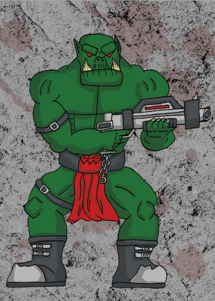
 Here is a preview of the orcs I'm working on. Thoughts? |
|
|
|
Post by kiladecus on Jan 17, 2013 14:38:10 GMT -9
I am NO Parduz, but I will give you my two cents worth..
As CBL ("CowboyLeland") pointed out, an open hand covers your face. With this in mind, to keep scale correct, if an Orc (Ork) has a larger than normal head, then his hands should be the same size.
This is one of the HARDEST things I had to learn (and I still struggle with it), but hands need to be larger...
The Orc/k overall, looks good. I personally would prefer to see armor plates and leather straps holding the plates on. Maybe you are planning on doing this with layers (like you did with the lizardmen), but not only that, SPIKES are necessary on Orc/ks!
;D
Lastly, you have an INCREDIBLE color pallette. Exploit it more. Why do you have the skull and the "tunic" both red? If the tunic is red, make the skull "belt-buckle" silver. Let it contrast and offer more to your figure.
Finally, Take a few hours and look through Jim Hartman's figures and various Hoard figures. Primarily... the feet! If you have feet BOTH facing outward, it gives your figure the feeling of being "duck-footed." It is fine to have one foot facing "out," but the other should be "head on." If you are looking at it, you should see the toes and the "top " of the foot.
LABRAT does an excellent job with this... Take a great long look at HIS Orc/k feet, and you will see what I mean.
Please understand I am not "ripping your work apart." Trust me, I am NO ONE to criticize, I am just offering some "pointers" to help you get a more refined figure.
I used to get my feelings hurt when people offered "advice." I took it personally. It was only when I discovered that people were trying to "help" me, that I realized they had good advice to offer. I started taking it, nad my figures are... well, better than they were.
Just tryin' to help a friend.
|
|
|
|
Post by Brave Adventures on Jan 18, 2013 6:31:06 GMT -9
Thanks for the feedback Kil. That's why I posted the sample, to get people's opinion about proportions etc.
I agree about the hands. They are way too small for his big fat orc head ^^ Also, the legs are bent in a squat because I was going for the bow-legged-orc look and in that stance the feet naturally point out a bit. But I can see that it is too much, I'll try to adjust it.
The skull and the cloth were both red because it was just a test and I finished and posted it around 1am ^^ Good point though, I'll adjust the colours.
Don't worry, there will be armour bits and spikes. You were correct, those details are in separate layers. Everything is a separate piece, similar to tonsha's zoas or a real life plastic miniature sprue. I'll try to add enough bits for the orcs to look suitably badass and orcish.
Same with the Power Armoured guys above, they were also designed as sprue pieces. The orcs were my second attempt though so their sprue is a bit better and they fit together more easily.
Thanks again for the feedback. I appreciate it.
Ryan
|
|