|
|
Post by ghostgirl on Nov 14, 2013 13:11:10 GMT -9
I have noticed something disturbing about my miniatures. They look good (to me) on my screen and printed at larger scales, but when I print them at miniature scale the colors seem flat or dull. The colors just dont "pop". Like even on plain cardstock.. jims miniatures and some others have almost a shiny look to them compared to mine. I think it may be because i'm not using a gradient shading but i'm not sure. :/ any ideas? 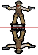 |
|
|
|
Post by Rhannon on Nov 14, 2013 14:08:57 GMT -9
Sadly I can't help you about technical issues ( it is known here that my technical skill is less than zero ). But also the printing paper quality is very important. link ( Squirmidad's post ) |
|
|
|
Post by squirmydad on Nov 14, 2013 17:35:47 GMT -9
You're bankrobber looks really good on my screen too, try changing up your paper. Plain cardstock makes for dull colors. I print all of my minis on Canon matte photo paper; beautiful and strong! I just a plain old inkjet printer too, no fancy lasery-printery stuff.  |
|
|
|
Post by ghostgirl on Nov 14, 2013 17:43:25 GMT -9
yeah.. using the same paper I get a different result for miniatures i've drawn vs other's work. I think it may just be my lack of using gradient shading or maybe im not creating enough contrast. I really noticed it on my fairy where the skin shading just vanishes at scale leaving the figure flat and dull. At least I think that is what i'm seeing. It is oddly hard to put my finger on.
*EDIT*
I played around with some photo paper and it does make a huge difference. Contrast between the two shades on my fairy's skin is still really hard to see but it is way better than on the cardstock. I think maybe a gradient style of shading is more forgiving of paper choice than my two tone shading though. It is something im going to have to keep in mind when choosing shades.
|
|
|
|
Post by cowboyleland on Nov 14, 2013 20:56:10 GMT -9
Hi Ghostgirl, Going back to the first post, I bet yours don't look as shiny as Jims because you are adding shadows but not highlights.
|
|
|
|
Post by Sirrob01 on Nov 14, 2013 21:03:02 GMT -9
Hi Ghostgirl, Going back to the first post, I bet yours don't look as shiny as Jims because you are adding shadows but not highlights. +1 to Cowboyland if you look Jims figures you'll notice many of his highlights go from really dark/deep colour to almost white. Like my poor alien mutant on screen he looks almost fluro green but if your print him whole different ball of twine he comes out a sort of dullish green..really to dark but then I didn't use a highlight. I'm sure Jim has posted on this before somewhere on a few occasions... I think our miniatures would all look brighter if they had backlight paper/card BTW like the cowboy |
|
|
|
Post by cowboyleland on Nov 14, 2013 21:06:25 GMT -9
Yeah, I'm generally well liked, I think it is my humil . . . oh, never mind.  |
|
|
|
Post by pavaro on Nov 14, 2013 21:28:20 GMT -9
Ghostgirl tell me what technique do you make your figurines and how do you do
the shading? The papier have importance. I use original paper dedicated to the printer only. I can see the difference.
Your figurine looks like nice.
|
|