|
|
Post by WackyAnne on Feb 1, 2014 12:24:06 GMT -9
Yeah, perhaps publishers could have a 'Tip Jar' item that is flagged 'PWYW'. Not sure if OneBookshelf would let that fly, but make it clear that it's simply a THANK YOU pdf that you can pay for, if you'd like to contribute to a publisher. Do you mean a product page for a PWYW tip jar for a publisher? That's an interesting idea. That reminds me, Dryw the Harper, do you plan on uploading any of your Imperfect People when you offer your Imperfect Castle for sale? As practice run, preview, promotion, PWYW? That's probably a much better idea than PWYW for the castle and expansions... |
|
|
|
Post by squirmydad on Feb 1, 2014 16:43:40 GMT -9
Thanks, having trouble accessing my sites, not sure if the fault is in Transmit or GoDaddy. I've pulled all the pics from Dryw's release thread to use, some more from Dryw's photobucket, couple from the FDG board, some that I took myself, some that people submitted-still missing a huge mound of pics though. I'll post the wish list soon tomorrow for peoples to review and see if they want to contribute to the gallery. Every pic helps.  So by tomorrow I meant monday...as some bug in my head is wringing gallons of fluid out of my brain, all from the left side though...vision getting blurry, head aching....going back to bed for a few days. -Eric |
|
|
|
Post by squirmydad on Feb 9, 2014 19:00:45 GMT -9
The final gallery previews will look like this; 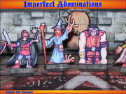 |
|
|
|
Post by WackyAnne on Feb 9, 2014 20:42:06 GMT -9
Alas, you've already got a wonderful pic of the child adventurers, otherwise there'd be my little picnic adventure  I'll see if I can dig up an applicable photo of the gypsy & other wagons tomorrow morning. I know I took a few good shots of a wagon train early on, and lots of pictures while making them. |
|
|
|
Post by squirmydad on Feb 10, 2014 11:29:55 GMT -9
Thanks Anne, every bit helps. I re-worked the frame a touch and wanted some quick feedback on the title font. Blackmoor is what I've been using, but is it too busy for the titles? Here's what I'm considering;  Font= Blackmoor  Font= Black  Font= Century  Font= Humana Serif  Font= Lucida Blackletter I just want to make sure it's legible from the start as with the volume of Imperfect files and images it'd be a bit tedious to rework everything later on. Let me know what you think of the font choices please. |
|
|
|
Post by mesper on Feb 10, 2014 12:19:58 GMT -9
I like second one (font = Black) - IMHO both with style and very clear / easy to read at the same time.
But you will need slightly more space (taller orange banner) because of "f" letter.
Lucida Blackletter - not bad, second choice - still less easy to read than Black
Blackmore - too heavy / clumsy - not easy to read (at least for me)
Century - IMO not matching series style
Humana Serif - kinda too cartoonish?
|
|
|
|
Post by mproteau (Paper Realms) on Feb 10, 2014 13:02:01 GMT -9
I agree with mesper on the choice of Black as the font. It's thematic yet readable. I don't think you need a larger banner to accommodate the 'f' but it wouldn't hurt too much either. I think the issue I have with Humana Serif is that it's not bold enough. Century lacks a fantasy vibe. The others are too uniform for me to easily read (relative to the others). |
|
|
|
Post by mahotsukai on Feb 10, 2014 13:52:45 GMT -9
I've always had a soft spot for Lucida Blackletter, however I agree that Black has greater legibility as well as character.
|
|
|
|
Post by Vermin King on Feb 10, 2014 15:17:16 GMT -9
No argument here. Legible, but with character
|
|
|
|
Post by WackyAnne on Feb 10, 2014 15:39:39 GMT -9
I like second one (font = Black) - IMHO both with style and very clear / easy to read at the same time. But you will need slightly more space (taller orange banner) because of "f" letter. Lucida Blackletter - not bad, second choice - still less easy to read than Black Blackmore - too heavy / clumsy - not easy to read (at least for me) Century - IMO not matching series style Humana Serif - kinda too cartoonish? My vote is Lucida Blackletter: 1) Because it is next closest to the Cardboard Warriors font ( Blackmoor, ne c'est pas?) 2) Because it is next closest in readability to Black3) Because it seems to be others' second choice Therefore, Lucida Blackletter is the Imperfect Font! At least until the man himself weighs in... P.S. squirmydad In what condition and method would you like the Imperfect Pictures? I've got good shots of at least the Gypsy and Closed Wagons, maybe the Open Wagon and even more. Would Disco Infernals make the cut? on the dance floor? ;D P.P.S. 4) Because it is actually the one I like the best of the bunch! |
|
|
|
Post by squirmydad on Feb 10, 2014 16:21:16 GMT -9
Sorry Anne, decided I liked that big fancy loop coming off the "I" in the Black font. Pic submissions; mainly not blurry is the biggest thing. If they fit into a 9"x7" frame with a light, or contrasty, or at least intersting background-that's good. Send me what you've got I'll see if I can use it. Here's the frame I'm using for my layouts- Imperfect FrameThe first page of the Gallery is roughed in with the pics I have for Abominations through Lumberjacks- Gallery1 |
|
|
|
Post by afet on Feb 11, 2014 17:25:46 GMT -9
Okay, here (in a series of emails) are the Imperfect adventurers sets. Number 3 is missing the knight. I couldn't find it anywhere. Imperfect adventurers 1  |
|
|
|
Post by afet on Feb 11, 2014 17:27:46 GMT -9
Imperfect adventurers 2  |
|
|
|
Post by afet on Feb 11, 2014 17:37:24 GMT -9
Imperfect adventurers 3 (missing kight in blue)  |
|
|
|
Post by afet on Feb 11, 2014 17:40:18 GMT -9
Imperfect Adventurers 4 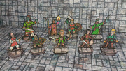 |
|
|
|
Post by afet on Feb 11, 2014 17:45:11 GMT -9
Imperfect Adventurers 5  |
|
|
|
Post by squirmydad on Feb 11, 2014 18:41:30 GMT -9
|
|
|
|
Post by mproteau (Paper Realms) on Feb 12, 2014 2:58:01 GMT -9
I know I've got a number of these already cut out... elementals, giants, monks, swashbucklers, orientals, ships crew, townsfolk, zombie soldiers... If I don't see someone else post pics, I'll try to cobble something together this weekend.
|
|
|
|
Post by oldschooldm on Feb 12, 2014 15:34:28 GMT -9
I'm shooting the pirate sets now.
|
|
|
|
Post by oldschooldm on Feb 12, 2014 16:26:32 GMT -9
I've uploaded photos of Ship Crew 1 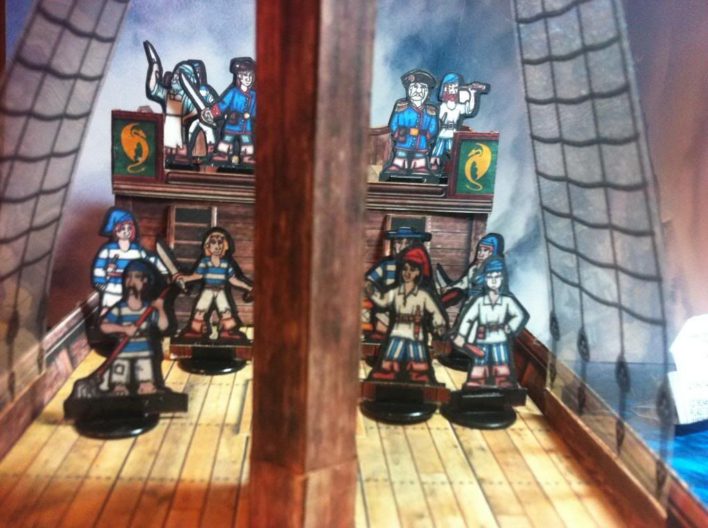 and Ship Crew 3 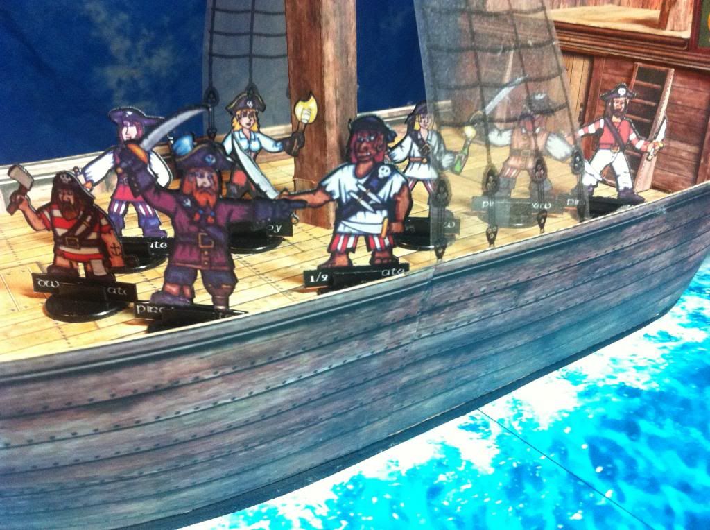 Clicking through will give you several other shots as options. Also, that album contains my shots from other sets of yours. Feel free to use any of them if you like. I don't think I made Ship Crew 2 ever, sorry. |
|
|
|
Post by oldschooldm on Feb 12, 2014 16:32:44 GMT -9
I've also cut out the Children and will post them later (time to make dinner.)
|
|
|
|
Post by oldschooldm on Feb 12, 2014 17:14:54 GMT -9
Dinners cooking, so I slipped this in... Sorry I couldn't find two of the little boys... 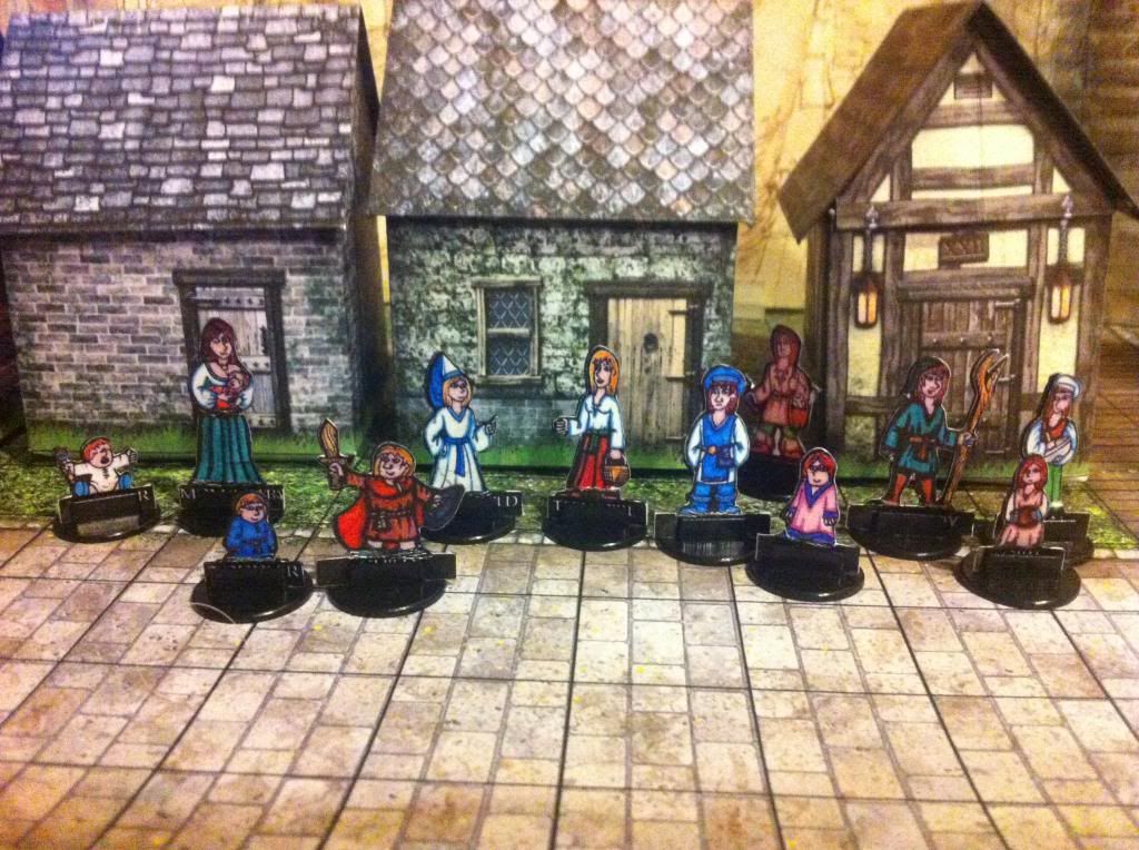 |
|
|
|
Post by squirmydad on Feb 12, 2014 19:50:50 GMT -9
|
|
|
|
Post by squirmydad on Feb 13, 2014 10:03:41 GMT -9
Thank you!  The pages have been updated, lists of missing pics edited and shortened, and new Gallery of Galleries page added to view a collection of pics that weren't used in the Dryw Downloads area. |
|
|
|
Post by afet on Feb 13, 2014 12:49:16 GMT -9
Nice setting :-)
|
|
|
|
Post by afet on Feb 13, 2014 14:22:27 GMT -9
Here's the angry mob 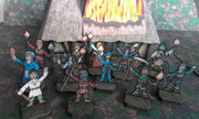 |
|
|
|
Post by squirmydad on Feb 13, 2014 16:38:52 GMT -9
Updated! Thank you.  |
|
|
|
Post by oldschooldm on Feb 13, 2014 17:50:46 GMT -9
Pages are a little messed up. The link to the second page is using the wrong graphic (and the page 2 graphic is on a image that should say "cutfiles included."
Also, on page 2 I can't click to get any of the PDFs that don't have a thumbnail image.
|
|
|
|
Post by afet on Feb 13, 2014 18:05:26 GMT -9
Bishop and guards  and the Caravan Guards 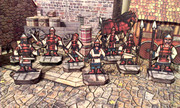 Cheers, Afet |
|
|
|
Post by squirmydad on Feb 14, 2014 8:49:29 GMT -9
Pages are a little messed up. The link to the second page is using the wrong graphic (and the page 2 graphic is on a image that should say "cutfiles included." Also, on page 2 I can't click to get any of the PDFs that don't have a thumbnail image. -The "No Image" file links haven't been enabled as I was waiting for pics, I turned them on today. -IWeb is a little jumpy with graphics; every time I do an update I see the same errors that you pointed out, they go away by hitting refresh. Once everything is in place the pages should stabilize. Should. Thanks again Afet, pages updated!   |
|