|
|
Post by Distrigillator on Apr 6, 2014 3:41:34 GMT -9
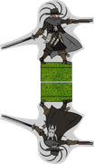
Good news, everyone!  I've continued my work with Theyra chronicles, and I want to represent you a part of new (3,5) edition set, more exactly - solo characters. Infidel hunters!   |
|
|
|
Post by Rhannon on Apr 6, 2014 4:16:30 GMT -9
Are they a bit dark?  Probably it is the cover but Aaron had a similar problem, if I remember correctly, with a similar color's squad. Surely if you keep them blacks ( specifically these figures will be high between 28 and 32 mm ) you will put some different details for contrast (buckles, straps, bandoliers ...),I suppose. |
|
|
|
Post by Distrigillator on Apr 7, 2014 2:02:14 GMT -9
Figures in the cover are really darker then umm... native? For example - rhino rider.  I want to print them at first, and check - if they are too dark, I'll fix it.  |
|
|
|
Post by migibb on Apr 7, 2014 7:57:43 GMT -9
I don't think Rhannon meant that their skin was too dark - more that the figures as a whole might be a bit dark to make out the details on them once printed.... I like them but a dash of colour here and there might draw out a bit more of the detail. The problem I had was I didn't realise at first that the guy on the far right was mounted - so I was wondering why you had so many midget inquisitors.....  |
|
|
|
Post by cowboyleland on Apr 7, 2014 12:11:23 GMT -9
I think I could have used these guys a few months ago when my son was looking for . . . some D&D race that I forget the name of. Anyway, they look cool. I think a lighter colour background would set them off better. I don't think the figures themselves are too dark.
|
|
|
|
Post by dungeonmistress on Apr 7, 2014 14:36:07 GMT -9
Very cool! I like these quite a lot. Though; maybe a little color here and there, as migibb said, for highlight/contrast might show off the awesome details better when they are printed up. Gotta say: I love the Rhino Rider! |
|
|
|
Post by Distrigillator on Apr 8, 2014 3:06:38 GMT -9
I think I can make them more bright - they are really a bit washy. May be like that?  |
|
|
|
Post by dungeonmistress on Apr 8, 2014 7:33:25 GMT -9
:)That is better, Distrigillator, but look at your own avatar. See what the gold highlights do for that figure? Your figures are dynamic and full of movement that can be easily seen at a large scale, but that gets lost in all the grey-scale at 28mm. I know they aren't entirely grey-scale, but when they're printed out at 28mm, all your subtle shading and color shifts go away as the eye does not discern such small details. However; if you use a brighter color for your highlights it will emphasize the action in your figures even when printed small. I'm not sure if I am explaining this clearly, maybe someone with more experience can put it in more concise terms. I love your figures, they're poses are great, the armor looks formidable and I like the bits of 'paper' stuck to them (no idea what it's for, but I like it), and the mount caught in mid leap - wonderful! Just adjust the colors so that all that comes through at 28mm and you got it! |
|
|
|
Post by aaron on Apr 8, 2014 7:52:55 GMT -9
ya what Rhannon was saying is I did the same thing by making a core of humanity unit that was almost completely black and though at 8" x 11 " 300dpi it looked really good when I shrunk it down to a 32 mm it was a black blob and looked terrible so I had to change the units entirely. here's what I mean 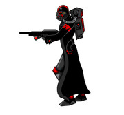 this totally didn't work so I took A lot of advice from the board and changed it to this ! 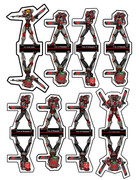 the results are very dramatic in that the 32 mm models are much easier to see and maintain their detail much better. Hope this helped ! |
|
|
|
Post by dungeonmistress on Apr 8, 2014 9:06:52 GMT -9
ya what Rhannon was saying is I did the same thing by making a core of humanity unit that was almost completely black and though at 8" x 11 " 300dpi it looked really good when I shrunk it down to a 32 mm it was a black blob and looked terrible so I had to change the units entirely. here's what I mean this totally didn't work so I took A lot of advice from the board and changed it to this ! the results are very dramatic in that the 32 mm models are much easier to see and maintain their detail much better. Hope this helped ! What he said! |
|
|
|
Post by Distrigillator on Apr 9, 2014 17:21:04 GMT -9
Ok, I got it. I'll try to fix something, but serious changes I'll do after test print. I hope to finish and them during 8-10 days. May be.  |
|
|
|
Post by Kimerlin on Apr 10, 2014 11:32:16 GMT -9
Дружище есть предложение вместе заняться разработкой. Одному реально не так интересно работать как командой. Разработаем мир, сделаем миньки с использованием всех наших наработок.
Ты как?
|
|
|
|
Post by pavaro on Apr 10, 2014 11:53:25 GMT -9
I think I can make them more bright - they are really a bit washy. May be like that? Tell me, do you have any the scale at designing your figurines? I mean the height of the form. 5, 6 height head? |
|
|
|
Post by Distrigillator on Apr 10, 2014 14:55:54 GMT -9
Tell me, do you have any the scale at designing your figurines? I mean the height of the form. 5, 6 height head? Yes, I do, the scle is 1:72. The height of the figures is 28mm from ground to top. What is 5,6? PS.: Kimerlin, watch your PM |
|
|
|
Post by WackyAnne on Apr 10, 2014 16:06:36 GMT -9
I think pavaro meant 5 or 6 feet high for the figure at real life scale. |
|
|
|
Post by Distrigillator on Apr 10, 2014 16:10:47 GMT -9
Oh, now it's clear, thanks. |
|
|
|
Post by pavaro on Apr 11, 2014 0:45:57 GMT -9
What is 5,6? I think pavaro meant 5 or 6 feet high for the figure at real life scale. Sorry for the complicated question. I wrote this post quite late. WackyAnne is right and thank you for your help. What proportions of the models are you using? |
|
|
|
Post by Distrigillator on Apr 11, 2014 1:13:21 GMT -9
Sorry for the complicated question. I wrote this post quite late. WackyAnne is right and thank you for your help. What proportions of the models are you using? Oh, the question wasn't quite clear because of metrical system, using in Russia, thats's all right that I didn't understand. And proportions... honestly, dunno.  Really, I have no idea. Just try to make figures as more as possible the same with real proportions. |
|
|
|
Post by aaron on Apr 11, 2014 2:40:05 GMT -9
the ones you posted here are (in photoshop )coming up as 62mm. do you shrink them down a bit?
|
|
|
|
Post by Distrigillator on Apr 11, 2014 3:40:49 GMT -9
Aw, got it! I make my figures in Inkscape (vector editing software), and when I export only figure, but not the whole list - the scale may be another. For example:   But "real" heigt of miniature in working file (.svg) is the same - 28mm. |
|
|
|
Post by aaron on Apr 11, 2014 10:54:19 GMT -9
ok so when I put this at 28mm It looks ok in photoshop/ inkscape however, the human eye can perceive the most subtle change in light and color my printer however is very limited. this is what my printer sees 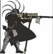 |
|
|
|
Post by Distrigillator on Apr 11, 2014 14:50:57 GMT -9
Oh, God, that's horrible!  I'll try to do something with figures, but they are almost ready, and it will take a time. |
|
|
|
Post by dungeonmistress on Apr 11, 2014 16:30:44 GMT -9
You have a great design, there and I for one will gladly await your adjustments. Worth the wait, I believe.
|
|
|
|
Post by aaron on Apr 12, 2014 6:53:47 GMT -9
yes! the design is fantastic ! it's just the limited printer that can't adjust for subtle color change.
|
|
|
|
Post by cowboyleland on Apr 12, 2014 12:26:34 GMT -9
I think I had the same issue shrinking Mesper's pirates. They looked fine in GIMP at 15mm but when they came out of my printer they were quite "muddy" looking.
|
|
|
|
Post by Distrigillator on Apr 18, 2014 3:15:08 GMT -9
|
|