|
|
Post by squirmydad on Oct 8, 2014 17:51:20 GMT -9
Nice lookin' tree, thanks.  |
|
|
|
Post by arcticdragongames on Oct 8, 2014 21:48:43 GMT -9
My son couldn't say Macaroni and cheese so he started calling it Monkey cheese ... and it stuck so now we call it monkey cheese LOL ok I was in need of a simple tree nothing fancy just a flat tree and it was impossible to find one, so I did what all good crafters do I complained like a baby and ate a bucket of ice-cream ! then I decided to make my own ... since I got what I needed out of it I figured if anyone wanted a flat tree just to add ambiance or something then here it is! 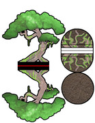 |
|
|
|
Post by arcticdragongames on Oct 8, 2014 21:49:51 GMT -9
That is a nice tree but making a paper tree seems so circular!
|
|
|
|
Post by aaron on Oct 9, 2014 6:59:22 GMT -9
Trees are nice I like them ... Circulart how? like circulation around the web circular or the tree it's self is round in shape? either way here's a pic of the tree cut out with some bayou militia hiding behind it 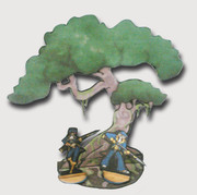 it worked out so well that I think I will make a few more and some branches you can stick on teh side just to give it more of a 3d feel to it. |
|
|
|
Post by mproteau (Paper Realms) on Oct 9, 2014 7:42:47 GMT -9
I think circular in that we make paper from trees, and you're making trees from paper. I like the shape of the tree a lot - if you're motivated to make a couple more in the same style, it'd help fill out a scene with some variety. |
|
|
|
Post by arcticdragongames on Oct 9, 2014 8:04:10 GMT -9
The tree with militia is my new screen saver, thanks! I meant circular because I think it is ironic that paper comes from trees and now we are making the paper back into trees.
|
|
|
|
Post by aaron on Oct 9, 2014 8:52:01 GMT -9
ah yes the circle of Irony LOL I thought about trying to use Bonzi trees but I couldn't find one that was the right size, cost a fortune and require tons of maintenance ... so paper it is!
and I am making more as we speak ... even though were not really speaking and by the time this is a week old it will be compleetly out dates so people who are reading this a week from now I made the trees already and you can skip this post .... LOL
|
|
|
|
Post by jackmatt on Oct 27, 2014 1:07:12 GMT -9
More trees yes please.
|
|
|
|
Post by aaron on Nov 6, 2014 15:09:09 GMT -9
ok so I was messing around trying to make realistic looking water .... not as easy as you might think .... if you ever thought it was easy. so here's my first attempt.... let me tell you what I did... FIRST the dirt !!! the dirt grass and rocks are all from Fat Dragons forest set !! LOVE IT !!! if you haven't already, go buy it your life will better and stuff... rpg.drivethrustuff.com/product/59439/EZ-TERRAIN-Forest--Ruins?cPath=587_4712 ok so now for the water I only use Photoshop Cs5 barbecue that's what I have and I'm to broke to use anything else and Photoshop works just fine for me and bla bla bla.... so I just made and amorphis shape and painted it a turquoise blue then I added a ripply water texture(image not filter) then in the layer filters I added a plastic wrap effect and finally an ocean ripple effect and this is what I got.... I'm still torn I like it but I don't like it. any suggestions ? 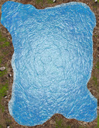 |
|
|
|
Post by cowboyleland on Nov 6, 2014 19:06:48 GMT -9
I think the plastic wrap is coming through too strongly. I don't think the light edges really work. I don't think the lightness works on the edges, though it might if there wasn't quite so much contrast in shade.
|
|
|
|
Post by mesper on Nov 6, 2014 19:31:25 GMT -9
I think the plastic wrap is coming through too strongly. I don't think the light edges really work. I don't think the lightness works on the edges, though it might if there wasn't quite so much contrast in shade. This! |
|
|
|
Post by mesper on Nov 6, 2014 20:39:38 GMT -9
I only use Photoshop Cs5 barbecue that's what I have and I'm to broke to use anything else and Photoshop works just fine for me and bla bla bla.... Yep... really blah, blah, blah... kinda #1stWorldProblems... Now c'mon please be serious - PS Cs5 is an extremely sophisticated, kinda state of the art piece of software - so lucky you! (actually I wish I could use such quality tools - you could be kinda miracle-worker using these!) Ad REM While ground textures looks pretty fine water looks IMHO artificial. Suggestions/hints: ---------------------- -CARTOON STYLYE use more cartoonish-style -- it's specific technique, not that easy as it seems but at the same time quite fast and much more "forgiving" -REALISTIC STYLE do some "homework" -- ie grab your camera or cell-phone (or your brand new iPhone 6 PLUS - in case of #1stWorld!  )) -- walk outside and get some pics of water, especially banks/shore - it might be even some puddle, shore-spume etc thing is that you should photo water-to-shore area -- you can try with close-up/macro etc. Then (after importing photos into your PC /MAC) use these pics - apply some filters and/or try some classic photoshop tricks: for example try to add/overly some layers, expand these layers, do some smooth-eraser cleaning, blur etc... please do not be afraid to experiment... -CG STYLE pretty much as previous - there is a lot of useful tools in PS or even GIMP - IMHO crucial thing is to try to avoid SHARP connection / overlapping area between water and ground! So not be afraid to test some tools/functions like stretching, overlaying and blurring layers, mixing colours then adding some "surface" effects (like local sunshafts, small ridges caused by wind and of course some white foam advancing the shore) etc. Then you might also want to add some water-transparency effect (so kinda some small stones or sandy bottom could be semi-visible near the bank and then add some irregular/ more darkish areas of water (ie try to different shallow water from some deep/dark waters) But the general suggestion is to try to: 1) maintain the same style and level of details/cohesion for land and water area 2) take more care of water-shore/ground transition area -- so there will be no immediate/distinct kinda "sharp" borderline. Anyway these are just mine's two cents, hope helps a bit |
|
|
|
Post by aaron on Nov 7, 2014 3:34:42 GMT -9
It does and I think your right and I have on old school Android, No I anything here. if you put the letter I in front of something it increases the price so much I can't afford it LOL
Photoshop is pretty fantastic and it was one of the best investments I have ever made.
so the image is supposed to be a pond... I looked at a lot of images of shore lines and ponds have a very sharp contrast between the shore and the water usually with a lot of foliage I.E. cat tails and thrush grass that sort of thing.
so I didn't try to make a shore line like a lake or river would have. I think Coyboy is right the Plasitc wrap is making it look to solid like it not water but something else maybe gel? I have decided that I don't like it and will do it again LOL
|
|
|
|
Post by Vermin King on Nov 7, 2014 7:46:19 GMT -9
I'm glad you are having another go of it. It almost seems inverted. What should be low looks high for some reason. Your comment about gel seems right. It looks more like mounds of a gel than water in a low spot. I haven't a clue how to fix it.
|
|
|
|
Post by WackyAnne on Nov 7, 2014 9:48:33 GMT -9
The biggest critique that jumps out to me is not textures so much as colour, and that's an issue I've had with Fat Dragon's as well. There is no way in nature that you'd have water as blue as that - the pond bottom alone would prevent that. Only the most tropical, transparent waters come across that bright and blue, largely because they are over sea beds of white sand (silica, bleached coral and shell fragments)*. Over an earth or even rock layer, the water would be brown, perhaps with other colours mixed in. If the pond itself gets disturbed, the bottom sediment (sand, mud, muck, debris), and anything suspended in the water itself, would make the water murky, not clear like this appears.
Now, if the water is highly reflective and showing those reflections, then you would get flashes and hints of a potentially blue sky, but it would still usually appear a few to several shades darker than the sky itself...
* Well, aside from water coloured by poisonous minerals and/or microorganisms).
|
|
|
|
Post by aaron on Nov 7, 2014 16:24:36 GMT -9
your right of course I was looking at pond water and it's always a murky brown/forest green color !
|
|
|
|
Post by aaron on Nov 7, 2014 19:46:54 GMT -9
better or worse? 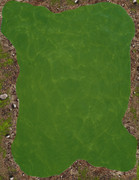 |
|
|
|
Post by cowboyleland on Nov 7, 2014 20:06:45 GMT -9
A philosophical question: should tiles look like an aerial photograph or should they look like you are looking down from an angle, as one does when sitting beside the game board? When you look at google images of "Pond" this makes a big difference. I suspect the most satisfying look for a 2d tile that is viewed from an angle may not look very much like something you would see in real life. I remember trying to help someone design windows for a card building they were making. They ended up going with a black rectangle with a wide fuzzy white diagonal line through it. No real window looks like that, but some how it is what the viewer expects to see. I don't know what the equivalent solution is for ponds. All that just to muddy the waters |
|
|
|
Post by oldschooldm on Nov 7, 2014 20:29:36 GMT -9
cowboyleland, poll that question? Myself, I prefer top. Down.
|
|
|
|
Post by wyvern on Nov 8, 2014 4:53:02 GMT -9
The biggest critique that jumps out to me is not textures so much as colour, and that's an issue I've had with Fat Dragon's as well. There is no way in nature that you'd have water as blue as that - the pond bottom alone would prevent that. Only the most tropical, transparent waters come across that bright and blue, largely because they are over sea beds of white sand (silica, bleached coral and shell fragments)*. Over an earth or even rock layer, the water would be brown, perhaps with other colours mixed in. If the pond itself gets disturbed, the bottom sediment (sand, mud, muck, debris), and anything suspended in the water itself, would make the water murky, not clear like this appears. Now, if the water is highly reflective and showing those reflections, then you would get flashes and hints of a potentially blue sky, but it would still usually appear a few to several shades darker than the sky itself... * Well, aside from water coloured by poisonous minerals and/or microorganisms). Actually, this isn't quite true. Glacial melt-waters can have a strong blue tint too. If you look at the Peter Jackson Lord of the Rings and Hobbit movies, a large number of South Island New Zealand watercourses filmed for those have a natural, quite bright, if variable, blue colour, and that isn't some CGI enhancement (you can see it in ordinary photos, such as some of those here for instance). |
|
|
|
Post by cowboyleland on Nov 8, 2014 6:36:04 GMT -9
Yes, not too far from me (Eastern Ontario) is a small spring fed lake that is a beautiful aquamarine. It is called (wait for it) Little Green Lake. Again, looking at google images, there is a huge variety of hue's and shades that are dependent on the angle of the light and the colour of the sky, so there is no one answer on what a pond "should" look like. The question, I think, is what choice is going to look least jarringly wrong in most circumstances. Maybe a dark centre fading to a light edge with a suggestion of ripple. I've just tried with GIMP but I can't get it to do what I want. |
|
|
|
Post by mproteau (Paper Realms) on Nov 8, 2014 7:01:04 GMT -9
While I don't like the green color of the water, I like the light reflection you've got going on there. If the water were a brownish blue, blending in with the earth below, it might be nicer (to my eye). Here's some things you might consider trying... If the lowest layer is your earth layer, and above that is the water layer, have the bulk of the water semi-opaque, but only slightly transparent. Try to make the lake progressively more transparent toward the edges, allowing for more of the earth texture to show through. Then, thicken up the grass around the pond, but not right at the pond edge. That way, you'll have the sandy/rocky area surrounding the pond, and it can transition to grass. Lastly, consider trying a slightly less rocky earth texture, or at least not so rocky at the water's edge. I know you're reusing FDG's terrain here, but with the clone tool, you can do almost anything. Without more blending, it looks (to my eye) like two unrelated textures cut and pasted together. |
|
|
|
Post by mahotsukai on Nov 8, 2014 11:36:31 GMT -9
|
|
|
|
Post by mesper on Nov 8, 2014 13:10:05 GMT -9
If not reflecting the sky, most water tends to be a brownish-greenish sort of bluey-black colour. Well, true in most cases, BUT (also just to muddy the waters... : -colours;) -various shore-line with reed, grass, rocks etc.  --- I like the texture but not the colour, it looks toxic. I prefer v1 water-to-land more shadowed/blurred transition AND v2 water pattern, regardless of water colour. So well, all you have to do is just mix these, then add some soften-colour spots (for deeper and shallow water), perhaps add some rocks and reeds emerging from water, then maybe some optional light reflections and voilà!
=== Actually I think that I know your feelings after reading all these suggestions - well it seems that everybody knows what/where/why to improve or change something and in overall how to do it better:) Everyone got much better idea and... all these suggestions sounds sooo easy to implement and should be possible to be made just within a blink of an eye!But take it easy - there are really good suggestions and ideas among these, even if not each one could be used for this particular project, most are certainly worth to remember so could be used later on or in some different jobs. Anyway - ultimately everybody is a winner - you as an artist and pretty much the same for users, who will receive better tailored to their expectations/needs products! |
|
|
|
Post by cowboyleland on Nov 8, 2014 13:19:30 GMT -9
Edit: mesper and I were typing at the same time. OK, let's keep grinding on this question. This (for what it is worth) is what I think of as a typical view of a lake richardnilsendotcom1.files.wordpress.com/2013/09/walden-pond-aerial-view.jpgNotice the lake in the background shares many characteristics with the one in the foreground: fairly light blue and darker shadows around the far edge. Alternatively there is this pure top down: a very deep blue with a truly black line around the edge. Also, note the lack of waves in either of these images. On the other hand maybe this ( www.fs.fed.us/fire/fmt/contest/images/2004-1stAerial85-04.jpg ) is what we most expect to see. It has lots of waves to scream "WATER" and there is a light line around that suggests both beach and cresting waves. Of course this is least likely to actually occur in nature, but I feel it would be the most satisfying for the gaming table. |
|
|
|
Post by aaron on Nov 8, 2014 17:33:12 GMT -9
ok most ponds (not lakes) Ponds are a murky and green brown almost black. Lakes are typically fed by a water source where as Ponds are typically stagnant. like a Giant Tea bag steeping and steeping they just get darker and more yucky, this is a pond not a lake. sooo keep that in mind when you see what I did.... and just so you know I'm not 100% liking this either ... ok so first, I used drift wood images and three different texture layers along with some leaf litter images to create the bottom of the pond. 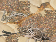 next I used 4 different color layers and three different effects to create the water....  next I put the bottom of the pond under the water layer and lowered the water opacity untill you could just make out the stuff on the bottom. 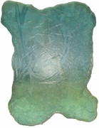 then I used the ground I have been only I added some grass textures over it and created the new pond tile. 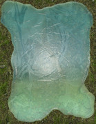 now ther will be some pond plants that I will put around the water edge and so it will look better but all in all I think it looks ok. Making this water feature is REALLY hard. Coyboy is right if you looking strait down on the pond from the air this is what it would look like but if your looking at it from an angle the light wont be refracted the same way and it will look almost black. also most ponds don't have a "shore line" lakes , rivers and the sea do but Ponds are typically still water and the foliage grows right up to the water and in most cases out into the water. so you don't often know where the land stops and the water starts. I don't know that I am properly representing that here?? maybe If I make some 2d plants to go around it.... |
|
|
|
Post by mproteau (Paper Realms) on Nov 8, 2014 17:37:41 GMT -9
I think cowboyleland hit on a point that I was also going to make in another thread regarding the gender of some anthropomorphic rats... The fact is, it might not always be 'right' to do things 'right'. Yeah - ponds might look a certain way in reality, but I think it's better to try to capture the images people conjure up in their heads when they think about the thing. That might mean making the water bluer than usual, or browner, or whatever. Or maybe it means making the water turbulent even though there's clearly no helicopter flying right over it... Same with the rat fellows. I was kind of tongue-in-cheek when I said that given the way they were drawn, they could be either male or female. In fact, I think most people, when looking at an anthropomorphized creature, will expect some of the stereotypical features that we apply to gender to make it more obvious. In that particular case, there were no obvious signs of what we often apply to make a figure more 'feminine' in appearance, and so a lot of folks will either think nothing of it and assume they're all male, or they'll think 'hey - they all look male - where are the females?' Sorry. This is starting to ramble... I just mean to say that maybe the hardest thing to do is figure out what to draw that will make people not think about it at all - it will just be a natural part of the terrain. And to get there, you might not want to emulate reality perfectly. Have you also looked at WWG's stuff that has water? They have the Atlantis set (which I turned into a TLX set) and it features dang-thats-really-bright-blue water, like you're in the Bahamas. There's the Himmelveil Canals set that features some eww-do-I-really-want-to-swim-in-that-shallow-water tiles. I like the water in the Hinterland Forests set, which I think showcases the point that having lots of ripples in what is really likely to be fairly still water is OK. Sadly, there's not much in the way of 'pond' in that set. The FDG Copper Dragon Forest Set 2 has some nice textures and the E-Z Tiles Rivers & Streams set with slightly different water. And, of course, if you don't need a LOT of water, there's always the shark pit trap from E-Z Dungeons - Expansion Set 6. |
|
|
|
Post by mproteau (Paper Realms) on Nov 8, 2014 17:42:00 GMT -9
aaron - My brain is having trouble with scaling here. The grass seems very thick, but looking at the grass and rocks, I feel like I'm actually looking at a closeup of someone's lawn, not a zoomed out shot of some terrain. Coupled with the glossy highlights on the water, it almost looks like a close-up shot of a cool science experiment of some small water bubble resting on top of the lawn. Sorry. I don't know how to describe it better.
|
|
|
|
Post by aaron on Nov 8, 2014 19:07:46 GMT -9
well the image is 8.5 by 11 inches so when you put it on the table at 28mm that would be a pretty good size but I agree with you that it's just missing something and I'm having a devil of a time trying to figure out what... maybe it needs some lilly pads or something?
or maybe I should give up on terrain and stick to making creatures LOL I hate making terrain anyway !
|
|
|
|
Post by WackyAnne on Nov 8, 2014 21:15:30 GMT -9
Most of those New Zealand rivers show what I'm talking about - muted green or brown, with blue reflections of the sky. The glacial-melthunderer fed Waikato River is the exception; but upon closer examination, it seems to be flowing over a very light coloured substrate rock. So it's very clear water, with little to no suspended organic or mineral matter, and isn't stirring up mud from the bottom either. Thanks for the pics, wyvern! What's the underlying material of the Little Green lake, cowboyleland? Similarly solid or predominantly chunky light-coloured rock? Of course my experience is coloured by the bulk of my experience, which is with waterbodies and -courses heavily impacted by the Acadian forest, tannic soils, conifers, bogs, salt marshes and the like - most often clear brown waters which reflect the sky in deep blues. I think mproteau (Paper Realms) gives good advice for this specific instance... |
|


 )) -- walk outside and get some pics of water, especially banks/shore - it might be even some puddle, shore-spume etc thing is that you should photo water-to-shore area -- you can try with close-up/macro etc.


