|
|
Post by Vermin King on Mar 13, 2018 18:03:28 GMT -9
Besides taking a model from Illustreret Familie-Journal of a Pagoda, cleaning it up and enlarging it(the illustration shows it mounted on a matchbox-some younger members may not know what a matchbox is), I also took one of my priests and gave him back art. I have a greater appreciation for what you guys do. I worked on what was probably the easiest one. As a seated figure, I think I'm going to base him using bravesirkevin's bases But here's what I've got 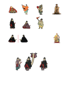 EDIT -- And the other one, in the colorful robes 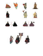 I think for the seated ones, flat bases are the way to go, but I'll stick with the One Monk-style basing for the standing figures. Can anyone point me to a tutorial on putting the verbage on tabs using GIMP? |
|
|
|
Post by cowboyleland on Mar 14, 2018 7:40:26 GMT -9
What I do: 1) Make foreground colour white
2) Select text tool (big "A" in toolbox)
3) The tool lets you create a rectangular layer; draw it so it takes up most of the top of the tab (leave some tab around the outside as a frame)
4) click inside the new layer and type in your verbage
5) click and drag to select the text
6) adjust text size to fill the layer
7) anchor layer to tab
8) IF you want to write on the back tab, rotate image and start at step 1
|
|
|
|
Post by Vermin King on Mar 14, 2018 8:11:12 GMT -9
It will probably make more sense in practice. I don't do layers because they always get screwed up, but it is time I learn
|
|
|
|
Post by yifferman on Mar 14, 2018 8:42:30 GMT -9
I THINK DO THESe because the woman need a figure too  |
|
|
|
Post by Vermin King on Mar 14, 2018 9:17:23 GMT -9
You are correct. I still plan on doing Amaterasu, and possibly Ushiwaga and Yiu
I'm just not good at figures, but I think by working on the backs of the priests, monks and pilgrims, I'm starting to get my eye and hand back.
The last one (the bather) won't fit the forum guidelines, though
I guess I don't understand what the instructions for Text is because it sure as heck didn't work.
Oh, well
And for some reason, following a YouTube Tutorial, it all worked fine to the point you try to lock it, and then it disappears. It's a shame it doesn't work like a text document
|
|
|
|
Post by cowboyleland on Mar 14, 2018 11:25:07 GMT -9
I also often get screwed up with layers. Sometimes I make a layer to do something specific and then anchor it right away so I don't mess up later. If "anchor layer" isn't working for you (happens sometimes, don't know why) try "Image; Flatten Image"
Great work on the backs BTW!
|
|
|
|
Post by Vermin King on Mar 14, 2018 11:41:39 GMT -9
There should be an easy way to anchor text. And the flipping text box ought to be able to be gotten rid of instead of being a permanent part of the file. They shouldn't make it this difficult. Paint is much easier, even the newer versions of Paint. If nothing else, I'll keep doing text documents, print to pdf, and then copy and paste. But there should be an easy way to do it without having to do three programs.
The hardest thing on backs is imagining what the figure would look like from the back. My 'system' is awkward, but I make a mirror image of the figure, then take out all the lines, like fabric folds, and belts, etc. Then I work on the stuff. On these guys, it's the accoutrements which stick out. Then I work on the head. Somewhere in the midst of that I try figuring out where the edges of the cloth with be. Then sampling the cloth textures that are roughly where I picture the alignment, I paste those in, and then make my border lines for creases, etc. I don't know if you do it that way, but it worked on the purple print guy
|
|
|
|
Post by Vermin King on Mar 14, 2018 13:01:40 GMT -9
Black robes are easiest. Did the guy in black who is standing in about 10 minutes. 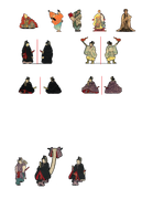 I guess I need to go back and read the story behind the tatebanko I grabbed these priests from. I doubt it is a normal thing for a priest to have his sword held in both hands under the front flap of his vestments, but that is the image I grabbed, so I made the figure accordingly. I didn't receive any responses on a comment I made above. I know it says in the format rules for figures to have them formatted for One Monk bases, but seated figures on the ground would look like they were levitating. Can we expand the rules to One Monk or bravesirkevin - style bases? By using bravesirkevin's format on figures, the tabs can still be used with One Monk bases. And I find it much easier to do backs mirrored side-to-side than top-to-bottom. I'd really like to hear some opinions on this |
|
|
|
Post by wyvern on Mar 14, 2018 13:39:28 GMT -9
Personally, as long as there are tabs I can fold outwards to slot through a paper ground-texture covering before gluing the mini onto a thicker card base, I'm not bothered whether the minis have to be folded one way or the other. The only thing I would say is to ensure the fold line works for ALL the minis in a strip down the page, as it's really tedious having to make numerous separate fold (and sometimes cut) lines where minis haven't been laid-out so cleanly. That is one advantage of the One Monk style, with that central fold-line concept.
As for the "levitating" seated figures, that's a problem for all minis, seated or standing, with those One Monk style bases - partly hence why I don't base minis that way any more, and haven't for years. The Papercraft Dungeon style of basing is quite similar to what I do, only my basing is permanent (but then I base a lot of my minis for wargaming, so they're grouped as several minis to a single base quite often).
|
|
|
|
Post by okumarts on Mar 14, 2018 14:23:27 GMT -9
YEah, one of the reasons I chose the stacked as opposed to side-by-side format is because you can fold over six at a time instead of one at a time so it makes it faster to build. I think these are really cool. I'm not bothered by 'levitating' seated figures myself.
|
|
|
|
Post by Vermin King on Mar 14, 2018 16:42:56 GMT -9
Well, I shouldn't have stopped that video earlier. #7 in cowboyleland's explanation was my problem. In the video, he showed 'Merge Down' which is what I was missing, I think I appreciate the comments. My page is not a final layout. I intend to get as many figures on a line as possible. The fronts and backs don't have to be separated that much, nor do the lines of figures have to be that far apart. It's just my working page. Also, the seated figures are wider, so you wouldn't get six of them on a line anyway, but point taken. The step guys are going to be separate. Not part of the Hoard. I only plan on having base tabs on the lower feet, not the upper ones. If you would place them on 'real' steps, slide the figure back to the next step up and it will appear that the figure is stepping down, even if the steps aren't the same size as in the tatebanko. It will just look like the upper foot is in the process of moving to the next step. On illusory steps, the foot tab could slide into a slot on the stairs or just be glued to the stairs. Needless to say, I consider these to be display figures, not game figures. That's why I plan on having them separate from the Hoard |
|
|
|
Post by Punkrabbitt on Mar 14, 2018 18:08:49 GMT -9
I've given it some thought, and I don't think I will have a submission this month. It's been a struggle just to function the last couple of weeks, and Stephen Hawking's death yesterday just kind of shut me down.
I look forward to what everyone else comes up with!
|
|
|
|
Post by Vermin King on Mar 14, 2018 18:44:02 GMT -9
Take care of yourself. You can't do a submission every month. Although I've been on a pretty good roll lately. Oh, yeah, I got a little closer to how I want to do these 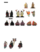 Eventually, I plan on rotating the whole shooting match, and three lines of figures. It will make more sense as it gets closer |
|
|
|
Post by Vermin King on Mar 15, 2018 8:13:41 GMT -9
When I get these two on the top row done, I think I am going to switch to deities, kamis and beasties 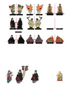 I guess with a working file name of 'Priests Monks Pilgrims' I ought to at least do one pilgrim. The Buddhist Priest is actually a monk, and the samurai flautist is also a monk, but there is a traveling monk that I probably ought to do too. I never did go back and do more work on the Goshoguruma |
|
|
|
Post by Vermin King on Mar 15, 2018 12:36:49 GMT -9
 That isn't too bad for being able to do strips of figures, is it? EDIT -- Yes, I know three don't have backs yet. |
|
|
|
Post by wyvern on Mar 15, 2018 12:48:57 GMT -9
Indeed it's not! Maybe add a slightly thicker black outline to some of the front views; it's more forgiving for those of us with less-than-ideal dexterity  |
|
|
|
Post by Vermin King on Mar 15, 2018 12:50:50 GMT -9
On front outlines I was using five pixels and then went to six. What's a good number to shoot for?
|
|
|
|
Post by Punkrabbitt on Mar 15, 2018 16:47:53 GMT -9
On front outlines I was using five pixels and then went to six. What's a good number to shoot for? I do 10. 20 on the backs. But I have a weird way of doing it lol |
|
|
|
Post by Vermin King on Mar 15, 2018 17:03:57 GMT -9
I'll do 10 then. 100% of those polled said 'ten' Thank you sir BTW-- going back and increasing front borders, I think I figured out what happened that some are very thin. Those are the ones I did at five pixels, but I was shaving the edges to get them to not look as rough, and I may have gone back a second time, leaving them really thin EDIT-- Got the fronts to 10 pixels, but haven't worked on the back borders ... yet. A good job for lunch tomorrow. 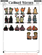 I really like the Fujiwara Yasumasa figure, the samurai flautist. Playing the flute in a hurricane, it looks like. I wonder what the story is. But I am having a hard time imagining his sword for the back view. You can see the hilt on his left side, but I'm not sure how it hangs on the back |
|
|
|
Post by cowboyleland on Mar 15, 2018 18:45:13 GMT -9
I really didn't know where to start with these guys. You are doing a fabulous job!
|
|
|
|
Post by Vermin King on Mar 15, 2018 19:06:52 GMT -9
I'm not sure whether the Scholar or the Buddhist Monk is my favorite thus far. The monk looks like he is about to introduce you to an adventure, whereas the scholar is giving details about an adventure. I just hope the Samurai Flute comes out well. From an art standpoint, he's my favorite. As far as art, I also like this pose of Songoku  Talk about a spindly base, though. If after scoring the fold, you glued another layer of card between the front and back, it would probably work, but probably wouldn't work well I was also thinking of turning a shishimai dancer into a shishimai demon  |
|
|
|
Post by Vermin King on Mar 15, 2018 20:06:01 GMT -9
I've given it some thought, and I don't think I will have a submission this month. It's been a struggle just to function the last couple of weeks, and Stephen Hawking's death yesterday just kind of shut me down. I look forward to what everyone else comes up with! Unless something comes out of nowhere to inspire me, I have a feeing next month will be the one I sit out on. It will give me a chance to catch up on a couple projects The next one -- 2D Dungeon Stuff -- already has my imagination working. It's hard to feel bad about Stephen Hawking being told he had two years to live and then living decades more. He definitely proved the doctors wrong, and accomplished a lot in the process |
|
|
|
Post by Punkrabbitt on Mar 15, 2018 23:44:23 GMT -9
It's hard to feel bad about Stephen Hawking being told he had two years to live and then living decades more. He was a rock star to me  It was just bad timing, he passed right after I started obsessing about things I thought I was doing better about. Straw that broke the camel's back and all that. |
|
|
|
Post by Vermin King on Mar 16, 2018 3:37:43 GMT -9
Take care of yourself
|
|
|
|
Post by Punkrabbitt on Mar 16, 2018 6:02:43 GMT -9
|
|
|
|
Post by okumarts on Mar 16, 2018 6:06:05 GMT -9
I've given it some thought, and I don't think I will have a submission this month. It's been a struggle just to function the last couple of weeks, and Stephen Hawking's death yesterday just kind of shut me down. I look forward to what everyone else comes up with! Sometimes you just have to make sure you take care of yourself. I hope you can finish stuff up and get it out at some point, but more importantly, I am happy that you are here at all and playing games. I often forget that sometimes you just have to stop and relax and feed your soul with whatever you are passionate about. When it starts to feel like work you've got to stop. |
|
|
|
Post by Vermin King on Mar 16, 2018 6:45:21 GMT -9
Hey, hey! Profitable webinar ... not the webinar, but I was able to work on some figures  |
|
|
|
Post by wyvern on Mar 16, 2018 11:40:32 GMT -9
Looking good, Vermin King! That 10-pixel front outline seems to work well. Sorry, I'd no idea what might work as regards pixel sizes; I tend to work either with exact values (millimetres) or abstract values as to what looks right at the time. Of course, you do realise you're making a rod for your own back in starting minis in this style, because now we're all going to want more...    |
|
|
|
Post by Vermin King on Mar 16, 2018 12:57:29 GMT -9
I'm not sure why I don't hear more about Far East games. Ninjas, Samurai, thousands of deities and demigods, the architecture, the history, and the list goes on. This works right in to my interests, and lets me expand into figuring out what works for minis and what doesn't. I like Oriental things, vintage things, and things that I just don't have enough knowledge of, like the history of the characters that these artists thought enough to do in the first place. I finished up the traveling monk, and now I'm going to attempt the foo dog lions. Picturing the backs of them has proved a little trying this afternoon after work, but I want to figure them out as part of the learning curve 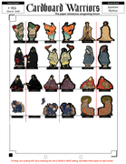 |
|
|
|
Post by wyvern on Mar 17, 2018 4:56:00 GMT -9
A little late, but if you're still struggling with the Foo Dog backs, a quick Google search for "Foo Dog 3D models" brought up a host of images, of which quite a percentage showed several views of the same figurine, so you get to see profiles and back views as well. Just "Foo Dog models" works quite well too, but the proportion of figure backs is a lot smaller that way.
|
|