|
|
Post by xtea on Sept 27, 2009 15:48:57 GMT -9
Anita-> Thanks!  Not really I am just became angry because of it. Stupid stupid adobe. >< xDD and stupid stupid me that I cannot save in time.  I can change color easily with useing the hue function. xD Ok it is not the same as I choose the color by myself... but... xD Kimerlin-> Thanks! :3 glad you like it. ^^
|
|
|
|
Post by onemonkeybeau on Sept 27, 2009 16:03:10 GMT -9
xtea! WOW! Thank you very much! My daughter's mouth hit the floor when she saw Pinky (a name which she likes very much  Expect a picture of Madison with Pinky in the near future as a thank you! onemonkeybeau |
|
|
|
Post by Sirrob01 on Sept 28, 2009 0:25:38 GMT -9
These all look great, I'm going to have to make one for my wife she loves unicorns  Photobucket free limits image size limit to 1024x768, so the raw unicorns are just a hair to big, for 30$ a year to go pro you can upload 3000x4000 sized images. |
|
|
|
Post by xtea on Sept 28, 2009 3:40:22 GMT -9
Beau-> ;D I am glad that you and your daughter like it.  Madison is your daughter right? Happy she likes Pinky's name.  Its popped up in my mind today that I must made Pinky to a female...  I hope its not a big problem that the unicorn Pinky is a he xDD sry for that. Sirrob->Thanks! I am happy you like it! ^^  Thanks for the advice but I dont wanna pay for it. =/ I think I will use the mediafire for the original sized. And yeah this unicorn just bigger with a 100 pixel xDD not much though. =P
|
|
|
|
Post by xtea on Oct 1, 2009 6:59:53 GMT -9
Hello again to everybody! Finally I finished the Nightmare Unicorn! I cant beleive it. It was a long work, ok not as much as the Original... or is it? *thinking*hmmmm dunno. But I am sure that the longest part of it was the fire. X__X I almost died when making it. xDD My dear sis *hugs* gave me a cool realistic fire tutorial. If you are interested in it, here it goes the link: www.tutorialwiz.com/realistic_fire/ Unfortunatelly it has negative sides but because I must do a black frame around the unicorn that doesnt really matter there. Ok you can noticed that the fire change its color when it meets with the unicorn's darker parts. Thats because I need to change the blending of the fire layer to linear dodge. Ok I will stop telling you guys the technical details.  I dont think that anybody is interested in it, and my English also terrible. xD So about the fire: I am not really satisfied with it. =/ When I imagine that unicorn in my mind I imagine it a better fire, but thats all I can do with it. I am especialy dont like it's tail. But I like how the other parts just turned out. I hope you too. ^__^ I have used a leather texture for the skin, from there: www.cgtextures.com/And here it goes the Nightmare Unicorn's photobucket resized one -it's bigger than the Original Unicorn, because it is a beast, tell me if you find it tooo big-: 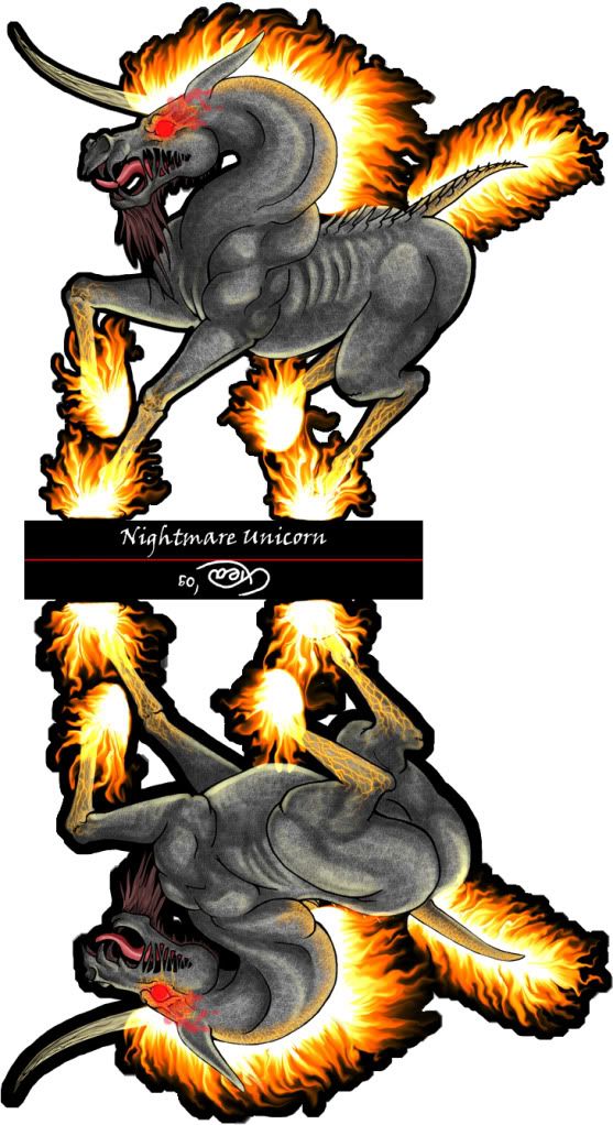 and here is in orginal size in mediafire: www.mediafire.com/file/zhj0lhiygyr/Nightmare Unicorn_miniature.jpg I hope you like it guys! ^^ I really enjoy to do it, especialy the first side. The skin, and the glowing chaps of the skin. Take care all and byez! ^____^ |
|
|
|
Post by Kimerlin on Oct 1, 2009 7:37:30 GMT -9
OOOOhhhhhhhhhhhhhhhhhh    Very good!!! |
|
|
|
Post by Scruff on Oct 1, 2009 12:01:33 GMT -9
Yup! The nightmare unicorn is still my favorite. Fantastic work!
Scruff
|
|
|
|
Post by Dryw the Harper on Oct 1, 2009 12:47:59 GMT -9
Hi Xtea, Love the Nightmare Unicorn. It can even be easily modified into a normal Nightmare if the situation calls for it.  I'd love to see you create a normal farm work-horse or draft horse, the type that does the plowing or pulls a farm cart (maybe even with a sway-back). I bet he'd be full of personality. ;D Keep up the great work, Dryw the Harper |
|
|
|
Post by Dave on Oct 1, 2009 16:14:52 GMT -9
Outstanding!
|
|
|
|
Post by jabbro on Oct 1, 2009 16:16:55 GMT -9
Very cool. I like the veins in the legs. This turned out nicely.
|
|
|
|
Post by onemonkeybeau on Oct 1, 2009 19:27:16 GMT -9
I agree with all the above!
The veins on the legs are what stood out as extra cool to me too!
And the fire is wicked cool as well!
onemonkeybeau
|
|
|
|
Post by old squirmydad on Oct 2, 2009 20:44:00 GMT -9
Wow, I need to make a flaming chariot for this guy to pull. Beautiful work!  |
|
|
|
Post by xtea on Oct 3, 2009 10:42:00 GMT -9
Kimerlin-> Thanks! ^^  Scruff Scruff-> Thanks! ;D Do you prefer darker things? Dryw the Harper-> Thanks!  Glad you like it! ^^ Ohhh I love those horses! They have soo much characteritic and they looks cute. :3 Maybe I will do one. I still plan to do 3 more, so maybe it will 4.  Dave Dave-> Thanks!  Jabbro Jabbro-> Thank you! Glad you like it.  The veins wanna be chaps... or how to call them... Beau-> Thanks! I am glad you like it. ^^  squirmydad squirmydad-> Thank you!  I am happy you like it.  Oh I am bet that chariot would looks cool. ;D
|
|
|
|
Post by anitangel on Oct 3, 2009 14:20:20 GMT -9
chaps= cracks on skin
And for Xtea *poke* *poke* Work on the new one you! *poke*
Anita
|
|
|
|
Post by xtea on Oct 4, 2009 9:25:45 GMT -9
Sry. Soo cracks okay... I used dictionary for it. =P
But I think I am afraid from the special one coloring. =( Dunno what colors should I used.
|
|
|
|
Post by anitangel on Oct 4, 2009 14:18:02 GMT -9
Urm... Blueish white with rainbow hair  Just do it, and then play around the colors X-D in adobe and settle down with the one you like  Anita |
|
|
|
Post by xtea on Oct 10, 2009 8:16:07 GMT -9
Anita-> With rainbow hair it would look like really funny. ;D xDD But Finnaly I color it! YAY! xD So hello guys again! First of all I would like to appologize because I am toooooo slow... But I really afraid from the special one coloring, but here is the result. ^^ i hope you like it guys.  So the photobucket resized one: 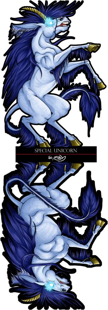 and the original sized version in mediafire: www.mediafire.com/?j53tkzqlm2oPoor unicorn has golden horn and hoofs. xD I hope you guys like the colors of it... ^^; OH! And stay tooned for more. The set isn't finished yet... just I need time. sorry for my slowness again. ^^;
|
|
|
|
Post by Sirrob01 on Oct 10, 2009 13:00:14 GMT -9
I really like the colouring on both the nightmare and Special Unicorn  |
|
|
|
Post by anitangel on Oct 10, 2009 14:57:25 GMT -9
Hey Xtea! See you didn't need to be that worried about those colors, the special unicorn looks nice, and the golden hooves and horn is fine. I'd make the hooves lighter, to make it more goldis looking rather than brown. I also think you should raise the contrast on the mane/tail a bit, to give it more shade and highlights and make the strands of hair jump out. These are all little changes in adobe --pulling slide bars. I've found a very cool way with the levels tool too... Either way is good for you. I hope you don't mind criticizing you so much.
You got this eye glowing business down good, and the hooves are fixed. Good job sis!
Anita
|
|
|
|
Post by xtea on Oct 11, 2009 4:47:11 GMT -9
Thanks Sirrob!  I am glad you like it. ^^ Anita-> Thanks! I am happy you like the special one coloring too. Okay I raise the contrast, but unfortunatelly I flatten the layers so I have to change the whole pic contrast... So here is the corrected special unicorn photobucket resized one: 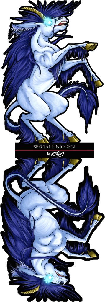 and in original size at mediafire: www.mediafire.com/imageview.php?quickkey=y0zwny5mthh&thumb=4I hope it is better now. ^^ Originally I came here to put up the lineart of the new "horse". For this time it is a pegasus. I drew the pose from a figure which I found in the net. it was a really great figure, here is the site->http://www.theplatelady.com/fairyfigurines.htm The pegasus figure is in the bottom. ^^ So here it goes the lineart: 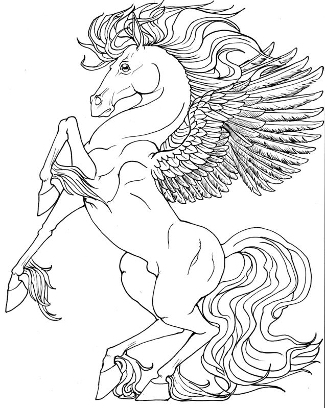 I havent done the other side yet. What do you think? |
|
|
|
Post by Floyd on Oct 11, 2009 6:41:04 GMT -9
The subtle musculature and striations on the Special Unicorn is really makes that figure!
You do great line work. Sweeping curves and all it feels very dynamic.
Can't wait to see this set completed!
~Floyd
|
|
|
|
Post by anitangel on Oct 11, 2009 7:41:16 GMT -9
Hrm merged layers? But but... why? Was it an accident? The contrast helps, even the body looks better, but it is really the mane and the tail that needs it, and it would still need more lights and shades.
About the pegasus I'd select the wing and stretch it a bit bigger. I know that you've ran out of paper drawing that ;-) It doesn't need to be too much bigger, but this wouldn't lift that horse up. It is a pretty pegasus.
|
|
|
|
Post by xtea on Oct 11, 2009 7:55:43 GMT -9
Floyd-> Thanks!  I am glad you like them. ^^  And I cant wait to finish the set finally.  Anita Anita-> No accident just my stupidity.  But for now on I will try to not flatten the image. =P Unfortunatelly if I give more contrast and brightness to it the skin looks really ugly... so thats the maximum what I can do. =/ I wanted to draw a bigger wing to the pegasus, but as you said I run out of paper. xDD I use a whole A/4 sized paper to it. Though the paper was stand. =/ I will try to increase the wings size when I will do the other side. Thanks! ^^
|
|
|
|
Post by anitangel on Oct 11, 2009 15:47:01 GMT -9
I hope you shrink him before coloring ;-) for speeding things up. Tomorrow I'll test print him, if his hair is not coming out nicely I'll ask you to send me the psd for edit  and I'll help you out. Anita |
|
|
|
Post by xtea on Oct 12, 2009 9:29:06 GMT -9
Ooookay... Than I will start to work with small files... I hope I can stand leave it as a big file.  Thanks. I hope that it doesnt need more changes. ;D |
|
|
|
Post by xtea on Oct 14, 2009 8:01:07 GMT -9
|
|
|
|
Post by anitangel on Oct 14, 2009 8:09:41 GMT -9
I've only test printed them. My figures need correcting too sometimes. Your outlines match up very nicely, it is just the placement compared to the base tab that was slid off a few pixels. Otherwise very very good job! Better than my first anyways so Don't worry about it, when you have a whole set that is when it matters how your figures line up ;-) And I hope there is going to be *hint* somebody else then me to test print these for you *hint* Besides these are only your previews!
Anita
|
|
|
|
Post by xtea on Oct 14, 2009 9:35:35 GMT -9
Yeah, and you put them in line. Not me.
Well sry that you have to test print them but I dont have money for color ink.
Thanks for helping me out! ^^ *hug*
|
|
|
|
Post by xtea on Oct 15, 2009 5:15:03 GMT -9
Hello guys again! I think I didnt have a clue what am I take upon myself with doing that horse set. xD Okay it wouldnt be an easy set. At least for me. So I have drawn more horses than I planned...  I would like to show you the sketches, because I dont know how you like them. So I will have few questions. But first, lets see the 4 horses. First lets see the wild horse: 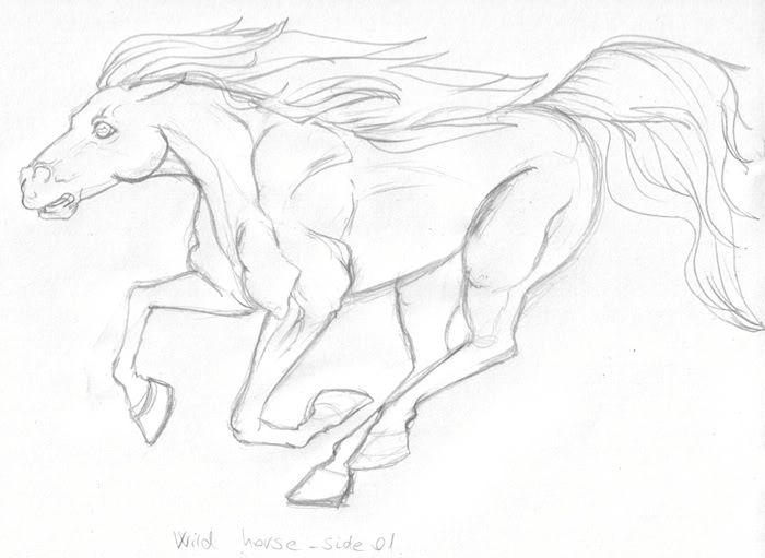 Question about it: Do you like that running pose? Or do you prefer a kickink pose for it? Second one, the knight horse: 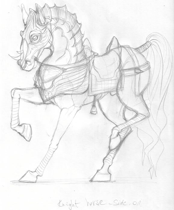 Third one, is the pack horse, my sis said that you guys would happy to get one pack horse, so: 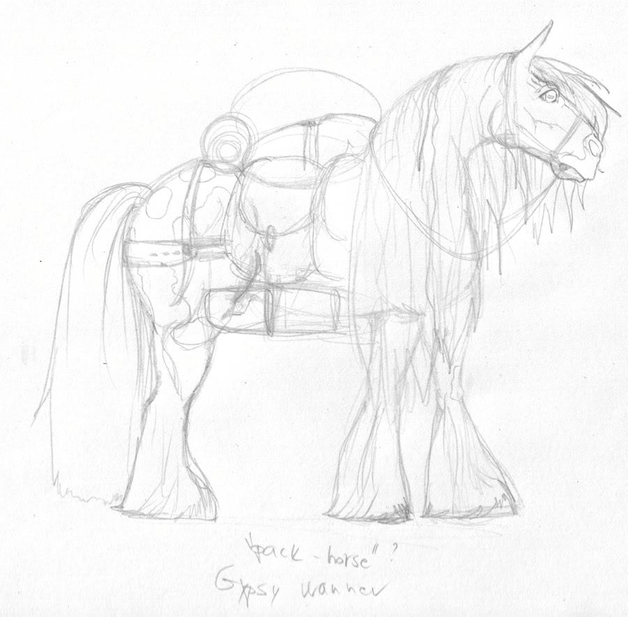 It is a gypsy wanner.  I love those horses. Question:-> Notice that the other side of his face wouldnt appear, his mane hide it. Is it a problem? I thought it would looks cute. :3 And the last one is the Palomino a normal steed... or how to call it.  so: 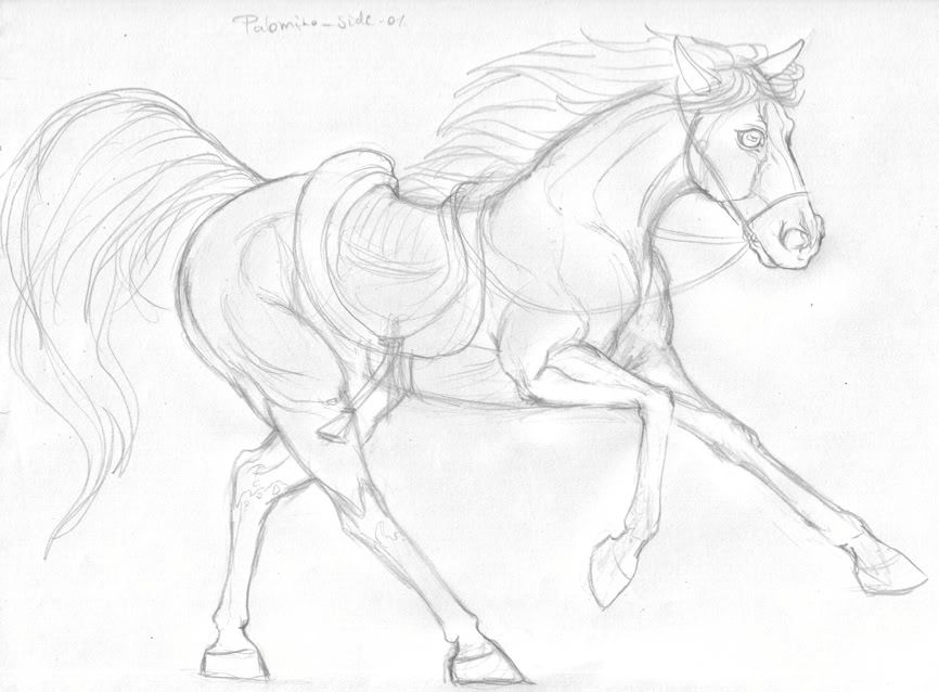 Okay the most important question: Is there any horse beetween them which would be useless? Because you guys dont need them, for example: the palomino, I wont do the lineart of it, and nor the coloring. So please tell it if you dont need them,and of course pls tell me which one is the useless? The other question is:Dryw ask me to do a draft horse too. I would do it, but you guys still need it if I wont make a cart behind him? I would draw him something like it: www.saddlesandharness.com/wp-content/uploads/2008/11/draft-horse.jpgPlease tell me what do you think? Thanks! ^^  And sorry for my slowness. U__U |
|
|
|
Post by Dryw the Harper on Oct 15, 2009 7:33:29 GMT -9
Hi Xtea,
Yes, yes, still do a draft horse. Don't worry about wagons or carts, there are a number of them available in sets from World Works if needed.
;D
Love your work.
Dryw the Harper
|
|