|
|
Post by bravesirkevin on May 10, 2013 16:32:19 GMT -9
Looks about right, remember to make the black border on the back side thicker than on the front side. I have never seen the utility in that approach. I must be missing something. Maybe if I were trying to cut right along the edge of the thinner black border... it just seems to be better to me if both sides have a thick black border, then I can cut it wherever I want. The reason we don't put thick borders on both sides is to counter Murphy's Law (ie. "If parts can be assembled a right way and a wrong way, they will be assembled the wrong way.") Wherever your border is, that's where the average person will cut, so if you put a thick black border, most people who build your minis would have finished versions with thick black borders on them, so at least one side should have a border that's suitably thin. The main reason for thickening up the border on the back is to reduce the risks of misalignment for the end user. It just makes things a little easier when they're cutting things out by hand. |
|
|
|
Post by bravesirkevin on Apr 25, 2013 5:59:45 GMT -9
Wow! Sir Kevin, thanks for the detailed analysis, I can say it has helped me. As I am a newbie, I am left wondering about how one would represent muscle tension. Is it done mostly by the position of the limbs -- for instance, an arm drawn back as if getting ready to punch? Maybe play with the figure's balance, or rotation of hips and shoulders? You're welcome! The position of limbs, the posture and all of that are very important for balance, but when it comes to muscle tension, it's all about light and shadow. Tensed muscles have dramatically more definition than relaxed ones. When drawing, you'd indicate this by deepening the detail around the tensed muscles, and by making the contracted muscles bulge visibly and making the extended muscles look like they're being pulled taut. On a particularly muscular character, you'd also emphasize the bulging of veins over the contracted muscles It's also very important to remember that the body is basically a machine, and the muscles are like a system of pistons that move the frame around... No muscle works on its own... it's part of an interconnected system. When you're raising a dumbell over your head with your right arm, it's not just the biceps doing work: The muscles of your forearm are contracted tightly to keep your fingers closed firmly around the bar. The triceps is flexed to keep your arm straight, and your biceps is stretched, but flexed to keep the triceps from bending your forearm too far backwards. Your deltoids and trapezius muscles are flexed to pull the arm up, and your lats and chest are pulled taut, tensed as they counter the pull of the trapezius. Your abs and back are firm and tight as they seek to keep your core stable, and if you're standing, your legs will be flexed tightly as they contribute to your balance too. The muscles of the left arm would be relatively relaxed however, as they don't really have anything to contribute. I'd also like the add that Mr Okum has the right of it. Silhouette is by far the most important thing. Definitely going to second his advice on learning from the masters. There's a lot of theory behind good character design, and we're pretty fortunate that some of the experts out there are willing to share their knowledge! I know I owe them a great debt for all they've taught me. |
|
|
|
Post by bravesirkevin on Apr 25, 2013 0:42:10 GMT -9
But I'd rather hear him explain where he's coming from.. I can't really speak for the guy, as he's as much a stranger to me as he is to the rest of you. I would like to offer some constructive criticism in a similar vein though. I get the impression that you, as an artist, strive for realism. I can't fault you on that one, as I strive for the same. In fact, I'd seriously recommend that you give consideration to taking some of your models and selling them on places like www.turbosquid.com/ and unity3d.com/asset-store/ where you are sure to get more than a few purchases with a nice profit on each sale. When tackling something like a gaming miniature however, whether it's made of paper or plastic or metal, you're dealing with something that's already really small, and something that's going to be sitting quite a distance from the eyes of the viewer. Realism actually begins to work against you in this setting, rather than helping you. Think of it more like theatre, and less like a video game. In a video game, the screen is big, and close to the viewer. The dynamic of the characters comes from a mobile camera, and ambient animations that give the characters the illusion of life. Realism in this environment is impressive and powerful. In theatre, the actors are far away from the audience. There are no close ups on the actor's faces to show off the subtle nuances in their facial expressions, so they don't bother with subtlely. Everything is loud and bombastic! The make-up is bold with lots of contrast, so much so that it looks terrible and ridiculous up close. A soft tear running down a cheek is not enough to show sadness, so the actor's whole body gets in on the act with arms flailing in despair and knees showing visible weakness. The actor who is seething with anger doesn't stand quietly with a grimace on his face... he throws his arms out defiantly, tensing every muscle in his body and screams furiously and loudly (even the characters standing right next to him are supposed to be oblivious to his rage). With hand-drawn cartoony figures, the dynamism is not added by the silly exaggeration, but instead, the simplicity of the figures makes them very expressive and the exaggeration only sharpens that effect. Make each piece tell a bit of a story. I can't think of a better way to illustrate my point than to give some direct advice on some of the figures you've presented here: This guy's an assassin? Instead of just making him a guy carrying lots of cool looking swords, give him some menacing presence. Make his pose more dramatic... Perhaps he's skulking in the shadows, hunched over observing his victim and waiting for the right moment. Perhaps he's sneaking up on his target, sword poised to deliver the death blow. This one has some story going on, so that's a good thing. The story's just not being told strongly enough. If his legs were bent more, so that he's half-crouching, and his shield was pushed forward while his body moves back it would add a lot of drama straight away. It would also help to position his sword in a way that made it look like he was actually about to use it, instead of just holding it, which is what he's doing now. This guy's also pretty good, but he could be a lot better. He's holding a massive hammer, that would certainly weigh more than 50 pounds with a chunky metal head like that, but he's holding like it's a bouquet of flowers that he's about to offer to his girlfriend. There's nothing about his posture that indicates the weight of that fearsome weapon, and nothing about his body language to reveal that he has any intention of using it to inflict horrible damage on the person he's facing. This guy's pose is awesome and the non-chalant look on his face is classic! The only real problem here is that most of the beauty here is completely lost in the translation. When printed out, you can barely see his swords at all, and all that beautiful detail on the face is little more than a smudge. This one might work a lot better in the same pose, but with the camera facing him from the side instead of head on, so that you can see the length of the sword and the threat it poses. This would definitely be helped by some indication of tension in his muscles, as if he's a tightly wound spring, with all of that potential kinetic energy just squeezed into him waiting for the slightest excuse to unleash it all in a frenetic ballet of death. Just some thoughts. I hope they're helpful.  |
|
|
|
Post by bravesirkevin on Apr 14, 2013 21:24:10 GMT -9
And it's up! Just to say thank you to all of you who've been following this thread, upon checking out type MalteseFalcon into the discount codes box to get 25% off your entire cart!* * One use per customer. You must be logged in or it won't work. Coupon code expires April 15th, 2013.
Just a reminder that this is the last day to take advantage of this coupon. |
|
|
|
Post by bravesirkevin on Apr 11, 2013 8:41:01 GMT -9
The alternative could be (I guess) to just divide it up into 1-2$ mini-sets in a pick-and-choose sort of manner. Something like... Shelves and cupboards -> 1$ Tables, chairs, stools, benches -> 2$ Etc. Yeah, that'd be a perfect way to go about it. Just make sure that the set is self contained and useful even if the customer only buys that one on its own. Bundle the whole lot as soon as you have a few compatible sets out. |
|
|
|
Post by bravesirkevin on Apr 11, 2013 8:26:31 GMT -9
I was actually thinking about selling them. Thought I'd maybe break it up by colour scheme so people can choose which one they want and pricing the whole set at around 15$ (or 30$ for all three colour schemes). Not quite sure how I'd break it up otherwise... One of the most popular sets I ever created was the Gothic Coffins, which is just 5 closed coffins and 5 open ones, with layers to allow customisation of the details, and that goes for $1.49. It's much harder to sell the bigger sets, even though the bigger sets have way more cool stuff in them. I'm actually busy working on a small furniture set (just 2 pages and lots of layers) with the same price tag in mind to see how it sells. I don't think it's impossible to sell big sets expensively, I just think that people are less likely to rethink a $2 purchase than they are to rethink one that's over $10. Apart from that, it's very easy to get a small set out quickly which means you can start earning and getting popular sooner and this important, because popularity is what takes you from selling 10 sets a month to selling hundreds of them... you'd want to get that going now, and not 6 months from now. Apart from that, I didn't really start seeing all that much money until my 8th set out. Just something to think about. You should also avoid selling multiple versions of a product that are completely indentical apart from the colour choice. People will only buy one. You'd be better off giving them all the colour choices at once, but limiting the amount of objects in the set, and then releasing a different set with new objects, so that people have an incentive to buy both. On a side note: sir Kev, can I know what's your source on the weapons you used in the Lair set? I created all the weapons in that set myself. I have 3d models of them that I created and textured. For some of the weapons, I followed the style of the illustrations in the 3rd ed DnD Player's Handbook, as a bit of an homage. |
|
|
|
Post by bravesirkevin on Apr 11, 2013 7:52:42 GMT -9
Should go faster the better of an idea I have about what I'm doing. Are you looking to sell the stuff when you're done with the art? If so, you're better off thinking of a theme for a set and doing a small release with a few components and an appropriate price every few weeks. If you go too big, it costs too much and takes too long to get the stuff going so you lose out on momentum. The small sets also allow you to gradually build up a fanbase. Once you have enough small sets, you can make bundles with all the small sets in them which encourages people to buy the whole lot in one go. |
|
|
|
Post by bravesirkevin on Apr 11, 2013 6:37:31 GMT -9
Printed and assembled first batch. Looks... better than I expected. Looks pretty good! I printed out the last batch you put up, but I haven't put them together yet. Been a bit of a busy week unfortunately. What else are you going to do now that the shelves are sorted? |
|
|
|
Post by bravesirkevin on Apr 7, 2013 13:33:00 GMT -9
What I'm unsure about is how to arrange all this into layers with the delicate lighting details that spring up here and there from the interaction of various elements. I recently did a set that included a shelf that used layers to customise the contents. There's a whole thread about the set over here: cardboard-warriors.proboards.com/index.cgi?board=bravesirkevin&action=display&thread=4607 I don't really talk about how I set up the layers, but there are a lot of pics of the customised shelves there. Basically I set it up so that the shelf was divided into 6 sections, and each section had 4 possible options. The 4 options were all fixed in their own spaces, with the lighting and position of all elements set as is. You could do something similar. I do have to warn you that if you do go that route, you'll need to be selective about how many layers you include, because my first build of that shelf PDF was a huge burden for acrobat to bear due to the amount of RAM it took to render it with all those high resolution images. A guy I sent a preview to said that it actually crashed his Acrobat, so I had to strip it down and optimise it to make it work more smoothly. |
|
|
|
Post by bravesirkevin on Apr 7, 2013 10:18:10 GMT -9
imgur.com/p5GmVo4And one more with slightly mode defined features. And some combinations. I'm almost tempted to try layered .pdf files but then I realise this won't work. This will be probably the final version and back to texture work. Layers could work, but there's a whole work flow behind it that might make it too much effort. In general it's good to get the components going and usable on their own, and then use the layers for optional details. If you do decide to go that way, you'll probably want to get your hands on a copy of Illustrator and a copy of Acrobat Pro so that you can do all of the editing you need to. |
|
|
|
Post by bravesirkevin on Apr 7, 2013 4:30:38 GMT -9
Scale's definitely looking a lot better. Interesting use of shapes there too. These are going to be some good looking shelves when you're done!
|
|
|
|
Post by bravesirkevin on Apr 5, 2013 13:47:47 GMT -9
On a side note, if any of you guys out there can do geometry and texturing like that, you may want to consider applying your skills to making 3d game and video assets and selling them on www.turbosquid.com, cos there's a lot more money to be made there than on papercraft sets for the same amount of work. |
|
|
|
Post by bravesirkevin on Apr 5, 2013 13:37:42 GMT -9
I've found this page by accident. While the models are over, insane complicate, what really is wonderfuls his the designer ability to enhance them with the textures. The textures are made so well than, in conjunction to his ability and precision, you often could not understand if a piece is just drawn or actually built.    I'd like to be able to just UNDERSTAND the "logic" behind the making of these textures... Sorry to burst your bubble Parduz... All this guy's done is to import the game models and textures from Starcraft 2's asset library into pepakura and used that to unfold it. All of the texturing and geometry was done by the guys over at Blizzard. |
|
|
|
Post by bravesirkevin on Apr 5, 2013 8:56:49 GMT -9
Ok, so I go through all of the options with the layers in my PDF, creating the unique minis I want. Now I want to take the file to Staples for printing. How do I do it? How I do I save just the variant sheet I created using the layers as a unique PDF file? Sorry if I am missing the obvious. Thanks! --Scott If you have Acrobat Professional, you can change which layers are on or off in the save by right-clicking on each of the relevant layers in the layer panel and selecting "properties". There's a pull-down menu for default state where you can turn it on or off. This does not work with Adobe Reader however, so if you don't have access to Acrobat Professional, then Hackbarth's method is probably the most reliable bet. |
|
|
|
Post by bravesirkevin on Apr 3, 2013 17:41:48 GMT -9
Very nice work Stephen!
The center line on your curved road's a little wonky, so you might want to have another look at that... but your textures are pretty neat!
|
|
|
|
Post by bravesirkevin on Apr 3, 2013 8:54:48 GMT -9
OMG this set rocks!!! Are there cut files for them in the DL or are there some someplace else?
The cutfiles for this set are up at papercraftdungeon.com. It's a free download. These cutfiles were created with Silhouette Studio version 2.7.18 by Kevin Richard John Berry and OldSchoolDM @ the Cardboard Warriors forums: cardboard-warriors.proboards.com/ and uses the registration marks already on the PDFs - just print at 100% scale and cut! Artwork is sold separately. A big thanks to OldSchoolDM for his help with these! |
|
|
|
Post by bravesirkevin on Apr 2, 2013 16:16:29 GMT -9
|
|
|
|
Post by bravesirkevin on Apr 1, 2013 11:49:15 GMT -9
|
|
|
|
Post by bravesirkevin on Apr 1, 2013 9:34:48 GMT -9
Thank you again.  You're most welcome friend! |
|
|
|
Post by bravesirkevin on Apr 1, 2013 4:19:37 GMT -9
Hi Kevin, I have some problems with download. So I sent you an e-mail from your site. Ciao G. Hey Rhannon, I got your mail and I've replied to it. It seems to have been an issue with an interrupted download, so it shouldn't be too hard to fix. Thanks, as always for your support! |
|
|
|
Post by bravesirkevin on Mar 31, 2013 18:18:37 GMT -9
 Freshly released! This set contains brand new Kev's Lounge papercraft dungeon tiles, and markers, along with 3d papercraft furniture, and a pair of innovative spiral staircases to add a third dimension to your dungeon delves! With the various layer options this set will allow you to create hundreds of completely unique pieces that can be arranged in nearly infinite combinations. Perfect for table top wargames, skirmish games and RPGs. The set includes 6x6 dungeon tiles that combine to form a large round room, and are great for representing the floors of a large tower, or a round pit, like an arena. This set is extremely customisable, and with the interactive buttons built into the PDFs it's very easy to adjust each and every piece of it to your liking!  A major highlight of this set is the pair of spiral staircases:  A Luxurious Lair: Council Chamber by Kev's Lounge available for download at Papercraft Dungeon. only $4.99! A Luxurious Lair: Council Chamber by Kev's Lounge available for download at Papercraft Dungeon. only $4.99! |
|
|
|
Post by bravesirkevin on Mar 31, 2013 17:51:49 GMT -9
And it's up! Just to say thank you to all of you who've been following this thread, upon checking out type MalteseFalcon into the discount codes box to get 25% off your entire cart!* * One use per customer. You must be logged in or it won't work. Coupon code expires April 15th, 2013.
|
|
|
|
Post by bravesirkevin on Mar 31, 2013 16:20:51 GMT -9
This set's busy uploading to papercraftdungeon.com right now! It's taking a while because it's a nice big zip file, and the other day a ship went and demolished the SEACOM cable in the mediterranean and consequently the internet around here moves at the speed of jam flowing down a very slight incline. At some point in the next 40 minutes you'll be able to pick up the set at www.papercraftdungeon.com/luxlair-council-chamber.html. Will do a proper announcement as soon as it's up and I've sorted out all of the descriptions and promo images. |
|
|
|
Post by bravesirkevin on Mar 30, 2013 0:04:09 GMT -9
Yeah....the lighting in a gaming room is going to be room light. But your model might be the inside of a tavern lit by torches...so its only going to look like that if you render it that way. This is seriously a bad idea. Believe me. Prebaking light like this never looks good. You're right, it does look bad most of the time. The exception would be that if the light source is visible on the model, like a sconce on a wall or a raging fire in a hearth, then the effects of that light should be baked in to the texture. |
|
|
|
Post by bravesirkevin on Mar 29, 2013 16:10:22 GMT -9
Hi there, and welcome to Cardboard Warriors!
First up, your renders are actually really pretty! Good use of textures and your shadows are really well done. They definitely help with the illusion of depth and they will definitely help in "reading" from a distance.
There are a few things you should pay a little more attention to though:
• You need to watch the scale. if these are scaled for a 28mm figure, then they're currently twice as big as they should be. The plates would be 2' diameter platters and that pot would be a collossal clay cauldron that would be above eye level of the average mini.
• The centre of gravity is a full inch above the ground, and it's only an inch wide, so it's going to get knocked over by a slight nudge. I usually overcome this by tapering the box and/or adding a heavy base that's wider than the model
• You're likely to run into a few problems with the printing. Photo papers and other high quality ink jet papers will hold the detail, but they're a pain to work with and expensive, so a lot of people use simple cardstock. Cardstock has a very absorbant surface so the ink bleeds out and makes images look muddy. this can be mitigated to a degree by ensuring there is enough sharpness in the detail. You don't need to go as extreme as Nikloveland suggested, but you do need more than you have right now. A specific problem that you're going to run into is that your beautiful stacks of plates are not going to look like stacks of plates when the model's built. Use the Unsharp mask filter to push the detail to a usable level.
• Contrast, like the others have been saying, is critical. In the latest example, the white crockery is perfect. The blue is okay, but likely to be problematic against the brown background. Might do okay on the grey. The tan crockery doesn't work at all on the brown background, but does okay against the grey. It's not just a matter of making the hue's different, you need to have have a noticeable difference in brightness (ie, a light and bright object against a dark, murky background, or a dark, richly coloured object in front of a light, dull background.
I hope that helps!
|
|
|
|
Post by bravesirkevin on Mar 25, 2013 9:22:43 GMT -9
Thanks for posting that OldSchoolDM ;D
To give a little more detail, this stairs have a simple build option and a challenging build option. OldSchoolDM's pics above show off the simple build. The challenging build takes a little more patience to put together, but has more detail and looks really cool!
Those pics also show off yet another of the possible floor textures in this set.
|
|
|
|
Post by bravesirkevin on Mar 23, 2013 11:24:56 GMT -9
So I got the pro photos done... Just going through and fixing bugs and generally cleaning things up as much as possible before unleashing this one on the world! 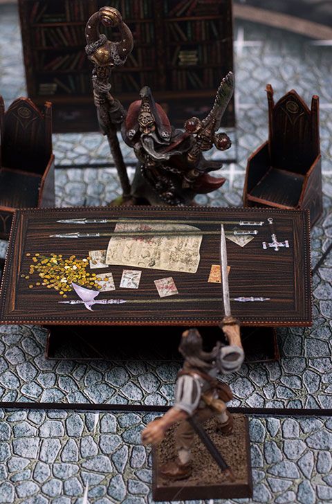 This set's got so much cool stuff in it, but right now the bit I'm most proud of are the spiral stair cases. My initial designs were hard to build and not really as great as I wanted them to be. Over the last couple days I've completely redesigned them and now they're a little more complicated, but they're a lot easier to build and they're a lot more awesome! They've got an innovative system that keeps them looking realistic, but allows figures to stand on them. When not being used in game, they'd be a really awesome display stand for your prize figures. 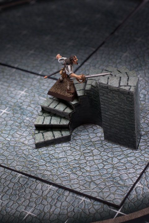
Photos by Photos By Mick |
|
|
|
Post by bravesirkevin on Mar 20, 2013 19:49:42 GMT -9
I just find it pretty funny that everyone's arguing about how the troll slayer should be holding his shield. He's a troll slayer. He'd look at a shield the same way an anorexic looks at a gigantic pizza... With absolute disgust and disdain. Even if he needs the shield every bit as much as the anorexic needs the 1200 calories, he's as unlikely to pick it up as the anorexic is to wolf that pie down. |
|
|
|
Post by bravesirkevin on Mar 20, 2013 19:41:14 GMT -9
This barn's looking great Dave! The trick I'm using here is one I use a lot. I start with a bright color, in this case pink. I create a new layer, and paint (in pink) all of the areas where I want the moss to go. Then I get a full page of a prepared texture, which happens to be a layer of grass that I've altered a bit. I lay the prepared texture field over my layer of pink markings. I use the Magic Wand to select "around" the pink markings, then hide that layer I do something similar to this all the time, but with a small twist that you might find comes in handy. I paste the texture into a new layer, then I add a layer mask. I also add a colour overlay in the Photoshop layer style's panel, of the brightest, most contrasting colour I can find. It's usually pink, but often will be a very bright green. After that's done, I'll invert the layer mask so that it's completely black, and thus renders the entire layer invisible. I'll then gradually paint white into the mask allowing parts of the layer to show through. The great thing about doing it this way is that I can smooth off the transition from full opacity to full transparency quite nicely... but more usefully, I can also turn off the colour overlay temporarily to see how my texture's looking, and then turn it back on to keep painting. Finally, it preserves the entire texture layer so that I can add it back in after I've trimmed it away, if I trimmed away a little too much. When done, I remove the layer style, since the colour overlay's not useful any more. Applying the layer mask will apply the transparency and delete the unused portions of the mask, which can reduce the save size considerably. I tend not to do that though, as I like to be able to go back and adjust it later if need be. |
|
|
|
Post by bravesirkevin on Mar 19, 2013 18:44:02 GMT -9
But a photo isn't really the best style-match for my papercraft. I'd spend a buck on a bitmap for fantasy town, wilderness, cave ceilings, etc. in the appropriate art style that I could print. Someone do the "Fantasy backdrop line" and I'll pay $1us for each! It would be quite a bit of work... but a lot less work than setting up a papercraft set. I might consider doing it if there was enough interest to guarantee more than just a few dollars per set out of it. |
|