|
|
Post by Vermin King on May 3, 2017 17:38:00 GMT -9
Saw this photo and immediately thought Habdome!   Cupola, porch, and some vertical walls... |
|
|
|
Post by jeffgeorge on May 4, 2017 9:36:48 GMT -9
At the risk of exposing my ignorance, where does one find that Habdome model?
|
|
|
|
Post by Vermin King on May 4, 2017 10:31:52 GMT -9
|
|
|
|
Post by jeffgeorge on May 4, 2017 13:56:53 GMT -9
TYVM!
|
|
|
|
Post by Vermin King on May 4, 2017 16:38:53 GMT -9
Well the house in the photo is the Armour–Stiner House, or Armour–Stiner Octagon House. So, I'm envisioning a Dodecagon House. The Habdome (the red brick one to supply textures) will actually be the roof. Then will need to do the two-story straight walls using the brick texture. Shrink the entrance piece a mite to be the lower roof windows. The little round dormers can go in the same location, just need more of them. I think the porch roof would have to be in three pieces on letter-sized paper, as would the porch floor. I think a dodecagon cupola would be a pain, so maybe hexagonal. The chimney needs to be extended higher. And swap out the windows and doors with something more Victorian. Porch supports and railings would have to be somewhat ornate. I do hope there is a kitbash category in Papercuts 2017, because I think I know what I'd like to do   No interior, but the ballroom looks interesting  It's below the cupola and above the Egyptian Revival Music Room 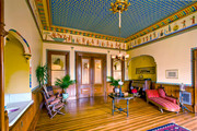 I think I'd like to do a pattern on the porch similar to the A-S House, only not so much to cut out |
|
|
|
Post by cowboyleland on May 5, 2017 3:39:33 GMT -9
Wow. That should be very cool.
|
|
|
|
Post by Vermin King on May 5, 2017 19:43:14 GMT -9
Let's leave this as 'inspired by'. I attempted to have the multi-colored, patterned slate tile on the roof and decided I would keep Chris's roof texture. If you aren't familiar with the model, each dome segment has three sections. I now have the roof texture on all three sections, with two segments having chimneys. Until I do the Cupola, I won't know how tall to make the chimney extensions. The brick texture will be used on the two-story vertical walls. I plan on using the windows from the inspiration building for the windows on this section. I have to decide on the doors. It strikes me as needing one main entry door and two less-ostentatious doors. The foundation will not be as tall, that way there will only be one step up to the porch level I think that if I consider the space between the paired columns in each support has a solid insert, I can keep a lot of the porch pattern. 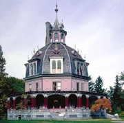 But I most certainly will NOT have the candy-cane roof on the porch 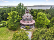 My personal feeling on this is that it should be very cool looking, but since most of the geometry and textures are Chris's, it won't really be shareable. Unless Chris says it is okay. And I'm thinking that as a modeler, I can get this looking pretty good, but I'm not so certain it will be to a standard where Chris would want to release it. I think it will really look good with Tommygun's Airship parked next door. cardboard-warriors.proboards.com/thread/2985/men-infernal-flying-machines |
|
|
|
Post by cowboyleland on May 6, 2017 5:56:43 GMT -9
"parked next door" or using the cupola as a mooring mast. Watch out for the chimney's though.  |
|
|
|
Post by Vermin King on May 6, 2017 8:59:32 GMT -9
I was actually thinking of taking a hunk out of the porch, and mounting Tommygun's Mooring Mast to the back of the building. I know most folks wouldn't mess with fiddly adornment, lightning rods and weather vane's, but I was thinking that if I do a set of them, I'd make them available. Looking at the construction of the airship, I realized this would be sturdier if the regular dome base had a gutter pattern as an extension. One to mount the dome to, and one for the top of the two-story part. The regular base will be used on the two-story part as a base, too. This looks like another one of those projects that are 'natural progressions'. It won't be short on pages, even without an interior. But I'm not thinking anything should be difficult, maybe not even fiddly. Tedious, though. Twelve Dormers and twelve round windows will definitely be tedious 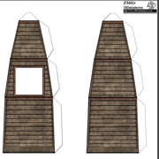 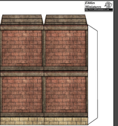 |
|
|
|
Post by Vermin King on May 6, 2017 18:21:11 GMT -9
Was fleshing out two versions of the walls: one similar to the A-S House and one more Victorian Gothic. I prefer the second version. And PostImage is down again ... And without a picture, it might not make as much sense, but I wanted to ask something. The porch going around this has a flat roof. I'm thinking of having the roof connect to the walls with roof tabs fitting into slots in the walls. I want to work on the porch next. With the radius on this, the floor will have to be divided into three sections. As the tabs won't show on this, I could do traditional glue tabs. The railings and porch supports will wrap around this, then the roof attaches.  Hey, hey! No more Bad Gateway message! On the A-S House, the porch roof attaches just under the upper windows, so the top of the concrete-looking band under the windows. I haven't decided to place it there or at the bottom. I was thinking that if I had it at the bottom, I could add an upstairs door to gain access to the Mooring Mast. Haven't decided yet I do like this version of the walls. This is just two of the three sections. The main double doors are at the front, and equally spaced around the building are the other two doors. |
|
|
|
Post by cowboyleland on May 7, 2017 5:49:24 GMT -9
You should follow your own instincts. My impulse would be to have a door out of the dome level and an option for the porch roof to be a balcony would also be cool. These are just thoughts, though. Most of the models I build are for game purposes and this seems too involved for the kind of gaming I do.
|
|
|
|
Post by Vermin King on May 7, 2017 6:33:01 GMT -9
Doing a door to the porch roof seems like an obvious choice. The balconies from the bottom dome level would seem more Steampunk/Victorian Gothic. You have the wheels spinning. I can see either a larger balcony over the main entrance or two smaller ones, one on either side of the front facet. Or two entrances with a balcony that extends between the two door pieces, being a three-facet balcony around the front. I think that would be really appropriate on a SP/VG theme. Also easy to do as an extension of the dome base
Going back to that, the real house has gutters going around the base of the dome that stick out much farther than I would have thought necessary. Underneath are bracket/cornice pieces. The cap for the two-story part could have the bracket/cornice texturing, but I'd need to add it to the top of the upper walls, too. My thought is that it is a detail element that would not really make building any more difficult, but would be very appropriate and make the design flow better.
I did the porch floor pieces last night. To tie things in, I thought about the porch roof having this bracket/cornice detailing, too. I can have it as a fold-over from the roof, like on Dave Graffam's roofs, and the fold-overs would cover the tabs from the wrap-around porch railing/support pieces.
I still think that tab-and-slot is the way to go for the porch roof
|
|
|
|
Post by Vermin King on May 7, 2017 14:04:23 GMT -9
When I started this, I thought that 12-sided would make the dome more round than 8-sided. With the windows on 12 sides it might look a little busy, but steampunk is usually a bit 'busy'. Then I played around with whether I should still keep eight sides on the porch, to keep the character of the porch, but that looked wonky. So I am proceeding with the 12-sides. Six-sided looked better than eight as far as side views, but not looking down at it. So, I'm proceeding as I started and hoping for the best.
Doing smaller windows on the dome should take away from the busy-ness, but then again, busy-ness might look good.
|
|
|
|
Post by Vermin King on May 7, 2017 15:27:10 GMT -9
You know how just a few minutes after posting how you get another idea that needs to be expressed? My big mistake is this: I like symmetry and order. In spite of being Octagonal, you can't think of it as symmetric  The round stairs (which I'm not doing) don't line up with the front door, but yeah, they are equally off-set. Keeping in mind that you are looking at the front doors (something you don't see from the outside because some idiot planted a tree between the stairs), look at the chimney. It isn't at the back, but at right angles to the entrance, without a mirror chimney on the other side. You can also see the porch support pattern I would like to emulate. With 12 sides, I could never fit two short sections with a wide section in the middle on one of these sides. If I don't have two short sections joining at the corners, I can adjust the porch so that there are wider sides and narrower sides, somewhat emulating the look. Since the angles are at angles, at least on the front and back, perspective says that the wide sections don't have to be as wide, nor the narrow sides as narrow. At least from front and back. From left or right, you'd be looking at the narrow side flanked by wide sides, so looking dead on, they'll appear approximately equal. This will be a second version of the porch. I'm not throwing my original away Sometimes the expression of a problem yields the solution |
|
|
|
Post by greypilgrim on May 8, 2017 11:59:27 GMT -9
Jusr - WOW! What a great inspiration!
|
|
|
|
Post by Vermin King on May 8, 2017 12:51:03 GMT -9
In all actuality, I have put a lot of time into this, but every time I hit a glitch, it sorts itself out almost immediately. I've decided to go ahead and keep the dodecahedral shape to the porch roof. It will look fine. I'm working on the dormers on the dome now. Originally, I'd planned on just using the Habdome door piece, only shrunk slightly and with different textures. I'm now trying to decide if I want to have a sloped roof on it. It makes it much more fiddly. If you look at the dormers, there is trim to either side. I think the easiest way to do it is make a 'dormer face/trim piece' to glue onto the front. The round dormers will require a little tweaking, but not much. Once I get those done, I'll just have to do the cupola. It's only going to have six sides, not twelve.
And when I get to that point, I will start tweaking textures. I want a lot of dullish-gleaming metal. Since I'm not doing all of the lightning rods (probably), I want brass trim, but not too shiny. And I still have to go back and do those eaves brackets. Quite a few of those. It only makes sense to do them as textures, instead of separate fiddly bits.
This reminds me of the Mos Eisley project. A lot to do, but everything do-able. Each snag is resulting in a solution that is better than the design I originally thought of.
Once it is designed, I want to think about it before building it. On Mos Eisley, I would build and then print up something different to replace what I wasn't happy with. As this is probably going to be about a twenty-page model (maybe more), I want to print and build once, only once. I'll still have to re-do parts, but hopefully not as many.
During the Thinking-About-It period, I'm going to build Tommygun's Airship, although I might do it as a hybrid between Tommygun's airship, and Squirmydad's airship, and Grendelsmother64's partial Airship. Build it straight? I think not
|
|
|
|
Post by Vermin King on May 10, 2017 14:45:22 GMT -9
As I was searching for more images, I found that this bad boy is for rent on Trulia for a meager $40,000 a month
EDIT: Three hours later--
Converted the pages that are pretty much my design (though relying heavily on Chris's textures) to being cutter friendly
Adjusted doors to be the same height as Chris's doors. When I laid out the walls, I guesstimated based on the height of the lower ring of the Habdome dome. I'm glad I checked. The doors were closer to 1/72 than 30mm. Keep in mind, this is 'inspired by', not a model of. If just the doors are considered, mansion doors, I think assuming seven foot tall doors is probably about right. If that is close, the ceiling on the porch is about 15 feet to 16 feet tall. Nice place
From the Trulia site, I finally found a section of the porch railings and supports that can be cleaned up and turned into my texture for those parts. The railing is pretty much done. I know I saw a detail of the dog relief that is the center of the railings. The railings are good to go except for the center-detail. The columns are requiring some thought. If you look at the corners on the A-S House, there are columns that go up slightly taller than the railing, then posts go up from there, but they aren't at the edges. I want to have the look somewhat similar ... if you don't look too close. I'm sure some solution will present itself.
|
|
|
|
Post by Vermin King on May 11, 2017 17:14:19 GMT -9
Getting close on the railings 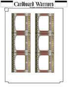 To do these at the larger outside dimensions, I was limited to doing three sections together. I have to figure out which sections need to be open for steps, and how open the openings need to be. Keeping in mind that I'm not doing the insides of the railings, I don't think I want to get more detailed than this. I think I have gotten myself to the point I am happy with the amount of detail. I didn't expect those stupid roof brackets to be such a pain to get the perspective out of them. There are two sets of straight steps on the A-S House. I'm going to carry over the riser patterns onto the steps for the Dodecagon House |
|
|
|
Post by Vermin King on May 12, 2017 9:44:16 GMT -9
I don't know how much free time I will have tonight ... need to mow, but I hope to get the roof brackets onto the eaves and wall tops. I think I have a plan to do the porch ones efficiently. If it works, I will apply the same method to the second story walls and the eaves of the dome roof. I also did the open section of rail on one piece. I also worked out the spacing for fitting those into the railings. I wish I'd saved a jpg of it to show, but it is saved on a pdf. And the tabs are on it. When I said above that I'm not doing the inside railings, I might have given the wrong impression. I will mirror print on the backs so that I won't have the glaring whiteness. So the end tabs on these are textured.
Next week I hope to have the dormers and round window dormers done, and the steps. Maybe the cupola.
I'd kinda hoped Chris would have jumped on here by now. I hope he is doing well.
Discovered an error on the cornice/brackets, and fixed it. Then fixed it on all the stuff listed above. Realized I had not done the railings for the balcony I added. It will have to wait until I get back from the weekend, though. I want the same railing pattern but I need different posts
|
|
|
|
Post by Christopher Roe on May 13, 2017 10:57:43 GMT -9
Sorry for the silence, work's been really busy lately and I haven't had much bandwidth for anything involving computers or advanced technology at the end of the day.
I really like what I'm seeing so far in this thread. I have no problem with people sharing their remixes and stuff in the Genet Gallery area. That's the nice thing about making my stuff free, I don't have to be all Download Police and have overly complicated approval pipelines or special availability channels for kitbashes. As long as it's shared in the Gallery here with a descriptive thread, it's all good!
|
|
|
|
Post by Vermin King on May 14, 2017 17:03:31 GMT -9
Sounds great. Without direction, I was half-tempted to go back and do an Octahedral House and avoid using any of your geometry, and develop my own textures. It seems a lot of the textures have been replaced already, but I've been trying to keep enough of the Redbrick Habdome there to see that it is a kitbash. Now that I have your blessing, I'll continue on the current path.
|
|
|
|
Post by Vermin King on May 15, 2017 16:18:21 GMT -9
As I get this figured out, I think I will post my 'working files'. The dome itself really is a re-texturing of Chris's dome, using Chris's textures. I'm going to post things like that as Ebbles Miniatures files. Files that I develop with and without Chris's textures with geometry I develop, I'll put in Cardboard Warriors format.
Yes, I plan on building this as part of a kitbash diorama for Papercuts, but even so, I am willing to share these and show the development.
If there is an interest in these being posted. And, if so, would you want to see the development trail, or just the finished product?
By now, you should know me well enough, that you should expect my preference. I try to come up with stuff to inspire others. Those tent dinos are something that I think should be a style used on more beasts and monsters than I've seen. Also, I like to show my trial-and-error approach, so that people who don't think they can do their own designs, might give it a try.
If you'd like to have me post the files as I work, let me know
|
|
|
|
Post by greypilgrim on May 17, 2017 14:44:58 GMT -9
yes, please
|
|
|
|
Post by Vermin King on May 17, 2017 15:25:01 GMT -9
I have to warn you ... there will be more pages than in the final draft. Some pages have collected items that don't have a better home for the moment, and others are looking a bit lonely on their pages (like the balcony railing I worked on the other night). Until I'm satisfied with it, I figured it needed to be on its own page entitled 'balcony railing', so I can find it easily enough. Most of the files at this point are pdf, so I need to convert to png (for final adjustments) and jpg (for an acceptable file size to post). And I'm not sure why I saved these as pdf instead of png. On my other projects I did all the work in png format.
I need to give more thought to the second floor doorways to the porch roof before I can post walls. I intend to work on that tonight and finish the balcony rail.
In giving more thought to having the porch roof being the access to the mooring mast, I think I want to have railings to cordon off the porch roof for the passengers. I don't want railings around the whole thing, so I think I want the second floor doors on the back. Yes, the whole concept is a bit fluid and dynamic, in spite of the amount of work accomplished thus far
|
|
|
|
Post by Vermin King on May 17, 2017 17:34:02 GMT -9
|
|
|
|
Post by Vermin King on May 18, 2017 17:56:44 GMT -9
Door situation solved ... 2nd story 4% taller, door 4% shorter. Tedious, but works.
Also, I build a lot of things without instructions, so I started with numbering parts and tabs. Realizing that the Dodecagon House (perhaps the Ashbrook-Stein House) should be built in sub-assemblies that need to be aligned, I'm going to have the old 'N', 'S', 'E' & 'W' indicators. I have this huge fear of getting them in the wrong order. Cupola will align with the dome, the dome aligns with the downstairs, which aligns with the porch. To indicate the balcony door dormers, I might put a 'D' on those locations, but I don't think it is necessary.
I think it's time for dormers and round windows, but not tonight
|
|
|
|
Post by Vermin King on May 20, 2017 7:19:21 GMT -9
On my completed files, I've got parts numbered in the four subassemblies, with the orientation markers and page numbering. Re-designated the subassemblies as Cupola and Dormers, Roof, Downstairs and Porch. By breaking it down, each subassembly section will have six pages or less. And frankly, some of this is optional. I doubt anyone but me would do all twelve round dormers, or eight main window dormers, two balcony doors and two chimney assemblies. Octagonal would have made this easier. Eight of the different thingummies instead of twelve. As I mentioned earlier, it will have a busy appearance, but Victorian Gothic usually does.
I like the evolving build order. Build the Downstairs, then build and attach the Porch. Build the Roof and chimneys and attach. Then the Cupola and Dormers.
Spent way too much time working on organization, labeling, and dormer textures last night, but in spite of the large number of pages, I think it is turning into a model that even a novice could build. Especially if I don't do all the weather vanes, lightning rods and other ornamentation.
After yard work and vacuuming, I hope to have the dormers done tonight. With that accomplished, I can move on to the Cupola, chimneys and steps. I am rather pleased with how the cupola roof is coming out. I just need to stop changing 'Done' things. I'm back to thinking I need to do the Ashbrooke Stein Dodecagon House before doing the Airship, only I think that the Airship will give me ideas to incorporate in the House. I still have some things to do before that decision has to be made
|
|
|
|
Post by Vermin King on May 20, 2017 19:26:51 GMT -9
Hmmm. The Chimney of the Habdome is on the same level as the round dormer windows. So having a set of window dormers directly under the chimneys is not going to work ... at least without looking silly. So, my idea is to turn the two lower dormers under the chimneys turned into wider, lower sections of the chimneys. To try to capture the look of the Armour Stiner House (but different), the two balcony doors are 95% the size of the Habdome doors, while the window dormers are at 80% of that size. I think the chimney pieces will need to be at 100%. To blend with the upper chimney base, I think I will extend it out slightly over the new lower chimney piece. I'm really just collecting my thoughts here on that, but I thought I would post the page with the two balcony doors and two window dormers.  |
|
|
|
Post by Vermin King on May 21, 2017 10:27:45 GMT -9
Started working on the chimneys, but decided I needed a handle on the cupola, so I can judge height and appearance I needed to clean up and square up a cupola face and then realized the dodecagon roof cap needed a hexagonal inner design to accept the cupola glue tabs. I'm not 100% certain that I don't want to make it a little taller. I think it is fine, and since the chimney dimensions depend on the cupola, I think I will leave it.  Inventory time. Chimneys, round dormers and steps. Thinking more about the airship and landing mast, it needs a metal spiral staircase. I would need to build this, the airship, and the mast to determine the height of the stairway. To be buildable, the center support would need to be much wider than on a typical staircase. Not only easier to roll, but it would give solid attachments for the stairs. This would purely be ornamental (unless I get surprised). To have a wide enough step to be used for figures, and have space between the handrail and the steps above, it seems it would have to be 'silly-steep', unless the wider support column is really wide. The wider the column, the more steps you can have for a complete turn. The more steps per turn, the higher the clearance on the steps. Since it will be made of paper, I wonder if I could do a Loretto Chapel Staircase. hmmm |
|
|
|
Post by Vermin King on May 21, 2017 10:54:24 GMT -9
If you aren't familiar with that staircase, I think I first saw it when I was about seven years old, and had never heard it called the 'Miracle Staircase' or anything, but even that young, I was drawn to it. It just didn't look right, but there it was. Not only did it look like it shouldn't be able to stand, but there was one brace going over to a column that just didn't look like it did anything, and the woodwork is beautiful. Hand-crafted complex curves that look perfect. If you are ever in Santa Fe ...  I always enjoy lighthouse builds. Would it be stupid to turn the cupola into a lighthouse? |
|