|
|
Post by Floyd on Jan 21, 2011 15:31:25 GMT -9
I got that Trojan Horse when Brian first wrote about it's release in promotion for the DSgame about ... 2 years ago.
Or did you mean Black Ox?
~F
|
|
|
|
Post by Floyd on Jan 21, 2011 11:50:02 GMT -9
Who did they infringe on ? The Greeks? Odysseus?  Anyone needs it, pm me. I'm looking for Tetsujin28's nemesis Black Ox if anyone has that paper model let me know. ~Floyd
|
|
|
|
Post by Floyd on Dec 27, 2010 10:42:47 GMT -9
Kringlebot's torso is too large. Santa's torso is waay to big too!  Seriously entire robot is out of proportion(although it is symmetrical) that look was intentional. It was kind of a simplistic retro-design. Long stilted legs, titled squat over large body... sort of the Elf's vision of a large scale toy-warbot. Though the wrist/hands lend a sort of manga-esque feel to it. Think of it as the WH40k Ork equivalent of a smaller Stompa. Or did you mean there is a problem with the assembly? Can you please be more specific... It was designed with the intention of 110lb card stock be used its assembly. Although I did build it with 65lb as well... ~F |
|
|
|
Post by Floyd on Dec 23, 2010 6:49:49 GMT -9
|
|
|
|
Post by Floyd on Dec 19, 2010 5:19:06 GMT -9
Here's the review...maybe you didn't write it Parduz. But I saw your comments and may have thought you wrote it and were simply responding to others comments. And yeah trying to gather enough people to play it proper is a bummer. It's a beautiful game though. I'll try to get my hands on Fury. Yeah Kila, the book was cool...the rules were not. ~F
|
|
|
|
Post by Floyd on Dec 17, 2010 8:10:35 GMT -9
That's the 2nd most visited website by me. LOL
I make my daily trip there.... then to Bluesnews
Ebbles, here, and Tabletop gaming.
~F
|
|
|
|
Post by Floyd on Dec 17, 2010 8:08:31 GMT -9
Good start for a figure Kila!
Speaking of MC. I just recently bought a perfect used copy of Siege of the Citadel from ebay based off of some research and Parduz's excellent review of it. Wow that's another game with a high WOW factor when you look at all the pieces and parts. Beautiful.
~F
|
|
|
|
Post by Floyd on Dec 11, 2010 5:01:02 GMT -9
Those look like a 2 x 2 " tail to tip, wing to wing....
Nice work Dave.
Looking forward to seeing these released.
~F
|
|
|
|
Post by Floyd on Nov 27, 2010 6:25:14 GMT -9
Krazy Nick looks excellent. Like all the detail. Here's my contribution.... 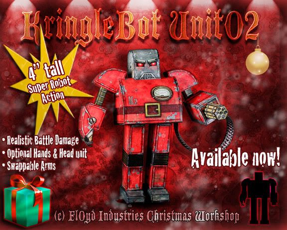 The optional head wouldn't fit on the 2 pages of PDFs. So it is included as a separate file. I've got most of the instruction pages done. I've posted them in a thread in my old section here for a short time. ~F
|
|
|
|
Post by Floyd on Nov 27, 2010 6:24:45 GMT -9
__________________________________________________________________ Model Link:
dl.dropbox.com/u/4953098/KbotU02_Release.zip
Enjoy & Happy Holidays everyone!__________________________________________________________________ 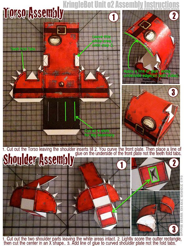 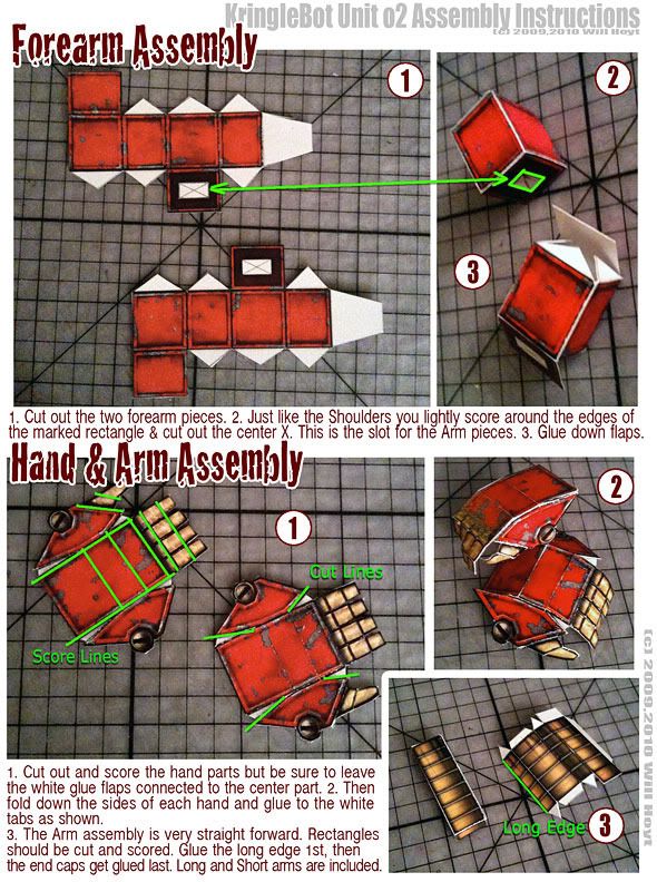 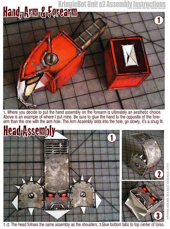 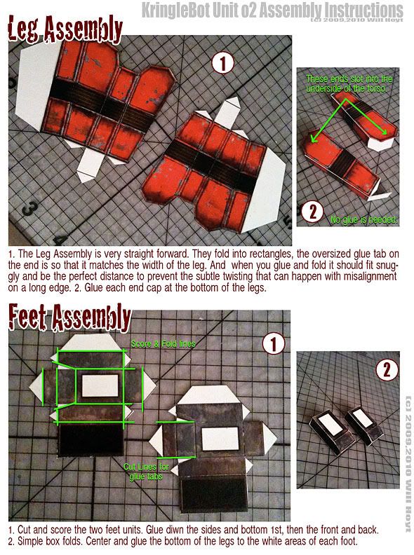 Here is the alternate head. Right click and save. When printing, make sure the image is at 200dpi for proper scale. 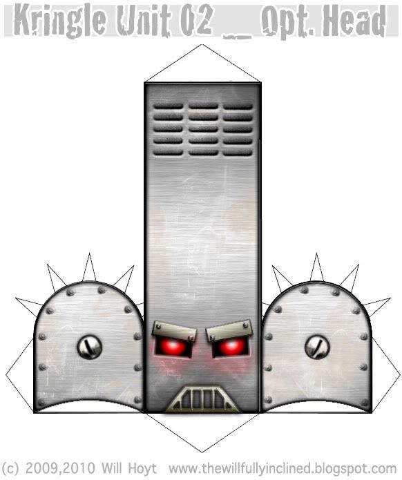 |
|
|
|
Post by Floyd on Nov 22, 2010 8:48:10 GMT -9
I am all for dioramas.
I find that too often the gradated backgrounds don't always suit, sometimes make everything appear overly flat, and dark-light depending on the color of the background. And if you aren't the best at cutting out the figures or edging them - more times than not your mistakes will show up worse than they actually are.
If you intend to go this route, use a variety of neutral colors please.
The StoneEdge, Gaffam Games & Ebbles Miniatures Rendered displays work well too.
~Floyd
The Cardboard Warrriors promo pic at the top was created in about an hour. And while it's no where near the production level of WWG ( I don't have Gels, Fancy Flash/Lights with barn doors to control the studio like lights...) we can achieve similar results easily in a Photo editing program (eg. Photoshop).
I used 3 procedures for post production in Photoshop to create the above image:
1. Render Light Flare for sword and it is cast a little onto the wizard.
2. I darkened the edges of the image to be more of a vignette and focus on the center action. I darkened the adventurer in the cave's side that are recessed into darkness (so that it looks like he is illuminated by his lantern).
3. The saturation was brought up slightly.
An unsharp mask was added after the image was reduced and cropped to size. (which is a sort of finely controlled sharpening that can reduce aritfacts but enhance details).
The miniatures and terrain above are from my play collection. They weren't specifically printed and assembled for that image. I used a big metal reflector (like you can get from Walmart) and a 500 watt blue bulb. I took a sheet of tracing paper and covered the front of the bulb to get a softer diffused light-source.
And I wrote the above just to explain that not a lot of time or effort is needed to produce (imo) a much more interesting & appealing display of what you're selling.
|
|
|
|
Post by Floyd on Nov 6, 2010 17:09:53 GMT -9
Sir Rob sorry I didn't see this sooner. It's a rough puddle shaped selection, with some bricks peeking through to show a bit of unevenness. The color was pulled from the general brick tone then desaturated to an ashy mud color...but do it to your taste. An inner bevel with light source at or near the top. So the top shadows and the bottom acts like a catch light at the lip of the puddle. An outer glow was used, set to black and multiplied. Then the opacity turned down so that the edge was not harsh and sort of meshed in with the surrounding brick in an unobtrusive way. For the interior puddle reflections I used a rough stone texture and *bump mapped it into the reflection using only a light source for highlights, no shadows. That way only some of the random edges show through as light post? moon? reflections. You could do a render-clouds (photoshop)or use a texture brush for some dark patches to subtly blend into the puddle to give the illusion of depth. All of the above is what I did to make that puddle. It seems like a lot when I explain it but it's a rather simple procedure. Just getting the illusion of depth is 90% of the trick. If I can help you at all let me know. ~Floyd * Try this top page animation for some visual inspiration. Also near the bottom is a visual explanation of the bump mapping technique if you weren't sure what I meant. This was done in Photoshop using the Layer palette Bevel/Texture combination. This is also how I did the texture on the Stalker recolors for GunCrawl. |
|
|
|
Post by Floyd on Nov 2, 2010 6:27:06 GMT -9
There can only be one 'Sanity Claus'. The Kurgan-Klause... no wimpy bad accented Connor MacLeod's... ~Floyd |
|
|
|
Post by Floyd on Oct 26, 2010 18:25:32 GMT -9
Nice texture work Sir Rob! The metal grating on the edges of the stone road is pretty cool. I like the use of reds from the brick and the use of the sever access hatch. It definitely feels like Victorian/steampunk. Maybe you could add some more ornate bits here and there... maybe some patterns in the stone work occasional or something. (maybe some 2.5d flat street lamps?) The perspective is probably not such a good idea because even with shadows added it will add too much height separation from the sidewalk to the road... it would feel like a few feet drop. Unless that is your intention. Also there is the matching up the tiles perspective wise it will look odd. What I'd like to see (for variety) : Some uneven stone work, where the road isn't perfectly smooth or flat. Maybe some puddles with riles meandering off to the drainage at the sides. I'd up the contrast and make it a bit more gritty, but then again that may not be what you were going after. Again real nice work! I hope you put a set out. (if this one is any inclination of the quality then it will be fantastic). ~Floyd I couldn't resist playing with your street, here is an example of some of the ideas mentioned above. Eliminating the brick work, making some of the road stones appear uneven, added some puddles and shadows where the sidewalk meets the drainage grates. 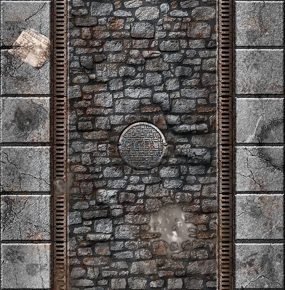
|
|
|
|
Post by Floyd on Oct 15, 2010 5:04:22 GMT -9
I know there are colored versions of these for Gear Krieg walkers for sale at RPGnow and the like, but DP9 has released ( for free) the black and white versions of quite a few of those models. Grab them here. There are some scenery bits as well. I wonder how well these would fit in with ArmorGridGames:Mech Attack as "opposing forces" ? Hmmm.....! ~Floyd
|
|
|
|
Post by Floyd on Oct 13, 2010 7:10:58 GMT -9
|
|
|
|
Post by Floyd on Oct 1, 2010 11:05:36 GMT -9
All I gotta say is awesome... Awesome!
The internal structure using foam core works really well. Providing a really sturdy frame with which to hang all the ornate goodies...
I want more... I want 1:1 Bolt Guns, I want an M41 (that I don't have to resize to US Letter and is a little more sturdily built with not so many pieces), I want some Gears of War weaponry!!!!
~Floyd
|
|
|
|
Post by Floyd on Oct 1, 2010 10:59:49 GMT -9
Floyd, not Floyd the Barber but
Pink Floyd.
My first BBS handle back in the mid-late 80's.
I'd say all-time Favorite band (with that much diversity in genres of music covered it's hard for them not to fit any mood)
I used to end a message post with Pink, but Floyd has a nicer ring to it.
It's funny how many of those handles I was mispronouncing in my mind. It was Magpiestir(pronounced like Hippstir) to me. And I like Marillion but didn't draw the connection... LOL.
Oh by the way,
which ones Pink...
~Floyd
|
|
|
|
Post by Floyd on Oct 1, 2010 10:40:46 GMT -9
Wow Dave!
That was really kind of you.
Thanks!
Another great model for the Fantastic Medieval Village.
~Floyd
|
|
|
|
Post by Floyd on Sept 21, 2010 15:02:04 GMT -9
Yep he mostly did. Thanks
Which I just wanted to be clear that's all. For future purposes. Which as we know is always uncertain. Though I should have said this particular recolor of the model, not the model itself. :-)
Thanks for the compliment though, all the same.
~F
|
|
|
|
Post by Floyd on Sept 21, 2010 10:42:36 GMT -9
I would like this recolor/modification of Jim's Wizard to remain free as part of the Hordes. Please do not repackage/resell this particular model. If it is intended that any or part of it or the Hordes it was part of be sold, kindly delete it from the roster.
Thank you,
Floyd
|
|
|
|
Post by Floyd on Sept 20, 2010 10:24:06 GMT -9
I'm just shocked Titan was released in 2010. I'd seriously given up on it until next year. I think it would have been a 2011 release had there not been an evaluation and refocus. It's a nice looking set of textures for a space ship corridor. The release is Spartan to the point of being anemic ... but I have faith in Paul as he is the one that usually chocks his sets full of stuff. (And I believe he may have went overboard a bit before really have a firm hold on TLX... and probably had to reconfigure/redo a bit of it.) I fully expect a lot of goodness on the expansion. ~F |
|
|
|
Post by Floyd on Sept 20, 2010 8:13:07 GMT -9
Here is a really nice PODcast interview and breakdown of the new DnD Ravenloft boardgame with it's head designer. What decisions were made and why. Very cool. Made me go out and buy it and the new Red Box DnD starter set. :Thumbs up: ~Floyd
|
|
|
|
Post by Floyd on Sept 19, 2010 15:45:23 GMT -9
Looking good!
|
|
|
|
Post by Floyd on Sept 19, 2010 15:37:37 GMT -9
1" to 1.25" is good. 1.25" (ala WHQ) is good because it offers a wee bit more room while visually inscale with 1".
~F
|
|
|
|
Post by Floyd on Sept 19, 2010 15:31:27 GMT -9
Good job man!! Agree'd with sentiments above!
~F
|
|
|
|
Post by Floyd on Sept 17, 2010 6:22:55 GMT -9
Cool to see another Scifi set by FDG.
Nice that he included hovering Security bots(reminds me of that remote control UFO toy you can buy) and a ship. Plus the ability to alter the texture overlays is always an added bonus for customization.
I don't think his texturing is quite up to the par of his Fantasy stuff though, that said it looks to be a pretty nice set.
~Floyd
|
|
|
|
Post by Floyd on Sept 17, 2010 6:13:00 GMT -9
Jim had a good system with his creating and selling his miniatures, with some freebies thrown in and the hoards... and while itt was a nice gesture and all he really shouldn't have just given all the sets away like he did (imo anyway). I think it hurt their value/perceived or otherwise.
The blister pack look was a great idea and I am really sorry he just decided to *give away the entire line of intellectual property like that. But kudos to you guys for swooping in before someone else could have.
I imagine a nice new repackaging, maybe a freshening of the older lines, a few recolors and alternate poses would be on the docket.
Good luck and I hope you guys keep Jims' work available and add to its value.
~Floyd
* - severely under-priced.
|
|
|
|
Post by Floyd on Sept 17, 2010 5:29:51 GMT -9
The Unsilent Majority?
~F
|
|
|
|
Post by Floyd on Sept 15, 2010 17:16:57 GMT -9
|
|


