|
|
Post by zygrott24 on Jun 12, 2014 17:44:30 GMT -9
I agree with cowboyleland, good stuff and your making them at quite a clip. I like the dynamic poses too, keep it up! You should definitely think about contributing something to the Horde! sometime. |
|
|
|
Post by zygrott24 on Jun 12, 2014 17:10:48 GMT -9
You know he does!  |
|
|
|
Post by zygrott24 on Jun 11, 2014 16:30:22 GMT -9
Wow. These are so good, and you are so prolific. You make me feel like a slacker... I hate to say it, but you have got to stop putting so many figures up here now. Get them to onebookshelf first! Just give us a teaser fig or two from each set, that way we know we need the whole set, but you still get to make your money. Anyway, you are awesome.
|
|
|
|
Post by zygrott24 on Jun 10, 2014 19:24:06 GMT -9
I haven't actually gotten around to drawing just yet but in looking around for inspiration I saw some great creative commons stuff (particularly from www.36peas.com - www.flickr.com/photos/goosemouse/sets/72157624410426985/ ). There is some great stuff there, including the requested manticore, and the licence is very clear (CC- attribution). If you are like me you may get some inspiration, or maybe the frontside of a figure of yours (if that's kosher for the horde). |
|
|
|
Post by zygrott24 on May 29, 2014 17:05:56 GMT -9
|
|
|
|
Post by zygrott24 on May 26, 2014 18:50:27 GMT -9
Here is a new version of the Big trouble crew (Now with Hypno-Brides!). I am experimenting with cell style shading, brutal comments are welcome. I will test build everyone tomorrow. I don't expect any problems, except for maybe Wang Chi. 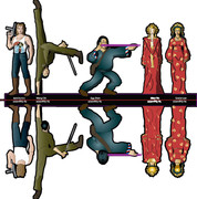 |
|
|
|
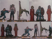
Post by zygrott24 on May 24, 2014 19:15:07 GMT -9
Yes, Wang should be much taller while doing a handspring. I scaled him down to fit the three of them together. I will adjust and do the outline to see how it looks.
|
|
|
|
Post by zygrott24 on May 24, 2014 18:45:42 GMT -9
My first draft of the Big Trouble heroes is done. 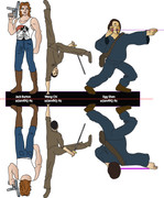 I still have to clean them up a little, fix a few colors, and shade them, but here is the WIP. If I have time I will do the brides as well. Wang is going to be a little flimsy without a toothpick or rolled paper to reinforce him, but I think it is worth it to have him flipping. Thoughts and comments always appreciated. |
|
|
|
Post by zygrott24 on May 23, 2014 5:58:12 GMT -9
Thanks, I really find a good theme constrains my thinking enough to let me pick a model and focus on it, no constraints lead to me messing a little with too many project beginnings. On that note lets try to get a set of themes picked for some future hordes (suggestions from me: Robots & clockwork, or maybe 4 legs good 2 legs bad). Now, I guess I need to make some Big Trouble in Little China heroes to go with the villains from a few hordes back... Here comes Jack Burton, and I will make at least one other guy, you know, to do stuff while Jack Burton fails to be a hero (that's why hes one of my favorite heroes).
|
|
|
|
Post by zygrott24 on May 23, 2014 5:46:58 GMT -9
Wow, I am late to this thread but and I am just reiterating comments that have already shown up in one form or another but, amazing work! The only bad thing is now everyone will be pestering you to make a fantasy version of Temporum Oblitus. I mean you have one race already done right... |
|
|
|
Post by zygrott24 on Mar 9, 2014 19:27:24 GMT -9
Here is the first goblin gardener, Plowhands! (Hey, it makes sense to goblins...)  As for gilius and the modern battle gardeners; I think the mower guy is great, the lady looks like she needs some hoses or something coming off of her sprayer but both designs are awesome. |
|
|
|
Post by zygrott24 on Mar 9, 2014 7:47:52 GMT -9
That Triffid belongs here too. Anyone remember where it was? That triffid was in Hoard #15 (Feb 2009). It is a set of 2. |
|
|
|
Post by zygrott24 on Mar 6, 2014 5:05:23 GMT -9
I personally like flats better than A frames but the thin line option is nice in that it lets people who are fans of either style to get what they want. Have you thought about doing a layered pdf that could let users turn the outlines/black silhouettes on and off?
|
|
|
|
Post by zygrott24 on Mar 6, 2014 4:54:34 GMT -9
madmanmike, awesome entries. There is semi-offical limit of a few figures (just to keep people from submitting a whole army). I think a handful of models on theme will always be welcome (people often submit 2-4 figures and nobody seems to mind). As for the 2.5D idea, in the past some models in the hoard had little instruction blurbs written next to them when they were 2.5 D or 3D so I am sure that that can be done for this model. Both look really good.
|
|
|
|
Post by zygrott24 on Mar 4, 2014 19:40:18 GMT -9
 I see not many of us were in the hero mood (even mad max is a bit on the anti-hero side). Maybe we should do heroes of cinema in an upcoming hoard to get our karma balanced (and give those colonial marines more time to sneak in). Great looking hoard everyone.
|
|
|
|
Post by zygrott24 on Mar 3, 2014 21:12:59 GMT -9
Glad to hear it!
I always post my work-in-progress here, it keeps the progress of my ideas together and saves me from making a thread for each design or submission theme. For me it is nice to have an end in sight (at the end of the month when the gates close) to help focus my project goals and get me motivated. And of course no work will ever be locked out of a hoard. If it is late, it goes to next month! It also seems like the folks who come to the Hoard forum before it is finalized are talkative and interested. Of course, a "gallery" or "new member artists" post will probably both get a lot of views too, forum goers here seem to range around pretty widely. I would say go with your gut on whichever feels like the best fit.
|
|
|
|
Post by zygrott24 on Mar 3, 2014 21:00:04 GMT -9
These are great. You could pitch them as "super not official" Risus figures. I like the understated way there is the essential element of every character that conveys their genre or role. With some serious coloring (and I think colored pencil is just fine for that, but maybe scan some of your favorite examples) they are good to go!
|
|
|
|
Post by zygrott24 on Mar 3, 2014 20:50:00 GMT -9
Great Cyclops, spiny and intimidating. I am blown away that it is a first mini! I think it is an awesome family project and hope you guys do some more mushroom men too. I love myconoids, and they would be perfect for the March Forum Hoard |
|
|
|
Post by zygrott24 on Mar 3, 2014 20:36:11 GMT -9
Yay gobbos! If you are posting a gobbo for the Garden of Doom I might post one too. A set of mischievous goblin gardeners sounds pretty good.
|
|
|
|
Post by zygrott24 on Mar 3, 2014 20:12:33 GMT -9
It's a great likeness Cowboyland. I knew exactly who it was at first glance. Hmmmm......now that you mention it, his car would be a relatively simple 3D project...... GM64 This post is a little all over the place so I apologize... I know I have seen a 3D starcar linked somewhere around here (probably by Cowboyleland), but for the life of me I cant find it right now... I thought it would be in last months Hoard. Cowboyleland, any reason you didn't repost it there? (as in it was by someone else or not for general release or something?) On other notes I am working on a Venus mantrap (because that is all I could think of for deadly flora for starters  ). I think I will finish it before too long so I was hoping for some more ideas for deadly plants or garden accouterments. Suggest away.  And on the subject of suggestions, Dungeonmistress, I like those suggestions and will let them simmer for a while. However, in that same post you say you couldn't do this stuff. There is no way that you aren't qualified to put your stuff up here. What you have shown (in say the Aelor's emporium post) is great quality and shows all the necessary skill to make good figures! I am not one of the heavy hitters of this forum by any means (and I wont name names for fear of leaving one of the many great artists here off), but I found that the biggest hurdle to doing it was posting that first figure. The same great artists I just mentioned they have been amazingly supportive and helpful and have made me feel welcome. That said, I hope you draw something and scan it in (uncolored is good too there are several people here who do great recolors all the time). Not good with photoshop/GIMP? Draw a big figure by hand, color it with pencils or markers; I or another forum member can resize it and/or give good links to free versions of those programs. Don't have a scanner? Take a good picture. Even an unfinished piece can serve as a starting point or inspiration for someone else. Contributing to the Hoard is very rewarding in my opinion and I strongly suggest it. This is a great community and every post/pic is appreciated. |
|
|
|
Post by zygrott24 on Feb 27, 2014 18:52:47 GMT -9
I added some texturing and tried to brighten up the colors for this version. But, my ink cartridges died during test printing (I will have to grab more this weekend)  From what I can see the colors look better. I am less sure about the textures as there was a lot of streaking. If they don't look good with the new burlap-ish texture I can remove it pretty easily.  Full res (some alternative textures on the right side too): www.dropbox.com/sh/ldtc8gdsxf9ykch/dUy_N66mV2/lopanand%20Storms_003%20copy.png |
|
|
|
Post by zygrott24 on Feb 20, 2014 20:24:48 GMT -9
|
|
|
|
Post by zygrott24 on Feb 7, 2014 17:28:44 GMT -9
Are these ships 2.5d or full 3d? Either way they look great (perfect for Full Thrust!). How long is the build time on each ship? I would love to see more spaceships here Try posting the pngs directly using the forum's uploader (be sure to select the best quality option that is available) or post a public dropbox link in a new thread in the new member artists section. (http://cardboard-warriors.proboards.com/board/74/new-member-artists) You could also post them in cardboard-warriors.proboards.com/board/37/fan-art-member-exclusives if you want to make them available to site members only. |
|
|
|
Post by zygrott24 on Feb 5, 2014 20:15:44 GMT -9
So I have a couple of questions for those interested... How tall (in scale) should Lo-pan be given that he is a "10 foot tall road block" and how much lightning is too much to put on the model of Lightning? Test builds of Lo pan at a few different sizes and my early attempts at a lightning effect on Lightning: Dropbox for full quality: dl.dropboxusercontent.com/u/67457759/lopan_andStorms_test007%20copy.jpg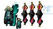 |
|
|
|
Post by zygrott24 on Feb 3, 2014 19:17:07 GMT -9
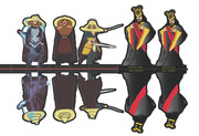
I am going to suggest Big Trouble in Little China! (What can I say, it is one of my guilty pleasure movies): First installment, Lo Pan! I am still in the process of shading and tweaking but he came together well enough that I thought I would show him and ask for input.  If I can finish him early who should I do next? Egg Shen, The Three Storms (basket headed guys), or Jack Burton? |
|
|
|
Post by zygrott24 on Jan 31, 2014 18:46:25 GMT -9
Here is a slightly improved version of the ogre with lighter colors (he was too dark in 1st my test print). www.dropbox.com/s/4ozzjg7r33nyeor/ogre%20clean03%20flat.pdfI seem to have this issue often (darker than intended colors or slightly off colors on printing). Should I be working in a specific palate better suited for printing (I use CS2 photoshop and Illustrator since those are available for free)? Any advice or tricks you guys use to get the screen colors to print true would be appreciated. |
|
|
|
Post by zygrott24 on Jan 30, 2014 20:21:05 GMT -9
I am tossing in an old ogre I had lying around. I was playing a lot with textures so he is a bit messy but it will have to do for now. I don't want to miss the cut off  .  I will try to get him test printed tomorrow to work out the bugs in the lineup of the two sides. dl.dropboxusercontent.com/u/67457759/Texture_Ogre_001.pdf |
|
|
|
Post by zygrott24 on Dec 31, 2013 14:04:34 GMT -9
Thanks for taking on the transparency build, I am too cheap to buy sheets for one experiment Any comments on how it looks in person? Would the hexes be better at a different size? Maybe thicker lines? Or, on the flipside, is it just adding fiddly bits to cut out without adding any real visual interest? I will reflow the text to avoid the frames when I have a little time (I hope it gets in before the official cutoff). Also, I noticed your prints of the frames came out much greener (and less grey) than mine. Is this just a printing issue, or is it likely to be due to some setting in my original document? I think a few different textures/colors will be a good idea in any case. Thanks again for the test build. |
|
|
|
Post by zygrott24 on Dec 29, 2013 13:57:08 GMT -9
Here is new version, retextured, rescaled, and with a streetlight option as well as some alternate screens. I haven't printed it on transparency yet to see if the hex effect on the screen reads well on the table. If someone can think of a way to make the screens easily swappable I would love to hear it. Streetlamp version: 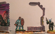 Screens: 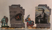
dropbox link to new file: dl.dropboxusercontent.com/u/67457759/VidScreenFrame_009a.jpg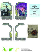 |
|
|
|
Post by zygrott24 on Dec 27, 2013 13:47:40 GMT -9
Now with Creative commons Video/holo screen Art! (attributions are on the images themselves) 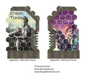 I will work on greebling the frames some more and I will see if I can find some alternate screen art (maybe public domain?). Just to check, there is no problem with using properly attributed CC art, is there? |
|


 I see not many of us were in the hero mood (even mad max is a bit on the anti-hero side). Maybe we should do heroes of cinema in an upcoming hoard to get our karma balanced (and give those colonial marines more time to sneak in). Great looking hoard everyone.
 ). I think I will finish it before too long so I was hoping for some more ideas for deadly plants or garden accouterments. Suggest away.