|
|
Post by anitangel on Oct 23, 2009 16:13:23 GMT -9
I said I planned no Puck or Oberon, but I was planning a Queen of fairies. I wasn't planning naming her Tatiana mind you. She was just going to be human scale. The list grows though with the king if you want it.
Anita
|
|
|
|
Post by anitangel on Oct 23, 2009 8:05:21 GMT -9
Steve: I haven't planned on making an Oberon or a Puck. IS the list getting any longer?  Xtea: Thanks. Anita |
|
|
|
Post by anitangel on Oct 22, 2009 14:15:35 GMT -9
That is better. You are fast with these little fellas. How long does it take to get them done from designing? I am awfully slow.
I can't wait to see the little menacing goblins.
Anita
|
|
|
|
Post by anitangel on Oct 22, 2009 14:13:27 GMT -9
That did make him pop didn't it?! I think it is ready for the hoard  Well, going through some account on deviantart is pretty discouraging for me, especially when 13 years olds whip out better drawing then I do. I don't know if you feel the same way, but don't let it discourage you. You are doing very well if you are observing and try to learn from others. And don't belittle yourself, you are better then some people and you will get even better. I couldn't have made a dune buggy, I could learn that from you, if I was interested in designing 3D. Anita |
|
|
|
Post by anitangel on Oct 22, 2009 14:04:52 GMT -9
Okay, sorry I misunderstood. I can fix that too. Anita |
|
|
|
Post by anitangel on Oct 22, 2009 8:46:54 GMT -9
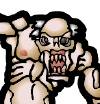
Could you shade the hair a bit too?
I agree the cutest heroes, but are the monsters going to be cute too? You make me curious Mr.Lost.
I couldn't decide myself. Goblins maybe?
And congrats to your own board.
Anita
|
|
|
|
Post by anitangel on Oct 22, 2009 8:40:34 GMT -9
Gradients, shades, textures, colors! Well done!
Weird that Jabbro here likes subtle shading while pushes me to raise the contrast and darken the shades on my figures... The shades between the muscles on the chest are strong and give dimension. How about darkening the shades on the arm and the legs a bit? Or does he print out okay?
Your development in just designing these three swamp things is amazing. You evolve your drawing fast. Practicing pays off easy for you.
Anita
|
|
|
|
Post by anitangel on Oct 21, 2009 15:19:48 GMT -9
WaffleM: Yeah, the details ;D I wish I could have come up with something natural for the straps and ropes, maybe insturments. But honestly would you believe that a fairy could play a broccoli? www.youtube.com/watch?v=_GabHGlGm14 or a carrot? I also know that fairies decorate" themselves however they wish with their magic so magic could hold up those leaf slippers, but why not let the guy concentrate on music instead of holding onto his clothes? Thank you for sharing your opinion with me, no need to say sorry for that! The white part was supposed to be a glint, the walnut fairy's is/are the biggest. So they weren't supposed to be colored, but if it makes him look bad I'm going to undo them. Remove the glints completely, or make it a lot smaller. Does it bother anyone on the other fairies? I haven't done it on the angels, but I don't leave it out when I draw otherwise --for fun. Beau: Let's see if resizing will keep them fantastic. I'm wondering about doing different sizes as well as different colors. But I'm nowhere near the end yet to think about that. Xtea: My fav is the autumn chestnut. Although I don't particularly like many of these guys. Out of the 12 I am happy with 5 of them? So let me talk about something I'd love. When will I see your horses?  Anita |
|
|
|
Post by anitangel on Oct 20, 2009 17:10:08 GMT -9
|
|
|
|
Post by anitangel on Oct 20, 2009 7:56:00 GMT -9
Yay! You are making female and male versions! My suggestions are: - The monk lady --being a monk-- should wear something less revealing. The guys usually wrap themselves up in long long sashes. You don't have to do that for the girl, but I'd not show her tummy.
- The druid guy should get the antlers, and for the druid girl it's optional. Just like real elks.
- And maybe the sorcerer could be fancier with a longer coat (not cape) or even robe and a pointy hat.
Anita |
|
|
|
Post by anitangel on Oct 19, 2009 14:06:25 GMT -9
You are really improving in coloring job! I really like how you use the gradients, and the shades.
Anita
|
|
|
|
Post by anitangel on Oct 18, 2009 14:18:25 GMT -9
Hi,
Thanks for the comments.
Anita
|
|
|
|
Post by anitangel on Oct 16, 2009 6:06:16 GMT -9
Updates from me:  Anita |
|
|
|
Post by anitangel on Oct 15, 2009 12:16:58 GMT -9
Yes, the problem indeed is the back left leg. Doesn't look like a hard fix though. The thigh on your picture is tilted, while on the reference the tight points straight down on the ground, which of course would change the point where the lower part of it meets up with the horse's knee, so maybe it is not that easy after all  I don't know... maybe you'll find it funny what it reminds me now as is, but you have to put up with meaner jokes from dad, so I'm sure you'll forgive me if it doesn't sound funny at all. This way the horse looks like he really has to go to the bathroom, but has to wait, and crosses her legs to be able to make it. Anita |
|
|
|
Post by anitangel on Oct 15, 2009 8:21:57 GMT -9
|
|
|
|
Post by anitangel on Oct 15, 2009 8:09:24 GMT -9
Well done! I agree ready for coloring. The feet are just fine too.
Anita
|
|
|
|
Post by anitangel on Oct 14, 2009 10:43:35 GMT -9
I won't be surprised by anything now after seeing the land rovers pink. I thought land rovers would rather be painted a sand color to hide it. The pink surprisingly works well. As for the explanation why a plane is pink... Dawn and Dusk are short period of time for the airplane to be camouflaged, after that they are in plain sight for anyone to see... and on top of that guys feel insecure riding it (just read it).
Anita
|
|
|
|
Post by anitangel on Oct 14, 2009 8:09:41 GMT -9
I've only test printed them. My figures need correcting too sometimes. Your outlines match up very nicely, it is just the placement compared to the base tab that was slid off a few pixels. Otherwise very very good job! Better than my first anyways so Don't worry about it, when you have a whole set that is when it matters how your figures line up ;-) And I hope there is going to be *hint* somebody else then me to test print these for you *hint* Besides these are only your previews!
Anita
|
|
|
|
Post by anitangel on Oct 14, 2009 7:59:57 GMT -9
The second head is a lot better. I think he still has the lagoon monster look. The collar bone gives some definition to the torso although collar bones tilt the other way start in the middle of the chest and tip upwards toward the shoulders Could be though that he has inherited some anatomy from fishes. Oh, and I've just noticed you could make us see his knee caps a bit. Not a must. The hand has lots of detail, very nice improvement! Anita |
|
|
|
Post by anitangel on Oct 13, 2009 15:02:34 GMT -9
He shouts for collarbones this way his muscle doesn't look stiff... That should make a difference.
Anita
|
|
|
|
Post by anitangel on Oct 13, 2009 14:34:04 GMT -9
You've gained a wow from me. This is my favorite so far!
Anita
|
|
|
|
Post by anitangel on Oct 13, 2009 14:26:53 GMT -9
Well, you could lock up your things away from her if it bothered you that much, but where is the fun in that? Who knows what adventures will your marines get into with a horde of big headed doggies. ;D
Anita
|
|
|
|
Post by anitangel on Oct 13, 2009 14:21:37 GMT -9
Magpiestear: I was referring to the animated version. Thanks Anita |
|
|
|
Post by anitangel on Oct 12, 2009 10:58:48 GMT -9
Yeah, Jabbro doesn't think that recolors are much good. No matter what I tell him, he thinks it is waste of space in a pdf.
I don't agree, I think it is time saver for your customers to provide different color schemes. I don't think it would raise the price of the product though, it wouldn't be fair. So in that point of view the artist could turn the recoloring time into his/her new project.
Anita
|
|
|
|
Post by anitangel on Oct 12, 2009 10:46:03 GMT -9
Because you wanted me to I'm going to write it here to, arabians without beards are dishonored, give that guard at least a goatee.
The guys were talking no non-sense, there is really only one girl in the group, and the scorpion guy really would make a huge army. You k'now you could do two sets that are Arabian I'm pretty sure you'd have enough to do so.
Anita
|
|
|
|
Post by anitangel on Oct 12, 2009 10:42:06 GMT -9
Kids? Does it mean Carmen is not an only child? Does she have a brother?
Carmen is so cute! And I'm honored to have a fan like her.
I like littlest pet shop too, those figures are so adorable looking!
This is an interesting story, especially the "nappy time", those are missing from the RPGs we--adults play ;D
Steve and Emergencyoverride thanks for the comments!
Anita
|
|
|
|
Post by anitangel on Oct 12, 2009 10:36:48 GMT -9
Thanks Steve and Xtea! I'm on the good road then. One more boy to go (In two versions) and the girls are on the schedule.
Anita
|
|
|
|
Post by anitangel on Oct 11, 2009 15:47:01 GMT -9
I hope you shrink him before coloring ;-) for speeding things up. Tomorrow I'll test print him, if his hair is not coming out nicely I'll ask you to send me the psd for edit and I'll help you out. Anita |
|
|
|
Post by anitangel on Oct 11, 2009 7:41:16 GMT -9
Hrm merged layers? But but... why? Was it an accident? The contrast helps, even the body looks better, but it is really the mane and the tail that needs it, and it would still need more lights and shades.
About the pegasus I'd select the wing and stretch it a bit bigger. I know that you've ran out of paper drawing that ;-) It doesn't need to be too much bigger, but this wouldn't lift that horse up. It is a pretty pegasus.
|
|
|
|
Post by anitangel on Oct 11, 2009 7:12:53 GMT -9
Eric: That is so cute! Thanks, and I will stay tuned. I was grinning reading your story too with Jabbro.
Bryn: You are welcome!
DJLittle: Thanks!
Floyd: That is right 1-2 months. Cannot compare my speed to Jim's though, he is amazing.
Anita
|
|