|
|
Post by Slick on Jun 13, 2009 13:15:04 GMT -9
Well here one is all built up and edged. The base is just my test base I need to find a good set of bases for them. I might also try out the flat basing style on these guys but I like round bases. I don't know I'll have to see. 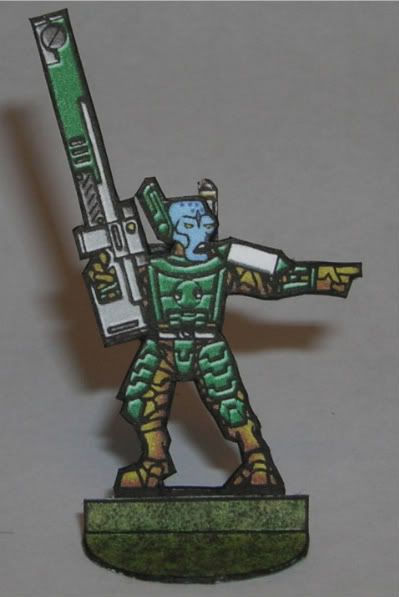 This has been a great learning experience now on the the other figures in the set. Nate |
|
|
|
Post by Slick on Jun 12, 2009 17:08:09 GMT -9
There's a white patch just above his left shoulder. Should that be colored? I wonder if some shading beneath the rifle would give it more weight? It seems to be a little flat. I'd be tempted to use a blue-to-green gradient layer on the armor to tie the color scheme together, and maybe apply an outer glow to make those red and yellow buttons/displays on the rifle look like they're luminous. The white patch above the shoulder is left white as that part of the pad and the symbol is in white. I also tried applying a gradient shade over the armor as well but it messed up with the beveling. (alas this is most likely just my inexperience causing the problem) Great idea about the luminous buttons ill have to see what I can do. I also added a drop shadow under the weapon but removed it due to the figure becoming too dark. Ill post where I'm at with the figure latter tonight. Nate !EDIT! Here is the final figure. I'm done adding details too it. I added a shadow under the weapon and made the 2 displays on the gun have a bit of a glow to them. I need to stop here because I want to be able to replicate this on the other figures and I'm already at 10 layers. 1) base color image 2)green armor bevel (fronts) 3)green armor bevel (backs) 4)white armor bevel (front) 5)white armor bevel (backs) 6)light gray/red weapon bevel 7)dark gray weapon bevel 8)Highlights 9)shader 10) detail parts (glowie bits and what not) Here is the pic. 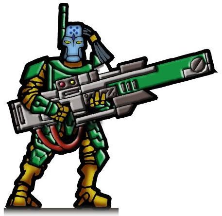 The figure came a long way from the basic solid fills that I started with and it was not too much work to get it looking like this. The figures printed well but I might increase the brightness by about 5-10% on my next batch. Nate |
|
|
|
Post by Slick on Jun 11, 2009 18:51:44 GMT -9
I don't know, thats a great idea to try out the bevel on the weapon ill give it a shot later tomorrow! Nate EDIT Well latter tomorrow came about 30 min after I posted the above statement and here is a pic. 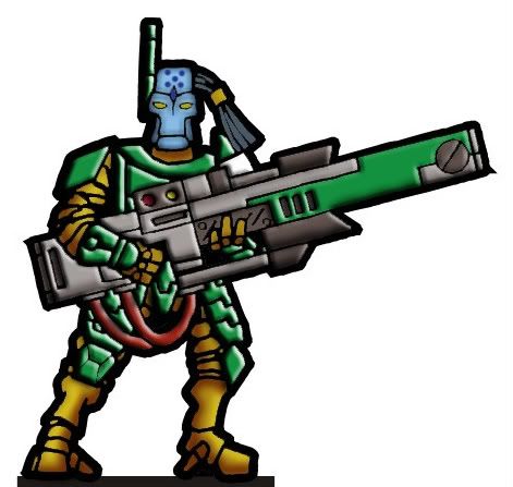 I like it but we will have to see how well it prints. I think that the details are too fine to look that good on paper but Ill give it a try later. There is no shading done to the beveled armor parts I let photoshop do that. I might be able to tone it down some after some messing with the bevel settings. Nate |
|
|
|
Post by Slick on Jun 10, 2009 18:52:43 GMT -9
Well I was going through my files and playing around with the cool shading and highlighting tutorial that Floyd put up in the photoshop section. I have been applying this technique to various models of Jim's and mine. All the models I have used this on have already had some highlights in the form of gradient fills. Then I had an Idea. Lets take a standard bucket fill and use this technique and see where it leads. Below is the before and after shots of a TOA figure. Before 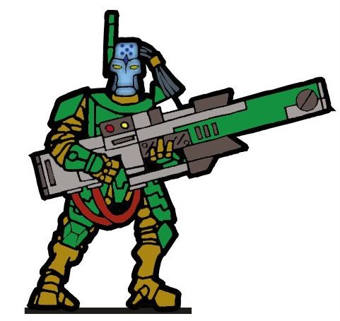 (the head was textured on the base layer with a standard box blur after filling and freckles were added after. Hence why it is textured on the before picture) All parts were filled with a standard solid color at 65% tolerance to get ride of most of the white and gray outlines. Then the shadow, highlight and bevel layers were made following the tutorial and here is what I came out with. After 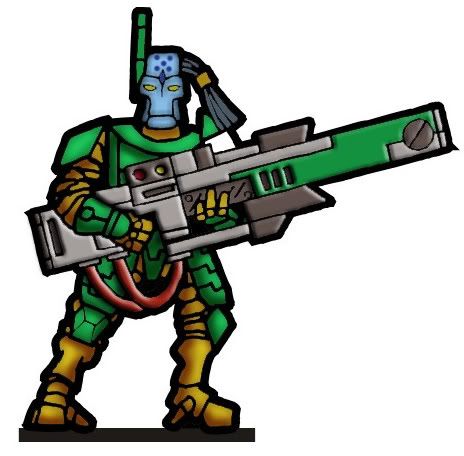 I know the lighting is off but it's not too bad looking I think. Its a lot faster to do this then work out gradient fills for each section and then make them all look good. Nate |
|
|
|
Post by Slick on Jun 8, 2009 13:06:23 GMT -9
Very awesome! These are coming along nicely!
Nate
|
|
|
|
Post by Slick on Jun 4, 2009 12:59:11 GMT -9
I agree with you on the helmet. I thought It would grow on me and it has not. As far as face masks go I don't think ill do them on these guys. This was my first figure to not have a face mask and even though I used Jim's heads I don't want to cover them up too much. The shoulder pads will be saved for the heavy infantry.
Nate
|
|
|
|
Post by Slick on Jun 3, 2009 19:21:08 GMT -9
Thanks everyone! I have changed the weapon to lighter color so its not lost. As far as the pose goes that was just a slap together I did without rotating the parts hence the perfect parallel angles. The red in the camo is just for fun but I agree and it has been reduced for the final figure and the blues have been lightened. Believe it or not there is a Russian urban camo that has 3 primary colors of blue, gray and a form of clay red (More red then brown) This was the look I was going for. I also remove the shoulder pads They looked too bulky. Here is a pic before I changed the weapon color. Also the camo came out more brown then reddish brown so ill have to fix that too. Nate 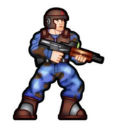 |
|
|
|
Post by Slick on Jun 2, 2009 18:54:29 GMT -9
jabbro, Yes that was my idea. To create base unit that I can add armors and accessories on to generate different troops types. Dagger, I agree totally I think I will be removing them altogether because they will just get covered up by accessories. Here is a test build just to give you all a sense of colors. The helmet and forward hand are not going to be final. I just wanted to try out Floyd's technique for shading and highlighting and a camo tool Squirmydad sent me a link for. Over all not too bad i think. Enjoy, Nate 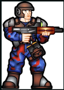 |
|
|
|
Post by Slick on Jun 2, 2009 16:37:24 GMT -9
Just an image to let you all know that this project is not dead. I have been spending a lot of time fooling around with illustrator and photoshop just trying different things. I took your suggestion for some optics agelessone and added a reflex sight. As with my shock troopers I have mimicked Jim's Terra force work. Enjoy. Nate  |
|
|
|
Post by Slick on Jun 1, 2009 11:21:10 GMT -9
I have been a paper modeler for years (I have a hard copy of pepekura designer 1) I have seen in the past 6 years a huge increase in paper models as a whole. There are now blogs out there that track paper models creation. For gamers this is by far the best and most economical way to game. Gone are my days of spending $1000s of dollars (literally) on plastic models and supplies and with a little computer know how and personal drive drive you can create you own or recolor other's work. I feel the hobby is growing and taking on a new shape. Heck just look how far Jim's stuff has come in the past year! Or look at any one of the artists boards. I for one personally have grown in the past year as a designer. Heck I used to work in mspaint at 72dpi  . but alas I rant! This is a great hobby that can give you great products at a very economical price or even free. Nate |
|
|
|
Post by Slick on Jun 1, 2009 11:08:56 GMT -9
Great work! I too Love the camo maker in gimp and have been looking for something similar in photoshop but have come up at a loss. Its great to see all of the recolors that are being done. I feel that recoloring give the figures a personal touch (just like painted minis) that just make them pop!
Nate
|
|
|
|
Post by Slick on May 29, 2009 18:06:12 GMT -9
|
|
|
|
Post by Slick on May 20, 2009 9:54:57 GMT -9
hehe ya its amazing how much the net has changed in the past 10 years. Kina a neat program if you did not have access to a computer that you can install stuff on.
Nate
|
|
|
|
Post by Slick on May 20, 2009 2:45:27 GMT -9
I agree Aestelon they look Great. Nice job Mel they should fit in with your stuff perfectly.
Nate
|
|
|
|
Post by Slick on May 19, 2009 6:24:29 GMT -9
I agree with Kane. Even when I went to a print shop and tried to get them done there was a small issue with alignment that was very hard to correct. It was a VERY small misalignment but alas when your dealing with figures .5mm-1mm is a huge margin for error and can ultimately ruin the finish. If you can get it to work though post your process here I think there would be a bunch of us interested in the process!
Nate
|
|
|
|
Post by Slick on May 17, 2009 19:18:15 GMT -9
Ahh the good old L85a2. A great weapon but in my book it scores low on the sexiness scale. For that you need to look to the French who have a history for romance that can be seen in there FAMAS. It looks sexy!  Nate |
|
|
|
Post by Slick on May 17, 2009 15:40:35 GMT -9
LOL sorry about not having pics yet. Alas I have not even started on it. The legs will be based on the ones I used for my shock troopers as will most of the parts. My goal is to create a core model that I can add gibblys onto to create different sets. My modeling method as it stand means I have to start from scratch when I want to do something new. So this will be an experiment. As to the russians.... My thinking was based in no such way in reality but rather on the absurd fascination I have with the cold war and also because I drew a sick looking futuristic bull-pup Kalashnikov doodled on the paper table cloth from the Italian restaurant down the road. They got a kick out of the fact that I tore a piece of the paper off and took it with me  . Nate EDIT: You got me feeling all bad about not having pics Abaddon so here is a quick trace. 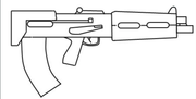 |
|
|
|
Post by Slick on May 17, 2009 15:02:35 GMT -9
I am starting my next figure project. Let me paint you a picture. Its the year 2200 and the world is a very different place. Most of Asia and Europe are occupied by the NRSS (New Republic of Soviet Socialists) while the Americas are ruled by the Democratic CDS (Combine of democratic states). Do to some unknown disaster (cuz I have not thought up of it yet). Both countries are bent on the others destruction. The setting of the world is one where industrialization for war is the almost complete background with huge complexes and war warehouses to fight in blah blah blah. You should get the picture by now. Anyways this will be my fist experiment working with vectors so we shall see where it goes.
Nate
|
|
|
|
Post by Slick on May 14, 2009 19:10:22 GMT -9
Laser printers by far are the best way to go for printing. After 11 years in the office supply biz I can vouch for the above statement! While the initial cost of a laser printer is very high when compared to inkjets there are several bonuses to getting one as I will list below.
Cost: As I said above the initial cost is high but the cost per page is about 1/2 that of inkjets. I believe HP released a statement a few years back saying that inkjets run about 18-20 cents per full page of color (like a photo) where as there lasers ran about 7-9 cents per page. This is also apparent in the longevity of toner/pigments. Inkjets at max quality run anywhere from 200-500 pages of color and lasers are in the thousands hence the higher cost of toner.
Quality: The primary advantage of a laser printer is that it is not so reliant on paper quality to produce great quality print. This is another area where the lower cost comes into play. I can say that my laser printed stuff on cheap 65lb card stock looks as good if not better then my hp inkjet on matte photo-paper.
Durability: This should not play so much of a roll in purchasing one for personal use but it its worthy to mention. Most laser printer are Tanks! The are big bulky and can usually withstand much higher amounts of printing than an inkjet.
With all this being said there are some exceptions to the above rules. Samsung makes a great and affordable color laser printer that will set you back about $200 and the toners run about $55 but you sacrifice the CPP as stated above and just get the quality. HP are decent as well as Epson. I would advise most people to stay away from Brother. While there B&W printers are the best buy out there now, there color stuff is years behind the competition.
To be honest though aside from quality the cost of printing, it might take you a long time to recoup the initial purchase. You have to remember lasers are still very much business machines and only crazy people like me would ever want to get one for personal use.
Nate
|
|
|
|
Post by Slick on May 13, 2009 4:37:06 GMT -9
I was over on zealot.com yesterday and was following Jan's new sulaco build (1.3m long YAY I hope he gets it done). Anyways I was looking through his build photos and discovered he used watercolors for his edging. I laughed at first then I realized you can NEVER EVER see any of his fold and join lines on his models. I just though this was a cool method. Great for 3d stuff but I would stick to markers for my flats. I'm gona get some kids water colors later today and see what I can make my pulse rifle test look like.
|
|
|
|
Post by Slick on May 8, 2009 17:52:24 GMT -9
I'm still using it and I don't think the admins would mind but I post all my finished stuff over at www.papermakeit.com/. I use photobucket for my images as well. The main reason why I use paper make it is because other gamers (not just the ones that visit onemonks) get a chance to see and use it. Nate |
|
|
|
Post by Slick on May 6, 2009 7:42:00 GMT -9
Id say that is starting to look quite interesting I cant wait to see how it will look finished! It will be a great addition to my small Terra force!
Nate
|
|
|
|
Post by Slick on May 5, 2009 9:11:02 GMT -9
Very cool sir I love your airship designs they are a nice mesh of naval and steampunk!
Nate
|
|
|
|
Post by Slick on May 4, 2009 19:42:57 GMT -9
Jim one way I got around a good saving format for unfolding is to save as a google earth file (.kzm is think). If your using pepakura these files tend to have loads of errors or distortions. One way I have found to bypass this is to open the model in metasequia and save it in meta (.mpq i think). For some reason meta seems to fix a bunch of errors in the saving process. Or you could just send me the google sketch file and I can export it as any file you want and send it back  . Nate |
|
|
|
Post by Slick on May 2, 2009 9:58:14 GMT -9
Great work jenny absolutely great!!!!
Nate
|
|
|
|
Post by Slick on Apr 28, 2009 17:46:30 GMT -9
I'm coming in slightly late to the discussion but here is my 2 cents.
I would take the time to learn a 3d program it drastically reduces build time rather then doing it by hand. Sketchup is a Great program considering its free. I use it for all my models and to get the scale correct I pick an easy setup and just run with it. I go for the standard metric production design in mm and set the snap to 1mm. At 30mm scale 1mm is great. There are some things that sketchup does weird though when your looking to unfold stuff depending on the program you want to use. I always open my sketchup stuff in metasequia and save it as a .mpq and then open in pep for unfolding. For some reason this reduces the number of errors in building.
Nate
PS: Or like you said earlier all you have to do is ask (and supply us with sketches) and a few of us could whip up something for ya!
|
|
|
|
Post by Slick on Apr 12, 2009 15:48:57 GMT -9
what program are you useing?
|
|
|
|
Post by Slick on Apr 10, 2009 18:45:12 GMT -9
one of the things I learned when working in the office supply biz it that the weight of paper is not consistent through other types of mediums. For instance in the states 110lb cardstock is nowhere near as stiff as 80lb cover stock. Also 55lb photopaper is about the same stiffness as 85lb cardstock. What this means is don't go by weight unless your staying in the same style of paper. There are several different ways to measure paper weight here are 2 of the most common. "GSM" or grams per square meter and "LBS" pounds per 1000sq ft. This can get somewhat confusing but all papers are not the same. Cover stock is more similar to matte board rather then cardstock. Also things can stiffen a sheet of paper while not adding too much weight such as lamination and photopapers finishing All in all your best bet is to go the the copy center at your local office store and get a few sample sheets to do test prints on to get one that suits your taste.
In your case Aestelon it is totally possible for the 4x6 photopaper you bought thats 235gsm to actually be thinner and flimsier then the 210 cardstock you have been using.
Nate
|
|
|
|
Post by Slick on Apr 9, 2009 7:18:30 GMT -9
I agree very cool stuff. Its great how us hybrid lovers think alike. I have a set of arms as well that have the talons photoshoped onto them. They are how ever meant to be attached to the standard stalker. Your conversion to make them appear like they are leaping is just awesome. Cant wait till we get to see one in all of its colored glory.
Nate
|
|
|
|
Post by Slick on Apr 1, 2009 6:12:01 GMT -9
I too am loving the 15mm scale! It gives so much more room on your standard gaming table to allow for monstrous creatures and large vehicles to blend in with troops and even air support! Great work it looks stellar!
Nate
|
|


 .
. .
. .
.
